Towers in the Tempest
This visualization won Honorable Mention in the National Science Foundation's Science and Engineering Visualization Challenge in September 2007. It was also shown during the SIGGRAPH 2008 Computer Animation Festival in Los Angeles, CA. 'Towers in the Tempest' is a 4.5 minute narrated animation that explains recent scientific insights into how hurricanes intensify. This intensification can be caused by a phenomenon called a 'hot tower'. For the first time, research meteorologists have run complex simulations using a very fine temporal resolution of 3 minutes. Combining this simulation data with satellite observations enables detailed study of 'hot towers'. The science of 'hot towers' is described using: observed hurricane data from a satellite, descriptive illustrations, and volumetric visualizations of simulation data. The first section of the animation shows actual data from Hurricane Bonnie observed by NASA's Tropical Rainfall Measuring Mission (TRMM) spacecraft. Three dimensional precipitation radar data reveal a strong 'hot tower' in Hurricane Bonnie's internal structure. The second section uses illustrations to show the dynamics of a hurricane and the formation of 'hot towers'. 'Hot towers' are formed as air spirals inward towards the eye and is forced rapidly upwards, accelerating the movement of energy into high altitude clouds. The third section shows these processes using volumetric cloud, wind, and vorticity data from a supercomputer simulation of Hurricane Bonnie. Vertical wind speed data highlights a 'hot tower'. Arrows representing the wind field move rapidly up into the 'hot tower, boosting the energy and intensifying the hurricane. Combining satellite observations with super-computer simulations provides a powerful tool for studying Earth's complex systems. The complete script is available here . The storyboard is available here . There is also a movie of storyboard drawings with narration below.
Towers in the Tempest - full narrated version
This video is also available on our YouTube channel.
This animation combines the first two sections of the narrated piece above. It begins with NASA's fleet of satellites, shows observed data from the TRMM satellite, and then displays NCAR meoscale model data of Hurricane Bonnie.
This is the section two of the full movie that explains the dynamics of wind and energy inside of a hurricane. This movie contains audio.

NASA's Earth observing fleet
TRMM observes Hurricane Bonnie using the Visible and Infrared Sensor (VIRS)
TRMM's precipitation radar (PR) data of Hurricane Bonnie
A hurricane's eye is an intense low pressure system
Air spirals inward towards the eye, rapidly upward, and outward
Air picks up energy from the warm ocean through evaporation and releases it in the hurricane through condensation
Hot towers act like 'express elevators', accelerating the movement of energy up into the hurricane
Wind speed changes between the fierce eye wall and relatively calm winds in the eye can spin up intense vortices
Near the surface, air spiraling inward collides with vortices, forcing the air upwards, creating an updraft
A very strong updraft moves energy much higher than normal, creating a hot tower
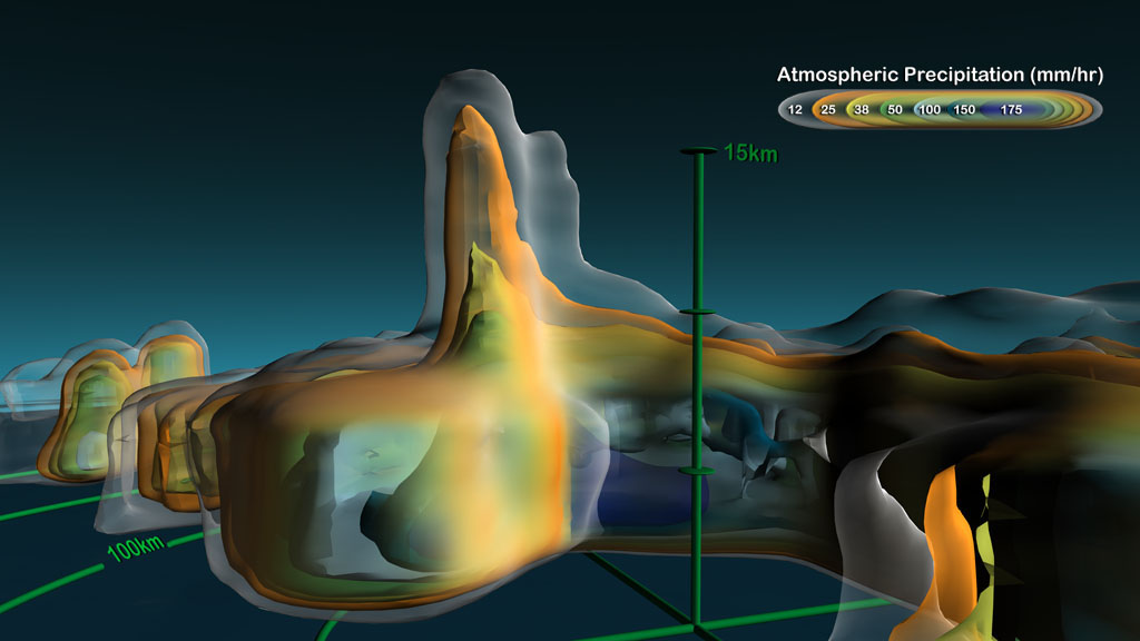
Step zero of the simulation shows the low level winds, represented as arrows, rising quickly in the updraft (orange region).
Fifteen minutes later, the updrafts (orange) have moved with the winds. Notice the red arrows which show the low level winds caught in the storm's updrafts.
The winds and updrafts continue to change. The green circles are 50 km, 100 km, 150 km, and 200 km from the center of the simulation.
The favorable region for updraft formation and a vortex/updraft pair.
The eye of the storm is shown in blue and vorticity in red.
Volumetric clouds of Hurricane Bonnie only.
Composite still
This animation is the video from section two of the full movie which illustrates the dynamics of a hurricane and the formation of Hot Towers.
Storyboard composite based on original hand-drawn sketches (displayed at SIGGRAPH 2008)
Storyboard version with hand-drawn still images
Credits
Please give credit for this item to:
NASA/Goddard Space Flight Center Scientific Visualization Studio
-
Animators
- Greg Shirah (NASA/GSFC)
- Lori Perkins (NASA/GSFC)
- Alex Kekesi (Global Science and Technology, Inc.)
- James W. Williams (Global Science and Technology, Inc.)
- Horace Mitchell (NASA/GSFC)
- Marte Newcombe (Global Science and Technology, Inc.)
- Tom Bridgman (Global Science and Technology, Inc.)
- Helen-Nicole Kostis (UMBC)
-
Visualizer
- Cindy Starr (Global Science and Technology, Inc.)
-
Video editor
- Stuart A. Snodgrass (Global Science and Technology, Inc.)
-
Narrator
- Horace Mitchell (NASA/GSFC)
-
Scientist
- Scott Braun (NASA/GSFC)
-
Project support
- Randall Jones (Global Science and Technology, Inc.)
- Joycelyn Thomson Jones (NASA/GSFC)
- Kevin Mahoney (CSC)
- John Jacobi (Global Science and Technology, Inc.)
-
Writers
- Michael Starobin (HTSI)
- Greg Shirah (NASA/GSFC)
- Horace Mitchell (NASA/GSFC)
- Lori Perkins (NASA/GSFC)
- Scott Braun (NASA/GSFC)
Release date
This page was originally published on Thursday, May 10, 2007.
This page was last updated on Wednesday, May 3, 2023 at 1:55 PM EDT.
Missions
This visualization is related to the following missions:Series
This visualization can be found in the following series:Datasets used in this visualization
-
[TRMM: PR]
ID: 109 -
[TRMM: VIRS]
ID: 111 -
MM5 [Mesoscale Model Version 5 (MM5)]
ID: 586Model dataset from Penn State and The National Center for Atmospheric Research
This dataset can be found at: http://met.psu.edu/tropical/charm/
See all pages that use this dataset
Note: While we identify the data sets used in these visualizations, we do not store any further details, nor the data sets themselves on our site.
Related
- ID: 3773
 Visualization