Tickets
may already be gone, but thanks to NASA there's still one
way you can drop in on the opening and closing ceremonies
for the Salt Lake City Olympics. By carefully fusing image
data from NASA's Terra and Landsat spacecraft, as well as
the commercial Ikonos satellite belonging to Space Imaging,
the space agency brings you this remarkable view of the Rice-Eccles
Olympic Stadium as captured from space.
The
scene is also something of a celebration for the space agency;
2002 marks the thirtieth anniversary of the highly successful
Landsat program. Located on the University of Utah campus,
Rice-Eccles is the place for one of the world's biggest celebrations
this year. Nearly 45,000 people will pack the stands there,
while several billion people around the world will catch all
or part of the festivities on television.
The development of this zoom and ones like it has roots in
important scientific research. The computer science expertise
necessary to assemble the scene demands world-class custom
software, powerful hardware, and a lot of know-how. Images
like this illustrate the power of remote sensing, the ability
of scientists to gain perspective on their subject and make
measurements from a distance.
2002
marks the thirty year anniversary of Landsat, a family of
Earth observing satellites that's helped re-write the book
about what we know about the processes of change on our home
planet. During that time, NASA has refined its technologies
and broadened its horizons. On orbit now are not only the
latest and most advanced Landsat platform to date, but also
a suite of other remote sensing instruments, each designed
to collect vital information about the interconnected systems
that define the Earth.
The thirty-year Landsat milestone coincides with the Winter
Olympics in Salt Lake City. As eyes around the world turn
to that snow-covered scene, the space agency releases a remarkable
tour of that city in Utah, composed of images collected by
space-based instruments. And while the sights themselves are
almost as compelling as the competition on the snow and ice
below, the scientific opportunities are genuinely world class.
Swifter,
higher, stronger--and that's to say nothing of the athletes
competing this year at the Salt Lake City Olympic Games. In
terms of world-class performance, NASA's Earth Observing System
is clearly a medal contender.
This fly-by shows several of the Olympic venues as seen by
a powerful satellite called Landsat 7. But images like this
merely describe NASA's larger Earth observing efforts. The
fleet also includes a small instrument with an impressive
success record called SeaWiFS. It's a top contender in measuring
the colors of Earth. Since scientists use color as a direct
indicator of life processes, this satellite's value isn't
measured by mere size. A recently released assessment of the
global carbon cycle is a first-a new world record, if you
will.
But technologies like Landsat and SeaWiFs are only part of
the story. By studying how planetary processes change over
time, experts are starting to understand how they function
at fundamental levels. That's where models like this come
in to play. This remarkable scene shows a portion of a computer
simulation called NSIPP-the NASA Seasonal to Interannual Prediction
Project. NSIPP posits what the future might be, simulating
the Earth's climate inside the silicon brain of some of the
most powerful computers in the world.
In science as in competitive athletics, there are always surprises.
To that end, NASA salutes the athletes of the 2002 Olympic
games. See you in Salt Lake City.
How
can you see Salt Lake City's Olympic venues in twenty seconds?
Try this. We're taking you on a fly-over of the region via
the remarkable eyes of Landsat 7, NASA's land mapping champion.
Scattered around the map you'll see a number of colored
push-pins, designating various Olympic event locations.
This scene shows surface features as small as fifteen meters-a
target from space proportionally smaller in scale than even
the remarkably small biathlon target in the games. Planetary
surface features in this sequence have been exaggerated vertically
by a factor of six to more clearly show their contours.
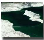
Image
4
Click
here for a tour of Salt Lake City -
Note: 5.45 MB download QuickTime Format
Click
here for a tour of Salt Lake City -
Note: 9 MB download MPEG-1 Format
We're
looking south as we begin this inspiring journey. Using imagery
captured by Landsat 7 on February 8, 2001, the peaks of the
Utah Rockies ring the Olympic sites in and around Salt Lake
City like minarets. This majestic panorama showcases one of
the powerful features of Earth imaging systems like Landsat.
As we see here, relatively localized regions can be studied
in geographical context to surrounding areas, affording experts
in a variety of fields a wide range of land management and
scientific information. Features like roads and buildings
appear clearly across the plains, while at the same time we
can see complex yet subtle characteristics about the surrounding
landscape. Even along the edges of the lakes in this scene
we can see texture and color gradients, indicating details
about shallow water sediment and the shore.
The
Seasons of Salt Lake City
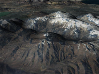
Images
5 and 6
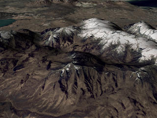
Click
here for an animation of the seasons of Salt Lake City.
- 2.17 MB
Landsat
7 monitors the Earth constantly, recording an ever-lengthening
and vital history of our planet's process of change over time.
In this sequence we look at the greater Salt Lake City region
through the four seasons. We begin in winter, traveling south
to north, facing west.
Derivation of useful information from satellite imagery is
a science unto itself. While the colors in these images are
enhanced to most dramatically convey seasonal change, land
imaging professionals can use highly sophisticated algorithms
to extract complex information about surface features, including
many details that are not detectable by the human eye.
Landsat 7 collected the data for these images on the following
dates:
Winter:
February 8, 2001
Spring: May 28, 2000
Summer: July 31, 2000
Fall: October 19, 2000
Then
and Now: A 28 Year Landsat Comparison
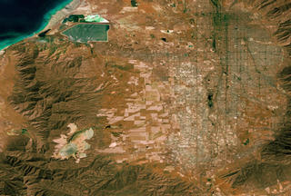
Images
7 and 8
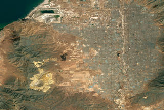
Click
here for an animation of how Salt Lake City has changed
from 1972 to 2001. - 874 KB QuickTime Format
Click
here for an animation of how Salt Lake City has changed
from 1972 to 2001. - 163 KB MPEG-1 Format
Take
a look at an old family photograph. If there's one thing that
catches your attention (besides the ubiquity of bell bottoms)
it's probably how much everyone has changed over time.
That's one of the principle forces behind the maintenance
of a long-term remote sensing record. By watching our planet
from space over time, experts can literally track how the
Earth is changing due to human and natural causes. With specific
regard to the 2002 Olympic Games, the greater Salt Lake City
region has changed profoundly over the past three decades.
The city limits have grown far beyond their older boundaries,
and plant life in the surrounding area has changed for a variety
of reasons. The mountains remain, of course, but carved into
their sides are new ski runs, highways, tunnels, and other
construction projects.
Landsat 7 took the most recent image. The older comparison
scene comes from its elder sibling, a spacecraft called ERTS-1,
or Earth Resources Technology Satellite. Originally the name
for the overall program, ERTS was changed to Landsat in the
70s to better capture the essential purpose of the project.
To date it has been one of the most successful long-term remote
sensing missions in history.
This sequence and the two that follow alternate between two
images several times. Landsat collected the data for the first
on August 7, 1972 and the second on July 31, 2000.
The
Richest Hole in the Earth
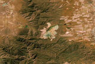
Images
9 and 10
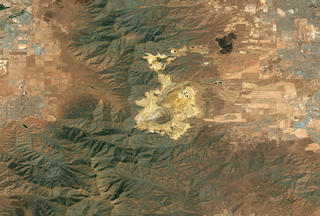
Click
here for an animation of the changes in Bingham mine
over the past 30 years. - 838 KB QuickTime Format
Click
here for an animation of the changes in Bingham mine
over the past 30 years. - 165 KB MPEG-1 Format
Officially
it's called the Bingham Canyon Mine, but regardless of its
title this is the place where money comes out of the ground.
Starting in 1906, this immense mine began producing a flabbergasting
quantity of metals and other minerals. To date, it is the
single biggest producer of copper in the world.
But this gigantic pit dug in an unending chase of raw materials
can also lay claim to another peculiar title: it's the largest
human-dug hole on the planet. It stretches approximately 3/4
of a mile down and more than 2 1/2 miles wide.
These two Landsat scenes show how much the mine has changed
and grown in twenty-eight years. The primary hole itself has
deepened, while the perimeter has stretched and expanded.
In World War II copper output just from this one mine produced
more than one third of all the copper used by the Allies.
In the early 1990s, as much as 300,000 tons of copper came
from Bingham Canyon each year. Yet while copper remains its
most well known product, this vast endeavor outside of Salt
Lake City also produces enormous quantities of gold, silver,
molybdenum, and other metals. But the treasures of Bingham
Canyon did not emerge without serious work. Each of the purified
metals in quantity are the result of huge efforts to sort
through more than 6 billion tons of rock that have been pulled
out of the ground since 1906.
The
Great Salt Lake-Vast and Vibrant

Images
11 and 12
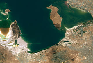
Click
here for an animation of how the Great Salt Lake has
changed over time. - 788 Kb
Click
here for an animation of how the Great Salt Lake has
changed over time. - 159 KB MPEG-1 Format
Covering
an area of approximately 1,485 square miles, the Great Salt
Lake on the edge of Salt Lake City, Utah stretches like a
lyric answer to the Rocky Mountains' declarative theme. The
lake does not have any outlets; water that finds its way into
the lake basin can only leave by evaporation. As a result,
the dissolved minerals left behind makes the water more than
eight times as salty as ocean water.
The basin holding the lake is wide and flat, averaging from
13 to 24 feet in depth, with shallow slopes around most of
the perimeter. As a result, increased inflows of water do
not cause the depth to change so much as they cause the edges
to spread out. Heavy snow melts and rainy seasons can have
pronounced changes on the shape of the lake.
In the two Landsat images shown here, we can see strong variability
in the lake. Notice how the perimeter changes dramatically,
with striking differences in shoreline sedimentation and color.
Urban development along the shores also appears as a significant
feature that changes over time. But perhaps most interesting
is the dividing line between the northern and southern parts
of the lake. In the original image, taken from space on August
7, 1972, you can see a thin line dividing two slightly different
colors of water. That line is a twelve mile long causeway
connecting the east and west shores. Construction of that
causeway inhibited circulation of water from one side to the
other, changing the salt balance between the sides and prompting
differences in the kinds of life that grow in each environment.
Replacement of the causeway with a bridge in 1984 changed
things, allowing more water to circulate between the north
and south. In the later Landsat picture, captured on July
31, 2000, you can see that the color division is less apparent,
with the lake now more uniform in its salinity.
Remote
Sensing Charts the Biosphere in Motion
Image
13
Click
here to view animation of seasonal changes - 1.44
MB
NASA
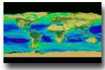
designed SeaWiFS to study ocean processes. But the mission
has surpassed its initial design goals. By carefully calibrating
the sensor, experts have been able to use SeaWiFS data to
monitor life on land, too.
Throughout the duration of the project, affiliated researchers
have produced a series of high-resolution images to help them
better understand seasonal changes in ocean and land-based
plant life in regions around the U.S. In the following visualization,
SeaWiFS depicts the presence of chlorophyll in the ocean in
terms of a color scale. High concentrations of chlorophyll
appear red, while low concentrations show up blue. In the
oceans, chlorophyll corresponds with the presence of phytoplankton,
the world's engine of life. On land, chlorophyll shows up
in leaves and other photosynthetic flora.
As we consider a flat map painted in the color-coded data
gathered by SeaWiFS over the last three years, it's important
to note the relative oxygen production of plant life in the
ocean versus on land. While the ocean doesn't put out as much
oxygen per square meter as vibrant rainforest, taken as a
whole the ocean does produce roughly the same amount as the
Earth's total land surface. This is due to the vastly larger
area of ocean on the surface, essentially making up for the
discrepancy in square meter productivity.
A
Gold Medal Climate Model
Image
14
Click
here to view animation of climate modeling - 1.16
MB
Some
things require perspective. Stand too close to a mountain
and you cannot appreciate its overall size and scale. The
same goes for events experienced over time. A mostly sunny
day would seem dreary if it were only experienced at the moment
a lonely cloud passed in front of the sun. But taken over
time, that brief moment of shadow takes its relative place
among many hours of light, simply adding motley complexity
to an otherwise cheerful day. Temporal perspective can be
just as important as spatial perspective.
The issue of perspective presents interesting challenges for
climatologists. Since climate describes general characteristics
for a given area over time, it can take years to collect enough
data to adequately understand what is climatologically natural
for a particular part of the Earth.
That's why experts turn to computer models. In the heart of
a computer, complex programs can simulate the dynamic characteristics
of climate at a vastly accelerated rate as compared to the
real world. Natural events that would take days or longer
can be speeded up to take only minutes, seconds, or even less.
It's a way to create experimental environments where researchers
can study phenomena that ordinarily would take too long or
be too large to measure in the real world.
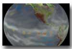
Here you see the result: virtual climate taking place in artificial
time. These images are the result of NSIPP, the NASA Seasonal
to Interannual Prediction Project. All the data used to create
these pictures come directly from the model, based on what
we believe to be the rules that govern climate. We begin with
a scene that shows sea surface temperatures alone. Experts
say that sea surface temperatures have profound influences
on many vital elements of global climate trends, from rainfall
totals to winds to air temperatures.
Next we add a layer of virtual water vapor. This shows large-scale
transport of moisture through the atmosphere. If you keep
an eye on the greater Salt Lake City region, you'll notice
relatively little water vapor. Watch what happens next.
In the last scene we add data showing relative soil moisture.
Notice how the area around Salt Lake City appears mostly brown.
It turns out that water vapor and soil moisture are intimately
related; they function as a feedback loop. Dry soil tends
to provoke limited rainfall, thus remaining dry. Moist soil
tends to coax precipitation; hence it tends to stay moist.
In this model, we see the laws of nature played out in virtual
space and time.
Computer time is not arbitrary. Although simulated, it too
has dates. This modeled climate sequence is running on NSIPP
data taken from December 1, 2001 to December 1, 2002.
NSIPP: Climate in a Computer
Image
15
Click
here to view animation of soil moisture. - 1.64 MB
NASA's
Goddard Space Flight Center developed NSIPP. It uses real-world
sea surface temperature measurements to set its simulated
weather patterns in motion. In some ways, these visualizations
are like timelines that could have been: they use historical
ocean temperature measurements to initiate simulated sequences
of climatological events. By comparing those simulated events
to the actual historical record of climate and weather, the
science team can make refinements to their model, thus gaining
a deeper understanding of how the different processes fit
together.
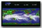
On these maps, green areas indicate regions that the model
says should have had higher than average quantities of soil
moisture. Brown areas show places that should have had lower
levels of soil moisture. Accurate analysis of total soil moisture
is a major tool for understanding the nature of overall seasonal
precipitation. The wispy veil curling across the map depicts
estimations of water vapor in the atmosphere-an influential
component to overall climate behavior.
The data used to generate the moving images describe regions
of the planet approximately two and a half degrees wide.
Blue
Marble: Painting the Planet with a New Brush

Image
16
Click
here to view a zoom from Salt Lake City to space.
- 1.82 MB
The
world is a big place and even from space, it's not easy to
see the whole thing at the same time. But using an instrument
called MODIS onboard the Earth observing flagship Terra, scientists
have assembled the most detailed true-color image of the entire
Earth to date. In this sequence we start in close to the greater
area around Salt Lake City and pull back to reveal the rest
of the Earth.
You
can download your own mosaic by visiting the Earth Observatory
Blue Marble page.
Landsat:
Continuing a Legacy of Earth Observation
Image
17
Click
here to view animation of Landsat - 0.99 MB
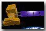
Landsat
7 is the latest in a series of satellites. From an altitude
of 438 miles (730 kilometers), Landsat 7 can see surface features
as small as 15 meters, providing world-wide land resource
information for a diverse range of uses.
The only scientific instrument onboard the satellite is the
Enhanced Thematic Mapper Plus, a passive sensor that measure
reflected solar radiation (light) from the surface of the
Earth. Landsat 7 is part of a global research effort NASA
calls the Earth Science Enterprise, which seeks to acquire
a long term understanding of the changes to our planet. NASA
officially called the first Landsat satellite the Earth Resources
Technology Satellite, or ERTS-1, on July 23, 1972. Since then
the program has continued to pave the way in research and
data acquisition techniques about the surface of our planet.
NASA,
USGS, and university researchers use imagery from these satellites
to study how our planet is changing, and to view local and
regional changes in their global context. Such changes include
crop maturity in farm states during the growing season, the
waxing and waning of severe storms and El Nino, deforestation
in the Amazon and reforestation in New England, and thinning
and thickening of the Greenland and Antarctic ice sheets.
The USGS Earth Resources Observation Systems Data Center (EROS
Data Center) in Sioux Falls, SD processes, archives, and distributes
all U.S. Landsat data. The Landsat Project Office, located
at Goddard, manages Landsat development for NASA's Office
of Earth Science in Washington, DC.
SeaWiFS:
Big Returns from a Small Package
Image
18
Click
here to view animation of SeaWiFS -Note:
5.42 MB download
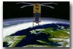
SeaWiFS
(Sea-Viewing Wide Field of View Sensor) is the scientific
portion of the OrbView-2 satellite, orbiting The Earth at
an altitude of 423 miles (705 kilometers). By providing a
regular picture of the planet's color, SeaWiFS helps researchers
learn about the state of the world's interconnected ecosystems.
OrbView-2 blasted into space on August 1, 1997 lifted by an
extended Pegasus rocket. SeaWiFS is considered a low cost
mission, many orders of magnitude less expensive than other
Earth observing instruments. In scientific terms, however,
this little instrument has proved to be one of the space agency's
star performers, it's highly focused mission parameters netting
huge scientific returns for researchers studying a wide variety
of questions.
Terra:
The Modern Flagship of the Earth Observing System
Terra is a multinational orbiting research platform managed
at NASA's Goddard Space Flight Center. By synchronizing a
sophisticated suite of sensors and instruments, Terra is helping
researchers pursue some of the grandest and most complex questions
about the nature of our home planet. The instruments onboard
can simultaneously study clouds, water vapor, aerosol particles,
trace gases, terrestrial and ocean properties, and systemic
interactions on a planetary scale.
High
resolution of Image 3 (903 Kb)
High
resolution of Image 5 (1 MB)
High resolution of Image 6 (1 MB)
High resolution of Image 7 (11
MB)
High resolution of Image 8 (11
MB)
High resolution of Image 9
(11 MB)
High resolution of Image 10
(11 MB)
High resolution of Image 11
(11 MB)
High resolution of Image 12
(11 MB)
High resolution of Image 13
(1 MB)
High resolution of Image 14
(1 MB)
High resolution of Image 15 (1
MB)
High resolution of Image 17 (1 MB)
High resolution of Image 18 (1 MB)
Back
to Top
Responsible NASA Official/For more information contact:
Wade
Sisler
NASA/GSFC Website Privacy and Security Statement,
Disclaimer, and Accessibility Certification