NASA Releases New Way to Measure Drought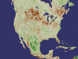 While flooding, storms, and fires can all bring disaster, the long-term wallop delivered by drought can immobilize nations for years, altering geography, food supplies, access to water, and more. This week, researchers at NASA's Goddard Space Flight Center are releasing a new tool for monitoring drought around the world. Using data collected from the National Oceanographic and Atmospheric Agency's POES (Polar Orbiting Environmental Satellite), they have developed a drought index based on plant growth. Used in conjunction with other drought monitoring and forecasting techniques, this newly released method will afford experts a sophisticated tool for predicting where droughts could develop and how long and intensely they might last. One Year Vegetation Average -- NDVI Measures Plant Growth 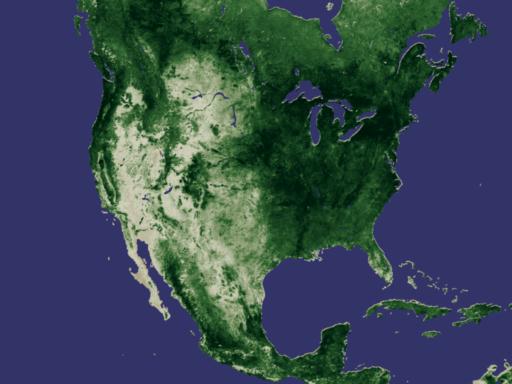
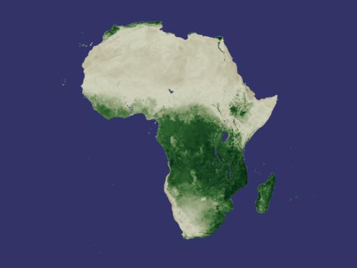
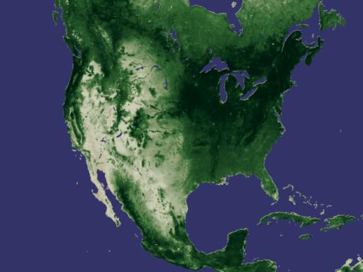
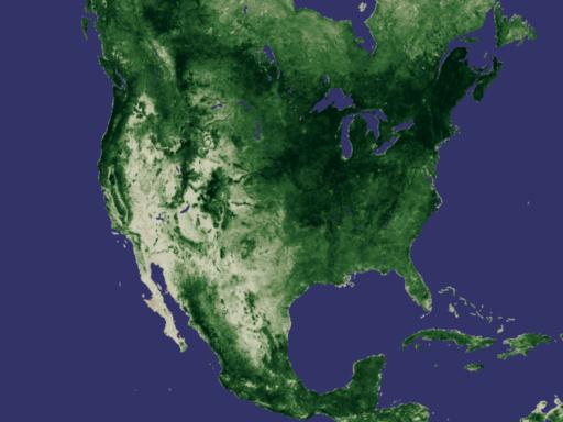
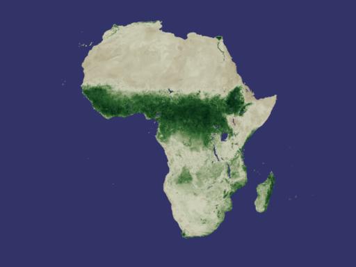
Developed nearly twenty years ago, the Normalized Difference Vegetation Index (NDVI) is a method for measuring how plants absorb or reflect sunlight. In these animations, NDVI data gathered by NOAA's Advanced Very High Resolution Radiometer shows the average annual cycle of vegetation growth and recession across the whole of the United States and Africa. The data is averaged over the years 1981 to 2000. View Movie View Images and Movies The Cycle of Life on Earth 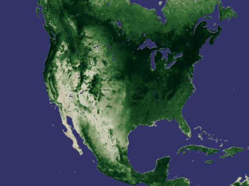
Although life on Earth moves in regular cycles, each year is not precisely identical to the next. In these animations, we see several years of NDVI data moving through seasonal growth and recession. Careful observation of the scintillating colors will show that although there are distinct and strong oscillating signals corresponding to the change of seasons, each year shows unique features as the plants grow and die off. As we'll see in a few moments, some of these unique features, frozen as still images, show distinct signs of drought. View Movie View Images and Movies The Browning of America -- Drought Seen from Space 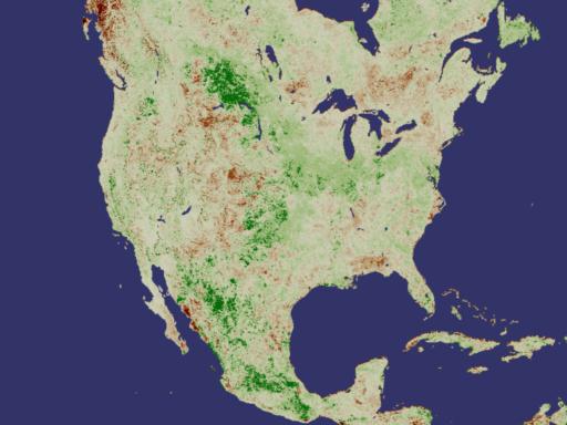
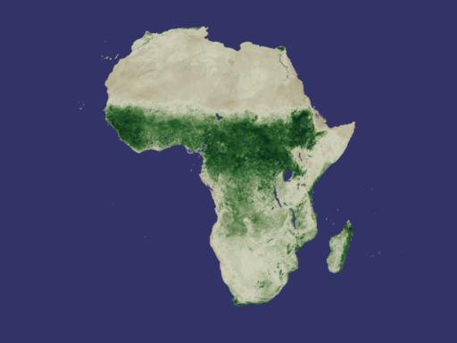
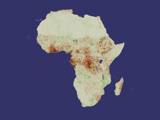
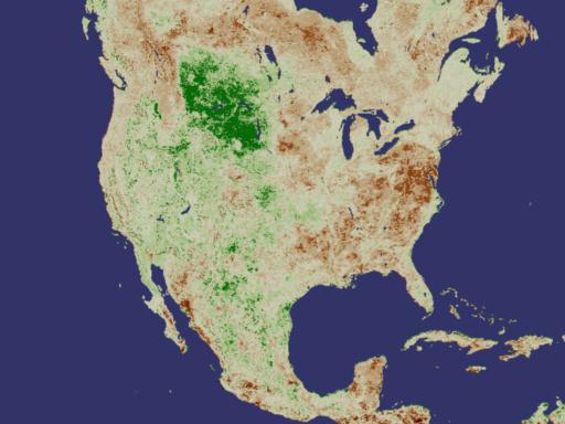
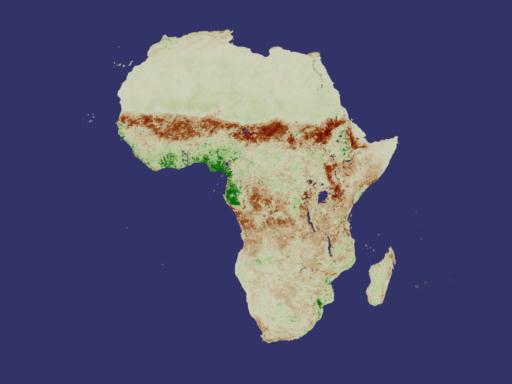
This new drought prediction technique uses a simple bit of visual arithmetic to derive its results. By taking the NDVI average of a particular region of the Earth for the years 1981-2000 and subtracting the NDVI value of that same region during a specific month, we are left with a value that can be placed along a scale that at one end indicates drought. In the following images, we see five specific months of data each displayed in three distinct ways. The first picture in each grouping shows the NDVI average for the 20 year period in the geographical region being studied. The second image shows the NDVI measurement for that same region as measured during a specific month. The final image in each sequence shows the difference between the two NDVI values; it's essentially a visualization of the quantified drought anomaly. In the anomaly images, browns indicate drought conditions as compared to the average, while greens indicate plant growth greater than the average. View Movie View Images and Movies Recent Drought Indications
Historical Drought Indications The following groups of images show historical drought data in North America and Africa.
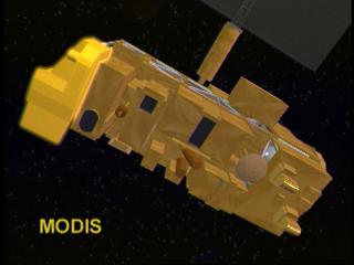
MODIS: Terra's Tool for Studying Vegetation
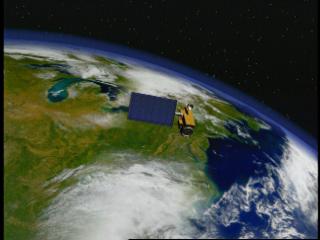
The recent successful activation of NASA's new satellite called Terra offers researchers a new instrument for building on this drought research. Called the Moderate-resolution Imaging Spectroradiometer (MODIS) it will be able to see the specific colors of the world every 1-2 days in 36 spectral bands. That is, as MODIS begins its full scale operational tour, it will be able to gather the most regular and highest resolution images of the world's plant life of any orbiting instrument to date. For further information, check out the following web sites about drought and climate research:
Special Thanks to Dr. Compton Tucker Please give credit for these images to: NASA - Goddard Space Flight Center NOAA Scientific Visualization Studio Television Production NASA-TV/GSFC Content Preparation & Project Production: Michael Starobin Last Revised: February 4, 2019 at 06:02 PM EST |
