VC Earth Interactive
Overview
Items for the digital interactive in the VC Earth science exhibit
Water
- Section

High Resolution Layers from "Monsoons: Wet, Dry, Repeat..."
Go to this sectionThe visualizations here are based on the visualization "Monsoons: Wet, Dry, Repeat".
- Section

High Resolution Layers from "Monsoons: Wet, Dry, Repeat..."
Go to this sectionThe visualizations here are based on the visualization "Monsoons: Wet, Dry, Repeat".
- Section
Components of the Water Cycle on a Flat Map
Go to this sectionWater regulates climate, predominately storing heat during the day and releasing it at night. Water in the ocean and atmosphere carry heat from the tropics to the poles. The process by which water moves around the earth, from the ocean, to the atmosphere, to the land and back to the ocean is called the water cycle. The animations below each portray a component of the water cycle. The three animations of atmospheric phenomena were created using data from the GEOS-5 atmospheric model on the cubed-sphere, run at 14-km global resolution for 25-days. Variables animated here include hourly evaporation, water vapor and precipitation. For more information on GEOS-5 see http://gmao.gsfc.nasa.gov/systems/geos5 . For more information on the cubed-sphere work see http://science.gsfc.nasa.gov/610.3/cubedsphere.html.The animation of global sea surface temperature was created using data from a model run of ECCO's Ocean General Circulation Model. See http://www.ecco-group.org/model.htm for more information on ECCO.This group of animations are an orthographic view of the data used in Components of the Water Cycle.
- ID: 4108 Visualization
Rivers
Go to this pageThese images highlight the global river systems that carry the flow of water from the continents back into the oceans. || Global rivers with transparency || rivers.0500.jpg (2048x1024) [436.2 KB] || rivers.0500_web.png (320x160) [24.7 KB] || rivers.0500.tif (2048x1024) [753.1 KB] ||
- ID: 4417 Visualization
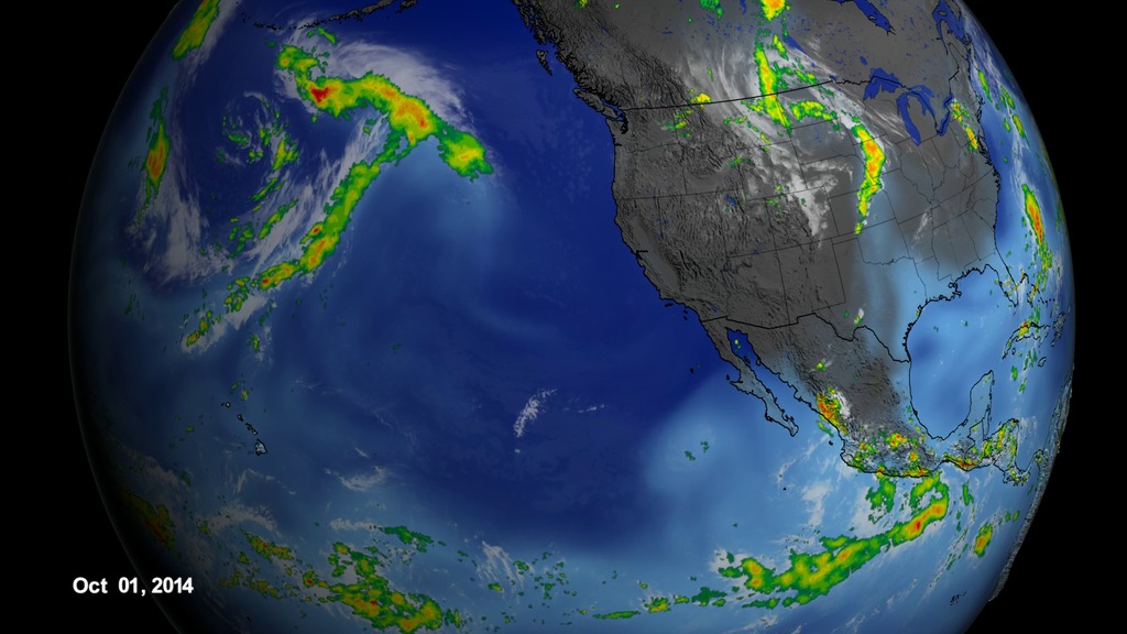
2014 - 2015 Atmospheric River
Go to this pageThe close-up view of the atmopheric river in Oct. 2014 - Mar. 2015. || atmosphericRiver_Oct2014_Mar2015_zoomIn_whole_1080p30_print.jpg (1024x576) [134.6 KB] || atmosphericRiver_Oct2014_Mar2015_zoomIn_whole_1080p30_searchweb.png (320x180) [83.4 KB] || atmosphericRiver_Oct2014_Mar2015_zoomIn_whole_1080p30_web.png (320x180) [83.4 KB] || atmosphericRiver_Oct2014_Mar2015_zoomIn_whole_1080p30_thm.png (80x40) [6.1 KB] || atmosphericRiver_Oct2014_Mar2015_zoomIn_whole_1080p30.mp4 (1920x1080) [601.3 MB] || frames/1920x1080_16x9_30p/zoomIn/ (1920x1080) [512.0 KB] || atmosphericRiver_Oct2014_Mar2015_zoomIn_whole_1080p30.webm (1920x1080) [22.7 MB] ||
- Section
CCMP Winds from June through October 2011
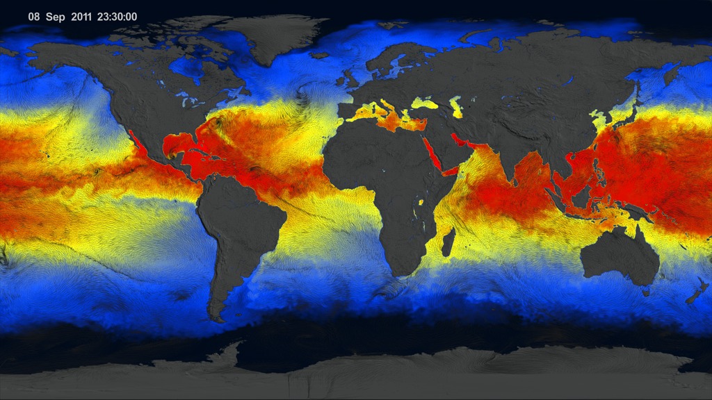
Go to this sectionThese visualizations show the directional flow and magnitude of surface wind vector data (calibrated to a 10 meter reference height) from June 2011 through October 2011. The first two of these visualizations include an underlay of sea surface temperature (SST) data rendered to show two unique perspectives: 1) a regional perspective of the North Atlantic region to highlight tropical cyclone activity and 2) the global perspective. A third visualization shows the surface wind vector flow lines colored to show the clear distinctions in wind speed. A color bar is provided below for interpretation. As large storms such as hurricanes move over warm waters, notice how the SST cools. Warm surface water powers these storms, and as the storms absorb this energy they tend to leave cooler water trails in their wake. A great example is Hurricane Irene, which became a hurricane as it crossed the island of Puerto Rico and skirted the eastern and northern coastlines of Hispaniola on August 22, 2011. As Hurricane Irene enters the open Atlantic Ocean, the storm intensifies and an SST cooling effect is clearly visible in the wake of the storm track. This cooling effect takes place due to latent and sensible heat fluxes as well as well as wind-induced upwelling. The wind-induced upwelling is most pronounced to the right of the storm track. The wind data is from the Cross-Calibrated Multi-Platform project. The SST data is from the Multi-scale Ultra-high Resolution (MUR) Sea Surface Temperature (SST) Analysis. Both CCMP and MUR data were funded by the NASA
MEaSUREs program.
Air
- ID: 30017 Hyperwall Visual
GEOS-5 Nature Run Collection
Go to this pageThrough numerical experiments that simulate the dynamical and physical processes governing weather and climate variability of Earth's atmosphere, models create a dynamic portrait of our planet. This 10-kilometer global mesoscale simulation (Nature Run) using the NASA Goddard Earth Observing System Model (GEOS-5) explores the evolution of surface temperatures as the sun heats the Earth and fuels cloud formation in the tropics and along baroclinic zones; the presence of water vapor and precipitation within these global weather patterns; the dispersion of global aerosols from dust, biomass burning, fossil fuel emissions, and volcanoes; and the winds that transport these aerosols from the surface to upper-levels.The full GEOS-5 simulation covered 2 years—from May 2005 to May 2007. It ran on 3,750 processors of the Discover supercomputer at the NASA Center for Climate Simulation, consuming 3 million processor hours and producing over 400 terabytes of data. GEOS-5 development is funded by NASA's Modeling, Analysis, and Prediction Program. ||
- ID: 30754 Hyperwall Visual
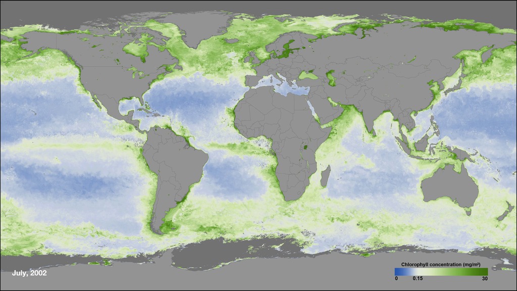
Ocean Color Time Series
Go to this pageOcean Color, July 2002 - March 2017 || ocean_color_mollweide_1080p.00001_print.jpg (1024x576) [147.0 KB] || ocean_color_mollweide_1080p.mp4 (1920x1080) [52.3 MB] || ocean_color_mollweide_720p.mp4 (1280x720) [26.0 MB] || ocean_color_mollweide_1080p.webm (1920x1080) [4.1 MB] || ocean_color_mollweide_2304p.mp4 (4096x2304) [172.6 MB] || frames/4104x2304_16x9_30p/mollweide/ (4104x2304) [64.0 KB] ||
- Section
Components of the Water Cycle
Go to this sectionWater regulates climate, storing heat during the day and releasing it at night. Water in the ocean and atmosphere carry heat from the tropics to the poles. The process by which water moves around the earth, from the ocean, to the atmosphere, to the land and back to the ocean is called the water cycle. The animations below each portray a component of the water cycle. All use an identical view and camera motion to allow for easy compositing.Data for the animation of global sea surface temperature was derived from a model run of ECCO's Ocean General Circulation Model. See http://www.ecco-group.org/model.htm for more information on ECCO.Data for the animation of atmospheric phenomena was created using data from the GEOS-5 atmospheric model on the cubed-sphere, run at 14-km global resolution for 25-days. Variables animated here include evaporation, water vapor and precipitation.For more information on the GEOS-5 see http://gmao.gsfc.nasa.gov/systems/geos5.For more information on the cubed-sphere work see http://science.gsfc.nasa.gov/610.3/cubedsphere.html.All three of these animations are time synchronous throughout the animation to allow cross fades during compositing.The final animation shown here, a pulsing network of rivers over the continents, represents the flow of water from land back into the ocean, thereby completing the water cycle.A flat version of these animations can be found in item #3811.
- Section
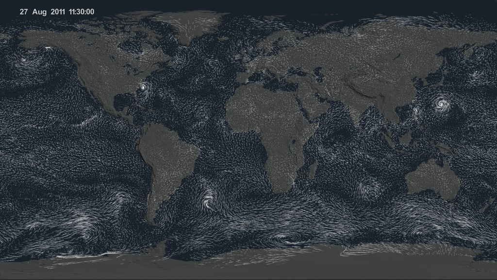
CCMP Winds from June through October 2011
Go to this sectionThese visualizations show the directional flow and magnitude of surface wind vector data (calibrated to a 10 meter reference height) from June 2011 through October 2011. The first two of these visualizations include an underlay of sea surface temperature (SST) data rendered to show two unique perspectives: 1) a regional perspective of the North Atlantic region to highlight tropical cyclone activity and 2) the global perspective. A third visualization shows the surface wind vector flow lines colored to show the clear distinctions in wind speed. A color bar is provided below for interpretation. As large storms such as hurricanes move over warm waters, notice how the SST cools. Warm surface water powers these storms, and as the storms absorb this energy they tend to leave cooler water trails in their wake. A great example is Hurricane Irene, which became a hurricane as it crossed the island of Puerto Rico and skirted the eastern and northern coastlines of Hispaniola on August 22, 2011. As Hurricane Irene enters the open Atlantic Ocean, the storm intensifies and an SST cooling effect is clearly visible in the wake of the storm track. This cooling effect takes place due to latent and sensible heat fluxes as well as well as wind-induced upwelling. The wind-induced upwelling is most pronounced to the right of the storm track. The wind data is from the Cross-Calibrated Multi-Platform project. The SST data is from the Multi-scale Ultra-high Resolution (MUR) Sea Surface Temperature (SST) Analysis. Both CCMP and MUR data were funded by the NASA
MEaSUREs program. - Section
High Resolution Layers from "Monsoons: Wet, Dry, Repeat..."
Go to this sectionThe visualizations here are based on the visualization "Monsoons: Wet, Dry, Repeat".
- ID: 11719 Produced Video
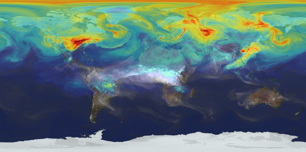
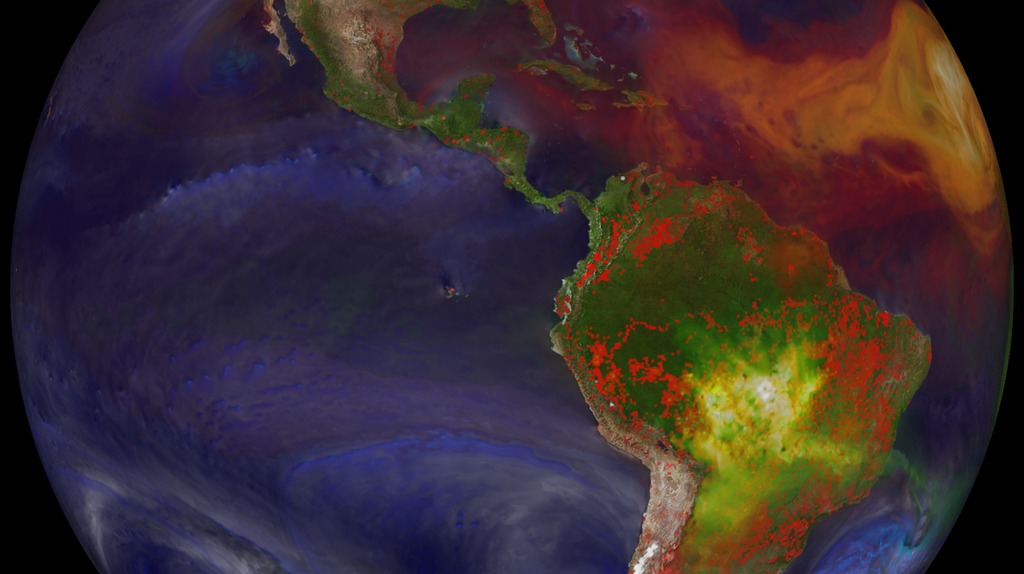
A Year In The Life Of Earth’s CO2
Go to this pageAn ultra-high-resolution NASA computer model has given scientists a stunning new look at how carbon dioxide in the atmosphere travels around the globe.Plumes of carbon dioxide in the simulation swirl and shift as winds disperse the greenhouse gas away from its sources. The simulation also illustrates differences in carbon dioxide levels in the northern and southern hemispheres and distinct swings in global carbon dioxide concentrations as the growth cycle of plants and trees changes with the seasons.The carbon dioxide visualization was produced by a computer model called GEOS-5, created by scientists at NASA Goddard Space Flight Center’s Global Modeling and Assimilation Office.The visualization is a product of a simulation called a “Nature Run.” The Nature Run ingests real data on atmospheric conditions and the emission of greenhouse gases and both natural and man-made particulates. The model is then left to run on its own and simulate the natural behavior of the Earth’s atmosphere. This Nature Run simulates January 2006 through December 2006.While Goddard scientists worked with a “beta” version of the Nature Run internally for several years, they released this updated, improved version to the scientific community for the first time in the fall of 2014. ||
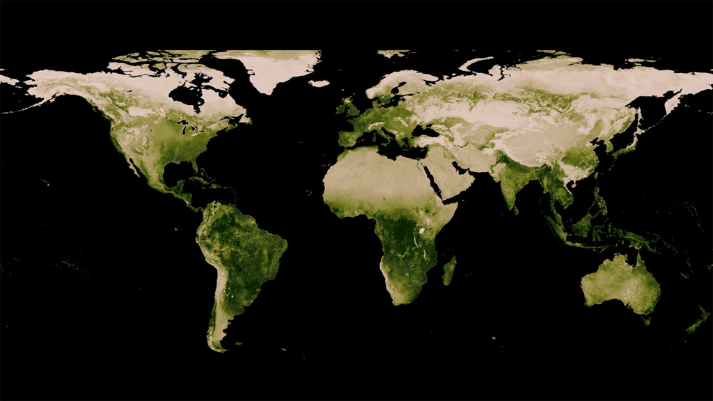
Life
- Section
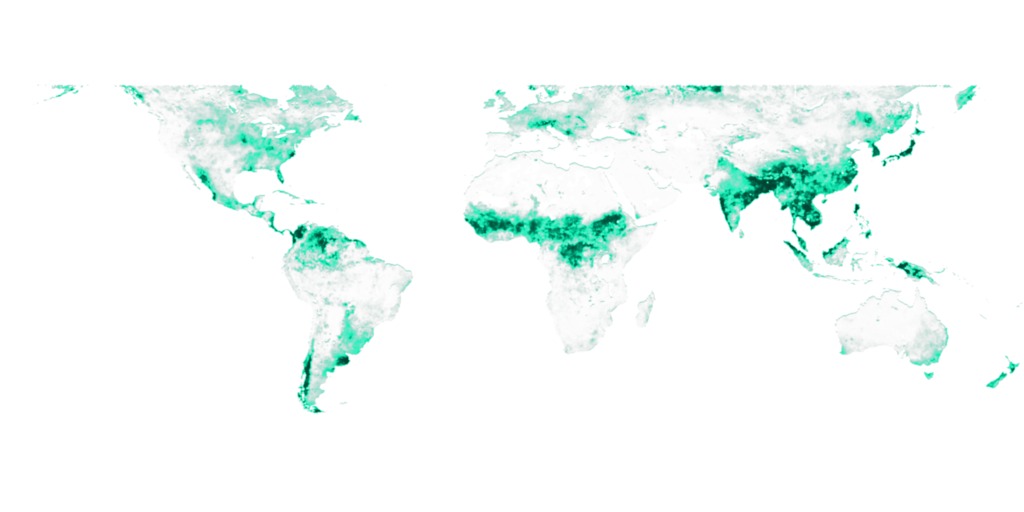
- ID: 3764 Visualization
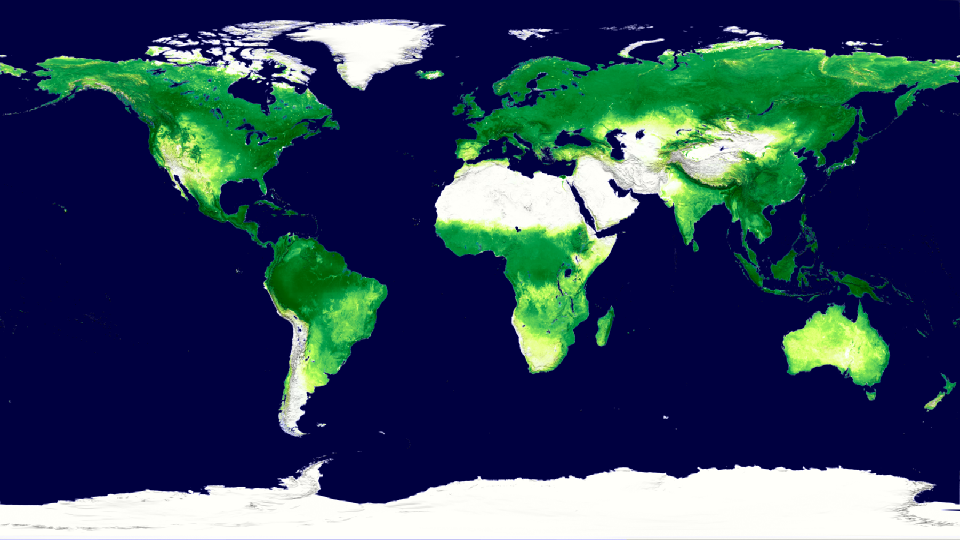
How Much Carbon do Plants Take from the Atmosphere?
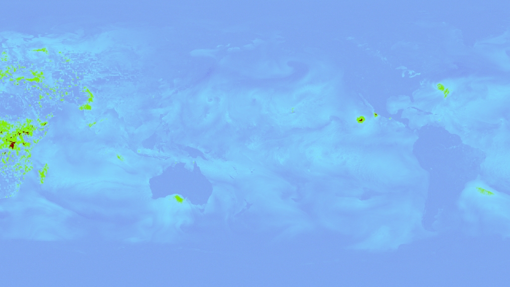
Go to this pagePlant life converts atmospheric carbon dioxide into biomass through photosynthesis, a process called 'fixing'. This is one of the main ways in which carbon dioxide is removed from the atmosphere and is a major part of the carbon cycle. The amount of carbon removed is called the gross primary productivity (GPP), and the change in GPP due to rising global temperatures is very important factor in the response of the Earth to climate change.Data from the MODIS instrument on NASA's Terra satellite has been recently used to calculate the GPP for the whole world for the last 10 years. This animation shows a time sequence of GPP on land as measured by MODIS during the years 2000 through 2009. Two things to note are the year-long productivity of the tropical regions and the large seasonal productivity in the northern hemisphere. A close look at the animation also reveals major urban areas for which the productivity is negligible.For a look at why the decade from 2000 through 2009 meant lower productivity, see the page 'How has the Atmospheric Carbon Uptake from Plants Changed in the Last Decade?' ||
- ID: 30754 Hyperwall Visual
Ocean Color Time Series
Go to this pageOcean Color, July 2002 - March 2017 || ocean_color_mollweide_1080p.00001_print.jpg (1024x576) [147.0 KB] || ocean_color_mollweide_1080p.mp4 (1920x1080) [52.3 MB] || ocean_color_mollweide_720p.mp4 (1280x720) [26.0 MB] || ocean_color_mollweide_1080p.webm (1920x1080) [4.1 MB] || ocean_color_mollweide_2304p.mp4 (4096x2304) [172.6 MB] || frames/4104x2304_16x9_30p/mollweide/ (4104x2304) [64.0 KB] ||
- ID: 3912 Visualization
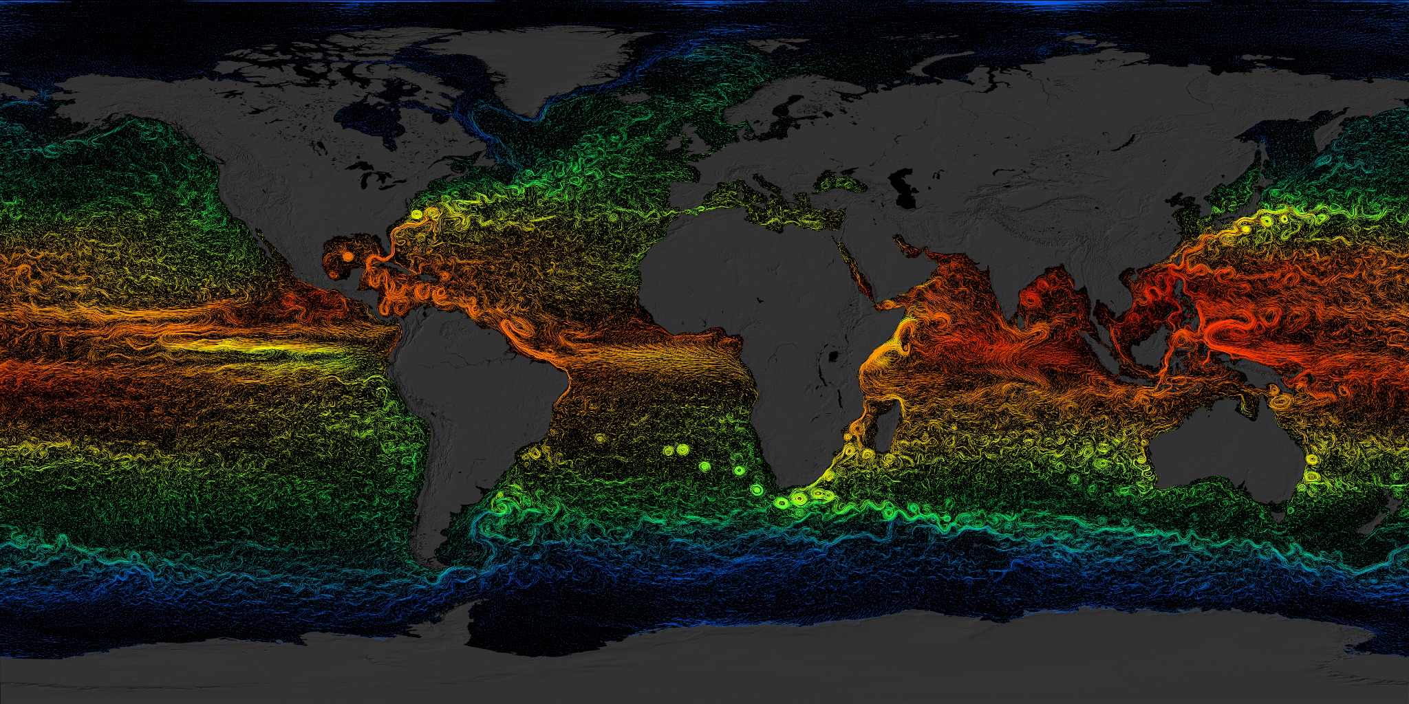
Global Sea Surface Currents and Temperature
Go to this pageThis visualization shows sea surface current flows. The flows are colored by corresponding sea surface temperature data. This visualization is rendered for display on very high resolution devices like hyperwalls or for print media.This visualization was produced using model output from the joint MIT/JPL project entitled Estimating the Circulation and Climate of the Ocean, Phase II (ECCO2). ECCO2 uses the MIT general circulation model (MITgcm) to synthesize satellite and in-situ data of the global ocean and sea-ice at resolutions that begin to resolve ocean eddies and other narrow current systems, which transport heat and carbon in the oceans. The ECCO2 model simulates ocean flows at all depths, but only surface flows are used in this visualization. ||
- Section
High Resolution Layers from "Monsoons: Wet, Dry, Repeat..."
Go to this sectionThe visualizations here are based on the visualization "Monsoons: Wet, Dry, Repeat".
- ID: 11719 Produced Video
A Year In The Life Of Earth’s CO2
Go to this pageAn ultra-high-resolution NASA computer model has given scientists a stunning new look at how carbon dioxide in the atmosphere travels around the globe.Plumes of carbon dioxide in the simulation swirl and shift as winds disperse the greenhouse gas away from its sources. The simulation also illustrates differences in carbon dioxide levels in the northern and southern hemispheres and distinct swings in global carbon dioxide concentrations as the growth cycle of plants and trees changes with the seasons.The carbon dioxide visualization was produced by a computer model called GEOS-5, created by scientists at NASA Goddard Space Flight Center’s Global Modeling and Assimilation Office.The visualization is a product of a simulation called a “Nature Run.” The Nature Run ingests real data on atmospheric conditions and the emission of greenhouse gases and both natural and man-made particulates. The model is then left to run on its own and simulate the natural behavior of the Earth’s atmosphere. This Nature Run simulates January 2006 through December 2006.While Goddard scientists worked with a “beta” version of the Nature Run internally for several years, they released this updated, improved version to the scientific community for the first time in the fall of 2014. ||