Visualizations Presented at SIGGRAPH 2015
Overview
The SIGGRAPH conference is widely recognized as the most prestigious forum for the publication of computer graphics research. The conference provides an interdisciplinary educational experience highlighting outstanding achievements in time-based art, scientific visualization, visual effects, real-time graphics, and narrative shorts. Below are contributions to the conference made by members of NASA Goddard's Scientific Visualization Studio.
Computer Animation Festival
The SIGGRAPH Computer Animation Festival is the leading annual festival for innovative digital film and video creators. An internationally recognized jury receives hundreds of submissions and presents the best work of the year in the two programs of the Computer Animation Festival: Daytime Selects and the Electronic Theater.
- ID: 4253 Visualization
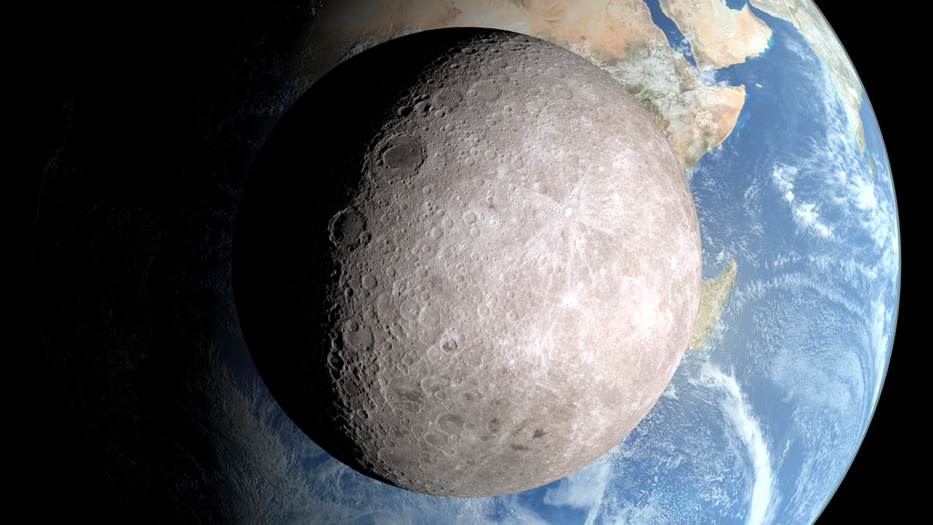
Moon Phase and Libration, from the Other Side
Go to this pageThis narrated video introduces two views of the Moon's far side. Transcript.This video is also available on our YouTube channel. || opposite.0820_print.jpg (1024x576) [158.8 KB] || opposite.0820_thm.png (80x40) [5.8 KB] || G2015-013_ViewfromOtherSide_MASTER_youtube_hq.mov (1280x720) [75.4 MB] || G2015-013_ViewfromOtherSide_MASTER_1280x720.wmv (1280x720) [50.7 MB] || G2015-013_ViewfromOtherSide_MASTER_appletv.m4v (960x540) [43.3 MB] || G2015-013_ViewfromOtherSide_MASTER_appletv.webm (960x540) [13.8 MB] || G2015-013_ViewfromOtherSide_MASTER_appletv_subtitles.m4v (960x540) [43.2 MB] || G2015-013_ViewfromOtherSide_MASTER_nasaportal.mov (640x360) [34.9 MB] || G2015-013_ViewfromOtherSide_MASTER_ipod_lg.m4v (640x360) [19.0 MB] || G2015-013_ViewfromOtherSide.en_US.srt [2.0 KB] || G2015-013_ViewfromOtherSide.en_US.vtt [2.0 KB] || G2015-013_ViewfromOtherSide_MASTER_prores.mov (1280x720) [1.5 GB] || G2015-013_ViewfromOtherSide_MASTER_ipod_sm.mp4 (320x240) [9.0 MB] ||
Dailies
Dailies let you experience the production culture behind a finished visual. Here artists and visualizers tell the story behind the imagery they created through a series of very short presentations.
- Section
Dust in the Wind - A Data-Driven Dust Visualization
Go to this sectionWhat connects the world's largest desert to the world's largest rainforest? Dust. And lots of it. Each year, dust from the Saharan Desert in Africa is swept up into the atmosphere, where it travels across the Atlantic Ocean towards the Amazon Rainforest in South America. On average, a staggering 27 million tons of African dust is deposited into the Amazon Basin each year. So much dust is deposited in the Amazon that scientists credit the phosphates found in the dust with fertilizing the Amazon Rainforest and keeping it as lush as it is. I was tasked with creating this data-driven visualization to tell the story of African Dust. The textures you see on these walls were created using data from NASA's CALIPSO satellite, which measures aerosols in the atmosphere. These walls are compared with the satellite imagery taken from the same time period. The hazy brown sections of the images are areas where dust is present in the atmosphere. Viewing the CALIPSO data walls sequentially allows us to follow the dust as it travels across the ocean and makes it's way toward South America. This next section describes dust flux or how much dust moves through a region over a period of time. The amount of dust in the atmosphere varies with season, and has a lot to do with how much rain Africa gets. This was a particularly tricky dataset to visualize. I elected to use a particle system that emits particles at a rate and velocity relative to the measured flux for a region, and we can see how those particle shapes evolve over the seasons. The piece was well received by the media, with versions of the visualization running on Time, Discovery, the Washington Post, and weather.com.
- Section
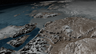
How did we tile Greenland?
Go to this sectionAt NASA's Scientific Visualization Studio we work with many Earth science datasets that must be accurately positioned on a globe. For example, we obtained 30-meter topography data for Greenland along with an ocean and an ice sheet mask from the Greenland Ice Mapping Project at Ohio State. Each of these datasets consists of a 6 x 6 array of 124 megapixel tiles. We also received seven sets of 20-meter Radarsat data from the Canadian Space Agency, mosaicked at the University of Washington's Applied Physics Lab. Each set consist of a 5 x 5 array of 421 megapixel tiles. We developed an IDL routine that extracts the coordinate and projection information from geo-tif images and writes out RSL include files that pass the parameters to a projection routine. The projection routine is a C++ Renderman plugin that computes the projection calculations in double precision and accurately positions the related texture tile. Parameters to the projection plugin are passed in string format in order to provide double precision accuracy. We employed this method with the high-resolution Greenland data, accurately mapping 87 gigapixels of data.
- Section
Searching for the Garbage Patches
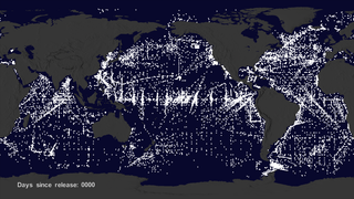
Go to this sectionWe wanted to see if we could visualize the so-called ocean garbage patches. We start with data from floating, scientific buoys that NOAA has been distributing in the oceans for the last 35-years represented here as white dots. Let's speed up time to see where the buoys go... Since new buoys are continually released, it's hard to tell where older buoys move to. Let's clear the map and add the starting locations of all the buoys. Interesting patterns appear all over the place. Lines of buoys are due to ships and planes that released buoys periodically. If we let all of the buoys go at the same time, we can observe buoy migration patterns. The number of buoys decreases because some buoys don't last as long as others. The buoys migrate to 5 known gyres also called ocean garbage patches. We can also see this in a computational model of ocean currents called ECCO-2.We release particles evenly around the world and let the modeled currents carry the particles. The particles from the model also migrate to the garbage patches. Even though the retimed buoys and modeled particles did not react to currents at the same times, the fact that the data tend to accumulate in the same regions show how robust the result is.
- Section
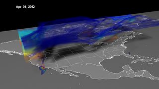
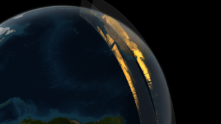
Visualization of a Stratospheric Ozone Intrusion
Go to this sectionOzone in the upper part of the atmosphere, the stratosphere, is a good thing; it absorbs ultraviolet radiation from the sun, which can cause skin cancer. But in the lower part of the atmosphere, the troposphere, ozone is a pollutant that can create respiratory problems. So monitoring tropospheric ozone is important for mitigating its effects. But sometimes, natural ozone from the stratosphere can make its way to the troposphere, confusing monitoring efforts. One of these events is what I'm visualizing here. In April 2012, an area of fast-moving low pressure caused ozone-rich stratospheric air to descend, folding into tropospheric air near the ground. Winds pushed it in all directions, bringing stratospheric ozone to the ground in the Southwest. You can see this as a curtain of swirling air reaching to the ground in this visualization. The air is color-coded by altitude blue at 10 km, and red at sea level. Atmospheric scientists at NASA's Goddard Space Flight Center in Greenbelt, Md., set out to see if the GEOS-5 Chemistry-Climate Model could replicate the intrusion at 25-kilometer resolution. Indeed, the model could replicate small-scale features, including finger-like filaments, within the apron of air that descended over Colorado. To communicate the implications of this result most effectively to non-scientists, we created a volumetric visualization that replaced numerical data with animation. By making visible events that would otherwise have remain invisible to those without expertise and training, the animation allows policymakers and the public to immediately comprehend the nature of the problem, and hopefully make more informed decisions in addressing it.
Dailies Talk
Talks present ideas that are still in progress, or showcase how computer graphics and interactive techniques are actually implemented and used.
- ID: 4335 Visualization
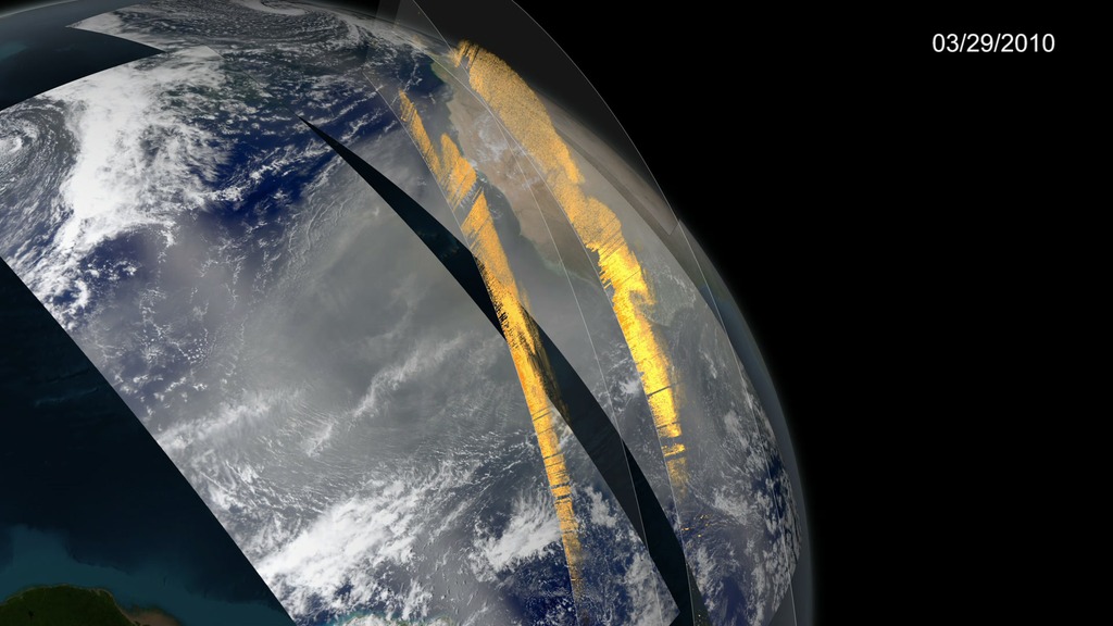
SIGGRAPH 2015: Dailies Talk
Go to this pageCALIPSO observes Saharan dust crossing the Atlantic OceanVisualizer and presenter: Kel ElkinsSummary:For the first time, a NASA satellite has quantified in three dimensions how much dust makes the trans-Atlantic journey from the Sahara Desert the Amazon rainforest. Among this dust is phosphorus, an essential nutrient that acts like a fertilizer, which the Amazon depends on in order to flourish.In this talk, Kel Elkins describes how NASA’s Scientific Visualization Studio (SVS) creates animated visualizations using data from NASA missions. Kel describes step-by-step how data from NASA’s CALIPSO satellite was used to create a visualization depicting dust from Africa traveling through the atmosphere towards South America. For PowerPoint slide presentation, click the 'Download' button above.For more details and to download other media formats, click here. || 4273_African_Dust_Still_print.jpg (1024x576) [125.8 KB] || 4273_African_Dust_Still_searchweb.png (320x180) [71.2 KB] || Dust_Entire_1080p_60fps.3072_thm.png (80x40) [5.4 KB] || 4273_African_Dust_1280x720.webm (1280x720) [10.9 MB] || ScientificVisualization_SIGGRAPHdailies2015_KelElkins_ForWeb.pptx [191.7 MB] ||
VR Village
Explore the fascinating potential of new formats for telling stories, engaging audiences, and powering real–world applications in health, education, design, and gaming. These visualizations were created for the planetarium dome show film called Dynamic Earth.
- Section
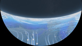
Wind and Ocean Circulation shot for Dynamic Earth Dome Show
Go to this sectionWind and Ocean Circulation camera slowly pushes in towards the Earth revealing global wind patterns. The wind patterns are from the MERRA computational model of the atomsphere. As the camera continues to push in, the winds fade away, revealing ocean currents which are driven, in part, by the winds. The ocean currents are from the ECCO-2 computational model of the oceans and ice. Only the higher speed ocean currents are shown. The camera moves around the Western Atlantic highlighting the Gulf stream from above and below. The camera finally emerges from beneath sea level and moves over to the Gulf of Mexico to examine the Loop Current.
- Section
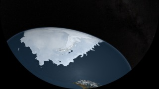
Arctic and Antarctic Sea Ice for the Dynamic Earth Dome Show
Go to this sectionThis animation shows the actual advance and retreat of the Arctic and the Antarctic sea ice as seen in satellite data. The day-to-day changes portrayed in the sea ice are derived from a running 3-day average sea ice concentration data in the region where the sea ice concentration is greater than 15%. The blueish white color of the sea ice is derived from a 3-day running miniimum of the AMSR-E 89 GHz brightness temperature data. The animation ends by flying over the Antarctic Peninsula.