Carbon and Climate
Overview
As carbon dioxide levels in Earth's atmosphere have increased in recent decades, the planet's land and ocean have continued to absorb about half of manmade emissions. NASA’s Earth science program works to improve our understanding of how carbon absorption and emission processes work in nature. It also seeks to track how these processes might change in a warming world with increasing levels of carbon dioxide and methane emissions from human activities.
The volume of carbon dioxide pumped into the atmosphere by human activities is the dominant force driving ongoing and future climate change. While NASA isn’t involved in policies around emissions levels, the agency’s scientists are targeting what can be called the "other half" of this carbon and climate equation – what will happen with the 50 percent of carbon dioxide emissions that are currently absorbed by the ocean, forests and other land ecosystems?
The twenty-first Conference of Parties (COP-21) to the United Nations Framework Convention on Climate Change will take place in Paris, France, November 30 to December 11, 2015. Each year, the COP meets for two weeks to discuss the state of Earth’s climate and how best to deal with future climate change. Hosted by the U.S. Department of State, the U.S. Center at COP-21 is a major public outreach initiative to inform attendees about key climate initiatives and scientific research taking place in the U.S. As has been the standard for several years, NASA scientists will be present to show examples of our ongoing research.
Land
- ID: 4399 Visualization
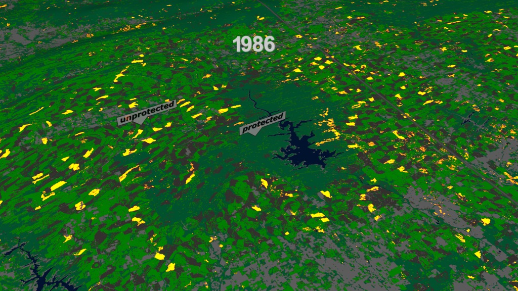
A Quarter Century US Forest Disturbance History from Landsat – the NAFD-NEX Products
Go to this pageVisualization showing forest change in various locations from 1986 to 2010This video is also available on our YouTube channel. || annual_forest43.04000_print.jpg (1024x576) [253.2 KB] || annual_forest43.04000_searchweb.png (180x320) [129.5 KB] || annual_forest43.04000_thm.png (80x40) [7.7 KB] || 1920x1080_16x9_60p (1920x1080) [0 Item(s)] || annual_forest43_1920x1080p60.webm (1920x1080) [23.2 MB] || annual_forest43_1920x1080p60.mp4 (1920x1080) [228.8 MB] || 9600x3240_16x9_30p (9600x3240) [0 Item(s)] || 3840x2160_16x9_60p (3840x2160) [0 Item(s)] || annual_forest43_4399.key [233.2 MB] || annual_forest43_4399.pptx [230.6 MB] || annual_forest43_4k_2160p60.mp4 (3840x2160) [825.7 MB] || 4399_annual_forest43_4k_cbar_MP4.mov (3840x2160) [14.4 GB] || annual.hwshow [55 bytes] ||
- ID: 3947 Visualization
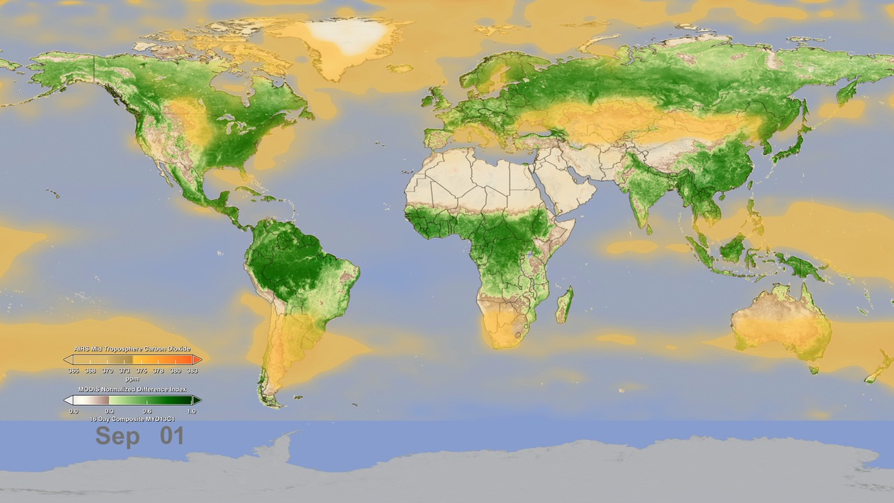
Watching the Earth Breathe:
An Animation of Seasonal Vegetation and its effect on Earth's Global Atmospheric Carbon DioxideGo to this pageIn this animation, NASA instruments show the seasonal cycle of vegetation and the concentration of carbon dioxide in the atmosphere. The animation begins on January 1, when the northern hemisphere is in winter and the southern hemisphere is in summer. At this time of year, the bulk of living vegetation, shown in green, hovers around the equator and below it, in the southern hemisphere.As the animation plays forward through mid-April, the concentration of carbon dioxide, shown in orange-yellow, in the middle part of Earth's lowest atmospheric layer, the troposphere, increases and spreads throughout the northern hemisphere, reaching a maximum around May. This blooming effect of carbon dioxide follows the seasonal changes that occur in northern latitude ecosystems, in which deciduous trees lose their leaves, resulting in a net release of carbon dioxide through a process called respiration. Carbon dioxide is also released in early spring as soils begin to warm. Almost 10 percent of atmospheric carbon dioxide passes through soils each year.After April, the northern hemisphere moves into late spring and summer and plants begin to grow, reaching a peak in the late summer. The process of plant photosynthesis removes carbon dioxide from the air. The animation shows how carbon dioxide is scrubbed out of the atmosphere by the large volume of new and growing vegetation. Following the peak in vegetation, the drawdown of atmospheric carbon dioxide due to photosynthesis becomes apparent, particularly over the boreal forests.Note that there is roughly a three-month lag between the state of vegetation at Earth's surface and its effect on carbon dioxide in the middle troposphere.Data like these give scientists a new opportunity to better understand the relationships between carbon dioxide in Earth's middle troposphere and the seasonal cycle of vegetation near the surface.Creating the AnimationThis animation was created with data taken from two NASA spaceborne instruments. The concentration of carbon dioxide data from the Atmospheric Infrared Sounder (AIRS), a weather and climate instrument that flies aboard NASA's Aqua spacecraft, is overlain on measurements of vegetation index from the Moderate Resolution Imaging Spectroradiometer (MODIS) instrument, also on NASA's Aqua spacecraft, to better understand how photosynthesis and respiration influences the atmospheric carbon dioxide cycle over the globe. The animation runs from January through December and repeats. The AIRS tropospheric carbon dioxide seasonal cycle values were made by averaging AIRS data collected between 2003 and 2010, from which the annual carbon dioxide growth trend of 2 parts per million per year has been removed. For example, the data used for January 1 is actually an average of eight years of AIRS carbon dioxide data taken each year on January 1. The vegetation values were made using data averaged over a four-year period, from 2003 to 2006.Further DetailAIRS uses infrared technology to determine the concentration of atmospheric water vapor and several important trace gases as well as information about temperature and clouds. AIRS orbits Earth from pole-to-pole at an altitude of 438 miles (705 kilometers), measuring Earth's infrared spectrum in 3,278 channels spanning a wavelength range from 3.74 microns to 15.4 microns. Originally designed to improve weather forecasts, AIRS has improved operational five-day weather forecasts more than any other single instrument over the past decade. AIRS has also been found to be sensitive to atmospheric carbon dioxide in the middle troposphere, at an altitude of 5 to 10 kilometers or 3 to 6 miles. AIRS is managed by NASA's Jet Propulsion Laboratory, Pasadena, Calif., under contract to NASA. JPL is a division of the California Institute of Technology in Pasadena. For further information, access the AIRS projectThe MODIS instrument is managed by NASA's Goddard Space Flight Center, Greenbelt, Md. For further information, access the MODIS project. ||
- ID: 3868 Visualization
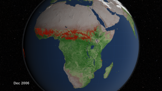
Global Fire Observations and MODIS NDVI
Go to this pageThis visualization leads viewers on a narrated global tour of fire detections beginning in July 2002 and ending July 2011. The visualization also includes vegetation and snow cover data to show how fires respond to seasonal changes. The tour begins in Australia in 2002 by showing a network of massive grassland fires spreading across interior Australia as well as the greener Eucalyptus forests in the northern and eastern part of the continent. The tour then shifts to Asia where large numbers of agricultural fires are visible first in China in June 2004, then across a huge swath of Europe and western Russia in August, and then across India and Southeast Asia through the early part of 2005. It moves next to Africa, the continent that has more abundant burning than any other. MODIS observations have shown that some 70 percent of the world's fires occur in Africa alone. In what's a fairly average burning season, the visualization shows a huge outbreak of savanna fires during the dry season in Central Africa in July, August, and September of 2006, driven mainly by agricultural activities but also by the fact that the region experiences more lightning than anywhere else in the world. The tour shifts next to South America where a steady flickering of fire is visible across much of the Amazon rainforest with peaks of activity in September and November of 2009. Almost all of the fires in the Amazon are the direct result of human activity, including slash-and-burn agriculture, because the high moisture levels in the region prevent inhibit natural fires from occurring. It concludes in North America, a region where fires are comparatively rare. North American fires make up just 2 percent of the world's burned area each year. The fires that receive the most attention in the United States, the uncontrolled forest fires in the West, are less visible than the wave of agricultural fires prominent in the Southeast and along the Mississippi River Valley, but some of the large wildfires that struck Texas earlier this spring are visible. More information on the Fire Information for Resource Management System (FIRMS) is available at http://maps.geog.umd.edu/firms/. ||
- ID: 11393 Produced Video

Global Forest Cover, Loss, and Gain 2000-2012
Go to this pageTwelve years of global deforestation, wildfires, windstorms, insect infestations, and more are captured in a new set of forest disturbance maps created from billions of pixels acquired by the imager on the NASA-USGS Landsat 7 satellite. The maps are the first to measure forest loss and gain using a consistent method around the globe at high spatial resolution, allowing scientists to compare forest changes in different countries and to monitor annual deforestation. Since each pixel in a Landsat image represents a piece of land about the size of a baseball diamond, researchers can see enough detail to tell local, regional and global stories. Hansen and colleagues analyzed 143 billion pixels in 654,000 Landsat images to compile maps of forest loss and gain between 2000 and 2012. During that period, 888,000 square miles (2.3 million square kilometers) of forest was lost, and 308,900 square miles (0.8 million square kilometers) regrew. The researchers, including scientists from the University of Maryland, Google, the State University of New York, Woods Hole Research Center, the U.S. Geological Survey and South Dakota State University, published their work in the Nov. 15, 2013, issue of the journal Science.Key to the project was collaboration with team members from Google Earth Engine, who reproduced in the Google Cloud the models developed at the University of Maryland for processing and characterizing the Landsat data; Google Earth Engine contains a complete copy of the Landsat record. The computing required to generate these maps would have taken 15 years on a single desktop computer, but with cloud computing was performed in a few days. Since 1972, the Landsat program has played a critical role in monitoring, understanding and managing the resources needed to sustain human life such as food, water and forests. Landsat 8 launched Feb. 11, 2013, and is jointly managed by NASA and USGS to continue the 40-plus years of Earth observations. To view the forest cover maps in Google Earth Engine, visit: http://earthenginepartners.appspot.com/google.com/science-2013-global-forest ||
- ID: 11061 Produced Video
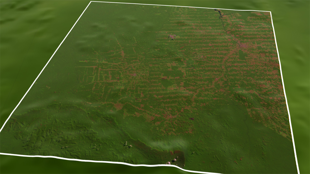
Fishbone Forest
Go to this pageIn the rain forest of Rondonia in western Brazil, deforestation has cut a unique fishbone pattern into the landscape that is visible from space. Beginning in the 1970s, farmers and ranchers began to clear land that branched off one main road. As new roads penetrated deeper into the forest, the continued clearing ultimately left a number of orthogonal scars running through the lush canopy. The many forest edges created by this crosshatching fragment the ecosystem and negatively impact biodiversity, even more so than logging that clear-cuts habitat. By the 2000s, connected deforested areas created open spaces now used as farmland and pastures. The visualization shows images of the rain forest captured by USGS-NASA Landsat satellites from 1975 to 2012. ||
Atmosphere
- ID: 12056 Produced Video

Carbon Dioxide Sources From a High-Resolution Climate Model
Go to this pageAnimation of carbon dioxide released from two different sources: fires (biomass burning) and massive urban centers known as megacities. The animation covers a five day period in June 2006. The model is based on real emission data and is then set to run so that scientists can observe how the greenhouse gas behaves once it has been emitted. || tagged_co2_global_loop_appletv_print.jpg (1024x576) [102.9 KB] || tagged_co2_global_loop_appletv_searchweb.png (320x180) [75.4 KB] || tagged_co2_global_loop_appletv_thm.png (80x40) [6.0 KB] || tagged_co2_global_loop_appletv.m4v (1280x720) [25.1 MB] || tagged_co2_global_loop_youtube_hq.mov (1920x1080) [80.0 MB] || tagged_co2_global_loop.webm (960x540) [14.5 MB] || tagged_co2_global_loop_ipod_sm.mp4 (320x240) [7.8 MB] || tagged_co2_global_loop.mpeg (1280x720) [172.7 MB] || tagged_co2_global_loop_prores.mov (1280x720) [707.1 MB] ||
- ID: 4184 Visualization
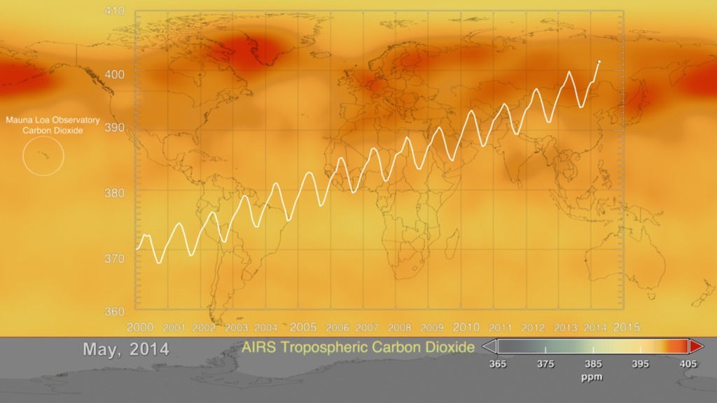
2014 Update Aqua/AIRS Carbon Dioxide with Mauna Loa Carbon Dioxide
Go to this pageThis visualization is a time-series of the global distribution and variation of the concentration of mid-tropospheric carbon dioxide observed by the Atmospheric Infrared Sounder (AIRS) on the NASA Aqua spacecraft. For comparison, it is overlain by a graph of the seasonal variation and interannual increase of carbon dioxide observed at the Mauna Loa, Hawaii observatory.The graph shows data, commonly called the Keeling Curve, from the Scripps measurements of monthly carbon dioxide concentration at Mauna Loa Observatory. The collection of this data was started by C. David Keeling of the Scripps Institution of Oceanography in March of 1958 at a facility of the National Oceanic and Atmospheric Administration [Keeling, 1976]. The two most notable features of this visualization are the seasonal variation of carbon dioxide and the trend of increase in its concentration from year to year. The global map clearly shows that the carbon dioxide in the Northern Hemisphere peaks in April-May and then drops to a minimum in September-October. Although the seasonal cycle is less pronounced in the Southern Hemisphere it is opposite to that in the Northern Hemisphere. This seasonal cycle is governed by the growth cycle of plants. The Northern Hemisphere has the majority of the land masses, and so the amplitude of the cycle is greater in that hemisphere. The overall color of the map shifts toward the red with advancing time due to the annual increase of carbon dioxide.The concentration of carbon dioxide in the mid-troposphere lags the concentration found at the surface as mixing from the lower to upper altitudes usually takes days to weeks.More information about AIRS can be found at http://airs.jpl.nasa.gov. More information about the carbon dioxide concentration at Mauna Loa Observatory can be found at http://scrippsco2.ucsd.edu/ ||
- ID: 11719 Produced Video
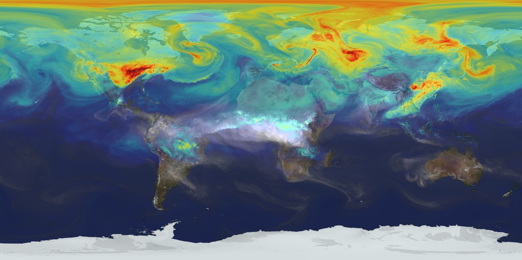
A Year In The Life Of Earth’s CO2
Go to this pageAn ultra-high-resolution NASA computer model has given scientists a stunning new look at how carbon dioxide in the atmosphere travels around the globe.Plumes of carbon dioxide in the simulation swirl and shift as winds disperse the greenhouse gas away from its sources. The simulation also illustrates differences in carbon dioxide levels in the northern and southern hemispheres and distinct swings in global carbon dioxide concentrations as the growth cycle of plants and trees changes with the seasons.The carbon dioxide visualization was produced by a computer model called GEOS-5, created by scientists at NASA Goddard Space Flight Center’s Global Modeling and Assimilation Office.The visualization is a product of a simulation called a “Nature Run.” The Nature Run ingests real data on atmospheric conditions and the emission of greenhouse gases and both natural and man-made particulates. The model is then left to run on its own and simulate the natural behavior of the Earth’s atmosphere. This Nature Run simulates January 2006 through December 2006.While Goddard scientists worked with a “beta” version of the Nature Run internally for several years, they released this updated, improved version to the scientific community for the first time in the fall of 2014. ||
- ID: 30590 Hyperwall Visual
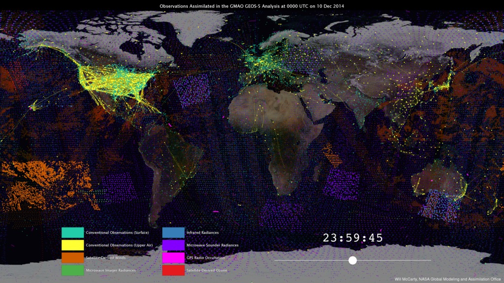
From Observations to Models
Go to this pageNASA’s Global Modeling and Assimilation Office (GMAO) uses the Goddard Earth Observing System Model, Version 5 Data Assimilation System (GEOS-5 DAS) to produce global numerical weather forecasts on a routine basis. GMAO forecasts play important roles in managing NASA’s fleet of science satellites and in researching the impact of new satellite observations. In order to provide timely information about the state of the atmosphere for NASA instrument teams and researchers, the GMAO runs the GEOS-5 DAS four times each day in real time. For each forecast, it is necessary to provide accurate initial conditions that drive the GEOS-5 forecasts. To do this, the best estimate of the full, three-dimensional atmospheric state is determined by combining the latest observations and a short-term, 6-hour forecast—a process known as data assimilation. The GEOS-5 DAS assimilates more than 5 million observations during each 6-hour assimilation period.These observations are assembled from a number of sources from around the globe, including NASA, NOAA, EUMETSAT (European Organization for the Exploitation of Meteorological Satellites), commercial airlines, the US Department of Defense, and many others. Similarly, each observation type has its own sampling characteristics. It can be seen in the animation how different observation types have different strategies. One of the main challenges of data assimilation is to understand how all these observations are alike, how they differ, and how they interact with each other.Funding for the development of the GEOS-5 model and data assimilation system development comes from NASA's Modeling, Analysis, and Prediction Program and the NASA Weather Focus Area's contribution to the Joint Center for Satellite Data Assimilation.The GEOS-5 DAS runs at the NASA Center for Climate Simulation, which is funded by NASA’s High-End Computing Program.For More Information:http://gmao.gsfc.nasa.gov/http://www.nccs.nasa.gov/images/data_assim_story_072815.pdf ||
Oceans
- ID: 30709 Hyperwall Visual
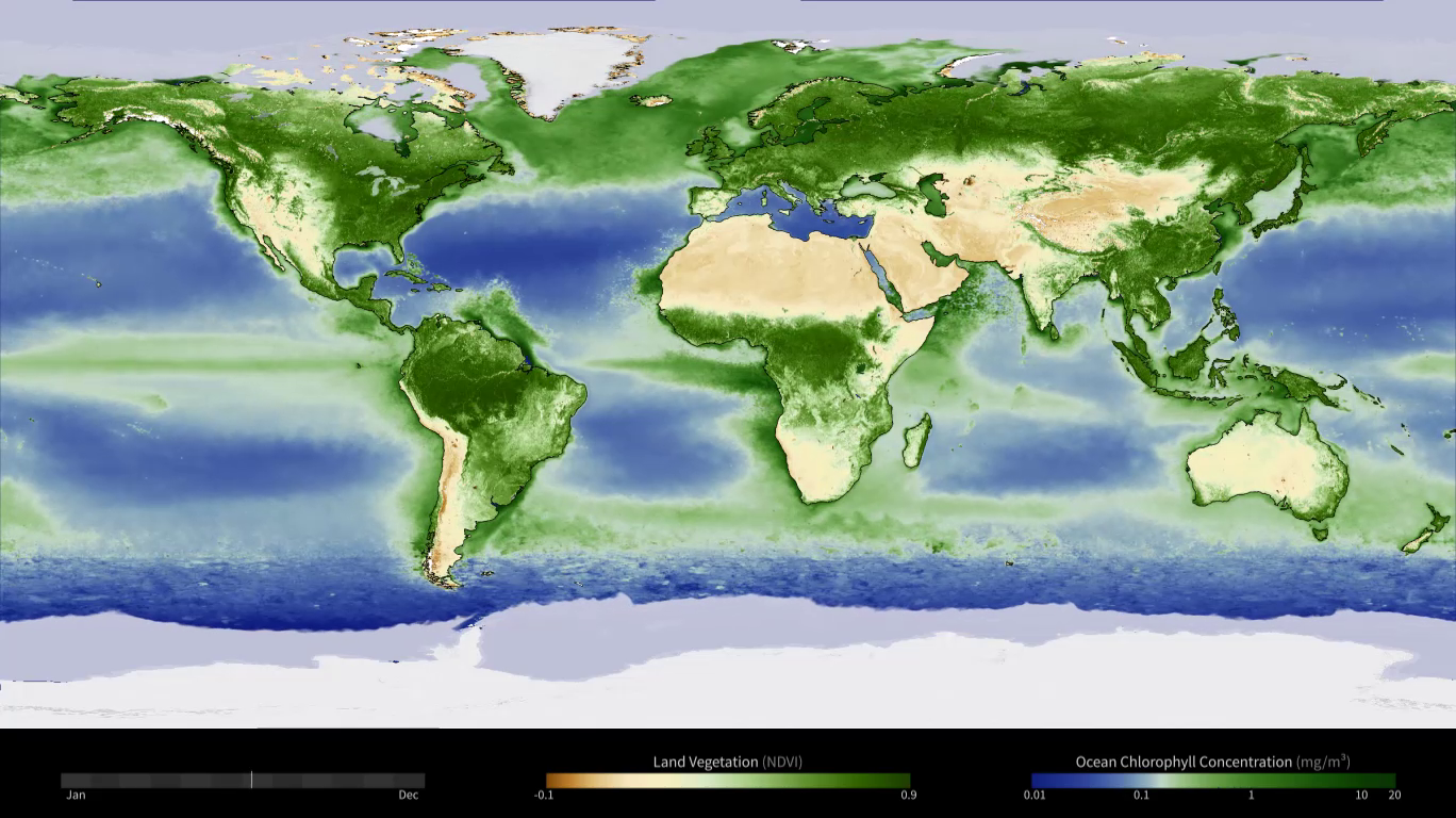
Yearly Cycle of Earth's Biosphere
Go to this pageanimation with traditional colors for chl || yearly_biosphere_color2_1080p.00001_print.jpg (1024x576) [164.5 KB] || yearly_biosphere_color2_1080p.00001_searchweb.png (180x320) [86.0 KB] || yearly_biosphere_color2_1080p.00001_thm.png (80x40) [6.9 KB] || yearly_biosphere_color2_1080p.mp4 (1920x1080) [17.2 MB] || yearly_biosphere_color2_1080p.webm (1920x1080) [1.3 MB] || yearly_biosphere_color2_1080p.hwshow [94 bytes] ||
- ID: 30512 Hyperwall Visual
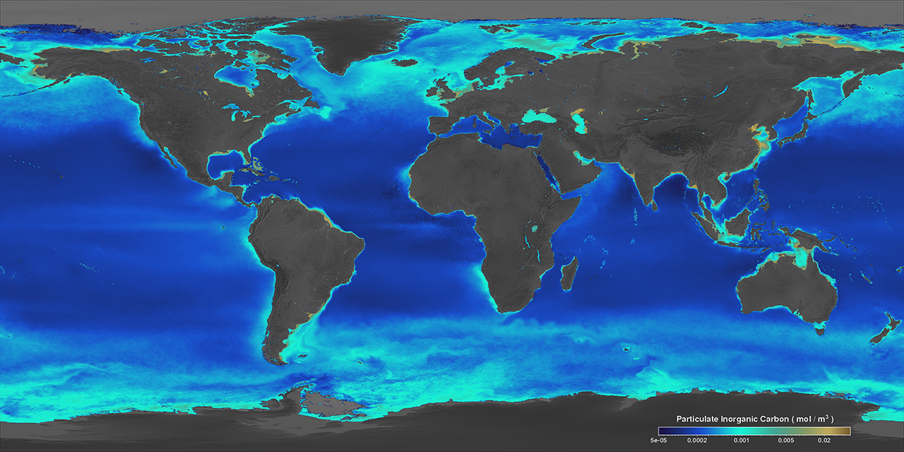
Bright Waters of the Southern Ocean
Go to this pagePhytoplankton are microscopic organisms that live in watery environments, forming the foundation of the aquatic and marine food webs. Phytoplankton populations can grow explosively creating bright green and blue marble swirls, or blooms, near the surface. This visualization shows global daily averages of suspended particulate inorganic carbon (PIC, known as calcium carbonate or limestone) from July 4, 2002 to May 26, 2014, made with data from Aqua/MODIS. One can see shades of bright turquoise circling the Southern Ocean, a unique and consistent feature characterized by the presence of elevated PIC concentrations near the Sub-Tropical, Sub-Antarctic, and Polar Fronts. Referred to as the "Great Calcite Belt," high PIC concentrations result from large numbers of highly reflective microscopic PIC plates called “coccoliths,” released from calcifying coccolithophores. Such regions of elevated reflectance have been observed each year during austral summer with minor variations from year to year. Many sectors of the Southern Ocean are generally characterized by low concentrations of potentially growth limiting iron (Fe) concentrations. Studies suggest, however, that coccolithophores are well adapted to growth under low ambient iron conditions. ||
- ID: 10903 Produced Video
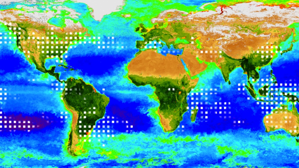
Carbonivores
Go to this pageWe all inhale oxygen and exhale carbon dioxide with every breath. For plants, it's the opposite. Tiny pores on leaves absorb carbon dioxide and release oxygen as part of a cellular process that converts sunlight and water into energy. Individually, plants take in small amounts of carbon dioxide from the air, but en masse the world's vegetation behaves like a giant lung that can change the composition of the atmosphere. The visualization below, which is based on data from the MODIS instrument and four years of carbon dioxide measurements from the Atmospheric Infrared Sounder (AIRS) on NASA's Aqua satellite, reveals how carbon dioxide concentrations fluctuate due to vegetation cover on land. Here, flashing white squares represent carbon dioxide levels in the atmosphere. Notice a sharp reduction in squares as vegetation thrives during the Northern Hemisphere summer. Conversely, more squares are present in winter as vegetation losses lead to rising carbon dioxide levels across the globe. ||
Temperature
- ID: 4252 Visualization

Five-Year Global Temperature Anomalies from 1880 to 2014
Go to this pageThis color-coded map in Robinson projection displays a progression of changing global surface temperature anomalies from 1880 through 2014. Higher than normal temperatures are shown in red and lower then normal termperatures are shown in blue. The final frame represents the global temperatures 5-year averaged from 2010 through 2014. || GISTEMP_2014update.0905_print.jpg (1024x576) [122.2 KB] || GISTEMP_2014update.0905_searchweb.png (320x180) [74.5 KB] || GISTEMP_2014update.0905_thm.png (80x40) [6.7 KB] || composite (1920x1080) [0 Item(s)] || 2014_update_robinson_composite.mp4 (1920x1080) [36.8 MB] || 2014_update_robinson_composite.webm (1920x1080) [3.5 MB] ||
- ID: 4255 Visualization
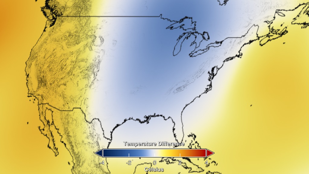
2014 Global Temperature Anomalies: United States to Global view
Go to this pageThis visualization of annual global temperature anomalies from 2014 starts with a local view of the United States and then zooms out to the global color-coded map. Blue represents colder then normal temperatures and red represents warmer then normal temperatures. || US_Global_pullout_2014GISTEMP_0001_print.jpg (1024x576) [105.0 KB] || US_Global_pullout_2014GISTEMP_0001_searchweb.png (320x180) [75.7 KB] || US_Global_pullout_2014GISTEMP_0001_thm.png (80x40) [6.1 KB] || composite (1920x1080) [0 Item(s)] || Annual2014GISSTEMP_US2Global.mp4 (1920x1080) [11.2 MB] || Annual2014GISSTEMP_US2Global.webm (1920x1080) [1.3 MB] ||
- ID: 4105 Visualization
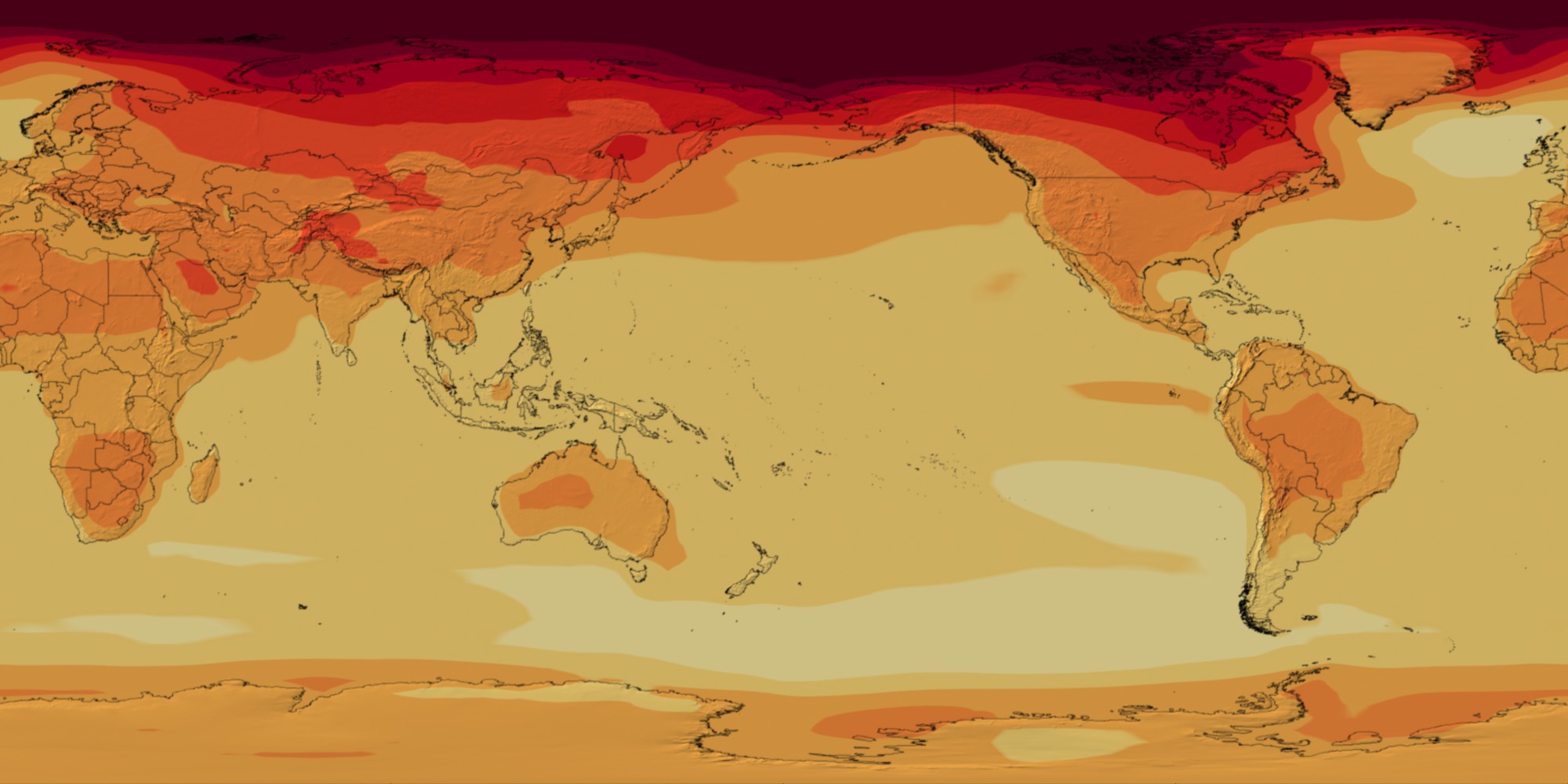
CMIP5: 21st Century Temperature Scenarios
Go to this pageThese data visualizations from the NASA Center for Climate Simulation and NASA's Scientific Visualization Studio at Goddard Space Flight Center, Greenbelt, Md., show how climate models used in the new report from the United Nations' Intergovernmental Panel on Climate Change (IPCC) estimate possible temperature pattern changes throughout the 21st century. The United Nations' Intergovernmental Panel on Climate Change publishes a report on the consensus view of climate change science about every five to seven years. The first findings of the IPCC's Fifth Assessment Report (AR5) were released on Sept. 27, 2013, in the form of the Summary for Policymakers report and a draft of IPCC Working Group 1's Physical Science Basis. The IPCC does not perform new science but instead authors a report that establishes the established understanding of the world's climate science community.The report not only includes observations of the real world but also the results of climate model projections of how the Earth will respond as a system to rising greenhouse gas concentrations in the atmosphere. The IPCC's AR5 relies on the Coupled Model Intercomparison Project Phase 5 (CMIP5) effort, an international effort among the climate modeling community to coordinate climate change experiments. These visualizations represent the mean output of how of how certain groups of CMIP5 models responded to four different scenarios defined by the IPCC called Representative Concentration Pathways (RCPs). These four RCPs – 2.6, 4.5, 6 and 8.5 – represent a wide range of potential worldwide greenhouse gas emissions and sequestration scenarios for the coming century. The pathways are numbered based on the expected Watts per square meter – essentially a measure of how much heat energy is being trapped by the climate system – each scenario would produce. The pathways are partly based on the ultimate concentrations of carbon dioxide and other greenhouse gases. The current carbon dioxide concentration in the atmosphere is around 400 parts per million, up from less than 300 parts per million at the end of the 19th century.The carbon dioxide concentrations in the year 2100 for each RCP are:RCP 2.6: 421 ppmRCP 4.5: 538 ppmRCP 6: 670 ppmRCP 8.5: 936 ppmEach visualization represents the mean output of a different number of models for each RCP, because data from all models in the CMIP5 project was not available in the same format for visualization for each RCP. All of the models compare a projection of temperatures from 2006-2099 to a baseline historical average from 1971-2000. Thus, the values shown for each year represent the departure for that year compared to the observed average global surface temperature from 1971-2000. The IPCC report used 1986-2005 as a baseline period, making its reported anomalies slightly different from those shown in the visualizations. ||
- ID: 4095 Visualization

Potential Evaporation in North America Through 2100
Go to this pageThis animation shows the projected increase in potential evaporation during the fire season through the year 2100, relative to 1980, based on the combined results of multiple climate models: MERRA data for 1980-2010 and an ensemble of 20 climate models for 2010-2100. The maximum increase across North America is about 1 mm/day by 2100. This concept, potential evaporation, is a measure of drying potential or "fire weather." An average increase of 1 mm/day over the whole year is a big change — 1 mm/day increase in PE is considered to be an "extreme" event for fires, similar to the conditions in Colorado in 2012. By these projections, fire years like 2012 would be the new normal in regions like the western US by the end of the 21st century. ||
Interviews with Scientists
- ID: 12047 Produced Video
Carbon and Climate: Interview Clips
Go to this pageBroadcast quality interviews with scientists involved in NASA's Carbon and Climate press briefing. ||
- ID: 12064 Produced Video
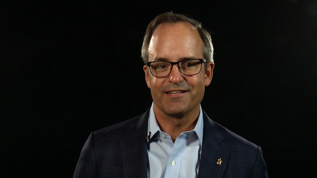
George Hurtt: Carbon and Climate Soundbite
Go to this pageGeorge Hurtt, professor at University of Maryland, gives information on NASA's Carbon Monitoring System in advance of the United Nations COP-21 climate meeting in Paris, 2015For complete transcript, click here.Music credit: Rippling Rays by Jon Wygens || George_Hurtt_Cover_Image_print.jpg (1024x576) [72.6 KB] || George_Hurtt_Cover_Image_searchweb.png (320x180) [73.5 KB] || George_Hurtt_Cover_Image_thm.png (80x40) [4.8 KB] || George_Hurtt_MASTER_prores.mov (1280x720) [603.3 MB] || George_Hurtt_MASTER_youtube_hq.mov (1280x720) [147.2 MB] || George_Hurtt_MASTER_appletv.m4v (1280x720) [21.4 MB] || George_Hurtt_Carbon_Climate.mp4 (1280x720) [42.5 MB] || George_Hurtt_MASTER.mpeg (1280x720) [144.3 MB] || George_Hurtt_MASTER.webm (960x540) [17.2 MB] || George_Hurtt_Cover_Image.tif (1280x720) [3.5 MB] || George_Hurtt_MASTER_appletv_subtitles.m4v (1280x720) [21.5 MB] || 12064_George_Hurtt_captions.en_US.srt [972 bytes] || 12064_George_Hurtt_captions.en_US.vtt [979 bytes] || George_Hurtt_MASTER_ipod_sm.mp4 (320x240) [7.6 MB] ||
- ID: 12065 Produced Video
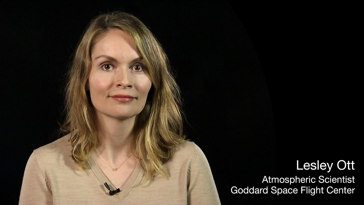
Lesley Ott: Carbon and Climate Soundbite
Go to this pageLesley Ott, research meteorologist in the Global Modeling and Assimilation Center at NASA's Goddard Space Flight Center, discusses how NASA is working to understand the global carbon cycle. Dr. Ott made these points on a media telecon in advance of the United Nations COP-21 climate meeting in Paris, 2015.For complete transcript, click here.Music credit: Piano Dreams by Jon Wygens || Lesley_Ott_Poster-no_text.jpg (1280x720) [219.6 KB] || Lesley_Ott_Poster-no_text_searchweb.png (320x180) [82.4 KB] || Lesley_Ott_Poster-no_text_thm.png (80x40) [17.1 KB] || Lesley_Ott_MASTER_prores.mov (1280x720) [596.5 MB] || Lesley_Ott_MASTER_youtube_hq.mov (1280x720) [137.3 MB] || Lesley_Ott_MASTER_appletv.m4v (1280x720) [20.8 MB] || Lesley_Ott_Carbon_Climate.mp4 (1280x720) [41.2 MB] || Lesley_Ott_MASTER.mpeg (1280x720) [140.0 MB] || Lesley_Ott_MASTER.webm (960x540) [16.7 MB] || Lesley_Ott_MASTER_appletv_subtitles.m4v (1280x720) [20.9 MB] || 12065_Lesley_Ott-captions.en_US.srt [953 bytes] || 12065_Lesley_Ott-captions.en_US.vtt [963 bytes] || Lesley_Ott_MASTER_ipod_sm.mp4 (320x240) [7.2 MB] ||
- ID: 12067 Produced Video
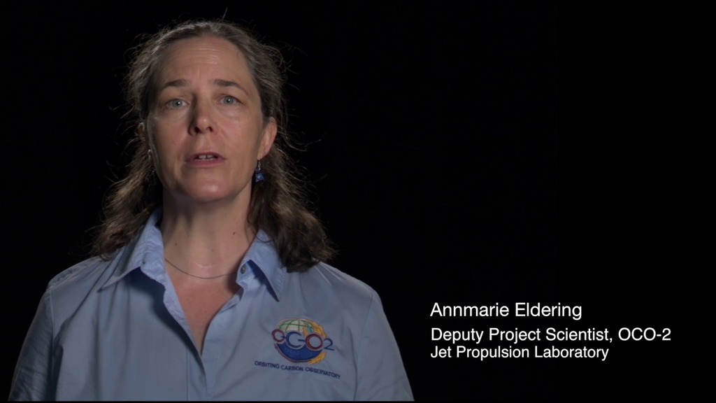
Annmarie Eldering: Carbon and Climate Soundbite
Go to this pageRising carbon dioxide levels in the atmosphere are driving changes in Earth’s climate. But scientists are still trying to answer important questions about how carbon dioxide emissions get absorbed by the land and the ocean — and how this could change in the future. NASA Jet Propulsion Laboratory’s Annmarie Eldering shares how the Orbiting Carbon Observatory-2 is helping answer these questions on a global scale.For complete transcript, click here. || CarbonClimate_TheGlobalCarbonSystem_AnnmarieEldering_appletv_print.jpg (1024x576) [62.1 KB] || CarbonClimate_TheGlobalCarbonSystem_AnnmarieEldering_appletv_searchweb.png (320x180) [57.2 KB] || CarbonClimate_TheGlobalCarbonSystem_AnnmarieEldering_appletv_thm.png (80x40) [4.4 KB] || CarbonClimate_TheGlobalCarbonSystem_AnnmarieEldering_youtube_hq.mov (1920x1080) [88.6 MB] || CarbonClimate_TheGlobalCarbonSystem_AnnmarieEldering_appletv.m4v (1280x720) [23.5 MB] || CarbonClimate_TheGlobalCarbonSystem_AnnmarieEldering.mpeg (1280x720) [150.3 MB] || CarbonClimate_TheGlobalCarbonSystem_AnnmarieEldering.webm (960x540) [18.9 MB] || CarbonClimate_TheGlobalCarbonSystem_AnnmarieEldering_appletv_subtitles.m4v (1280x720) [23.5 MB] || CarbonClimate_TheGlobalCarbonSystem_AnnmarieEldering.en_US.srt [931 bytes] || CarbonClimate_TheGlobalCarbonSystem_AnnmarieEldering.en_US.vtt [944 bytes] || CarbonClimate_TheGlobalCarbonSystem_AnnmarieEldering_ipod_sm.mp4 (320x240) [8.5 MB] ||
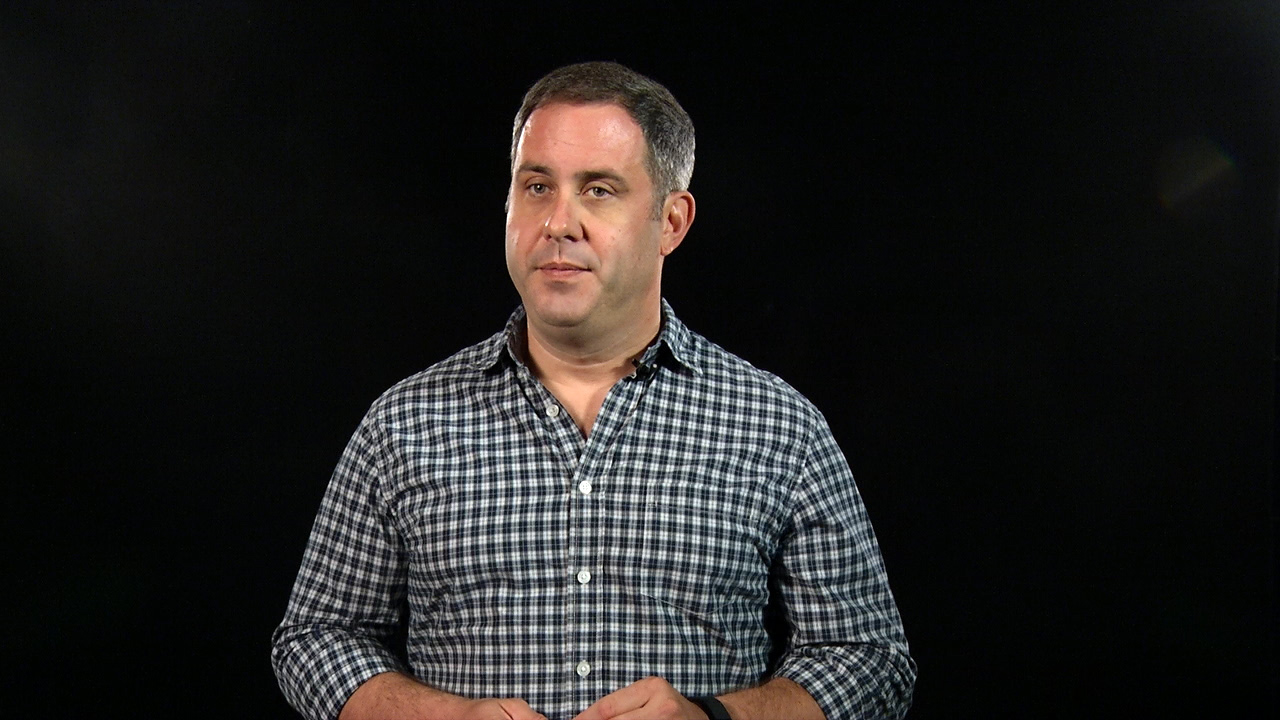
- ID: 12066 Produced Video
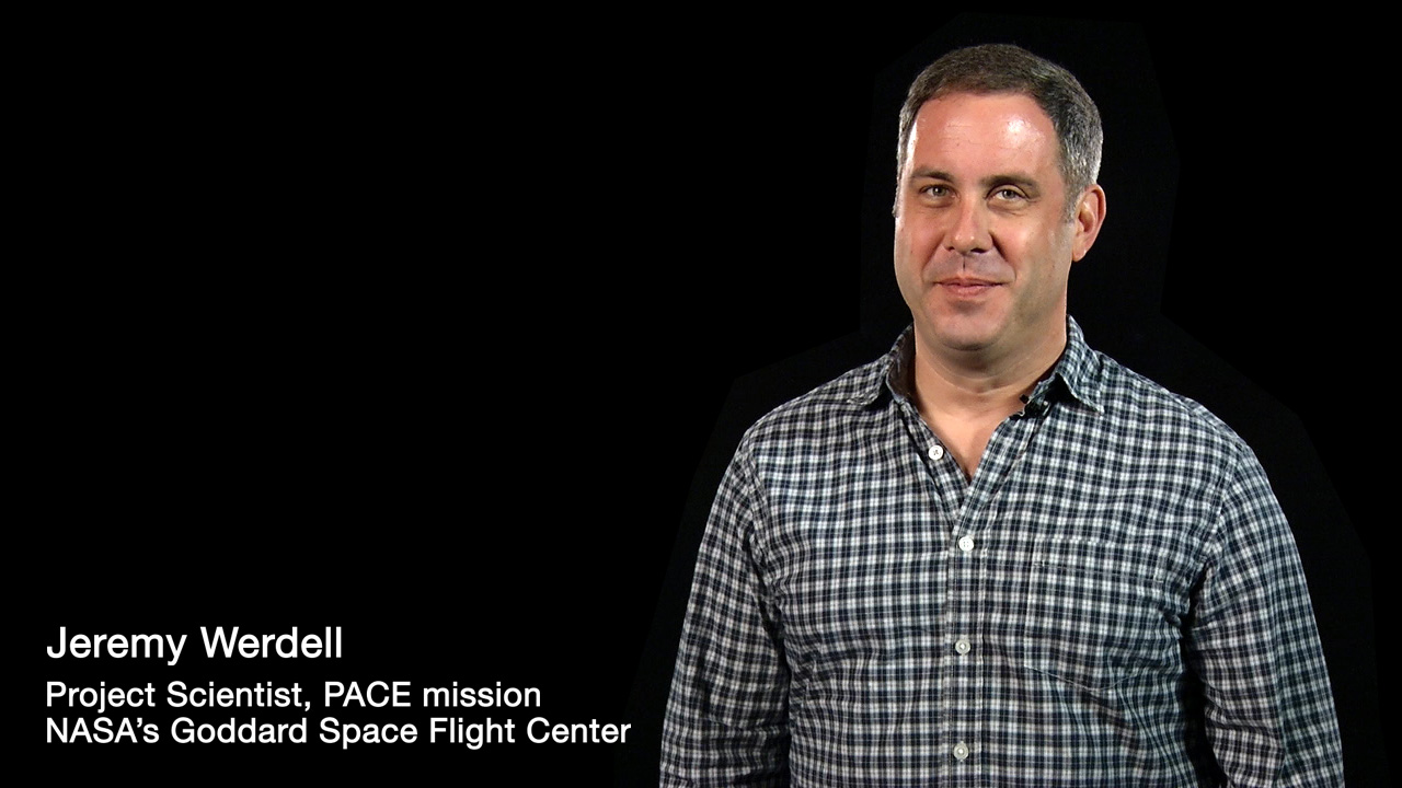
Jeremy Werdell: Carbon and Climate Soundbite
Go to this pageJeremy Werdell, oceanographer at NASA's Goddard Space Flight Center, discusses the importance of microscopic plankton in the global carbon cycle. With his colleagues, Jeremy is working to answer important questions about how much carbon dioxide the oceans are absorbing, and how that might change in the future.For complete transcript, click here.Music credit: Molecular by Mark Hawkins || Jeremy_Werdell_Poster-notext.jpg (1280x720) [202.1 KB] || Jeremy_Werdell_Poster-notext_searchweb.png (320x180) [67.1 KB] || Jeremy_Werdell_Poster-notext_thm.png (80x40) [14.4 KB] || 12066_Jeremy_Werdell_MASTER_prores.mov (1280x720) [633.4 MB] || 12066_Jeremy_Werdell_MASTER_youtube_hq.mov (1280x720) [185.2 MB] || Jeremy_Werdell_Carbon_Climate.mp4 (1280x720) [44.2 MB] || 12066_Jeremy_Werdell_MASTER_appletv.m4v (1280x720) [20.4 MB] || 12066_Jeremy_Werdell_MASTER.mpeg (1280x720) [146.5 MB] || 12066_Jeremy_Werdell_MASTER.webm (960x540) [17.5 MB] || 12066_Jeremy_Werdell_MASTER_appletv_subtitles.m4v (1280x720) [20.4 MB] || 12066_Jeremy_Werdell-captions.en_US.srt [1015 bytes] || 12066_Jeremy_Werdell-captions.en_US.vtt [1.0 KB] || 12066_Jeremy_Werdell_MASTER_ipod_sm.mp4 (320x240) [7.5 MB] ||