Earth
ID: 4050
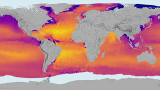
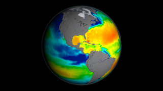
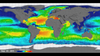
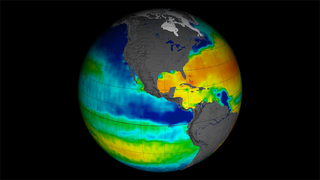
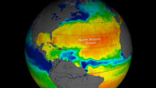
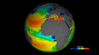
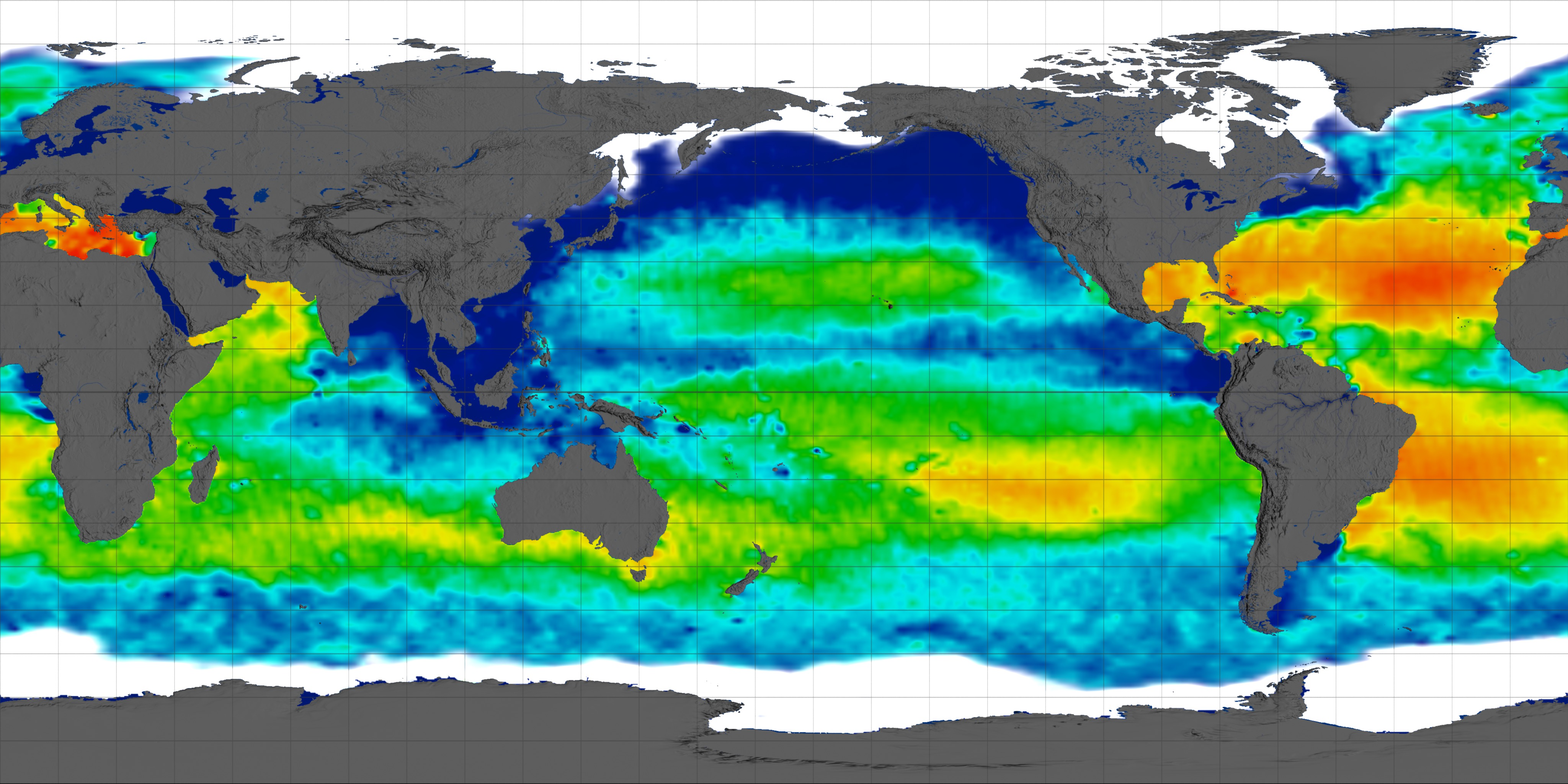
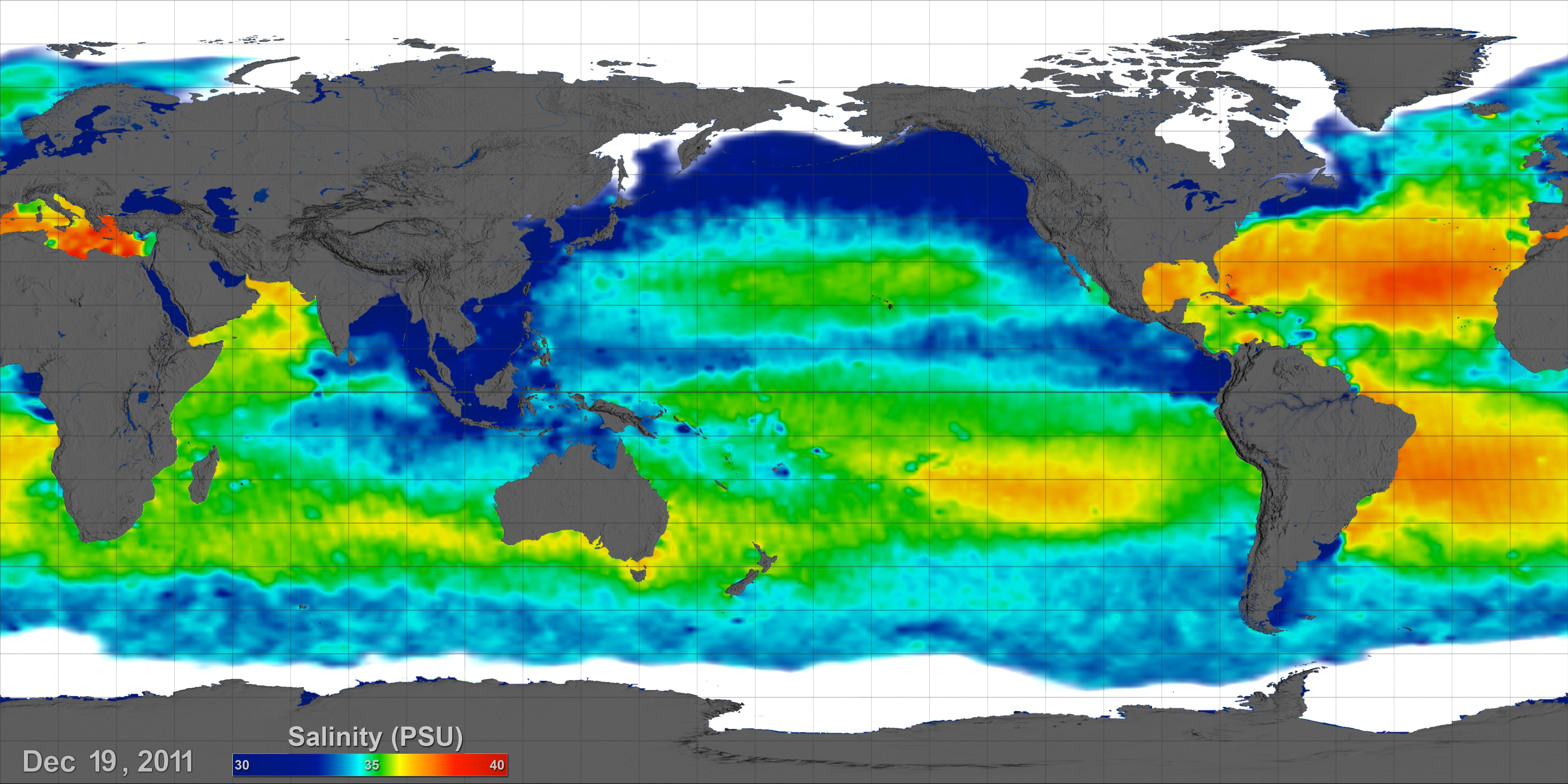
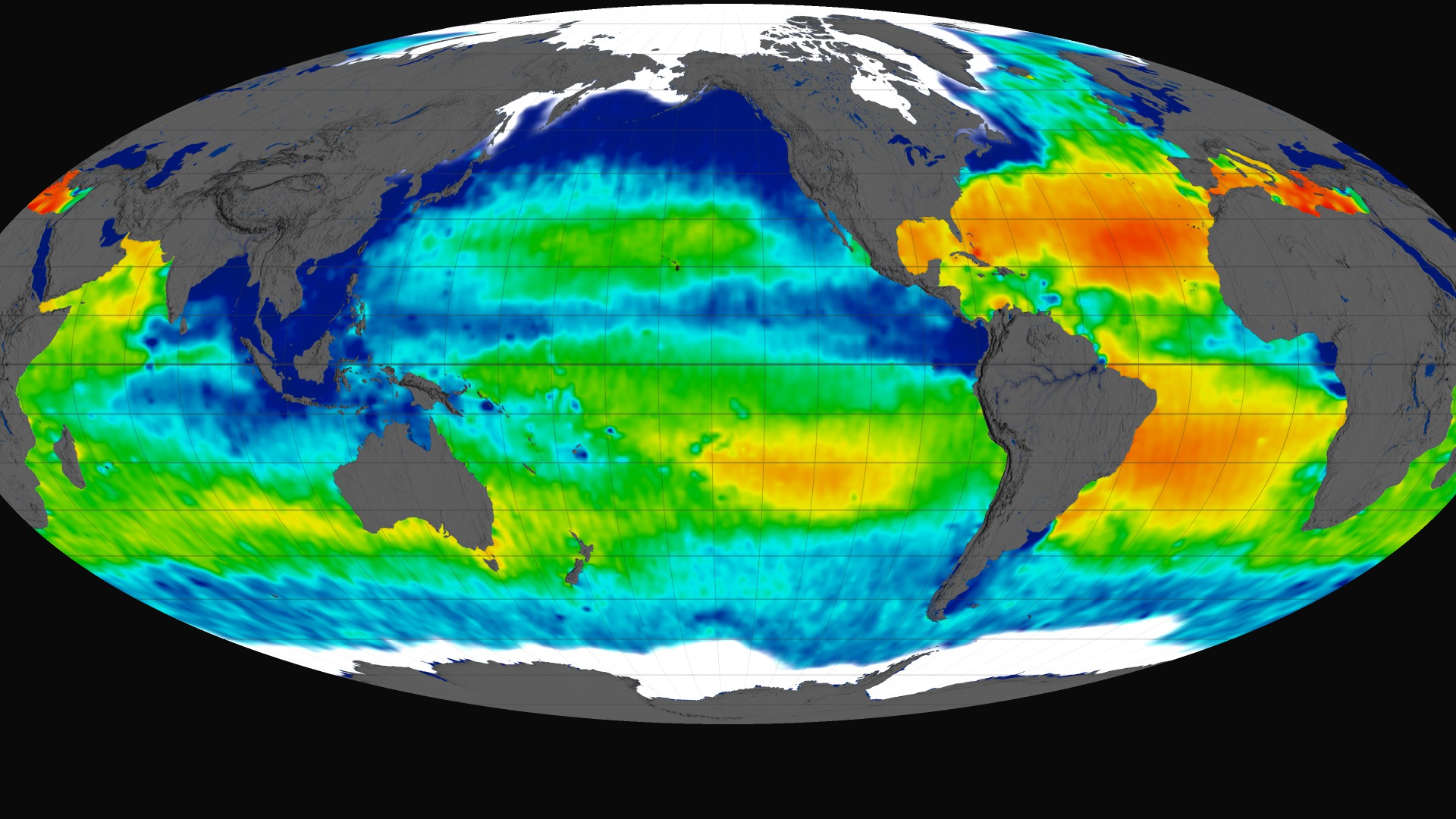
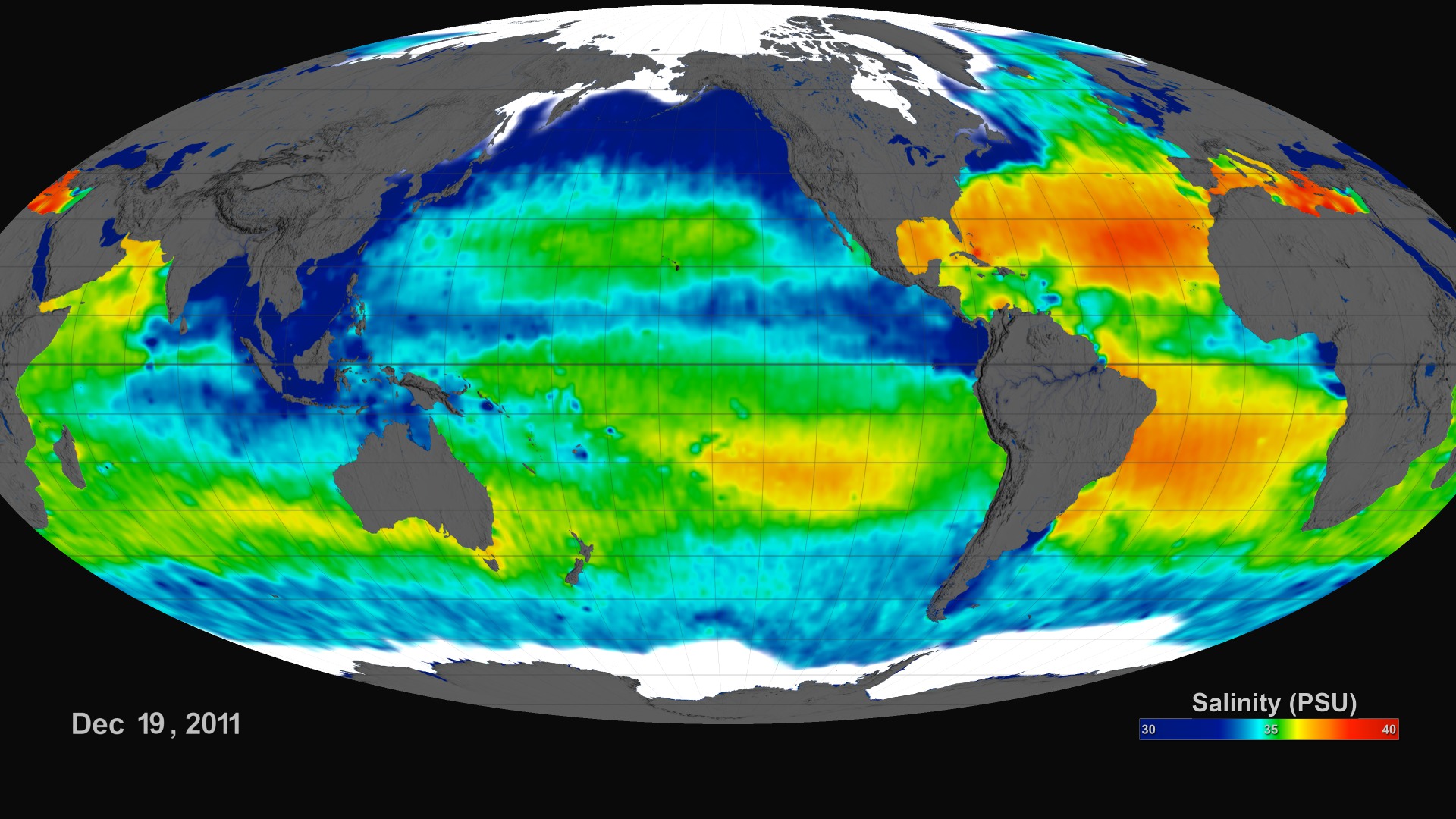
The Aquarius spacecraft is designed to measure global sea surface salinity. It is important to understand salinity, the amount of dissolved salts in water, because it will lead us to better understanding of the water cycle and can lead to improved climate models. Aquarius is a collaboration between NASA and the Space Agency of Argentina
Aquarius Sea Surface Salinity Flat Maps 2012
There is a newer version of this story located here: https://svs.gsfc.nasa.gov/5017
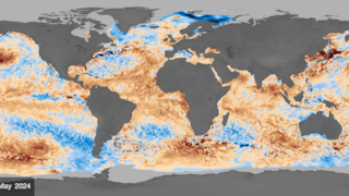
This visualization celebrates over a year of successful Aquarius observations. Sea surface salinity is shown on a flat map using a simple cartesian and extended Molleide projections. Versions are included with and without dates/color bars.
The range of time shown is December 2011 through Decemeber 2012. The data continuously loops through this range every 6 seconds. This visualization was generated based on version 2.0 of the Aquarius data products with all 3 scanning beams.
Newer Version
Related
For More Information
Visualization Credits
Greg Shirah (NASA/GSFC): Lead Animator
Horace Mitchell (NASA/GSFC): Animator
Kayvon Sharghi (USRA): Producer
Gary Lagerloef (ESR): Scientist
Gene Feldman (NASA/GSFC): Scientist
Norman Kuring (NASA/GSFC): Scientist
Horace Mitchell (NASA/GSFC): Animator
Kayvon Sharghi (USRA): Producer
Gary Lagerloef (ESR): Scientist
Gene Feldman (NASA/GSFC): Scientist
Norman Kuring (NASA/GSFC): Scientist
Please give credit for this item to:
NASA's Goddard Space Flight Center Scientific Visualization Studio
NASA's Goddard Space Flight Center Scientific Visualization Studio
Short URL to share this page:
https://svs.gsfc.nasa.gov/4050
Mission:
Aquarius
Data Used:
Note: While we identify the data sets used in these visualizations, we do not store any further details nor the data sets themselves on our site.
This item is part of this series:
Aquarius
Keywords:
GCMD >> Earth Science >> Oceans >> Salinity/Density >> Salinity
SVS >> Hyperwall
NASA Science >> Earth
GCMD keywords can be found on the Internet with the following citation: Olsen, L.M., G. Major, K. Shein, J. Scialdone, S. Ritz, T. Stevens, M. Morahan, A. Aleman, R. Vogel, S. Leicester, H. Weir, M. Meaux, S. Grebas, C.Solomon, M. Holland, T. Northcutt, R. A. Restrepo, R. Bilodeau, 2013. NASA/Global Change Master Directory (GCMD) Earth Science Keywords. Version 8.0.0.0.0
https://svs.gsfc.nasa.gov/4050
Mission:
Aquarius
Data Used:
Aquarius/Microwave Radiometer/Sea Surface Salinity also referred to as: SSS
Observed Data - NASAThis item is part of this series:
Aquarius
Keywords:
GCMD >> Earth Science >> Oceans >> Salinity/Density >> Salinity
SVS >> Hyperwall
NASA Science >> Earth
GCMD keywords can be found on the Internet with the following citation: Olsen, L.M., G. Major, K. Shein, J. Scialdone, S. Ritz, T. Stevens, M. Morahan, A. Aleman, R. Vogel, S. Leicester, H. Weir, M. Meaux, S. Grebas, C.Solomon, M. Holland, T. Northcutt, R. A. Restrepo, R. Bilodeau, 2013. NASA/Global Change Master Directory (GCMD) Earth Science Keywords. Version 8.0.0.0.0