2015-2016 El Niño: Daily Sea Surface Temperature Anomaly and Ocean Currents
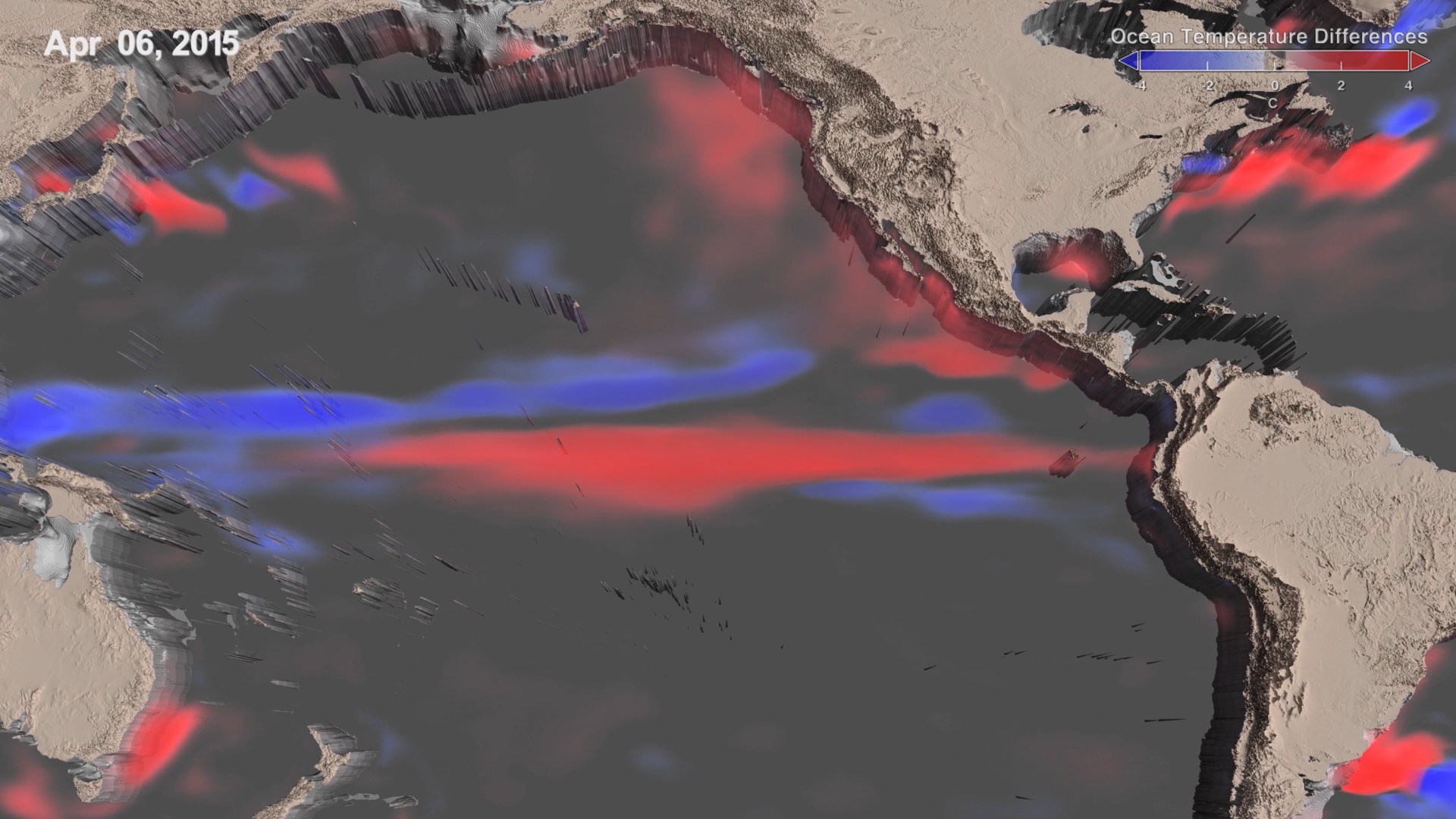
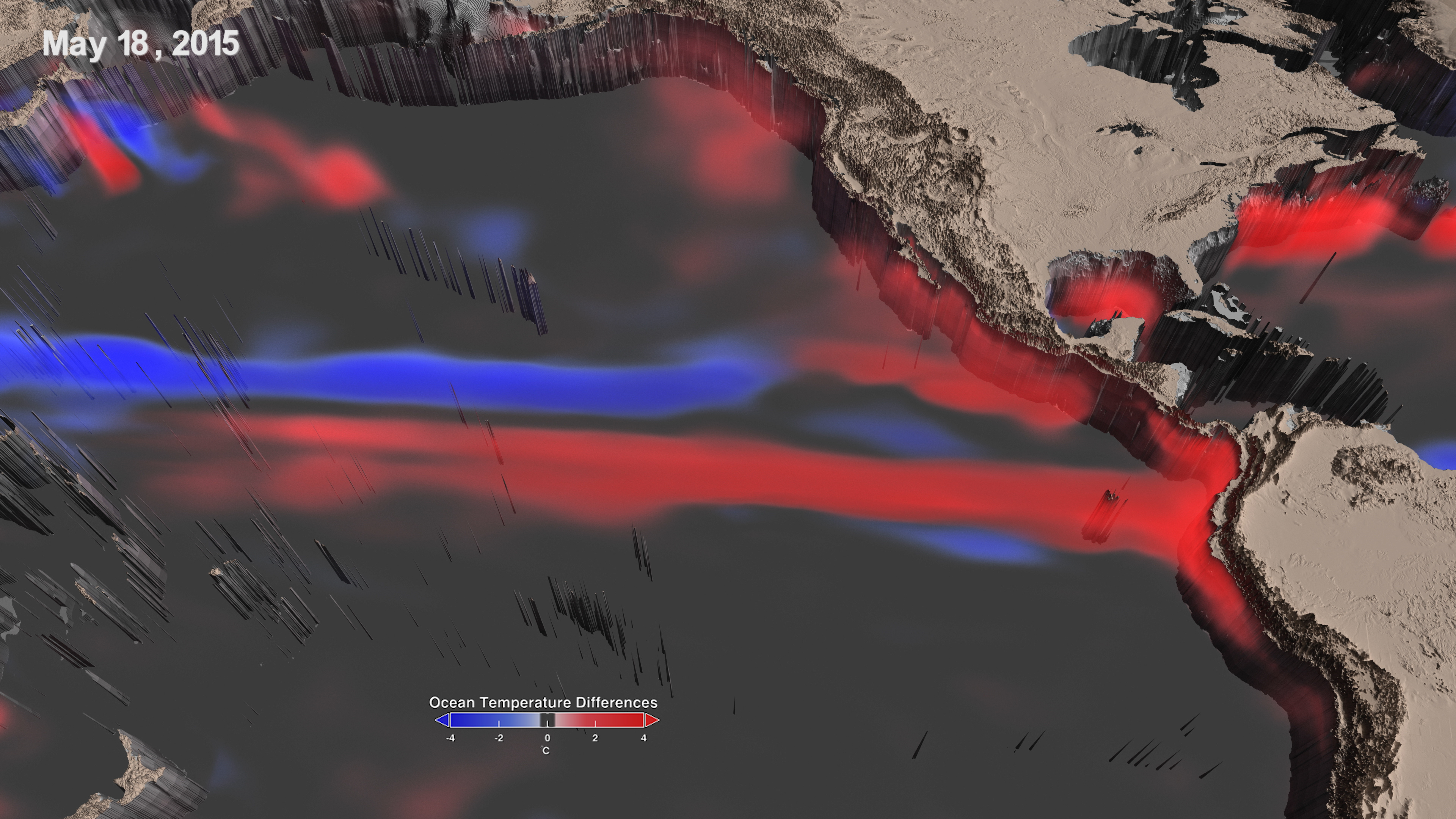
This visualization shows 2015-2016 El Nino through changes in sea surface temperature and ocean currents. Blue regions represent colder temperatures and red regions represent warmer temperatures when compared with normal conditions. Yellow arrows illustrate eastward currents and white arrows are westward currents.
El Niño is a recurring climate pattern characterized by warmer than usual ocean temperatures in the equatorial Pacific. This 3-D visualization tracks the changes in ocean temperatures and currents, respectively, throughout the life cycle of the 2015-2016 El Niño event, chronicling its inception in early 2015 to its dissipation by April 2016.
Blue regions represent colder temperatures and red regions warmer temperatures when compared with normal conditions.
Under normal conditions, equatorial trade winds in the Pacific Ocean blow from the east to the west, causing warm water to pile up in the Western Pacific, while also causing an upwelling- the rise of deep, cool water to the surface- in the Equatorial Pacific. During an El Niño, trade winds weaken or, as with this latest event, sometimes reverse course and blow from west to east. As a result, the warm surface water sloshes east along the equator from the Western Pacific and temporarily predominates in the Central and Eastern Pacific Ocean. At that time, cooler water slowly migrates westward just off the equator in the Western Pacific.
The first visualization shows the 2015-2016 El Niño through changes in sea surface temperature as warmer water moves east across the Pacific Ocean.The Eastern Pacific Ocean undergoes the most warming from July 2015 to January 2016. In the west, just to the north of the equator, cooler waters hit the western boundary and reflect along the equator and then head east starting in February 2016. Just as the warming waves traveled east earlier in the video, these cool waters make their way to the central Pacific, terminating the warming event there.
Hand-in-hand with an El Niño's changing sea surface temperatures are the wind-driven ocean currents that move the waters along the equator across the Pacific Ocean. The second visualization depicts these currents, which here comprise the ocean's surface to a depth of 225 meters: Yellow arrows illustrate eastward currents and white arrows are westward currents. The El Niño-inducing westerlies- winds coming from the west that blow east- causing eastward currents to occur in pulses.
These visualizations are derived from NASA Goddard's Global Modeling and Assimilation Office, using Modern-Era Retrospective Analysis for Research and Applications(MERRA) dataset, which comprises an optimal combination of observations and ocean and atmospheric models. For more information, see https://gmao.gsfc.nasa.gov/reanalysis/MERRA/.
 are transparent. Blue regions represent colder temperatures and red regions warmer temperatures when compared to normal conditions.")
This is the colorbar for the daily sea surface temperature anomaly. Regions close to normal values (0 ) are transparent. Blue regions represent colder temperatures and red regions warmer temperatures when compared to normal conditions.
This visualization is the same visualization as the movie above, but this visualization does not have the encoded colorbar overlay.
- Atmospheric/ocean Indicators
- Climate Indicators
- Computer Model
- Earth Science
- EARTH SCIENCE SERVICES
- El Nino
- GMAO
- Hyperwall
- MERRA
- Models
- ocean circulation
- ocean currents
- OCEAN GENERAL CIRCULATION MODELS (OGCM)/REGIONAL OCEAN MODELS
- Ocean Temperature
- Ocean Upwelling/downwelling
- Oceans
- Pacific
- Physical oceanography
- sea surface temperature
- Sea Surface Temperature Anomaly
- Simulation
- Water and Energy Cycle
Credits
Please give credit for this item to:
NASA's Scientific Visualization Studio
The GEOS-5 data used in this study/project have been provided by the Global Modeling and Assimilation Office (GMAO) at NASA Goddard Space Flight Center through the online data portal in the NASA Center for Climate Simulation
-
Data visualizer
- Lori Perkins (NASA/GSFC)
-
Scientists
- Robin Kovach (SSAI)
- Steven Pawson (NASA/GSFC)
-
Producer
- Matthew R. Radcliff (USRA)
-
Writer
- Samson K. Reiny (Wyle Information Systems)
Series
This page can be found in the following series:Datasets used
-
GMAO SST Anomaly
ID: 950 -
GMAO Ocean Currents (GMAO MERRA Volumetric Ocean Currents)
ID: 977This dataset is a 3D volumetric dataset of global ocean currents.
Credit: GMAO MERRA Ocean Currents
See all pages that use this dataset
Note: While we identify the data sets used on this page, we do not store any further details, nor the data sets themselves on our site.
Used as a Source In
- ID: 4742
 Visualization
 - ID: 12718
 Produced Video
 - ID: 12601
 Produced Video
Release date
This page was originally published on Friday, May 26, 2017.
This page was last updated on Sunday, October 6, 2024 at 10:39 PM EDT.