Atmospheric CO2 from AIRS 2002-2016
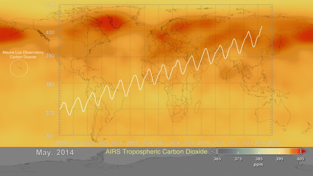
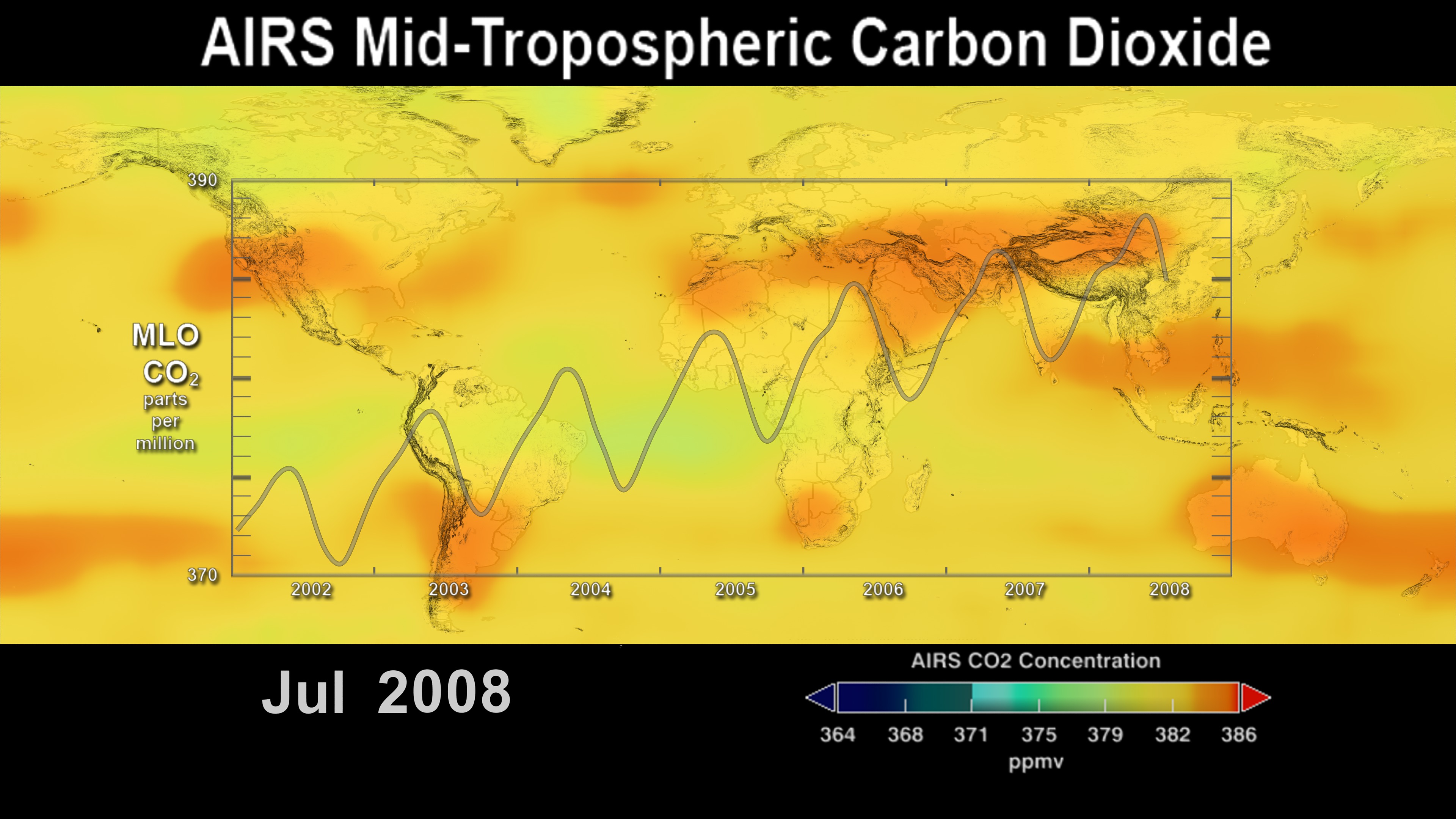
This visualization is an update of the global distribution and variation of the concentration of mid-tropospheric carbon dioxide observed by the Atmospheric Infrared Sounder (AIRS) on the NASA Aqua spacecraft. For comparison, it is overlain by a graph of the seasonal variation and interannual increase of carbon dioxide observed at the Mauna Loa, Hawaii observatory.
The two most notable features of this visualization are the seasonal variation of CO2 and the trend of increase in its concentration from year to year. The global map clearly shows that the CO2 in the northern hemisphere peaks in April-May and then drops to a minimum in September-October. Although the seasonal cycle is less pronounced in the southern hemisphere it is opposite to that in the northern hemisphere. This seasonal cycle is governed by the growth cycle of plants. The northern hemisphere has the majority of the land masses, and so the amplitude of the cycle is greater in that hemisphere. The overall color of the map shifts toward the red with advancing time due to the annual increase of CO2.
The visualization of AIRS CO2 dataset.
The visualization of AIRS CO2 dataset with the overlaid graph of Mauna Loa observed data.

The color bar for AIRS CO2 dataset.
Monthly images of AIRS CO2 dataset.
The visualization of AIRS CO2 dataset in 2048x1024. It's good for mapping on a sphere.
Credits
Please give credit for this item to:
NASA's Scientific Visualization Studio
-
Visualizers
- Cheng Zhang (USRA)
- Lori Perkins (NASA/GSFC)
-
Scientists
- Edward Olsen (NASA/JPL CalTech)
- Tom Pagano (NASA/JPL CalTech)
-
Project support
- Sharon Ray (NASA/JPL CalTech)
Datasets used
-
Monthly CO2 (Monthly CO2 V6) [Aqua: AIRS]
ID: 967Monthly CO2 from AIRS DAAC.
See all pages that use this dataset
Note: While we identify the data sets used on this page, we do not store any further details, nor the data sets themselves on our site.
Older Versions
- ID: 4184
- ID: 3562
Release date
This page was originally published on Thursday, December 15, 2016.
This page was last updated on Sunday, January 5, 2025 at 11:15 PM EST.