GPM sees Louisiana Floods
This visualization begins with an overview of the United States showing the clouds and rainfall accumulation of the massive rain event over Louisiana beginning on August 11th, 2016 through August 13th, 2016. The camera then begins to zoom in as time resets to August 11th. Time then slows way down on August 12th to show the first of GPM's passes. In this close up of GPM's volumetric DPR data over Louisiana, a cutting plane materializes into view to show the inner structure of this giant storm system. From this view, one can clearly see the heavy amounts of rain in the center of the storm (depicted in yellow, orange, and red). The GPM data then dissolves away as time speeds up before slowing down again later on that same day. This time GPM captures a much larger swath of the storm. Dissolving in the cutting plane again reveals huge amounts of rainfall at this later time. As the GPM data dissolves away again, time speeds back up to show the rest of the rainfall accumulation partway through August 13. At this time, a large portion of Louisiana can be seen completely saturated with rainfall accumulations (depicted in shades of orange to red).
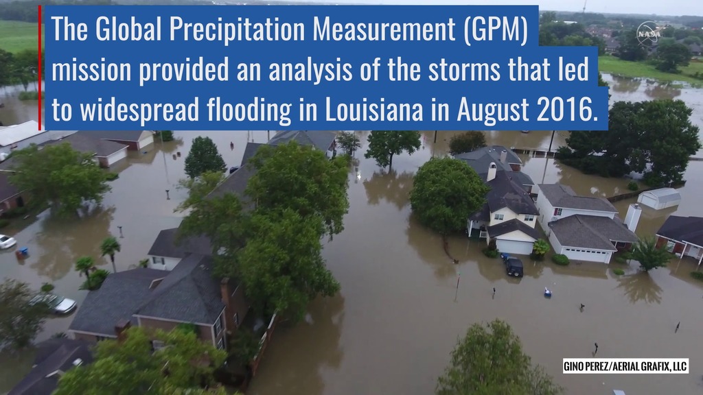
Twice on August 12, 2016 GPM flew over a massive rainstorm that flooded large portions of Louisiana. The flooding was some of the worst ever in the state, resulting in a state of emergency. Tens of thousands of people were evacuated from their homes in the wake of this unprecedented event.
Throughout the course of August 12 (UTC) GPM captured the internal structure of the storm twice and GPM IMERG measured the rainfall accumulation on the ground.
NASA's GPM satellite is designed to measure rainfall using both passive microwave (GMI) and radar (DPR) instruments. DPR can observe 3D structures of radar signals reflected by rain and snow in a narrower swath.
IMERG is a NASA data product that combines data from 12 different satellites into a single seamless map. IMERG covers more of the globe than any previous precipitation data set and is updated every half hour.
. Shades of cyan represent low amounts of frozen precipitation, whereas shades of purple represent high amounts of precipitation.")
Color bar for frozen precipitation rates (eg. snow rates). Shades of cyan represent low amounts of frozen precipitation, whereas shades of purple represent high amounts of precipitation.
Color bar for liquid precipitation rates (ie, rain rates). Shades of green represent low amounts of liquid precipitation, whereas shades of red represent high amounts of precipitation.
Color bar of rainfall accumulation in millimeters. Colors in black are little to no rain. Colors then range from blue to cyan to green, yellow, orange, and finally red (where red is the highest value.)
Credits
Please give credit for this item to:
NASA's Scientific Visualization Studio
-
Visualizer
-
Alex Kekesi
(Global Science and Technology, Inc.)

-
Alex Kekesi
(Global Science and Technology, Inc.)
-
Scientists
- Gail Skofronick Jackson (NASA/GSFC)
-
George Huffman
(NASA/GSFC)
- Dalia B Kirschbaum (NASA/GSFC)
-
Producer
- Ryan Fitzgibbons (USRA)
Missions
This page is related to the following missions:Series
This page can be found in the following series:Datasets used
-
CPC (Climate Prediction Center) Cloud Composite
ID: 600Global cloud cover from multiple satellites
See all pages that use this dataset -
Volumetric Precipitation data (Ku) [GPM: DPR]
ID: 830Credit: Data provided by the joint NASA/JAXA GPM mission.
See all pages that use this dataset -
IMERG
ID: 863This dataset can be found at: http://pmm.nasa.gov/sites/default/files/document_files/IMERG_ATBD_V4.4.pdf
See all pages that use this dataset
Note: While we identify the data sets used on this page, we do not store any further details, nor the data sets themselves on our site.
Related
- ID: 12387
 Produced Video
Used as a Source In
- ID: 12378
 Produced Video
Release date
This page was originally published on Tuesday, September 27, 2016.
This page was last updated on Wednesday, October 9, 2024 at 12:06 AM EDT.