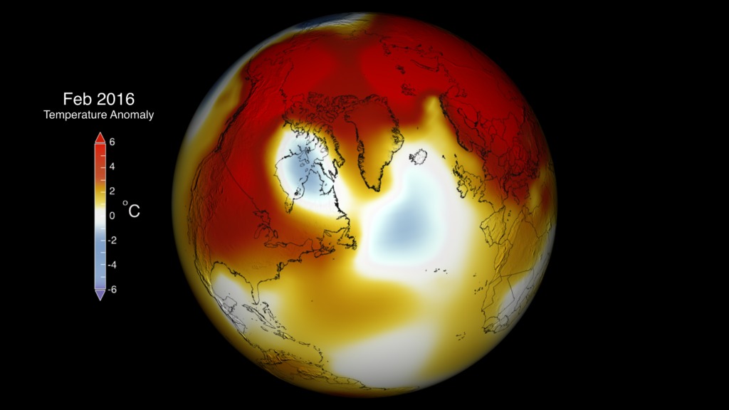
Global Temperature Anomalies from January 2016
This visualization shows the anomalously warm month of January 2016. Reds show areas that are warmer than normal and blue shows regions that are colder than normal.
Weather dynamics often affect regional temperatures, so not every region on Earth experienced record average temperatures last year. This data visualization of NASA's Goddard Institute for Space Studies (GISS) Global temperature anomalies for January of 2016 show warmer than averag temperatures in red and colder than average temperatures in blue. The extremely warm arctic temperatures contributed to a new record low sea ice for January.
For more information on the GISTEMP, see the GISTEMP analysis website located at: http://data.giss.nasa.gov/gistemp/
GISS Temperature Anomaly colorbar

This is the same frame sequence without the colorbar and title overlays.
Credits
Please give credit for this item to:
NASA/Goddard Space Flight Center Scientific Visualization Studio
Data provided by Robert B. Schmunk (NASA/GSFC GISS)
-
Scientists
-
Gavin A. Schmidt
(NASA/GSFC GISS)

-
Robert B Schmunk
(SIGMA Space Partners, LLC.)
-
Reto A. Ruedy
(SIGMA Space Partners, LLC.)
-
Gavin A. Schmidt
(NASA/GSFC GISS)
-
Producer
- Michelle Handleman (USRA)
-
Data visualizer
- Lori Perkins (NASA/GSFC)
Series
This page can be found in the following series:Datasets used
-
GISTEMP [GISS Surface Temperature Analysis (GISTEMP)]
ID: 585The GISS Surface Temperature Analysis version 4 (GISTEMP v4) is an estimate of global surface temperature change. Graphs and tables are updated around the middle of every month using current data files from NOAA GHCN v4 (meteorological stations) and ERSST v5 (ocean areas), combined as described in our publications Hansen et al. (2010), Lenssen et al. (2019), and Lenssen et al. (2024).
Credit: Lenssen, N., G.A. Schmidt, M. Hendrickson, P. Jacobs, M. Menne, and R. Ruedy, 2024: A GISTEMPv4 observational uncertainty ensemble. J. Geophys. Res. Atmos., 129, no. 17, e2023JD040179, doi:10.1029/2023JD040179.
This dataset can be found at: https://data.giss.nasa.gov/gistemp/
See all pages that use this dataset
Note: While we identify the data sets used on this page, we do not store any further details, nor the data sets themselves on our site.
Related
- ID: 4441
 Visualization
Used as a Source In
- ID: 12178
 Produced Video
Release date
This page was originally published on Friday, March 25, 2016.
This page was last updated on Sunday, January 5, 2025 at 10:59 PM EST.