Visualizations: A NASA Eye View of Our Earth
This gallery was created for Earth Science Week 2015 and beyond. It includes a quick start guide for educators and first-hand stories (blogs) for learners of all ages by NASA visualizers, scientists and educators. We hope that your understanding and use of NASA's visualizations will only increase as your appreciation grows for the beauty of the science they portray, and the communicative power they hold. Read all the blogs and find educational resources for all ages at: the Earth Science Week 2015 page.
Nearly every time I give a talk at the Hyperwall — a genius NASA creation which combines 9 to 15 high definition screens together to show amazing visualizations, pictures, movies and more — I always like to start with the GEOS-5 model of aerosols. This visualization shows how different types of aerosols (black and organic carbon, sea salt, dust, and sulfates) move around our planet. From this mesmerizing movie, you can see where dust storms originate from the Sahara, where fires in the Amazon are spewing black carbon into the atmosphere and how sea salt is spiraling around the southern oceans in huge bands.
The funny thing is that this visualization has very little to do with my own research... I just think it is really cool and most people agree with me! By getting them engaged through this visualization, they quickly see how our Earth system is interconnected and how a dust storm over China could actually impact them in their own backyards in the U.S.
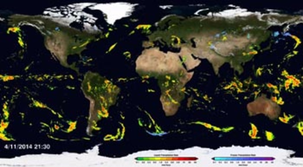
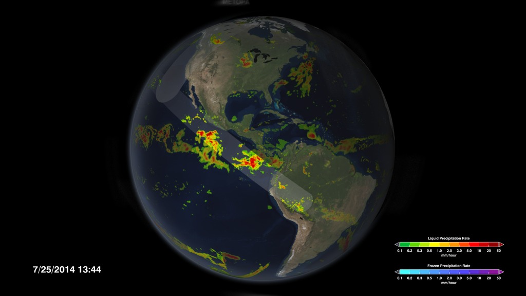
As a scientist, I always get excited when someone asks me about my work with the Global Precipitation Measurement (GPM) mission. Usually when I start describing how the GPM Core satellite measures rainfall and why it's important, I do a lot of hand waving. Sometimes I try to describe what we can do with satellites with a metaphor or two. Those are all helpful in painting a picture. But what really seems to make the point is when I pull up a particular visualization of a dozen or so different satellites all taking precipitation measurements over the globe within the same 3-hour window. With a short movie you can see how we can get a global picture of rain and snow everywhere around the world within a few hours!
This visualization speeds up time and merges ten satellite data swaths to show a continuous animation of changing rain and snowfall. The ten satellites are part of the GPM Constellation.
For more information on this visualization, click here.
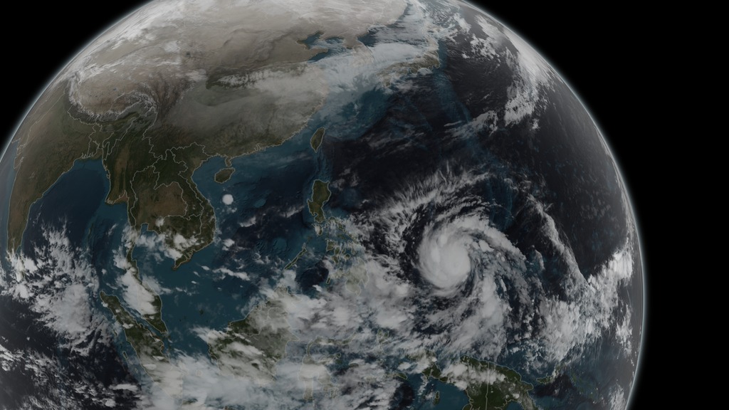
Another thing visualizations can do is to take you into a place where you will never be able to go... like inside a hurricane! Imagine if you could see a storm from the inside out. Planes can fly above them and people who are at the wrong place and wrong time can feel a hurricane’s force on the ground, but what about when the storm is growing off the coast of Africa? Or when it's changing from a small cluster of thunderstorms into a Category 3 storm with an eye visible from the International Space Station?
Satellites can provide us with the key measurements that tell us where the storm is, how much rain is falling, and the data that are used in hurricane forecast models to estimate where the storms may go. But a visualization of that data can introduce that storm to the public. The visualization makes anyone a hurricane explorer, taking them inside the hurricane to see the intense rainfall in the eye wall and the spiraling rain bands from the comfort of their own home.
On December 5, 2014 the GPM mission's Core Observatory flew over Typhoon Hagupit as it headed towards the Philippines. The GPM Microwave Imager sees through the tops of clouds to observe how much and where precipitation occurs, and the Dual-frequency Precipitation Radar observes precise details of precipitation in 3-dimensions. Precipitation rates are represented by colors in the visualization.
For more information on this visualization, click here.
A final thing I want people to know about visualizations is that they don't happen in the click of a mouse. Professional visualization teams agonize over converting gigabytes of satellite data into a 10 second visualization or argue about how to show the hurricane's "best side." I've seen (well, more participated in) lively discussions between scientists and visualizers about what color scheme to use and what satellite overpass shows the sheer power of the storm.
This is what makes NASA so great. I can sit next to a world-renowned hurricane expert, a highly skilled visualizer and a satellite data provider, and we can all work together (and argue) to tell a compelling story to the public through a visualization.
If you are interested in any or all parts of that story, from data management to Earth science to visualization, here are my recommendations: 1) Make sure to take math and science classes; 2) Try computer programming and maybe art or graphic design; 3) Lastly, seek out ways to get involved with NASA and Earth science.
The possibilities are endless and there are so many ways that you can get engaged with the great science, computer science and visualizations that are done inside and outside the walls of NASA. For more great visualizations about rainfall and hurricanes, be sure to check out the GPM Gallery.
-- Dalia Kirschbaum, Research Physical Scientist (NASA Goddard Space Flight Center)
 Mission Applications Scientist. When she’s not working, she enjoys spending time with her family, running and cooking.")
Dr. Dalia Kirschbaum earned her M.S. and Ph.D. from the Environmental Sciences Department at Columbia University. Her research interests are centered on natural hazard assessment using remotely sensed information, focusing on rainfall-triggered landslide hazard assessment and modeling. Dalia also currently serves as the (GPM) Mission Applications Scientist. When she’s not working, she enjoys spending time with her family, running and cooking.
Are you a student interested in working with NASA? Check out student internships, fellowships, scholarships and other opportunities at NASA OSSI.
Love hands-on science? Want to contribute real scientific data that scientists and TV meteorologists use every day? Join "CoCoRaHS", a volunteer network of weather observers of all ages and backgrounds working together to measure and map precipitation (rain, hail and snow) in their local communities.
For More Information
See the following sources:
Credits
Please give credit for this item to:
NASA's Scientific Visualization Studio
-
Author
- Dalia B Kirschbaum (NASA/GSFC)
-
Project support
- Leann Johnson (Global Science and Technology, Inc.)
Related
- ID: 11832
- ID: 4283
 Visualization
 - ID: 4248
 Visualization
Release date
This page was originally published on Friday, October 2, 2015.
This page was last updated on Wednesday, May 3, 2023 at 1:49 PM EDT.