Joaquin 360
Visualization of Tropical Storm Joaquin on September 29, 2015, just before the storm intensified into a hurricane. Visualization depicts a full 360 degree view of the storm.
Joaquin became a tropical storm Monday evening (EDT) midway between the Bahamas and Bermuda and has now formed into a hurricane. Joaquin is the 3rd hurricane of the 2015 season, though it could be the first to impact the US East Coast.
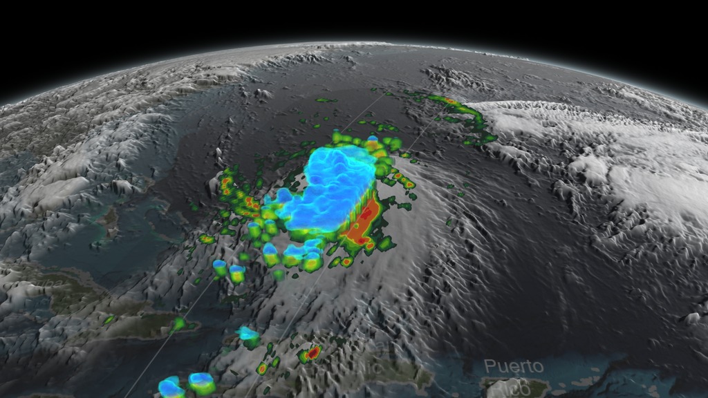
This visualization shows a 3D view of Joaquin via GPM's Dual-frequency Precipitation Radar on September 29th, 2015 21:39Z. The visualization shows a large area of very intense rain with rain rates ranging from around 50 to 132 mm/hr (~2 to 5 inches) just to the right of the center. This is a strong indication that large amounts of heat are being released into the storm's center, fueling its circulation and providing the means for its intensification. Associated with the area of intense rain is an area of tall convective towers with tops reaching above 16 km. Part of the snow aloft (in blue shades) extends as an anvil across the western part of the storm.This feature indicates that vertical wind shear (difference of winds with height) is strong, and can serve to rip a storm apart..

Print resolution still of Tropical Storm Joaquin showing a side view of the internal precipitation structure. The areas in blue are frozen precipitation. Areas in green and red are liquid precipitation.
Print resolution still of Tropical Storm Joaquin showing a side view of the internal precipitation structure. The areas in blue are frozen precipitation. Areas in green and red are liquid precipitation.
Print resolution still of Tropical Storm Joaquin showing a side view of the internal precipitation structure. The areas in blue are frozen precipitation. Areas in green and red are liquid precipitation.
Color bar for liquid precipitation rates (ie, rain rates). Shades of green represent low amounts of liquid precipitation, whereas shades of red represent high amounts of precipitation.
Color bar for frozen precipitation rates (ie, snow rates). Shades of cyan represent low amounts of frozen precipitation, whereas shades of purple represent high amounts of precipitation.
Credits
Please give credit for this item to:
NASA's Scientific Visualization Studio
-
Visualizers
-
Kel Elkins
(USRA)

-
Alex Kekesi
(Global Science and Technology, Inc.)
-
Kel Elkins
(USRA)
-
Scientists
- Gail Skofronick Jackson (NASA/GSFC)
-
George Huffman
(NASA/GSFC)
- Dalia B Kirschbaum (NASA/GSFC)
-
Producers
- Rani Gran (NASA/GSFC)
- Ryan Fitzgibbons (USRA)
-
Writer
- Stephen Lang (NASA/GSFC)
Missions
This page is related to the following missions:Datasets used
-
Rain Rates (Surface Precipitation) [GPM: GMI]
ID: 822Credit: Data provided by the joint NASA/JAXA GPM mission.
See all pages that use this dataset -
Volumetric Precipitation data (Ku) [GPM: DPR]
ID: 830Credit: Data provided by the joint NASA/JAXA GPM mission.
See all pages that use this dataset
Note: While we identify the data sets used on this page, we do not store any further details, nor the data sets themselves on our site.
Related
- ID: 4367
 Visualization
Release date
This page was originally published on Thursday, October 1, 2015.
This page was last updated on Sunday, January 5, 2025 at 10:49 PM EST.