Notes from the Underground
This gallery was created for Earth Science Week 2015 and beyond. It includes a quick start guide for educators and first-hand stories (blogs) for learners of all ages by NASA visualizers, scientists and educators. We hope that your understanding and use of NASA's visualizations will only increase as your appreciation grows for the beauty of the science they portray, and the communicative power they hold. Read all the blogs and find educational resources for all ages at: the Earth Science Week 2015 page.
I'm a hydrologist, which means I study how water moves around on land. Well, “on land” isn’t exactly right. It turns out that most of the interesting processes happen beneath the land surface, hidden from view.
You might think, for example, that rivers fill from above — it rains and the water that doesn't sink into the ground runs off into the rivers. But in fact, about 80 percent of the water in rivers comes from underground. Rain soaks into the ground, adding water to the water table. When the water table rises to where it intersects with the land surface (on the side of a hill or even gently sloping "flat" land), the water penetrates through to the surface and runs downhill. Eventually, the flowing water carves out a ditch and you have a stream and ultimately a river.
Let me show you what I mean:

Left: The top of the underground water table is below the surface of the land.
Right: The water table has risen to where it can seep through the land surface to form a stream or river.
As you see, a picture makes the idea a lot clearer. This particular illustration is conceptual. It gets the general idea across but doesn’t contain precise information such as the height of the water table or the amount of water flowing down the stream.
Here is an example of a visualization I might use if I wanted to convey specific information to other scientists:
A graph comparison of water storage to river discharge of the Missouri River in 2010 and 2011.
With just a few lines and dots, this graph presents a lot of information about the Missouri River in 2010 and 2011. If you’re not used to seeing graphs like this, it might not mean much to you at first. But scientists would look at this and understand immediately. Here’s what it shows:
The X-axis (the horizontal line at the bottom) represents the height of the water table. The Y-axis (the vertical line on the left) represents the amount of water flowing through the river. Each dot shows an actual point in time when the water table was at a certain height and a certain amount of water was in the river. The black curved line represents an average of the dots.
Basically, this graph shows that as the underground water table got higher and higher, the amount of water flowing in the river grew larger and larger. When the water table reached about 75 cubic kilometers, the amount of water in the river started increasing very rapidly. This tells scientists that the ground became saturated at that point, unable to hold any more water.
Some of the dots are off the curved line because much of the water was locked up as snow and ice in the winter and spring and then melted in June, July and August, driving the amount of water in the river way up.
So although a graph like this might seem confusing to someone who is unfamiliar with looking at information this way, it actually makes the information much easier to understand once you know how to read it.
I use visualization at every stage of research, both to help myself get a grip on the data and to share my work with others.
Data-based visualizations can also take the form of pictures. JPL, the NASA center where I work, is having an Open House for the public at the beginning of Earth Science Week this year. One of the items we’re handing out is a "lenticular card," a picture that animates when you pivot it from side to side.
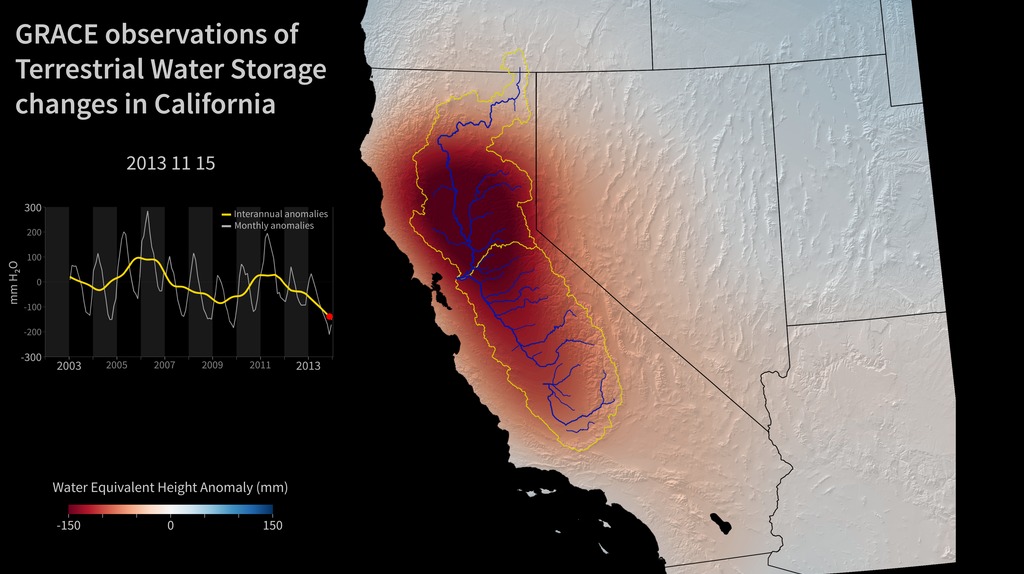
Three of the 12 images used in the GRACE lenticular card, which show the drying out of California’s aquifers based on the decreased amount of gravity they exert.
The animation actually consists of 12 separate images created from data provided by NASA's GRACE mission, which uses a pair of satellites in Earth orbit to measure changes in the planet's gravity field. Those changes are mostly caused by the movement of large amounts of water and ice, and the visualization clearly shows how California's aquifers (underground regions where water is concentrated) have been drying up during the 12 years that GRACE has been in operation.
Without the GRACE satellites, we would have had to drill and monitor millions of wells to get this information. And without visualizations like this, the GRACE data would just be hard-to-comprehend lists of numbers.
We live in an age in which technology enables us to collect data at a breathtaking rate. NASA currently has 15 Earth-orbiting missions producing the largest data stream of Earth observations in the history of mankind. Visualizations are what enable us to understand and use that data.
So what’s my advice to students thinking about careers in science? Follow your interests. And draw pictures!
-- JT Reager, Hydrologist (NASA Jet Propulsion Laboratory)

JT Reager received a PhD in Earth System Science from the University of California, Irvine. He has worked at NASA’s Jet Propulsion Laboratory since 2014, helping to increase understanding of how water cycles through the environment. He looks forward to the day when his two-year-old daughter, Elena, is old enough to take scuba diving.
For More Information
Credits
Please give credit for this item to:
NASA's Scientific Visualization Studio
-
Author
- John Thomas Reager (NASA/JPL CalTech)
-
Project support
- Leann Johnson (Global Science and Technology, Inc.)
Related
- ID: 4364
- ID: 30521
 Hyperwall Visual
Release date
This page was originally published on Tuesday, September 29, 2015.
This page was last updated on Wednesday, May 3, 2023 at 1:49 PM EDT.