Global Temperature Anomalies from November 2014
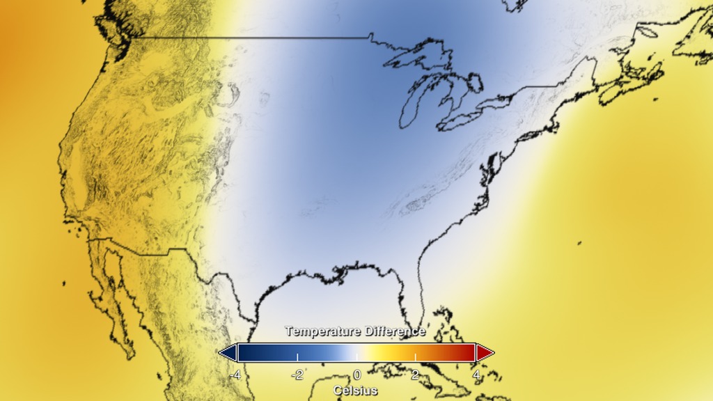
This visualization of global surface temperatures from November 2014 starts with a local view of the United States and then zooms out to see the global color-coded map. Blue represents colder then normal temperatures and red represents warmer.
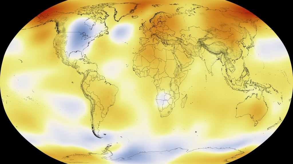
Residents of the eastern United States know that the temperature was colder then the average temperature in November 2014. This data visualization of NASA's Goddard Institute for Space Studies (GISS) Global temperature anomalies for January of 2014 show the United States and then zooms out to show the global picture. Temperature anomalies indicate how much warmer or colder it is than normal for a particular place and time. For more information on the GISTEMP, see the GISTEMP analysis website located at: http://data.giss.nasa.gov/gistemp/

Temperature Difference Colorbar
This visualization sequence contains the same information without the colorbar overlay.
For More Information
Credits
Please give credit for this item to:
NASA/Goddard Space Flight Center Scientific Visualization Studio
Data provided by Robert B. Schmunk (NASA/GSFC GISS)
-
Scientists
-
Gavin A. Schmidt
(NASA/GSFC GISS)

-
Robert B Schmunk
(SIGMA Space Partners, LLC.)
-
Reto A. Ruedy
(SIGMA Space Partners, LLC.)
-
Gavin A. Schmidt
(NASA/GSFC GISS)
-
Producers
- Michelle Handleman (USRA)
- Joy Ng (USRA)
-
Writer
- Patrick Lynch (Wyle Information Systems)
-
Data visualizer
- Lori Perkins (NASA/GSFC)
Series
This page can be found in the following series:Datasets used
-
GISTEMP [GISS Surface Temperature Analysis (GISTEMP)]
ID: 585The GISS Surface Temperature Analysis version 4 (GISTEMP v4) is an estimate of global surface temperature change. Graphs and tables are updated around the middle of every month using current data files from NOAA GHCN v4 (meteorological stations) and ERSST v5 (ocean areas), combined as described in our publications Hansen et al. (2010), Lenssen et al. (2019), and Lenssen et al. (2024).
Credit: Lenssen, N., G.A. Schmidt, M. Hendrickson, P. Jacobs, M. Menne, and R. Ruedy, 2024: A GISTEMPv4 observational uncertainty ensemble. J. Geophys. Res. Atmos., 129, no. 17, e2023JD040179, doi:10.1029/2023JD040179.
This dataset can be found at: https://data.giss.nasa.gov/gistemp/
See all pages that use this dataset
Note: While we identify the data sets used on this page, we do not store any further details, nor the data sets themselves on our site.
Related
- ID: 11729
 Produced Video
 - ID: 11727
 Produced Video
 - ID: 11730
 Produced Video
 - ID: 11731
- ID: 4252
 Visualization
 - ID: 4255
Release date
This page was originally published on Friday, January 16, 2015.
This page was last updated on Wednesday, May 3, 2023 at 1:50 PM EDT.