A newer version of this visualization is available.
2014 Update Aqua/AIRS Carbon Dioxide with Mauna Loa Carbon Dioxide
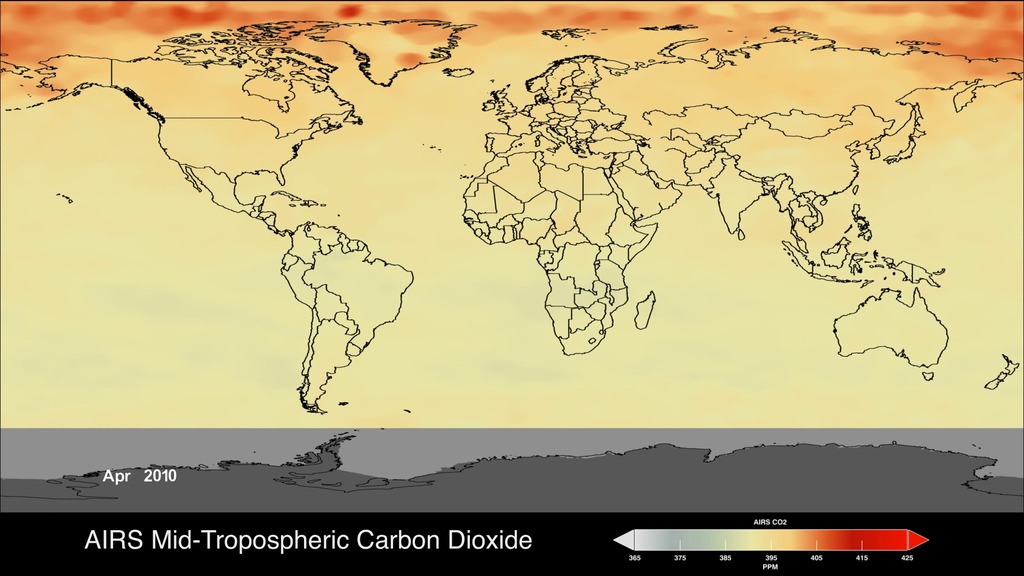
This visualization is a time-series of the global distribution and variation of the concentration of mid-tropospheric carbon dioxide observed by the Atmospheric Infrared Sounder (AIRS) on the NASA Aqua spacecraft. For comparison, it is overlain by a graph of the seasonal variation and interannual increase of carbon dioxide observed at the Mauna Loa, Hawaii observatory.
The graph shows data, commonly called the Keeling Curve, from the Scripps measurements of monthly carbon dioxide concentration at Mauna Loa Observatory. The collection of this data was started by C. David Keeling of the Scripps Institution of Oceanography in March of 1958 at a facility of the National Oceanic and Atmospheric Administration [Keeling, 1976].
The two most notable features of this visualization are the seasonal variation of carbon dioxide and the trend of increase in its concentration from year to year. The global map clearly shows that the carbon dioxide in the Northern Hemisphere peaks in April-May and then drops to a minimum in September-October. Although the seasonal cycle is less pronounced in the Southern Hemisphere it is opposite to that in the Northern Hemisphere. This seasonal cycle is governed by the growth cycle of plants. The Northern Hemisphere has the majority of the land masses, and so the amplitude of the cycle is greater in that hemisphere. The overall color of the map shifts toward the red with advancing time due to the annual increase of carbon dioxide.
The concentration of carbon dioxide in the mid-troposphere lags the concentration found at the surface as mixing from the lower to upper altitudes usually takes days to weeks.
More information about AIRS can be found at http://airs.jpl.nasa.gov.
More information about the carbon dioxide concentration at Mauna Loa Observatory can be found at http://scrippsco2.ucsd.edu/
This visualization is a time-series of the global distribution and variation of the concentration of mid-tropospheric carbon dioxide observed by the Atmospheric Infrared Sounder (AIRS) on the NASA Aqua spacecraft. For comparison, it is overlain by a graph of the seasonal variation and interannual increase of carbon dioxide observed at the Mauna Loa, Hawaii observatory. Please note, Mid-Tropospheric carbon dioxide shows a steady increase in atmospheric carbon dioxide concentrations over time.
This video is also available on our YouTube channel.
This frame set has the same data without the colorbar and title overlay.
This frame sequence has only the Mauna Loa Carbon Dioxide graph overlay.
This frame sequence is of just the corresponding date overlay.
This frame sequence is designed for the Science On a Sphere device. It contains AIRS tropospheric carbon dioxide for the 2000 to 2014 time period and is match rendered with the date frame sequence and the graph overlay frame sequence.
This frame sequence contains the monthly AIRS tropospheric Carbon Dioxide images starting from September of 2002 and ending with May of 2014.

AIRS Mid-Tropospheric Carbon Dioxide colorbar
Credits
Please give credit for this item to:
NASA/Goddard Space Flight Center Scientific Visualization Studio
-
Animators
- Lori Perkins (NASA/GSFC)
-
Greg Shirah
(NASA/GSFC)

-
Scientists
- Tom Pagano (NASA/JPL CalTech)
- Edward Olsen (NASA/JPL CalTech)
-
Project support
- Sharon Ray (NASA/JPL CalTech)
Series
This page can be found in the following series:Datasets used
-
Wind [Aqua: AIRS]
ID: 589 -
Keeling Curve (In Situ CO2 Monthly)
ID: 671
Note: While we identify the data sets used on this page, we do not store any further details, nor the data sets themselves on our site.
Newer Versions
- ID: 4533
 Visualization
Release date
This page was originally published on Monday, June 30, 2014.
This page was last updated on Sunday, October 6, 2024 at 12:06 AM EDT.