Long-term Global Warming trend, 2018 update

Global temperature anomaly for 2018
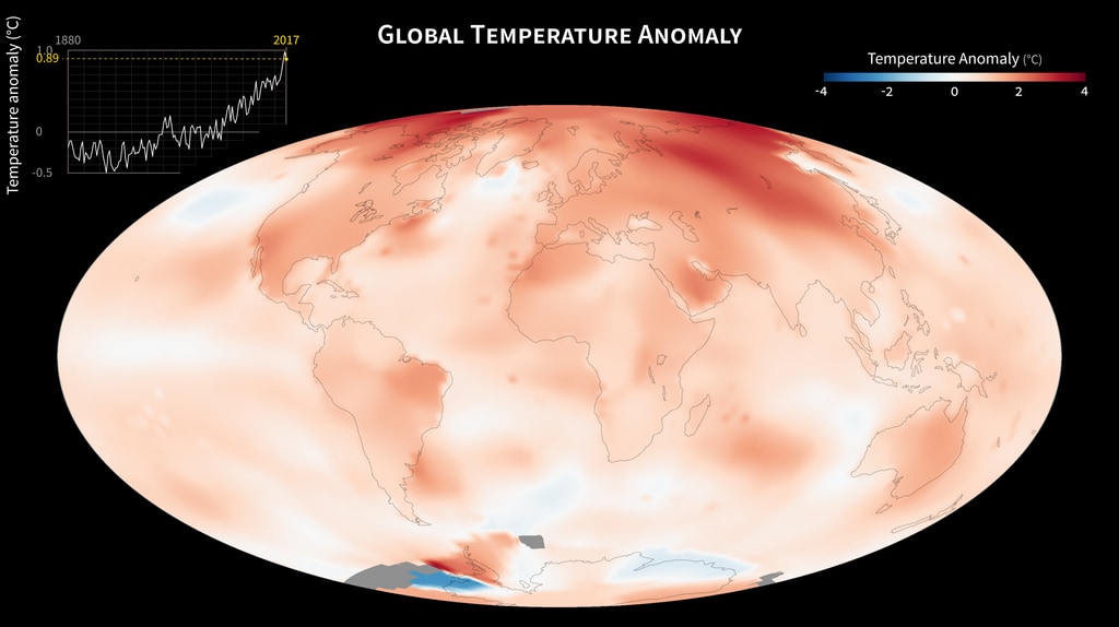
The world is getting warmer. This map shows global, annual temperature anomalies from 1880 to 2018 based on analysis conducted by NASA’s Goddard Institute for Space Studies (GISS). Red and blue shades show how much warmer or cooler a given area was compared to an averaged base period from 1951 to 1980. The graph shows yearly, global GISS temperature anomaly data from 1880 to 2018. Though there are minor variations from year to year, the general trend shows rapid warming in the past few decades, with the last decade being the warmest. To conduct its analysis, GISS uses publicly available data from approximately 6300 meteorological stations around the world; ship-based and satellite observations of sea surface temperature; and Antarctic research station measurements. These three datasets are loaded into a computer analysis program that calculates trends in temperature anomalies relative to the annual average temperature from 1951 to 1980. Generally, warming is greater over land than over the oceans because water is slower to absorb and release heat. Warming may also differ substantially within specific landmasses and ocean basins.
Global temperature anomalies from 1880 to 2018
Global temperature anomalies from 1950 to 2018
For More Information
Credits
Please give credit for this item to:
NASA's Goddard Space Flight Center, NASA Goddard Institute for Space Studies
-
Visualizer
- Marit Jentoft-Nilsen (Global Science and Technology, Inc.)
-
Writer
- Heather Hanson (Global Science and Technology, Inc.)
Datasets used
-
GISTEMP [GISS Surface Temperature Analysis (GISTEMP)]
ID: 585The GISS Surface Temperature Analysis version 4 (GISTEMP v4) is an estimate of global surface temperature change. Graphs and tables are updated around the middle of every month using current data files from NOAA GHCN v4 (meteorological stations) and ERSST v5 (ocean areas), combined as described in our publications Hansen et al. (2010), Lenssen et al. (2019), and Lenssen et al. (2024).
Credit: Lenssen, N., G.A. Schmidt, M. Hendrickson, P. Jacobs, M. Menne, and R. Ruedy, 2024: A GISTEMPv4 observational uncertainty ensemble. J. Geophys. Res. Atmos., 129, no. 17, e2023JD040179, doi:10.1029/2023JD040179.
This dataset can be found at: https://data.giss.nasa.gov/gistemp/
See all pages that use this dataset
Note: While we identify the data sets used on this page, we do not store any further details, nor the data sets themselves on our site.
Older Versions
- ID: 30974
 Hyperwall Visual
Release date
This page was originally published on Sunday, March 31, 2019.
This page was last updated on Monday, February 3, 2025 at 12:49 AM EST.