A newer version of this visualization is available.
The Solar 'Constant' - Faculae vs. Sunspots
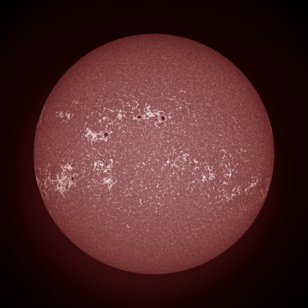
Three views of the Sun showing different levels of solar activity. The color table has been altered to enhance the appearance of the faculae (white regions) which are hotter than sunspots (red-black regions) and whose greater total area contribute to increasing the solar flux reaching the Earth.

Low solar activity - October 28, 1998
Moderate solar activity - April 27, 2002
High solar activity - March 28, 2001
Credits
Please give credit for this item to:
NASA/Goddard Space Flight Center
Scientific Visualization Studio. Source data courtesy of HAO & NSO PSPT project team. HAO is a division of the National Center for Atmospheric Research which is supported by the National Science Foundation.Special thanks to Vanessa George (University of Colorado/LASP) and Randy Meisner(Michigan State University)
-
Animator
- Tom Bridgman (Global Science and Technology, Inc.)
-
Scientists
- William R. Ochs (NASA/GSFC)
- Robert F. Cahalan (NASA/GSFC)
- Gary Rottman (University of Colorado/LASP)
Missions
This page is related to the following missions:Series
This page can be found in the following series:Datasets used
-
[PSPT: CaIIK camera]
ID: 80 -
[SORCE]
ID: 97The SORCE mission (launched January 23, 2003) will study the variability of the Sun and its impact on the Earth"s Climate.
See all pages that use this dataset
Note: While we identify the data sets used on this page, we do not store any further details, nor the data sets themselves on our site.
Newer Versions
- ID: 4892
 Visualization
Release date
This page was originally published on Thursday, January 2, 2003.
This page was last updated on Wednesday, May 3, 2023 at 1:57 PM EDT.