NASA, ESA, JAXA Release Global View of COVID-19 Impacts
NASA, ESA (European Space Agency) and JAXA (Japan Aerospace Exploration Agency) have created a dashboard of satellite data showing impacts on the environment and socioeconomic activity caused by the global response to the coronavirus (COVID-19) pandemic.
The dashboard will be released on Thursday, June 25 during a tri-agency media briefing. The briefing speakers are:
• Josef Aschbacher, director of ESA Earth Observation Programmes
• Thomas Zurbuchen, associate administrator of NASA’s Science Mission Directorate
• Koji Terada, vice president and director general for the Space Technology Directorate at JAXA
• Shin-ichi Sobue, project manager for JAXA’s ALOS-2 mission
• Ken Jucks, program scientist for NASA’s OCO-2 and Aura missions
• Anca Anghelea, open data scientist, ESA Earth observation programmes

JOSEF ASCHBACHER -- Graphic 1
ESA’s Earth Observation Programmes can be grouped into three main categories: operational Sentinel satellites in the context of the European Copernicus Programme, the scientific Earth Explorers, and the meteorological missions.
 concentrations for the time period from March 13 to April 13, 2020, to March-April 2019. Due to reduced industrial and social activity, the maps show a clear drop in atmospheric NO2 concentrations over Europe reaching over 50% over some of the main urban areas.")
JOSEF ASCHBACHER -- Graphic 2
These maps compare the average nitrogen dioxide (NO2) concentrations for the time period from March 13 to April 13, 2020, to March-April 2019. Due to reduced industrial and social activity, the maps show a clear drop in atmospheric NO2 concentrations over Europe reaching over 50% over some of the main urban areas.

THOMAS ZURBUCHEN -- Graphic 1
International collaboration has long been an important part of Earth Science at NASA. Twelve of NASA’s 39 Earth-observing missions currently in orbit or in development involve international collaborations.
 System supported by NASA. This map shows the amount of surface moisture in soil across the United States from June 12-21. Red areas have dry soil conditions; green/blue areas are much wetter.")
THOMAS ZURBUCHEN -- Graphic 2
One type of agricultural productivity information that will be added to the dashboard in the weeks ahead comes from the Global Agriculture Monitoring (GLAM) System supported by NASA. This map shows the amount of surface moisture in soil across the United States from June 12-21. Red areas have dry soil conditions; green/blue areas are much wetter.

KOJI TERADA -- Graphic 1
Data from the JAXA Earth-observing satellites GOSAT, ALOS-2 and GCOM-C are contributing to the dashboard to monitor changes in climate, the environment, and socio-economic activities.

KOJI TERADA -- Graphic 2
JAXA’s Earth-observing satellite fleet allows us to monitor a variety of physical parameters on Earth's surface and atmosphere globally and periodically.
 Red rectangle area shows parking area occupied by new cars at an automobile factory near Beijing airport in 2019 and 2020. In the period of the lockdown, the density of new cars has dropped significantly. (Right) A different example from Singapore port show the density of cars dropping from the end of April. The government decided to use that parking area for temporary accommodations for COVID-19 patients.")
SHIN-ICHI SOBUE -- Graphic 1
Using JAXA’s ALOS-2 and European Sentinel-1, cars in parking area near factories have been observed over time to monitor changes in car density. (Left) Red rectangle area shows parking area occupied by new cars at an automobile factory near Beijing airport in 2019 and 2020. In the period of the lockdown, the density of new cars has dropped significantly. (Right) A different example from Singapore port show the density of cars dropping from the end of April. The government decided to use that parking area for temporary accommodations for COVID-19 patients.

SHIN-ICHI SOBUE -- Graphic 2>
A NASA-NOAA satellite produces images of Earth at night that helps monitor light intensity to estimate energy use and economic activity. When San Francisco began to shelter in place in mid-March, city night lights detected from space did not change drastically. However, the University of California, San Francisco Medical Center brightened from January to April.
 abundances for March from the last four years and for 2020 from the OMI instrument on the NASA Aura satellite. The 2020 reductions in observed NO2 correspond with the reductions in fossil fuel emissions during that time frame in the New York City metropolitan area.")
KEN JUCKS -- Graphic 1
Nitrogen dioxide (NO2) abundances for March from the last four years and for 2020 from the OMI instrument on the NASA Aura satellite. The 2020 reductions in observed NO2 correspond with the reductions in fossil fuel emissions during that time frame in the New York City metropolitan area.
 abundances from a model that is highly constrained by data from the NASA OCO-2 mission from the previous three years compared to 2020 for three separate times. These very small changes are expected. The timing of the low CO2 over Asia, then Europe, then the United States correspond with the reductions in fossil fuel burning from the slowdown in economies over these time frames.")
KEN JUCKS -- Graphic 2
Changes in carbon dioxide (CO2) abundances from a model that is highly constrained by data from the NASA OCO-2 mission from the previous three years compared to 2020 for three separate times. These very small changes are expected. The timing of the low CO2 over Asia, then Europe, then the United States correspond with the reductions in fossil fuel burning from the slowdown in economies over these time frames.

KEN JUCKS -- Graphic 3
Differences in CO2 concentrations between the lower and upper troposphere derived from the JAXA GOSAT satellite as derived from repeated focused observations over Beijing over the past four-plus years. These plots show that the lower troposphere abundances are lower than prior years through March but they appear to recover in April.

ANCA ANGHELEA -- Graphic 1
In Europe, the COVID19 outbreak severely restricted the movement of seasonal agricultural workers, which affected the highly labor-intensive harvesting of asparagus in Germany. Satellite observations allowed for monitoring continuously the cultivated white asparagus fields documenting a 20-30% lower area in March and April during the lockdown in Brandenburg.

ANCA ANGHELEA -- Graphic 2
The dashboard design and development evolved through the collaboration between the triagency engineering and science teams. A wide range of satellite Earth observation data were processed using established scientific protocols and innovative artificial intelligence methods to generate the dashboard information products. Cloud computing, datacubes and shared APIs were key enabling technologies.
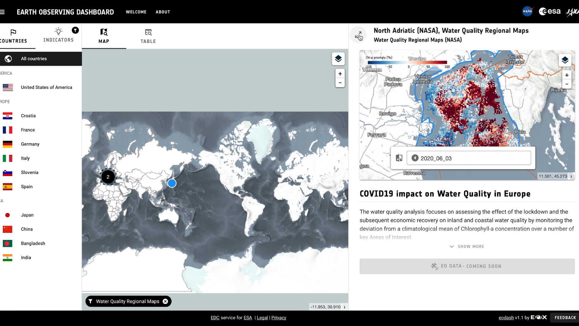
, or from the table view. Spotlight Areas are marked on the map, with a number shown of how many indicators are available in each area. The right panel displays the indicator data and provides additional information.")
ANCA ANGHELEA -- Graphic 3
COVID-19 Earth Observation Dashboard users can filter and select data from Countries and Indicators lists, the map (center), or from the table view. Spotlight Areas are marked on the map, with a number shown of how many indicators are available in each area. The right panel displays the indicator data and provides additional information.
Credits
Please give credit for this item to:
NASA's Goddard Space Flight Center
-
Editor
- Kathryn Mersmann (USRA)
-
Public affairs officer
- Stephen E. Cole (NASA/HQ)
Related
- ID: 13650
Release date
This page was originally published on Thursday, June 25, 2020.
This page was last updated on Wednesday, May 3, 2023 at 1:44 PM EDT.