"Tracking El Nino" Live Shots Resource Page
- Edited by:
- Michael Randazzo and
- Stuart A. Snodgrass
- Scientific consulting by:
- George Huffman and
- Lesley Ott
- Produced by:
- Claire Andreoli and
- Michelle Handleman
- View full credits
Movies
- WEBM_12152_George_Huffman_El_Nino_LS.webm (960x540) [102.1 MB]
- 12152_George_Huffman_El_Nino_LS.mov (1280x720) [2.5 GB]
- 12152_George_Huffman_El_Nino_LS.mp4 (1280x720) [384.1 MB]
Captions
- 12152_George_Huffman_El_Nino_LS.en_US.vtt [4.5 KB]
Images
- 12152_George_Huffman_El_Nino_LS_print.jpg (1024x576) [122.4 KB]
Interview with NASA Scientist George Huffman
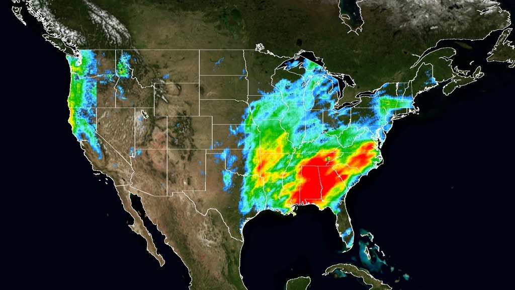
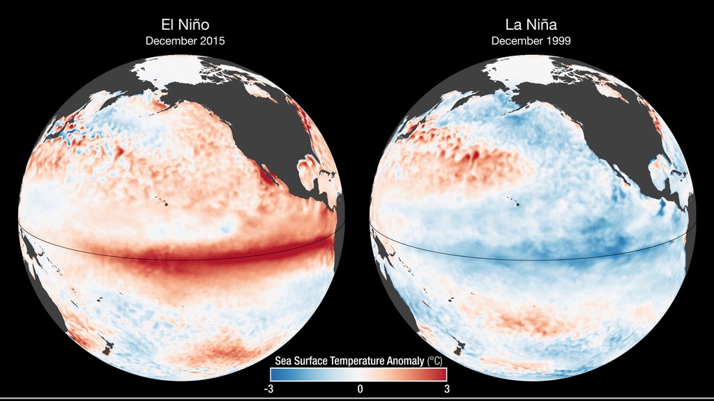
NASA scientists discuss how NASA is studying this year’s El Niño, one of the strongest on record. NASA scientists will show your viewers how Earth’s land, ocean and atmosphere are responding to El Niño-driven changes.
Suggested Questions:
1. What can you tell us about this year’s El Niño?
2. What kind of environmental changes are we seeing from El Niño?
3. Will this year’s El Niño bring a relief to the droughts in California?
4. Could this year’s El Nino turn into a La Nina, and what would that mean for us?
5. Where can we learn more?
For more information click here.
El Niño Observations
@NASAEarth
@NASA_ES (en Español)
Interview with NASA Scientist Miguel Roman (in Spanish)
B-Roll For Spanish
What can you tell us about this year’s El Niño?
What kind of environmental changes are we seeing from El Niño?
Will this year’s El Niño bring a relief to the droughts in California?
Could this year’s El Nino turn into a La Nina, and what would that mean for us?
Where can we learn more? (with Spanish Twitter handle)
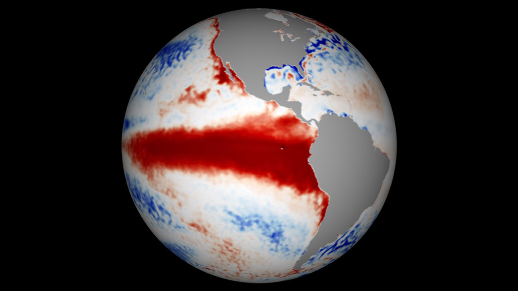
Global Precipitation Measurement mission animation
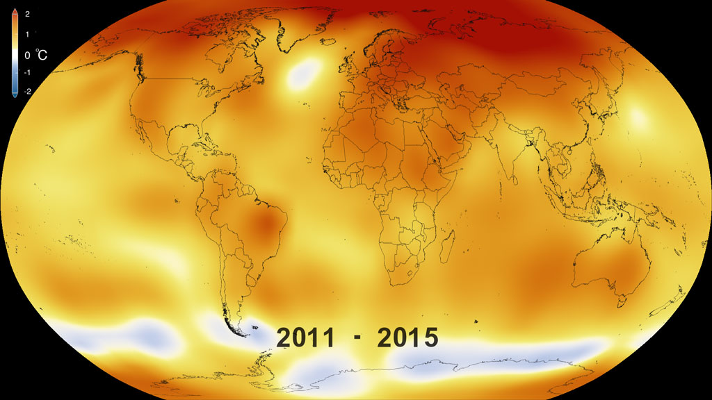
2015 warmest year on record. GISS temperature
For More Information
See nasa.gov/earth
Credits
Please give credit for this item to:
NASA's Goddard Space Flight Center
Editors
- Michael Randazzo (AIMM) [Lead]
- Stuart A. Snodgrass (KBRwyle) [Lead]
Scientists
- George Huffman (NASA/GSFC) [Lead]
- Lesley Ott (NASA/GSFC) [Lead]
- Miguel Román (USRA)
Producers
- Claire Andreoli (NASA/GSFC) [Lead]
- Michelle Handleman (KBRwyle) [Lead]
- Clare Skelly (NASA/GSFC)
- Jenny Hottle (NASA/GSFC)
- Kayvon Sharghi (USRA)
Missions
This visualization is related to the following missions:Related pages
El Niño: GMAO Daily Sea Surface Temperature Anomaly from 1997/1998 and 2015/2016
Feb. 25th, 2016
Read moreThis visualization shows how the Sea Surface Temperature Anomaly (SSTA) data and subsurface Temperature Anomaly from the 1997 El Nino year compares to the 2015 El Nino year. The visualization shows how the 1997 event started from colder-than-average sea surface temperatures – but the 2015 event started with warmer-than-average temperatures not only in the Pacific but also in in the Atlantic and Indian Oceans.This video is also available on our YouTube channel. color table for sea surface temperature anomaly and subsurface temperature anomaly in degrees celsius Visualization showing the Global Modeling and Assimilation Office(GMAO)'s Sea Surface Temperature Anomaly data and Subsurface Temperature Anomaly data from Jan 1, 2015 through Feb 14, 2016. The equator and international dateline are emphasized with a black outline. This frame sequence is the date overlay for the 2015/2016 sea surface temperature anomaly data. 2015 Date overlay for the GMAO sea surface temperature frame sequence This is the same 2015 frame sequence without the date overlay. Visualization of Sea Surface Temperature Anomaly data and subsurface temperature anomaly data from Jan 1, 1997 though Feb 14, 1998. This version has the colorbar overlay included. This is the same sequence of Sea Surface Temperature Anomaly data and subsurface temperature anomaly data without the colorbar overlay. This is the 1997 data sequence of GMAO's sea surface temperature anomaly data without the date overlay. 1997 date overlay frame sequence Since both the 1997 data and 2015 data are timed at the same rate, this is the Month overlay for both time periods Every two to seven years, an unusually warm pool of water -- sometimes two to three degrees Celsius higher than normal -- develops across the eastern tropical Pacific Ocean to create a natural short-term climate change event. This warm condition, known as El Niño, affects the local aquatic environment, but also spurs extreme weather patterns around the world, from flooding in California to droughts in Australia. In 2015 El Niño unfolded in the Pacific Ocean, as sea surface temperatures create different patterns than seen in the 1997-1998 El Niño. Computer models are just one tool that NASA scientists are using to study this large El Nino event, and compare it to other events in the past."The start of an El Niño is important," said Robin Kovach, a research scientist with the Global Modeling and Assimilation Office (GMAO) at NASA's Goddard Space Flight Center in Greenbelt, Maryland. The visualization shows how the 1997 event started from colder-than-average sea surface temperatures – but the 2015 event started with warmer-than-average temperatures not only in the Pacific but also in in the Atlantic and Indian Oceans."The '97 El Niño was much stronger in the Eastern Pacific, with much warmer water up to the coast of South America," Kovach said. In 2015, the warmest waters are instead in the Central Pacific and extend west of the International Date Line.The water temperature variations typical of El Niño are not only at the surface of the equatorial Pacific, but below the surface as well. And these variations were also different in 2015, compared to 1997. At the height of the El Niño in November, colder-than-average temperatures in the Western Pacific and warmer-than-average temperatures in the Eastern Pacific were stronger and extended deeper in 1997 than in 2015. Goddard’s computer models, with input from ocean buoys, atmospheric models, satellite data and other sources, can also simulate what ocean water temperatures could do in the coming months. The GMAO seasonal forecast, which takes 18 hours to complete, and creates more than nine terabytes of data, shows that this 2015 El Niño could be different until the end. "In the past, very strong El Niño events typically transition to neutral conditions and then a La Niña event," said Kovach. February computer model runs forecast a return to normal sea surface temperatures by June. The latest Feb 5, 2016 forecast does not yet predict below normal sea surface temperatures that would result in a large La Niña. As of Feb. 14, 2016, the latest ocean computer model shows colder-than-average water temperatures off the South American coast from Ecuador to Panama. "This current El Niño has been different so it will be interesting to see what happens in the next forecast and the coming months." For More InformationSee [http://gmao.gsfc.nasa.gov/research/highlights/](http://gmao.gsfc.nasa.gov/research/highlights/) Related pages
IMERG Rainfall Accumulation from December 2015 through February 2016
Feb. 25th, 2016
Read moreThis animation shows the accumulation of rainfall over the United States during December 2015, from the IMERG precipitation dataset. This animation shows the accumulation of rainfall over the United States during January 2016, from the IMERG precipitation dataset. This animation shows the accumulation of rainfall over the United States during the period February 1 to 16, 2016, from the IMERG precipitation dataset. This animation shows the accumulation of rainfall over the western United States during December 2015, from the IMERG precipitation dataset. This animation shows the accumulation of rainfall over the western United States during January 2016, from the IMERG precipitation dataset. This animation shows the accumulation of rainfall over the western United States during the period February 1 to 16, 2016, from the IMERG precipitation dataset. This is the colorbar for rainfall accumulation. Related pages
El Niño Rainfall and Ocean Temperature Visualizations
Feb. 25th, 2016
Read moreVisualization showing sea surface temperature (SST) anomaly data from Jan. 1, 2015 through Feb. 14, 2016. Visualization showing sea surface temperature (SST) anomaly data and subsurface temperature anomaly data from Jan. 1, 2015 through Feb. 14, 2016. Visualization showing sea surface temperature (SST) anomaly data from Jan. 1, 1997 through Feb. 14, 1998. Visualization showing sea surface temperature (SST) anomaly data and subsurface temperature anomaly data from Jan. 1, 1997 through Feb. 14, 1998. Visualization showing accumulated rainfall in the U.S. for Dec. 2015, Jan. 2016, and Feb. 1-16, 2016. Visualization showing accumulated rainfall in California for Dec. 2015, Jan. 2016, and Feb. 1-16, 2016. Visualization showing accumulated rainfall in the U.S. in December 2015. Visualization showing accumulated rainfall in the U.S. in December 2015 (with date layer and color bar). Visualization showing accumulated rainfall in the U.S. in January 2016. Visualization showing accumulated rainfall in the U.S. in January 2016 (with date layer and color bar). Visualization showing accumulated rainfall in the U.S. from February 1-16, 2016. Visualization showing accumulated rainfall in the U.S. from February 1-16, 2016 (with date layer and color bar). Visualization showing accumulated rainfall in the U.S. West in December 2015. Visualization showing accumulated rainfall in the U.S. West in December 2015 (with date layer). Visualization showing accumulated rainfall in the U.S. West in January 2016. Visualization showing accumulated rainfall in the U.S. West in January 2016 (with date layer). Visualization showing accumulated rainfall in the U.S. West from February 1-16, 2016. Visualization showing accumulated rainfall in the U.S. West from February 1-16, 2016 (with date layer). Date layer for December 2015 for accumulated rainfall visualizations. Date layer for January 2016 for accumulated rainfall visualizations. Date layer for February 1-16, 2016 for accumulated rainfall visualizations. Color bar for accumulated rainfall visualizations. Visualization showing accumulated rainfall in the U.S. West from Dec. 31, 2015 to Jan. 6, 2016. Video courtesy of Hal Pierce (SSAI/NASA GSFC). For More InformationSee [http://www.nasa.gov/feature/goddard/2016/nasa-sees-a-different-kind-of-el-nino](http://www.nasa.gov/feature/goddard/2016/nasa-sees-a-different-kind-of-el-nino) Related pages
NASA On Air: NASA's Global Hawk Flies Over El Niño Storms (2/5/2016)
Feb. 5th, 2016
Read moreLEAD: This month government scientists are making special research flights into and over the Pacific El Niño storms.1. NASA's remotely piloted Global Hawk aircraft will complete a series of high-level flights near 60,000 feet to measure the rainfall and upper level winds of the El Niño storms.2. This special research project is probing how the current El Niño’s unusually warm ocean temperatures in the equatorial Pacific are producing extreme precipitation on the West Coast, thousands of miles away.TAG: The goal of the research is help provide better warnings for the extreme weather that can accompany El Niño related storms. For More InformationSee [http://www.nasa.gov/centers/armstrong/aircraft/GlobalHawk/index.html](http://www.nasa.gov/centers/armstrong/aircraft/GlobalHawk/index.html) Related pages
2015 El Niño Disrupts Ocean Chlorophyll
Jan. 29th, 2016
Read moreThese images compare monthly sea surface temperature anomalies (SSTA) and surface chlorophyll concentrations during El Niño (Dec. 2015) and La Niña (Dec. 1999). The SSTA images are derived from NOAA Optimum Interpolation Sea Surface Temperature (OISST) data, while the chlorophyll images are derived using MODIS (El Niño) and SeaWiFS (La Niña) data. With the onset of El Niño, a drop in air pressure over the equatorial eastern Pacific causes the trade winds to weaken and sometimes even reverse, driving warm water eastward, towards South America. Below the ocean’s surface, the eastward migration of the warm pool deepens the thermocline and curtails the usual upwelling of deep-water nutrients to the surface, causing declining concentrations of surface chlorophyll, the green pigment that indicates the presence of phytoplankton. The opposite phase, La Niña, is characterized by strong trade winds, which causes upwelling to intensify. Cold, upwelled waters have more nutrients than the warmer surface waters; therefore, more intense upwelling coincides with higher chlorophyll and phytoplankton concentrations. During the 1997-98 El Niño, there were large population declines within the eastern Pacific marine food web. However, the strong La Niña that followed in 1998–99 had the opposite impact: stronger east-to-west trade winds that increased nutrient upwelling and fertilized one of the biggest phytoplankton blooms detected in the satellite record. The bloom ignited a dramatic increase in fish populations. Sea Surface Temperature Anomaly & Ocean Color variations during El Nino vs. La Nina, using the rainbow colorbar for Ocean Color Sea Surface Temperature Anomaly & Ocean Color variations during El Nino vs. La Nina For More InformationSee [http://oceancolor.gsfc.nasa.gov](http://oceancolor.gsfc.nasa.gov) Related pages
NASA On Air: NASA Launches Jason-3 Satellite To Measure Global Sea Levels And El Niño (1/20/2016)
Jan. 20th, 2016
Read moreLEAD: Scientists have a new satellite to help forecasters track El Niño and global sea levels.1. On Sunday, 1-17-2016, a SpaceX Falcon 9 rocket placed the U.S.-European Jason-3 satellite into orbit.2. From an altitude of 830-miles Jason-3 will precisely measure the height of 95 percent of the world's ice-free ocean every 10 days.3. The data will help improve forecasts of hurricanes and El Niño events.4. Jason-3 will add to a 23-year satellite record of global sea surface heights. Since 1992, researchers have observed a total global sea level rise of 2.8 inches. TAG: Because it is a measure of both ocean warming and loss of land ice, sea level rise is an important indicator of human-caused climate change. For More InformationSee [http://sealevel.jpl.nasa.gov/](http://sealevel.jpl.nasa.gov/) Related pages
Five-Year Global Temperature Anomalies from 1880 to 2015
Jan. 19th, 2016
Read moreThis color-coded map in Robinson projection displays a progression of changing global surface temperature anomalies from 1880 through 2015. Higher than normal temperatures are shown in red and lower then normal termperatures are shown in blue. The final frame represents the global temperatures 5-year averaged from 2011 through 2015. Scale in degree Celsius.This video is also available on our YouTube channel. This color-coded map draped over the spherical Earth displays a progression of changing global surface temperature anomalies from 1880 through 2015. Higher than normal temperatures are shown in red and lower then normal termperatures are shown in blue. The final frame represents the global temperatures 5-year averaged from 2011 through 2015. Scale is in degrees Celsius. This color-coded map in Robinson projection displays a progression of changing global surface temperature anomalies from 1880 through 2014. Higher than normal temperatures are shown in red and lower then normal termperatures are shown in blue. The final frame represents the global temperatures 5-year averaged from 2010 through 2014. Scale in degrees Fahrenheit. This frame sequence of color-coded global temperature anomalies in robinson projection display a progression of changing global surface temperatures. Each image represents a unique 5 year rolling time period with no fades between datasets. Higher than normal temperatures are shown in red and lower than normal are shown in blue. Colortable in fahrenheit from -4 degrees to +4 degrees This is an abbreviated version because this movie only uses the frames from 1950 through 2015. Global temperature anomalies averaged from 1881-1885 using the colortable in fahrenheit. Global temperature anomalies averaged from 1891-1895 using the colortable in fahrenheit. Global temperature anomalies averaged from 1901-1905 using the colortable in fahrenheit. Global temperature anomalies averaged from 1911-1915 using the colortable in fahrenheit. Global temperature anomalies averaged from 1921-1925 using the colortable in fahrenheit. Global temperature anomalies averaged from 1931-1935 using the colortable in fahrenheit. Global temperature anomalies averaged from 1941-1945 using the colortable in fahrenheit. Global temperature anomalies averaged from 1951-1955 using the colortable in fahrenheit. Global temperature anomalies averaged from 1961-1965 using the colortable in fahrenheit. Global temperature anomalies averaged from 1971-1975 using the colortable in fahrenheit. Global temperature anomalies averaged from 1981-1985 using the colortable in fahrenheit. Global temperature anomalies averaged from 1991-1995 using the colortable in fahrenheit. Global temperature anomalies averaged from 2001-2005 using the colortable in fahrenheit. Global temperature anomalies averaged from 2011-2015 using the colortable in fahrenheit. Science On a Sphere version Earth’s 2015 surface temperatures were the warmest since modern record keeping began in 1880, according to independent analyses by NASA and the National Oceanic and Atmospheric Administration (NOAA).Globally-averaged temperatures in 2015 shattered the previous mark set in 2014 by 0.23 degrees Fahrenheit (0.13 Celsius). Only once before, in 1998, has the new record been greater than the old record by this much.The 2015 temperatures continue a long-term warming trend, according to analyses by scientists at NASA’s Goddard Institute for Space Studies (GISS) in New York (GISTEMP). NOAA scientists agreed with the finding that 2015 was the warmest year on record based on separate, independent analyses of the data. Because weather station locations and measurements change over time, there is some uncertainty in the individual values in the GISTEMP index. Taking this into account, NASA analysis estimates 2015 was the warmest year with 94 percent certainty. “Climate change is the challenge of our generation, and NASA’s vital work on this important issue affects every person on Earth,” said NASA Administrator Charles Bolden. “Today’s announcement not only underscores how critical NASA’s Earth observation program is, it is a key data point that should make policy makers stand up and take notice - now is the time to act on climate.”The planet’s average surface temperature has risen about 1.8 degrees Fahrenheit (1.0 degree Celsius) since the late-19th century, a change largely driven by increased carbon dioxide and other human-made emissions into the atmosphere.Most of the warming occurred in the past 35 years, with 15 of the 16 warmest years on record occurring since 2001. Last year was the first time the global average temperatures were 1 degree Celsius or more above the 1880-1899 average.Phenomena such as El Niño or La Niña, which warm or cool the tropical Pacific Ocean, can contribute to short-term variations in global average temperature. A warming El Niño was in effect for most of 2015.“2015 was remarkable even in the context of the ongoing El Niño,” said GISS Director Gavin Schmidt. “Last year’s temperatures had an assist from El Niño, but it is the cumulative effect of the long-term trend that has resulted in the record warming that we are seeing.”Weather dynamics often affect regional temperatures, so not every region on Earth experienced record average temperatures last year. For example, NASA and NOAA found that the 2015 annual mean temperature for the contiguous 48 United States was the second warmest on record.The GISTEMP analysis website is located at: http://data.giss.nasa.gov/gistemp/ Related pages
Untitled
Jan. 5th, 2016
Read moreExplore how NASA will see this year’s El Niño from the vantage of space. El Niño affects every continent on Earth. Discover some of its key impacts in this video. El Niño often spurs a change in rainfall patterns that can lead to major flooding, landslides and droughts across the globe. El Niño also influences the formation of tropical storms. El Niño years are associated with fewer storms in the Atlantic but more in the Pacific. During El Niño, the number of fires increases in the tropics, especially under drought conditions in areas accustomed to wet weather. For More InformationSee [NASA.gov](http://www.nasa.gov/feature/goddard/how-nasa-sees-el-ni-o-effects-from-space) Related pages