Heating Up
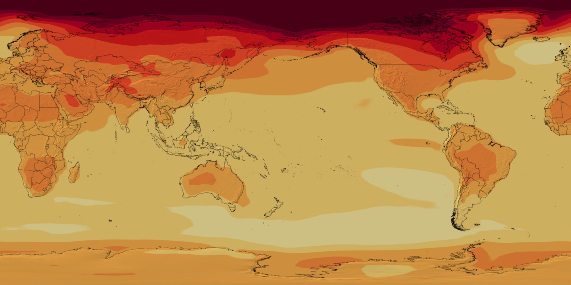
Roughly every six years, the United Nations' Intergovernmental Panel on Climate Change (IPCC) enlists hundreds of climate scientists worldwide in producing assessment reports. IPCC report authors rigorously evaluate the latest results from climate models run on supercomputers. Internationally, a few dozen modeling groups—including NASA’s Goddard Institute for Space Studies—contributed projections of 21st century climate to the current IPCC Fifth Assessment Report. The models simulated how Earth might respond to different scenarios of greenhouse gas emissions and reduction measures. Watch the video to see how global temperatures respond to the “business as usual” scenario, where carbon dioxide concentrations rise to 936 parts per million—more than double today's levels of 400 parts per million—by the year 2100.

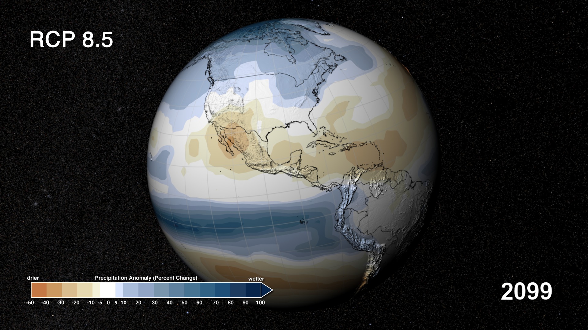
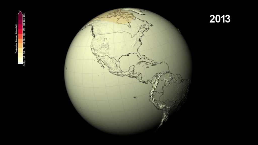
Climate models project 21st century global temperatures.
The temperature changes shown here are relative to the average temperatures observed from 1971-2000.
The Arctic will see the most drastic changes, with temperatures increasing by as much as 25 degrees Fahrenheit.
The models project North America to experience significant warming by the end of the century.
Temperature increases and other factors will likely dry up soils in southern Africa.
For More Information
See NASA.gov
Credits
Please give credit for this item to:
NASA's Scientific Visualization Studio and NASA Center for Climate Simulation
-
Animators
-
Alex Kekesi
(Global Science and Technology, Inc.)

-
Greg Shirah
(NASA/GSFC)
-
Alex Kekesi
(Global Science and Technology, Inc.)
-
Producer
- Matthew R. Radcliff (USRA)
-
Scientists
- Gerald Potter (USRA)
- Laura Carriere (CSC)
- Jay Alder (USGS)
- Ellen Salmon (NASA/GSFC)
- Michael Wehner (Lawrence Berkeley National Laboratory)
- Dean Williams (Lawrence Livermore National Laboratory)
-
Project support
- Jarrett Cohen (Global Science and Technology, Inc.)
-
Writers
- Jarrett Cohen (Global Science and Technology, Inc.)
- Patrick Lynch (Wyle Information Systems)
Related
- ID: 4110
- ID: 4105
 Visualization
 - ID: 11376
Release date
This page was originally published on Tuesday, February 25, 2014.
This page was last updated on Wednesday, May 3, 2023 at 1:51 PM EDT.