The Secret Life Of Forests
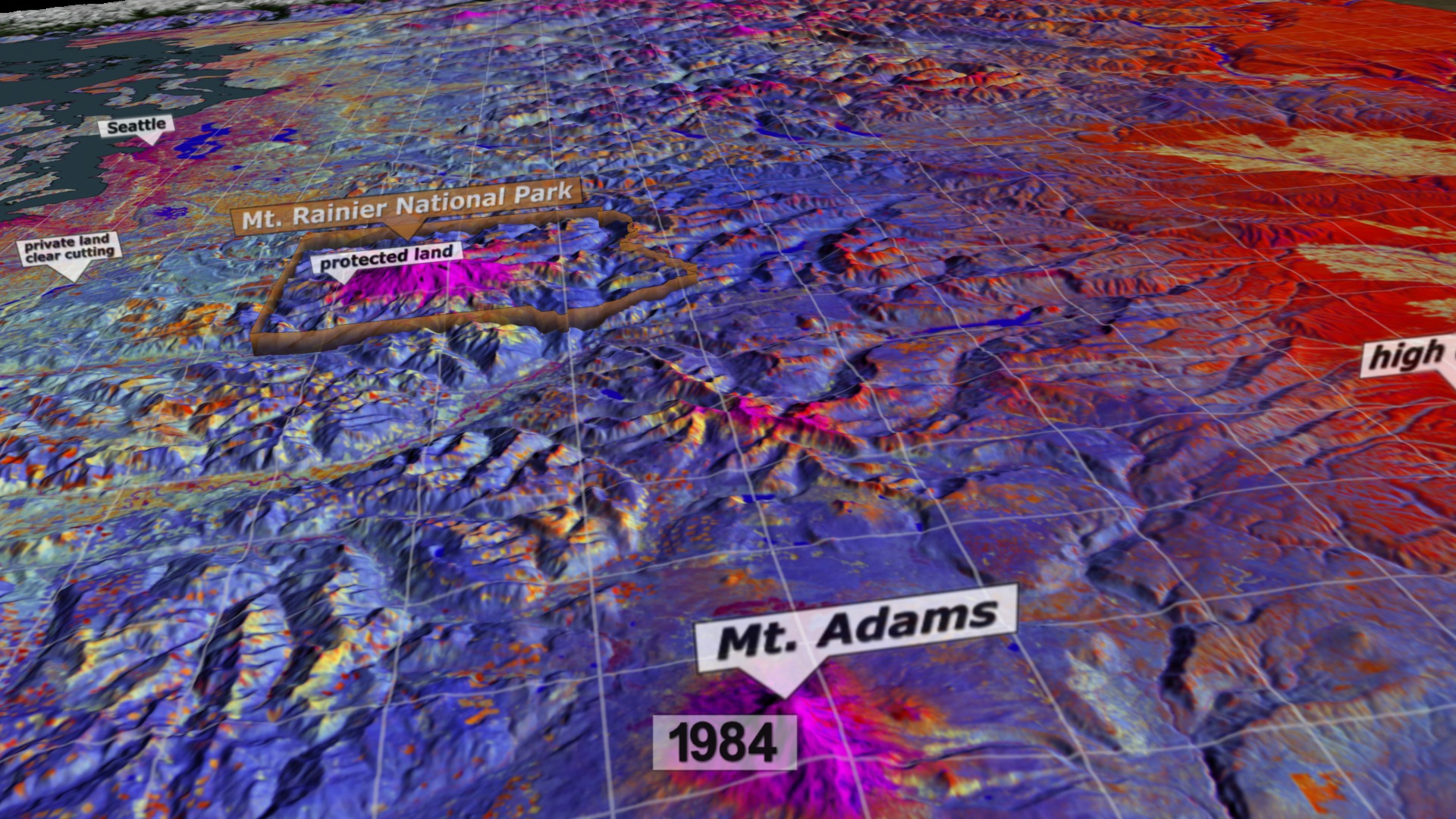
Forests in the United States are constantly changing. For four decades NASA and the U.S. Geological Survey's Landsat satellites have kept a steady watch from space, and now scientists are turning yearly data sets into powerful time series that show the evolution of the landscape. In this visualization of false color images taken of the Pacific Northwest from 1984 to 2011, scientists see many different stories. Some are obvious, like the patchwork of logged land that flickers from mature trees (blue) to clear-cut (red) to regrown shrubs (yellow). Some are subtle, like the bark beetle or western spruce budworm infestations (dark red) that pulse across mountainsides. Watch as these and other changes come to life in the video.

A new method of mapping satellite data reveals the hidden stories of forests in the Pacific Northwest.
Scientist Robert Kennedy of Boston University describes how researchers use the data behind the colors to see forest trends.
From the mid-1980s to 1991, western spruce budworms ravaged the trees in Mount Hood National Forest, Oregon.
Western spruce budworms feed on needles of coniferous trees as larvae beginning in late spring. In summer, they transform into adult moths.
From 2003 to 2004, a species of bark beetle called the mountain pine beetle
devastated the forests east of the Three Sisters, Oregon.
Mountain pine beetles bore under tree bark to lay their eggs. They introduce a fungus that prevents the tree from defending against the attack.
For More Information
See NASA.gov
Credits
Please give credit for this item to:
NASA's Goddard Space Flight Center
Western spruce budworm image courtesy of USDA Forest Service/Scott Tunnock, Bugwood.org
Mountain pine beetle image courtesy of Forest Health Management International/William M. Ciesla, Bugwood.org
-
Animators
-
Greg Shirah
(NASA/GSFC)

-
Alex Kekesi
(Global Science and Technology, Inc.)
- Horace Mitchell (NASA/GSFC)
-
Greg Shirah
(NASA/GSFC)
-
Video editor
- Matthew R. Radcliff (USRA)
-
Narrator
- Robert Kennedy (Boston University)
-
Producer
- Matthew R. Radcliff (USRA)
-
Scientists
- Robert Kennedy (Boston University)
- Zhiqiang Yang (Oregon State University)
- Justin Braaten (Oregon State University)
-
Writer
- Ellen T. Gray (ADNET Systems, Inc.)
Related
- ID: 4013
Release date
This page was originally published on Tuesday, December 11, 2012.
This page was last updated on Wednesday, May 3, 2023 at 1:52 PM EDT.