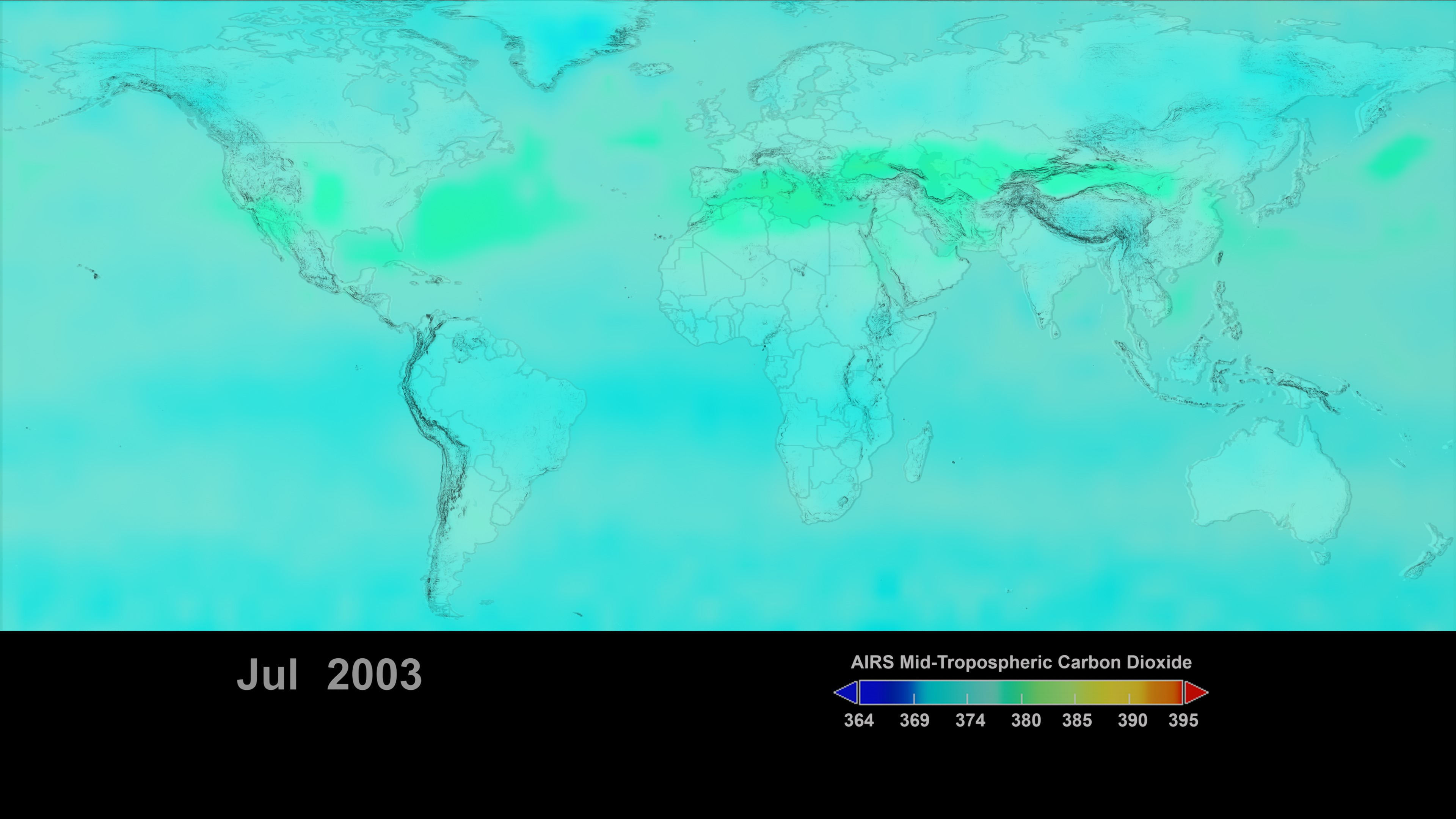
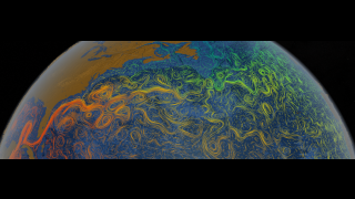
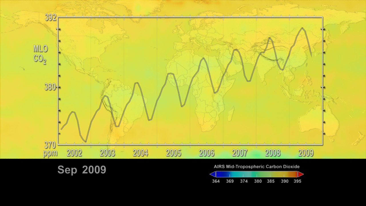
Aqua/AIRS Carbon Dioxide, 2002-2009, With Mauna Loa Carbon Dioxide Graph
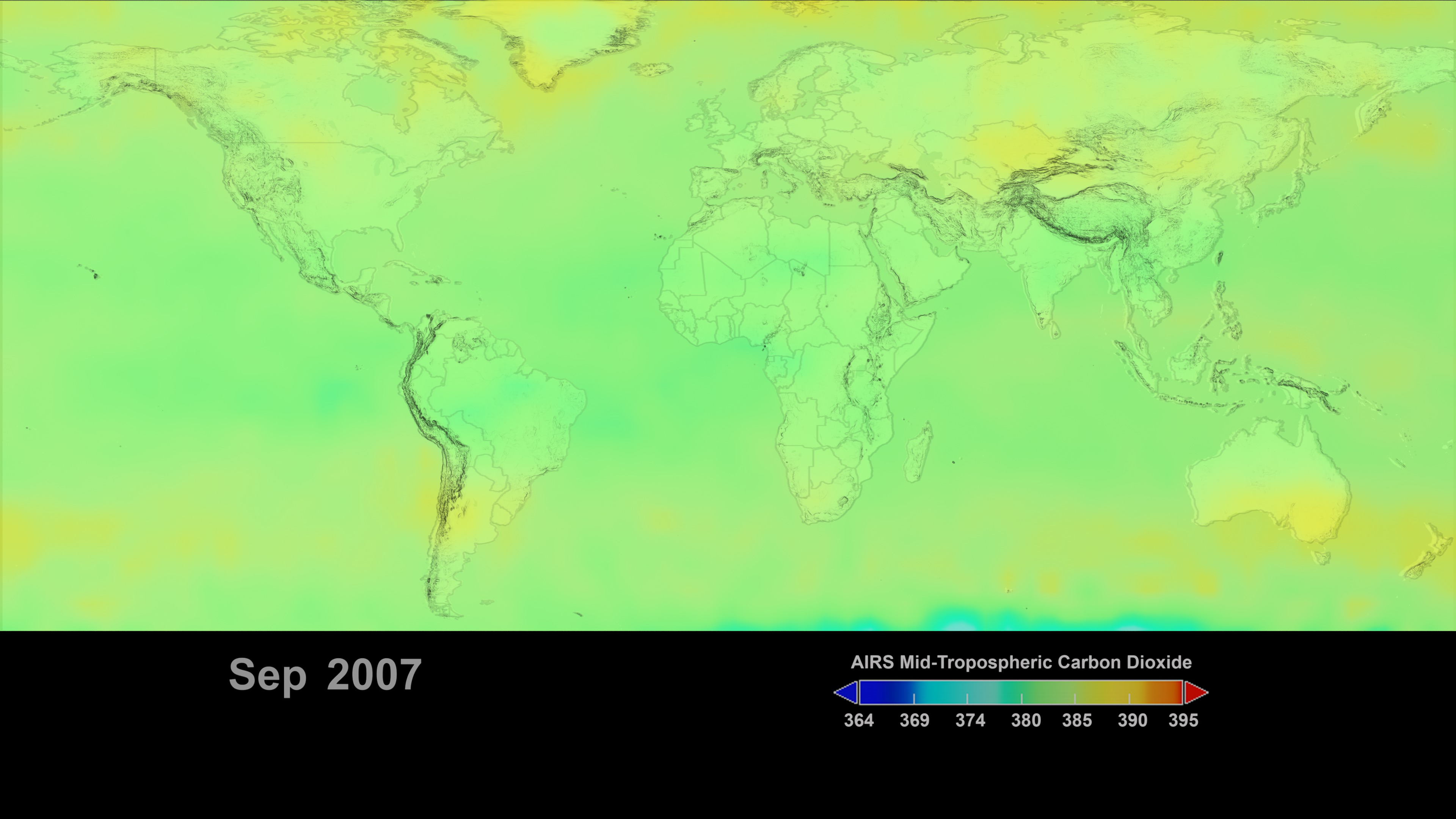
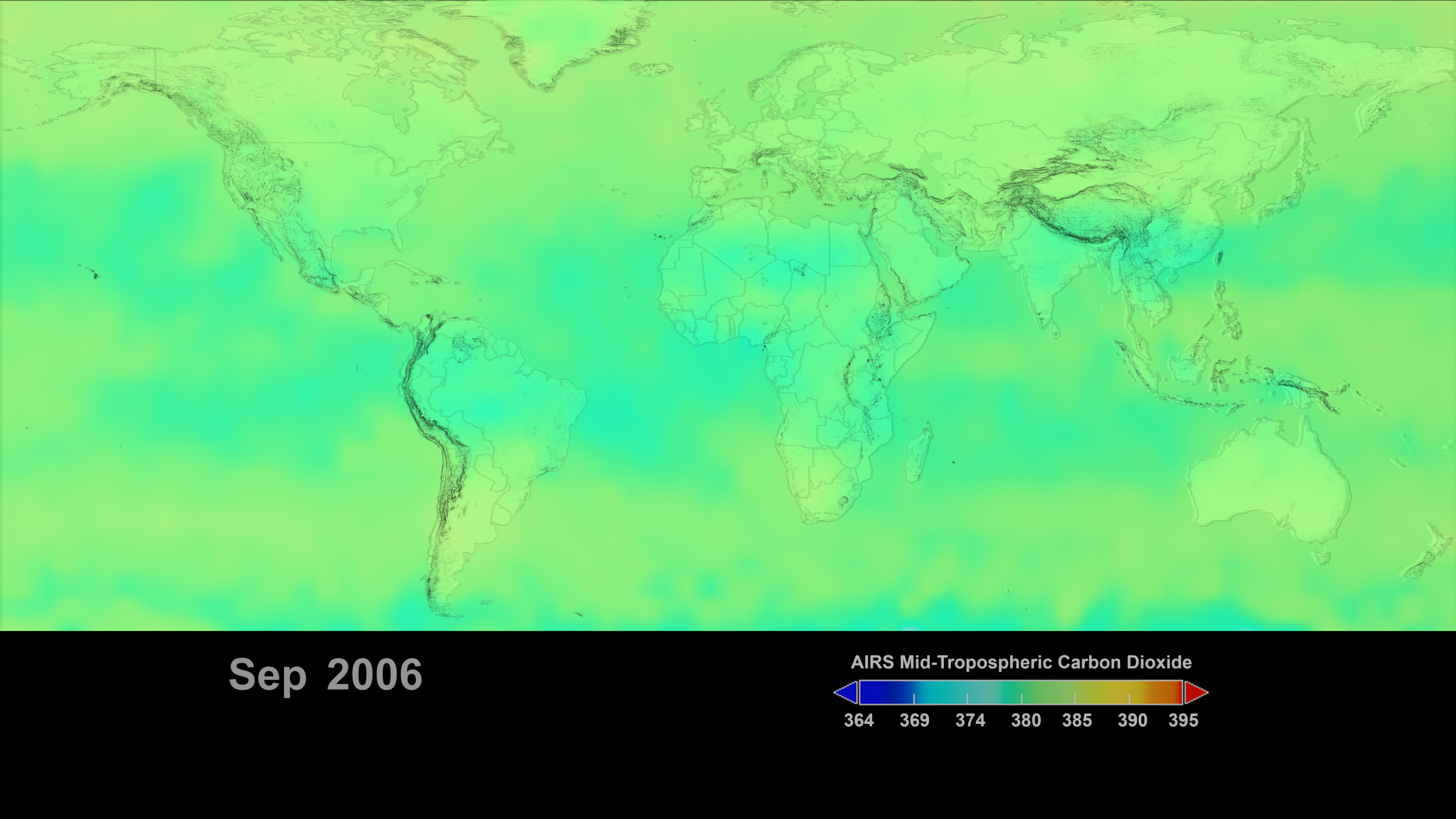
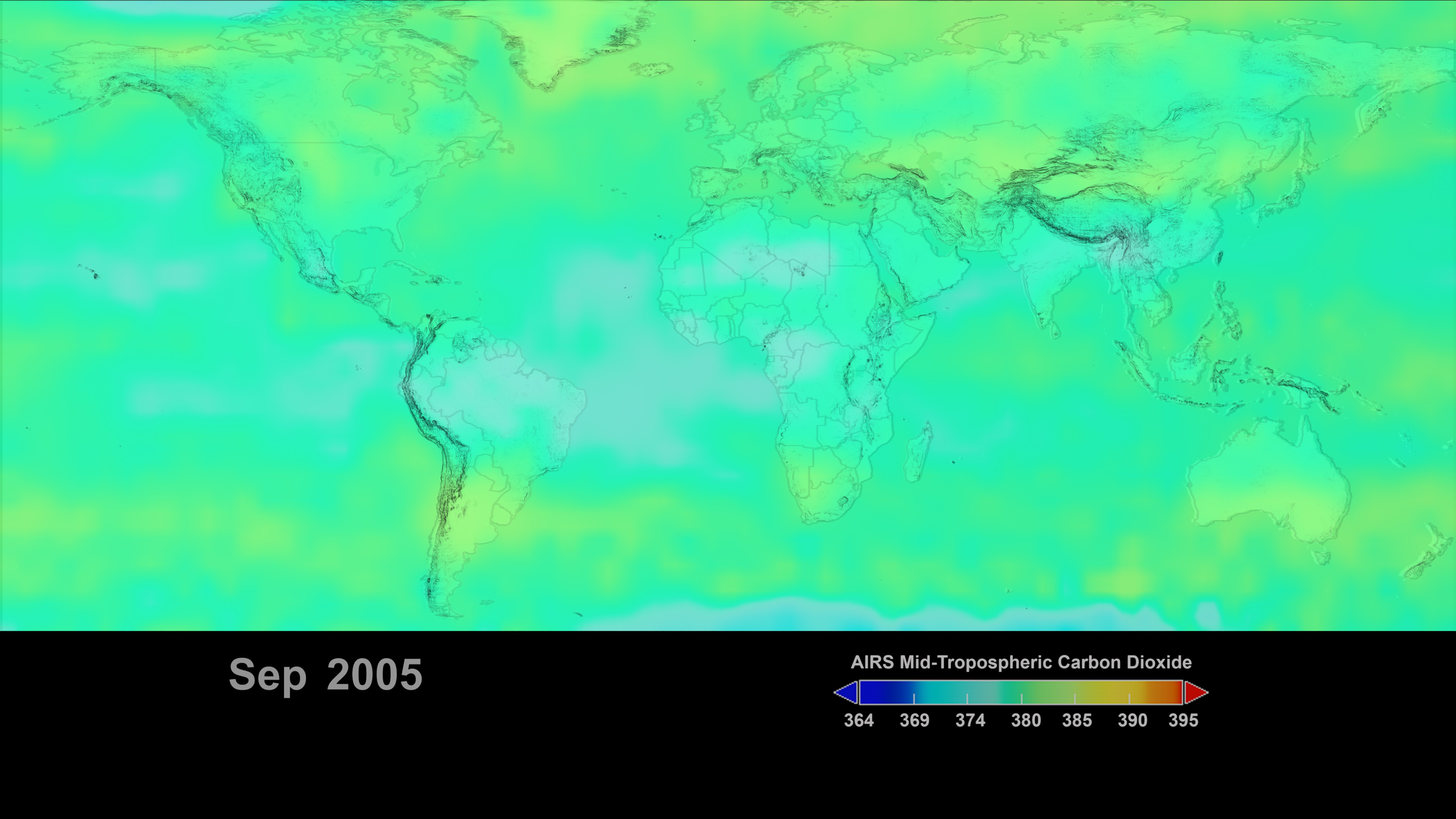
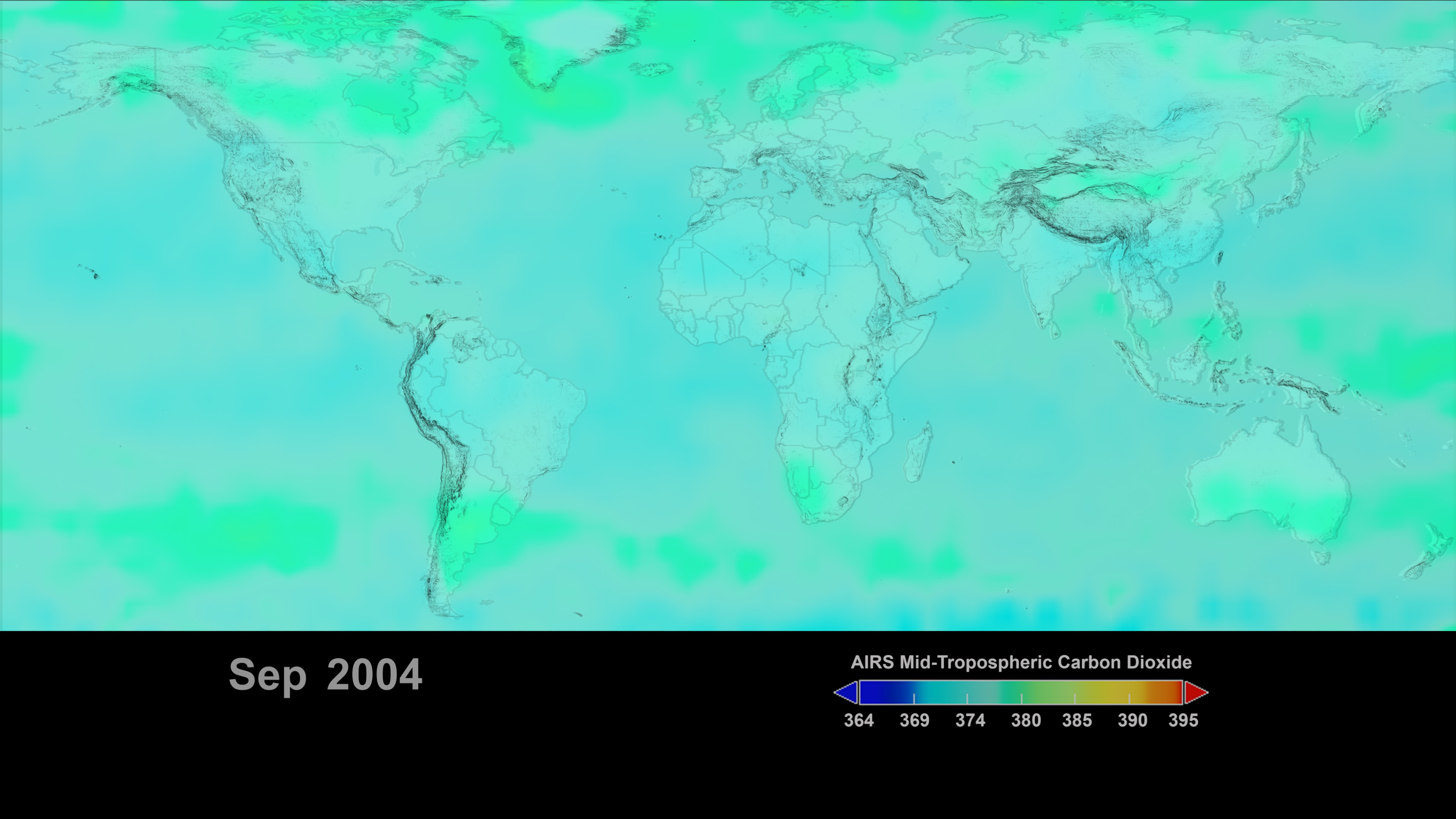
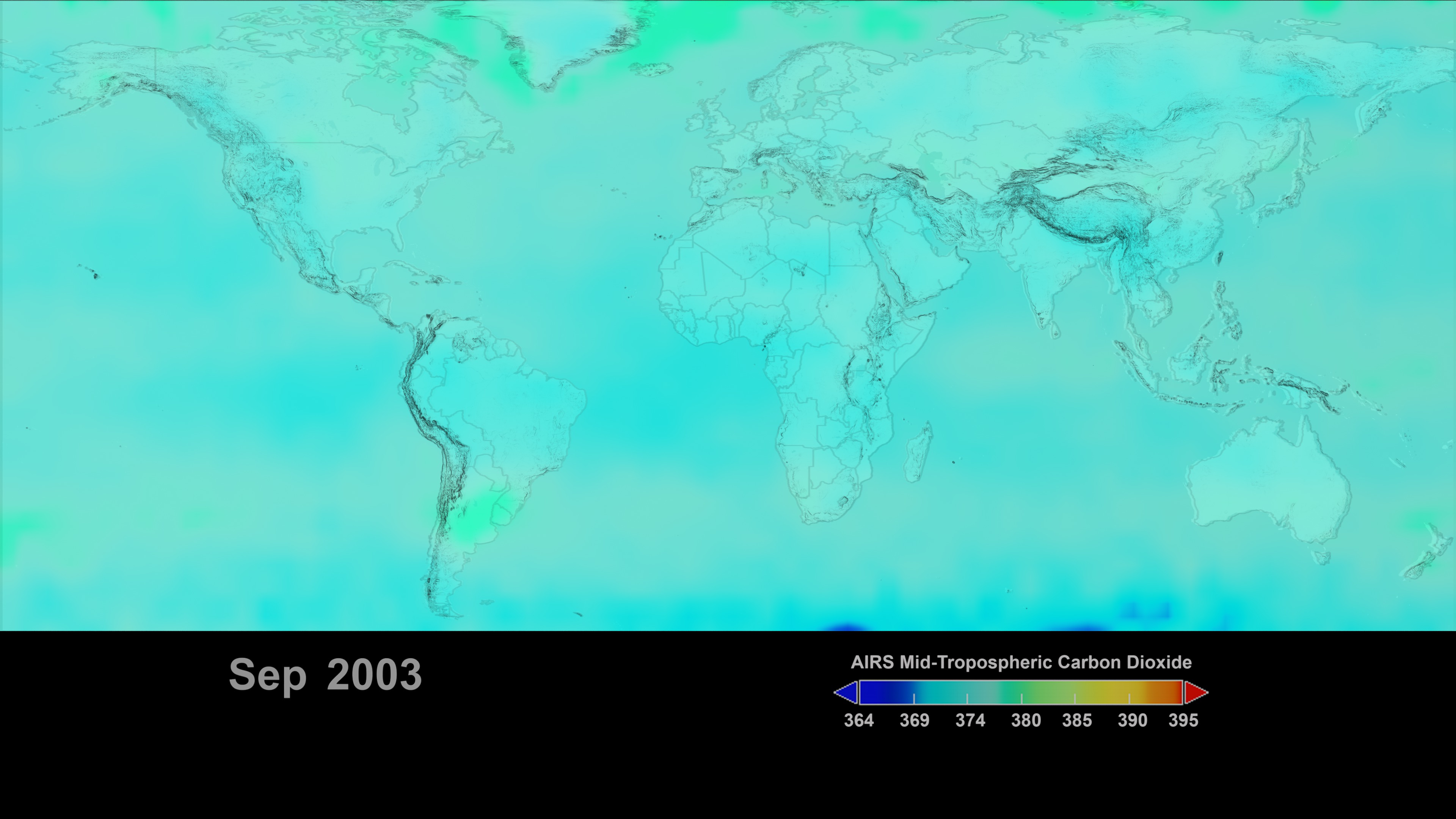
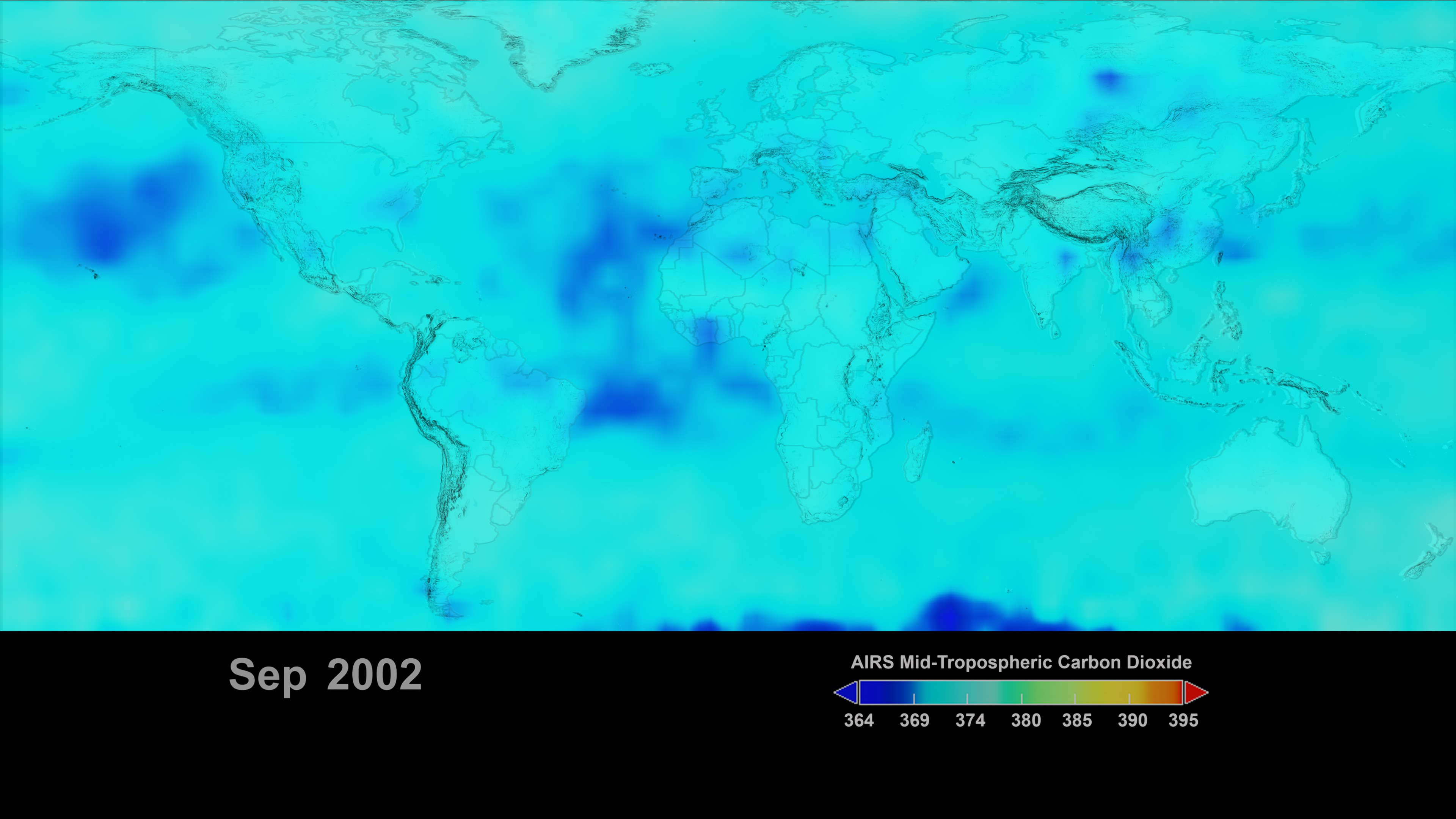
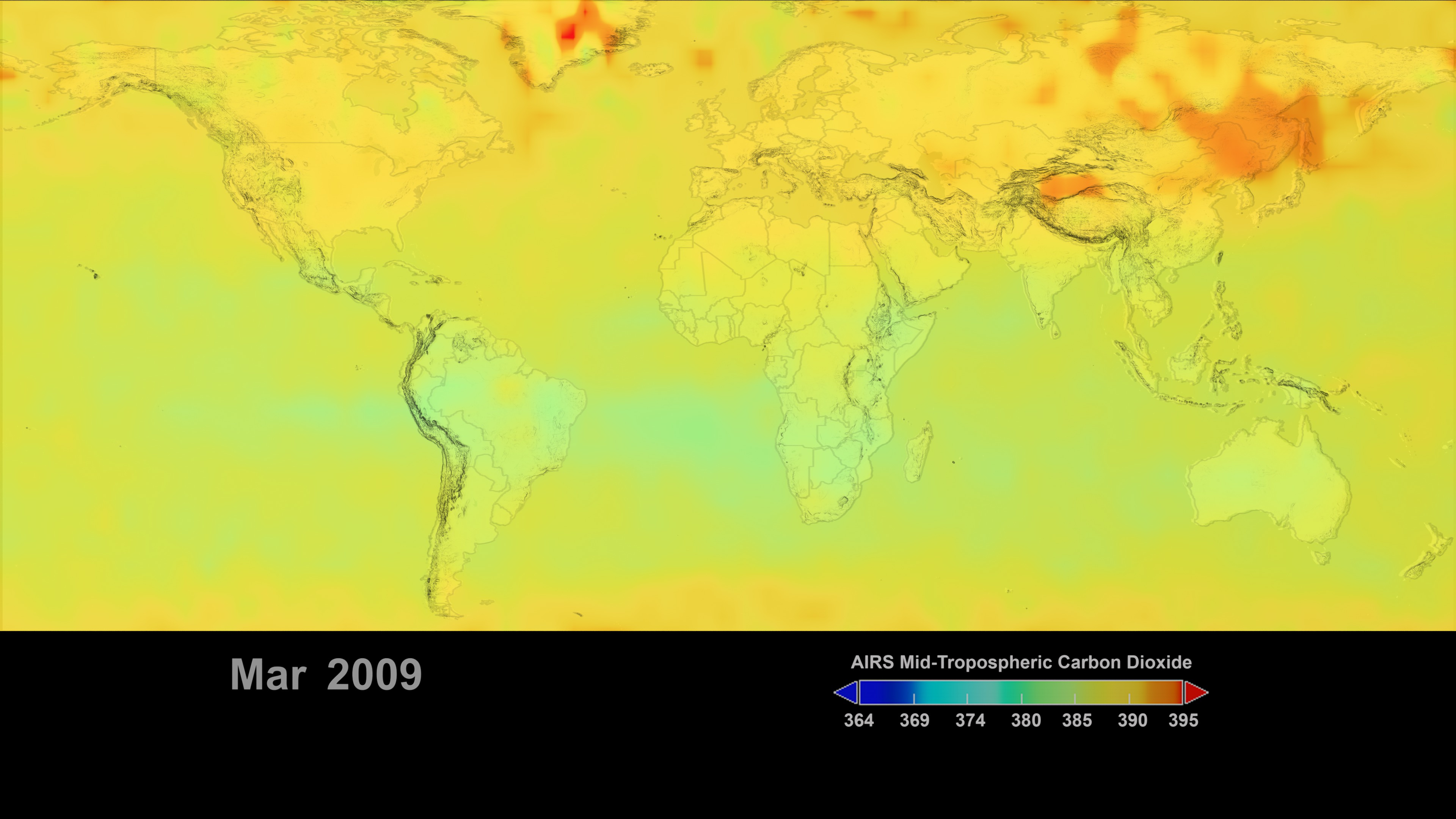
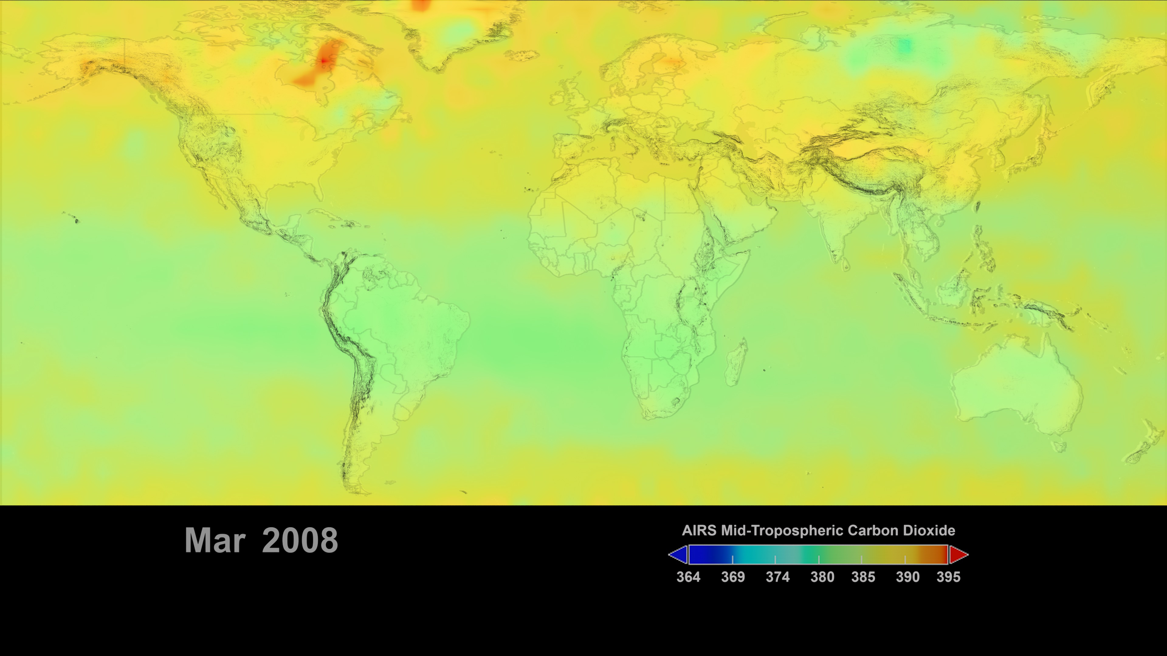
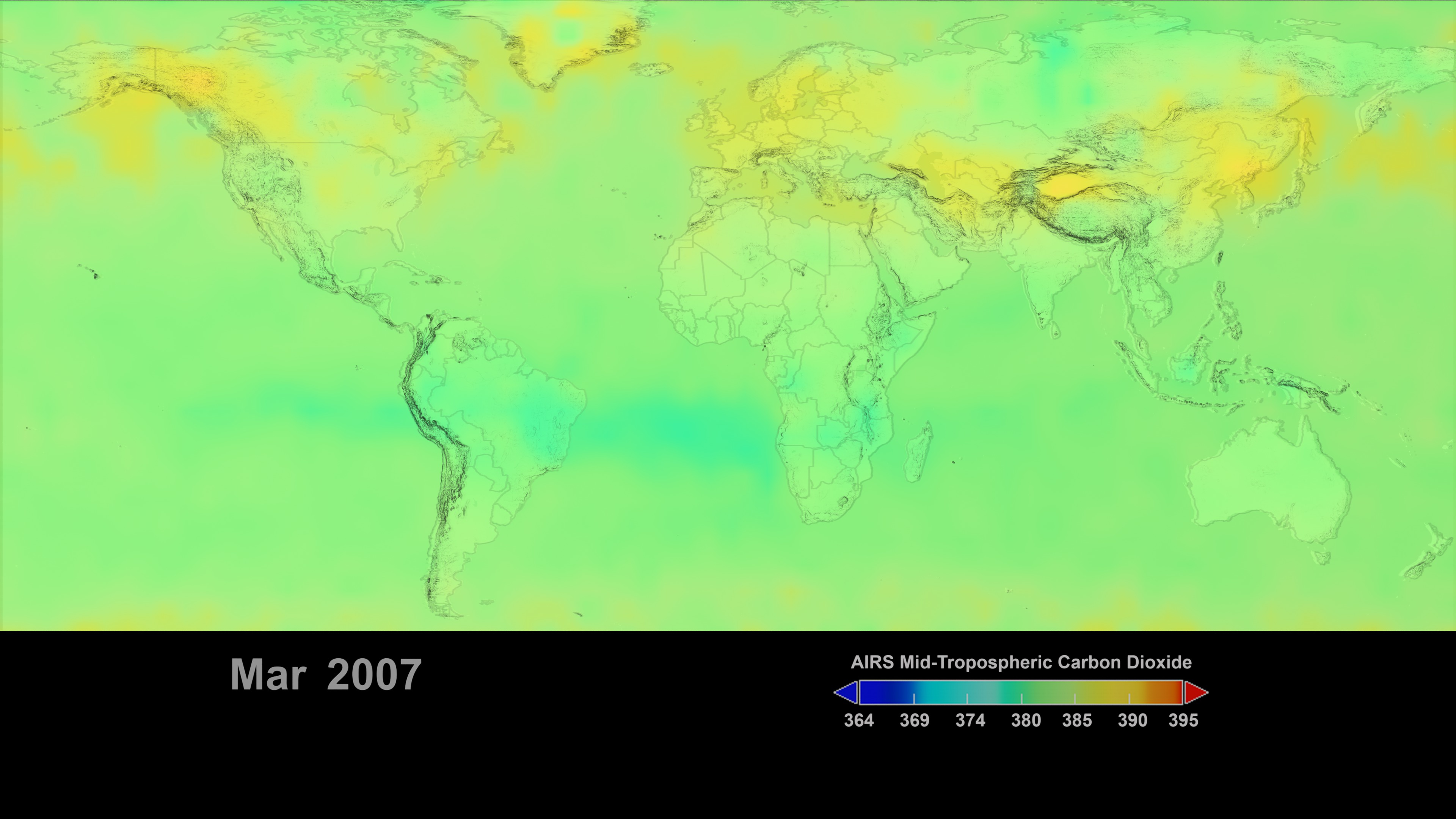
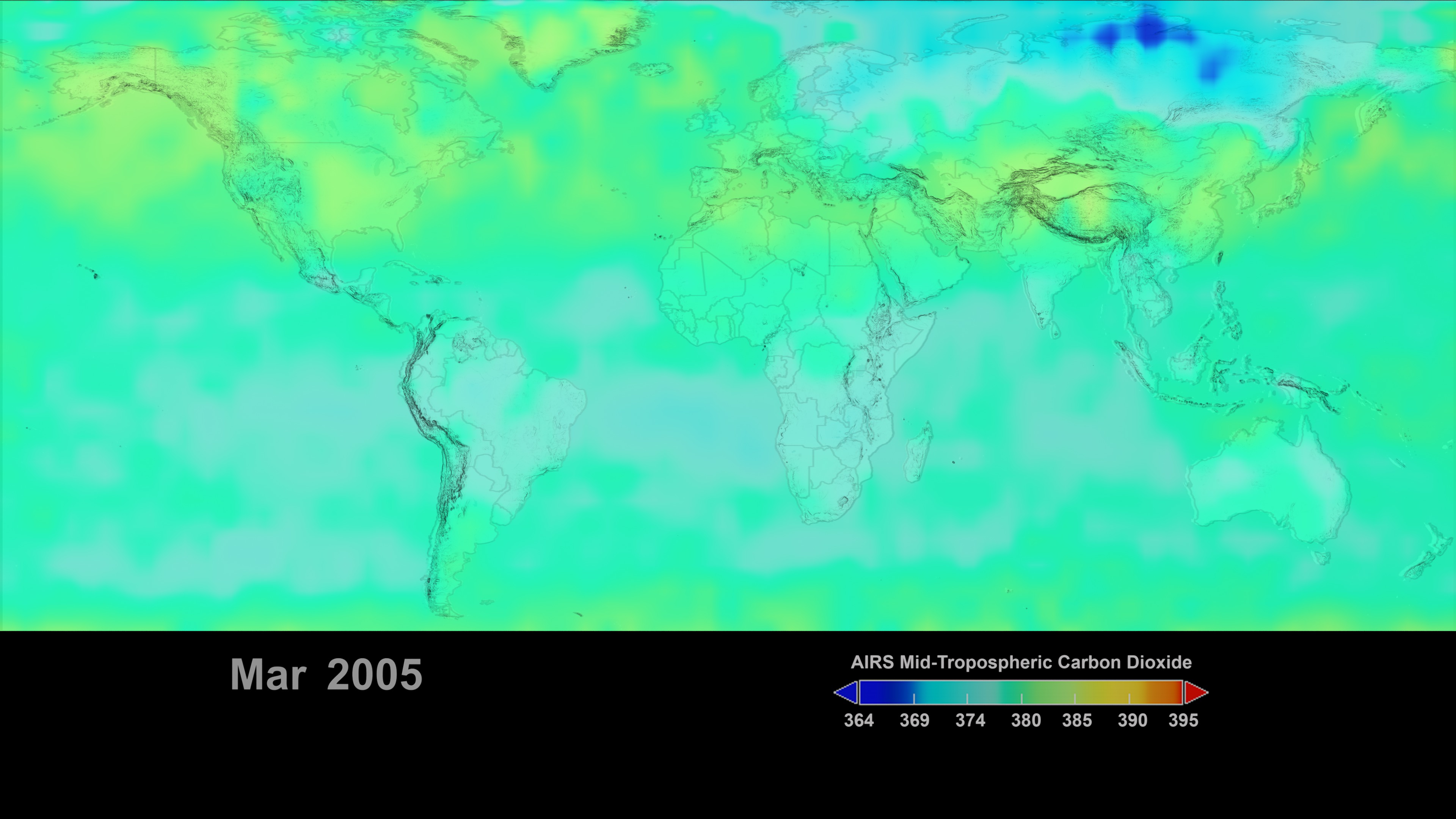
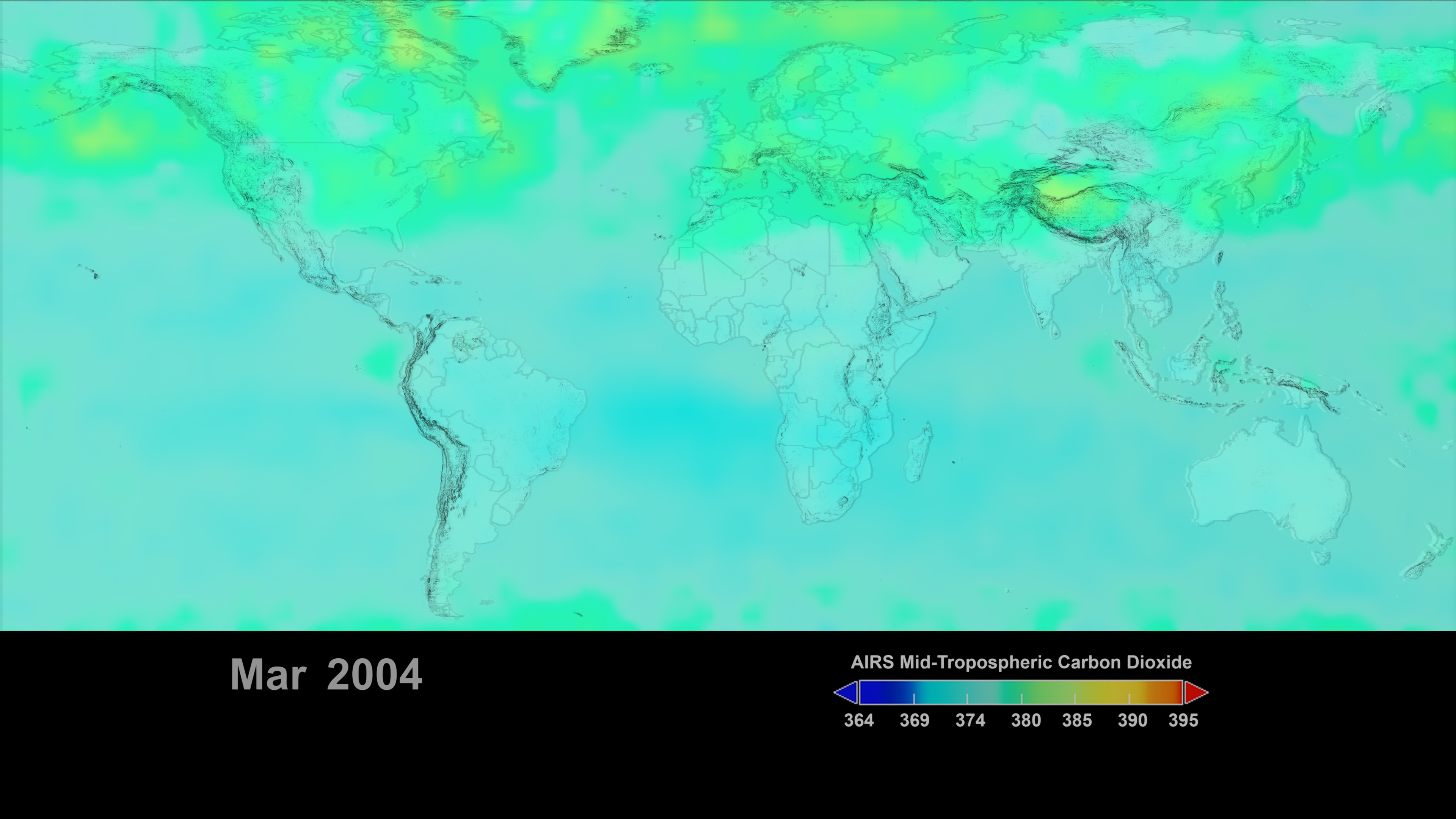
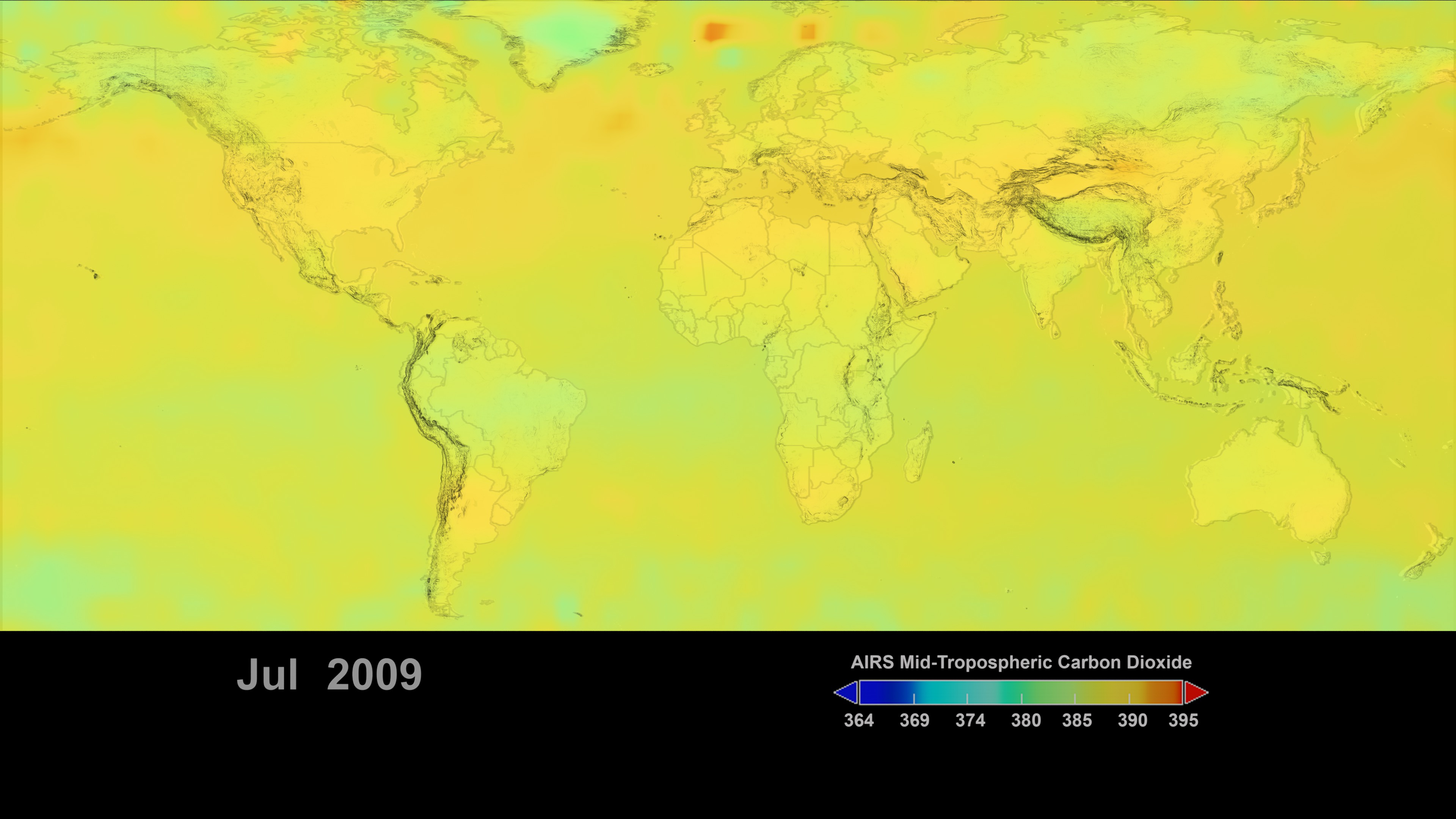
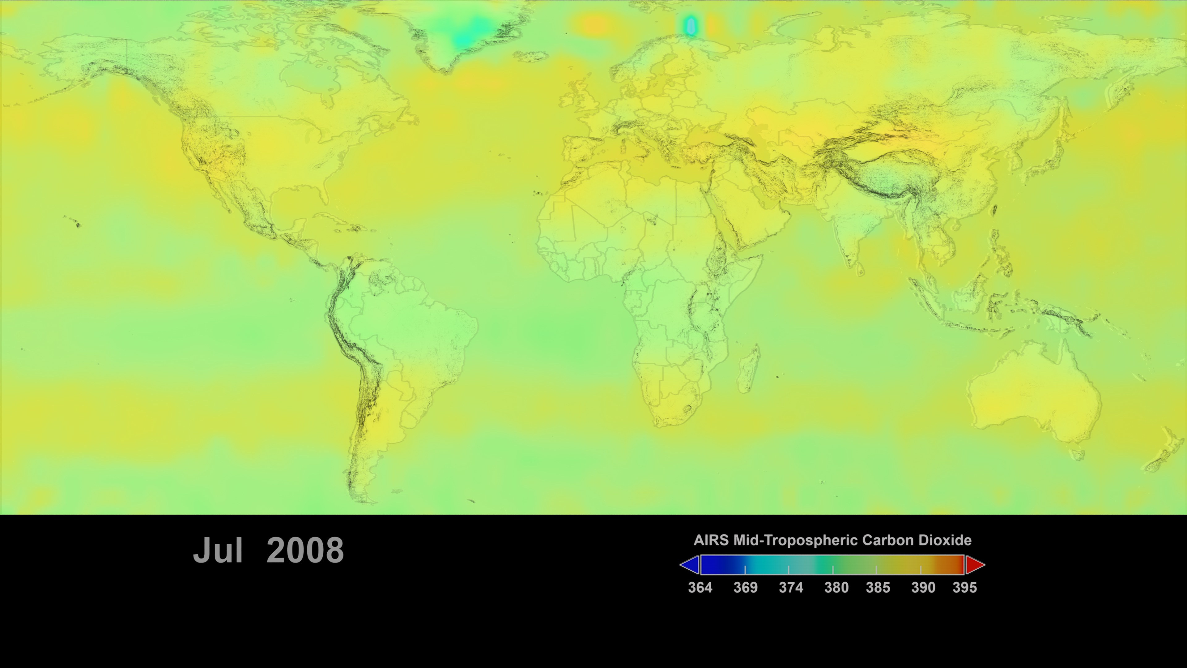
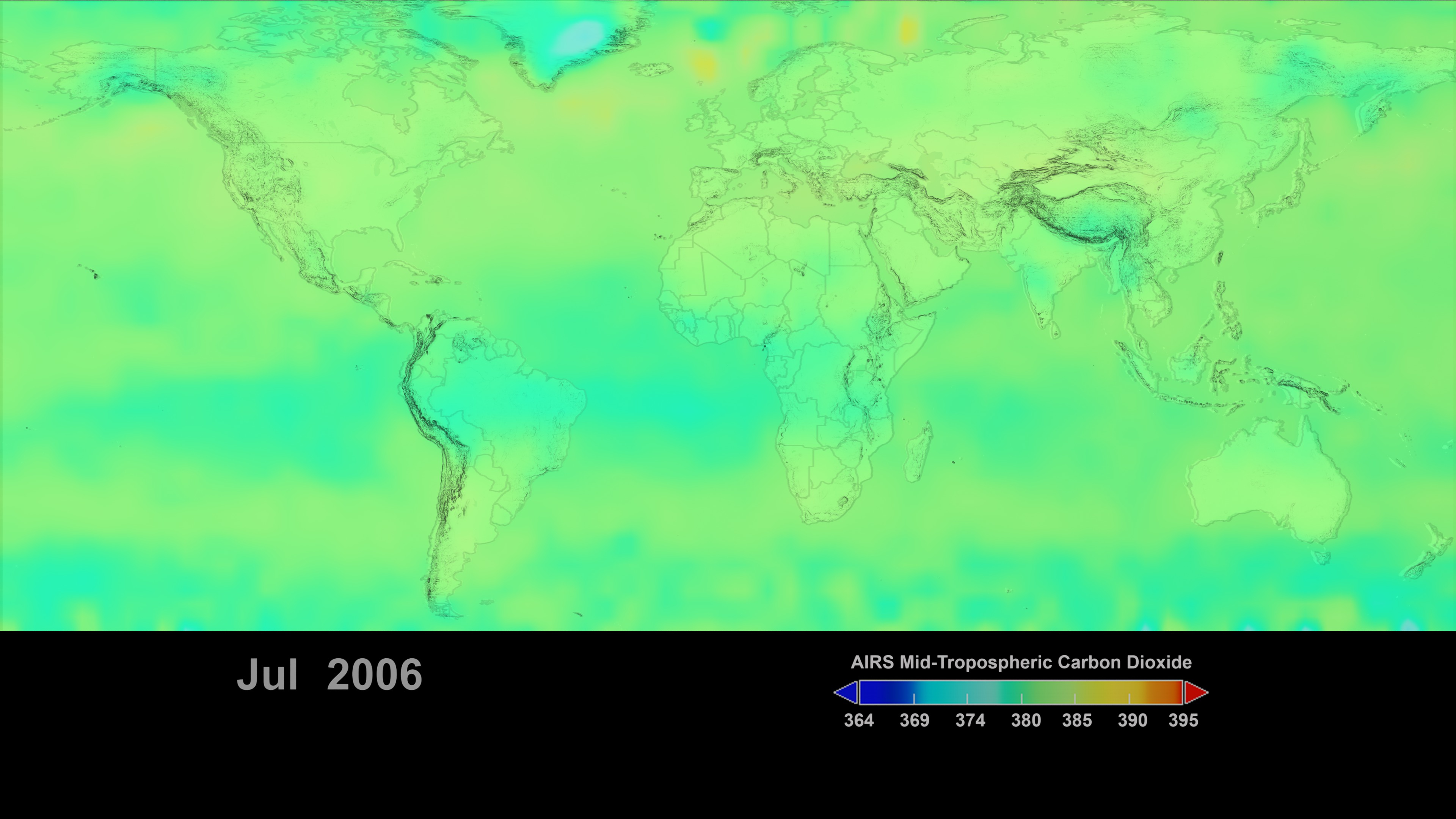
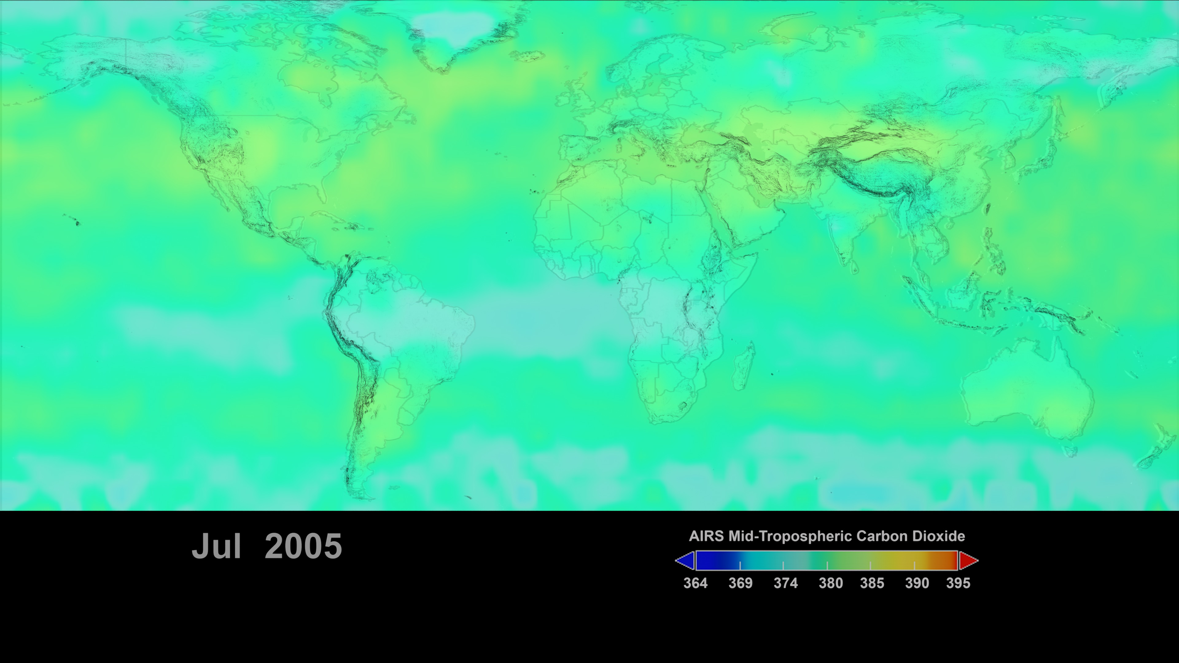
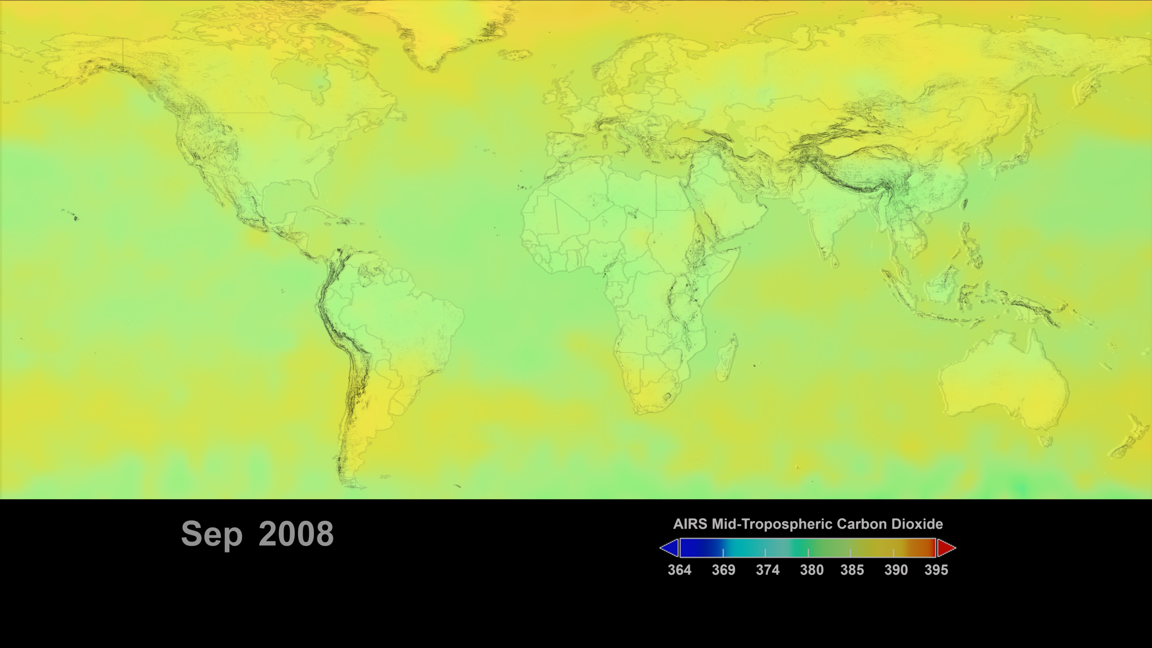
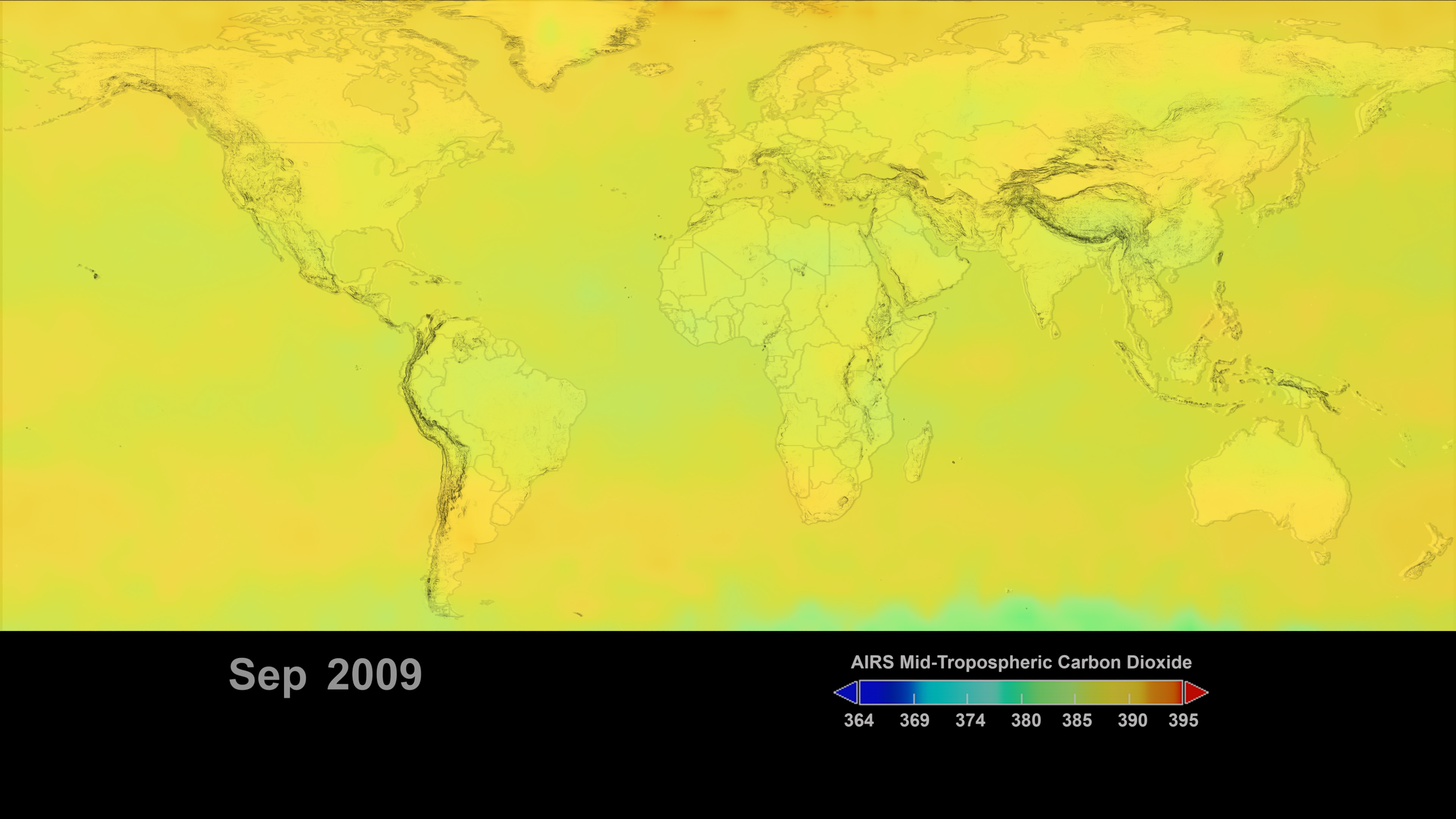
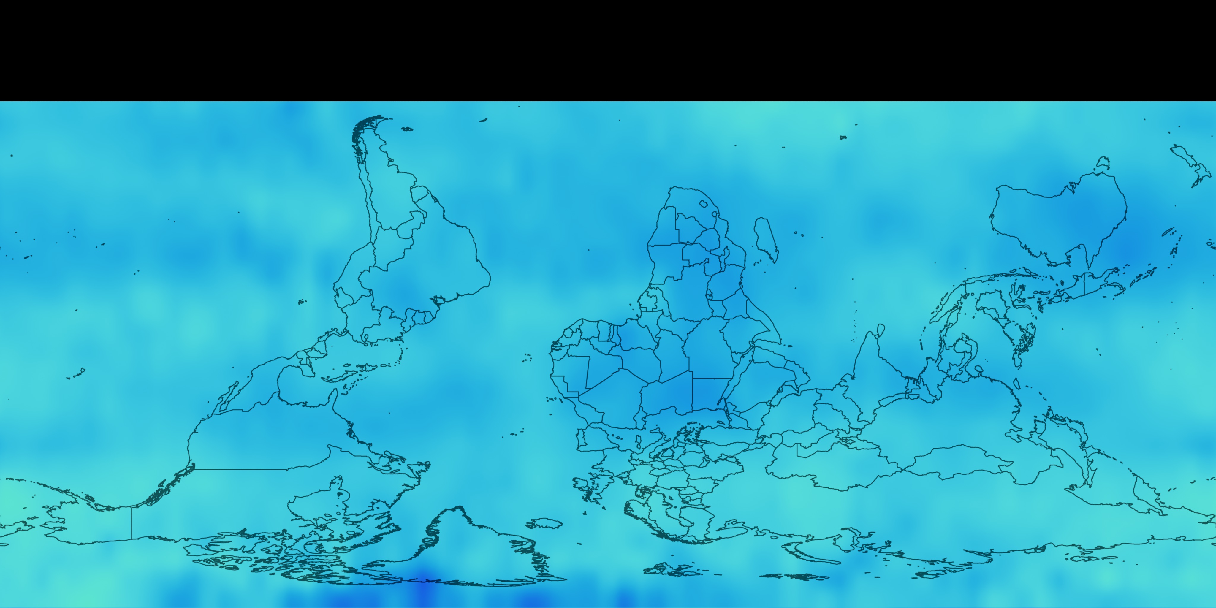
The two most notable features of this visualization are the seasonal variation of CO2 and the trend of increase in its concentration from year to year. The global map clearly shows that the CO2 in the northern hemisphere peaks in April-May and then drops to a minimum in September-October. Although the seasonal cycle is less pronounced in the southern hemisphere it is opposite to that in the northern hemisphere. This seasonal cycle is governed by the growth cycle of plants. The northern hemisphere has the majority of the land masses, and so the amplitude of the cycle is greater in that hemisphere. The overall color of the map shifts toward the red with advancing time due to the annual increase of CO2.
Although the mid-latitude jet streams are not visible in the map, we can see their influence upon the distribution of CO2 around the globe. These rivers of air occur at an altitude of about 5 km and rapidly transport CO2 around the globe at that altitude. In the northern hemisphere, the mid-latitude jet stream squirms like a released garden hose over the period of a few days due to the continental landmasses.
In the southern hemisphere the jet stream flow is more directly West to East, and during the period from July to October the CO2 concentration is enhanced in a belt delineated by the jet stream and lofting of CO2 into the free troposphere by the high Andes is visible in this period. The zonal flow of CO2 around the globe at the latitude of South Africa, southern Australia and southern South America is readily apparent.
Eastward flow of CO2 from Indonesia and the Celebes sea can be seen in the November to February time frame.


Visualization Credits
Greg Shirah (NASA/GSFC): Animator
Alan Buis (NASA/JPL CalTech): Producer
Moustafa Chahine (NASA/JPL CalTech): Scientist
Tom Pagano (NASA/JPL CalTech): Scientist
Edward Olsen (NASA/JPL CalTech): Scientist
Sushel Uninnayar (NASA/GSFC): Scientist
Luke Chen (NASA/JPL CalTech): Scientist
Please give credit for this item to:
NASA/Goddard Space Flight Center Scientific Visualization Studio
https://svs.gsfc.nasa.gov/3685
Data Used:
In Situ CO2 Monthly also referred to as: Keeling Curve
Data Compilation - ScrippsAqua/AIRS
9/15/2002 - 12/31/2009This item is part of these series:
COGlobalTransport
Goddard Magic Planet Media
Keywords:
DLESE >> Atmospheric science
SVS >> Carbon Cycle
SVS >> Carbon Dioxide
DLESE >> Chemistry
SVS >> HDTV
SVS >> Volume
GCMD >> Earth Science >> Atmosphere >> Atmospheric Chemistry
GCMD >> Earth Science >> Atmosphere >> Atmospheric Chemistry/Carbon and Hydrocarbon Compounds
GCMD >> Earth Science >> Biosphere >> Ecological Dynamics >> Photosynthesis
SVS >> Hyperwall
SVS >> Copenhagen
SVS >> For Educators
NASA Science >> Earth
SVS >> Presentation
GCMD keywords can be found on the Internet with the following citation: Olsen, L.M., G. Major, K. Shein, J. Scialdone, S. Ritz, T. Stevens, M. Morahan, A. Aleman, R. Vogel, S. Leicester, H. Weir, M. Meaux, S. Grebas, C.Solomon, M. Holland, T. Northcutt, R. A. Restrepo, R. Bilodeau, 2013. NASA/Global Change Master Directory (GCMD) Earth Science Keywords. Version 8.0.0.0.0
Places you might have seen this:
Feature article at http://www.terra-marin.com/articles/greengov.php