Earth
ID: 3072
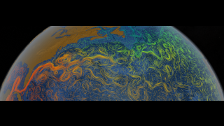
This visualization shows flow directions and relative speeds of the Jakobshavn glacier in Greenland. The red flow lines are from 1992 data; the blue flow lines are 2000 data. Notice that the flow speed of the glacier has increased significantly from 1992 to 2000.
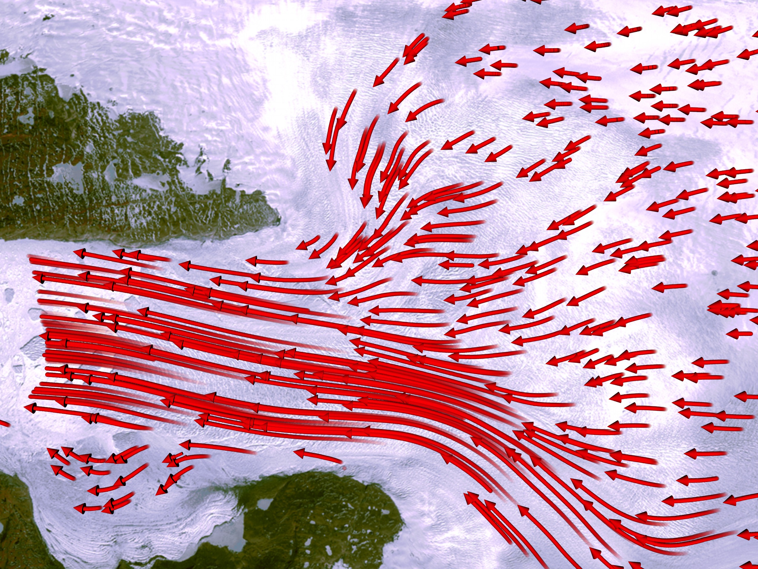
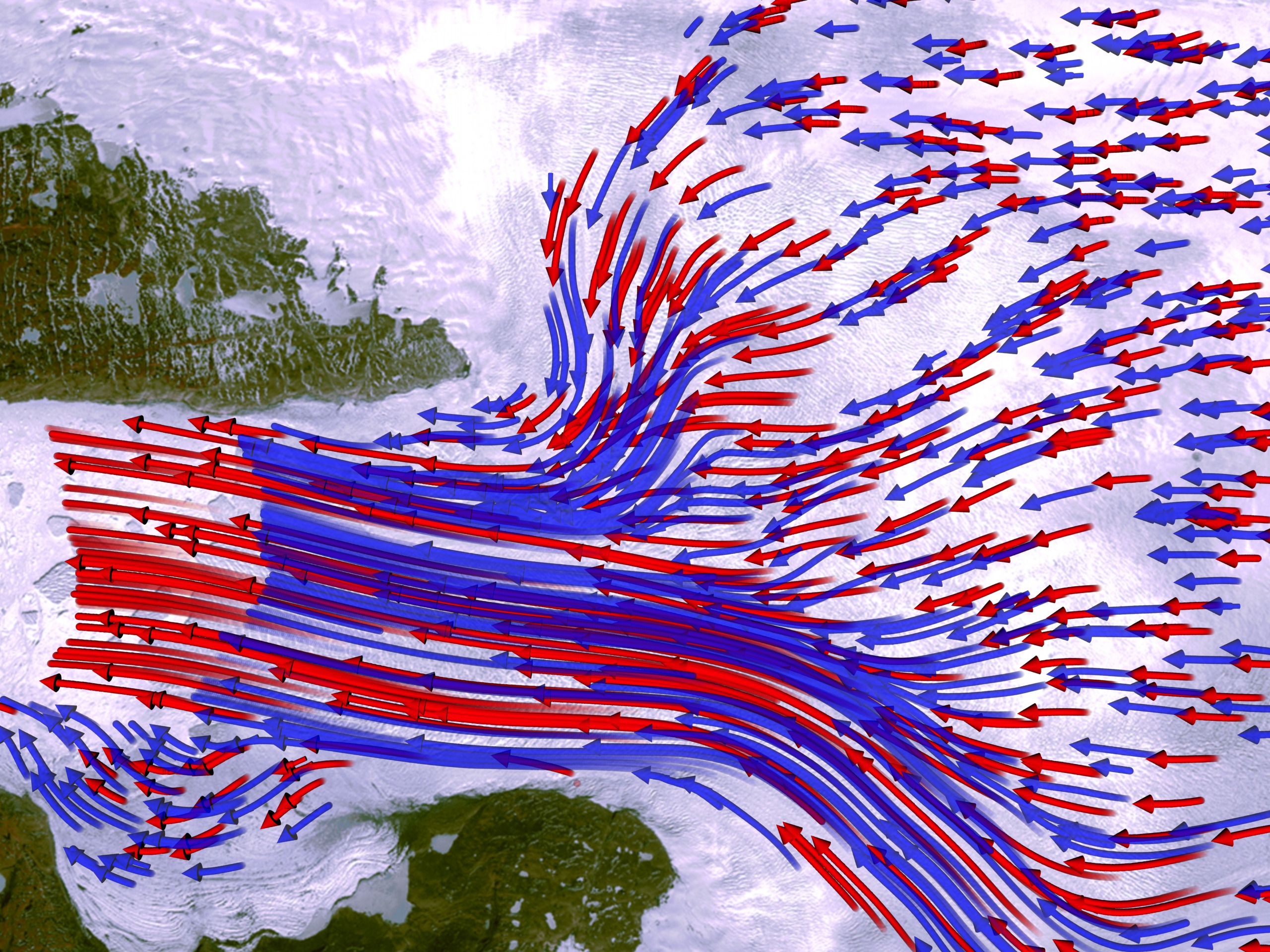
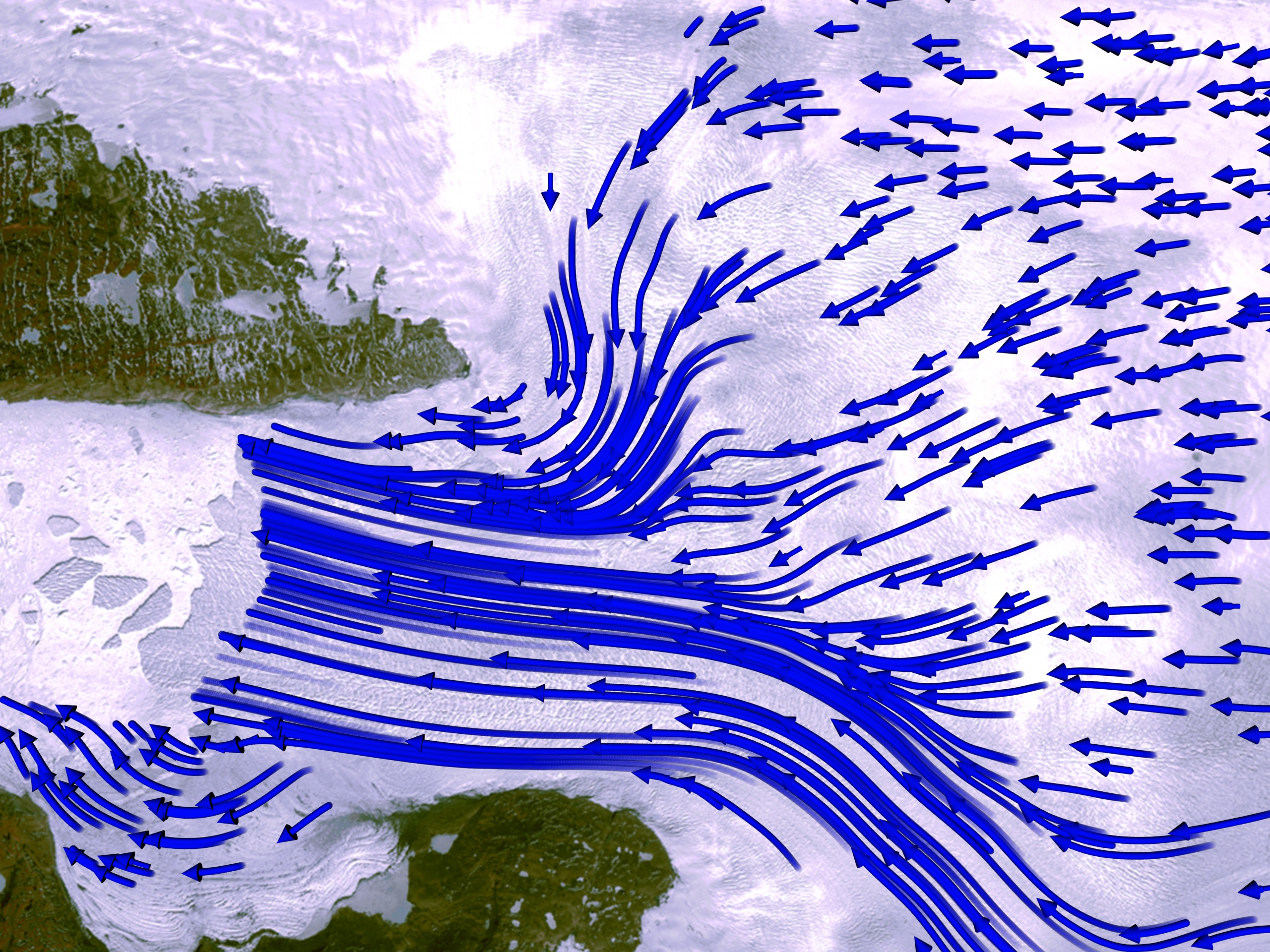
Jakobshavn Glacier, Greenland flow field
This visualization was created to support a talk at the Fall 2004 AGU meeting.
For More Information
Visualization Credits
Greg Shirah (NASA/GSFC): Lead Animator
Horace Mitchell (NASA/GSFC): Animator
Alex Kekesi (Global Science and Technology, Inc.): Animator
Waleed Abdalati (NASA/HQ): Scientist
Horace Mitchell (NASA/GSFC): Animator
Alex Kekesi (Global Science and Technology, Inc.): Animator
Waleed Abdalati (NASA/HQ): Scientist
Please give credit for this item to:
NASA/Goddard Space Flight Center Scientific Visualization Studio
NASA/Goddard Space Flight Center Scientific Visualization Studio
Short URL to share this page:
https://svs.gsfc.nasa.gov/3072
Mission:
Landsat
Data Used:
Note: While we identify the data sets used in these visualizations, we do not store any further details nor the data sets themselves on our site.
This item is part of these series:
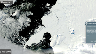
Greenland
AGU 2004
Goddard TV Tape:
G2004-064
Keywords:
SVS >> Glaciers
NASA Science >> Earth
https://svs.gsfc.nasa.gov/3072
Mission:
Landsat
Data Used:
Landsat/TM, ETM, ETM+/Band Combination 1, 2, 3
2002/05/23Landsat-7/ETM+/Jakobshavn flow field
1992, 2000This item is part of these series:
Greenland
AGU 2004
Goddard TV Tape:
G2004-064
Keywords:
SVS >> Glaciers
NASA Science >> Earth