Earth
ID: 2836
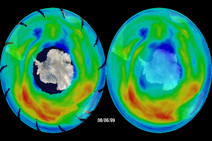
This ozone hole animation was created for the panel session 'Astrophysics or Astro-graphics' at the workshop 'Communicating Astronomy to the Public' on October 2, 2003. The purpose of the animation was to illustrate two different ways that a visualization might be structured based on the amount of time the viewer had to look at it. The animation on the left fully illustrated the data, imperfections and all, under the assumption that a presenter would have time to explain the animation in detail. The animation on the right had all the data 'imperfections' removed by interpolation, under the assumption that the viewer would only have 20 or 30 seconds to look at it (on the evening news, for example) with only the briefest of explanations. The problem was that, without explanation, a layman might interpret the region of missing data in the movie on the left to be the ozone hole, instead of the central blue region. The point was that the truth of a visualization lies in the mind of the beholder, not in the absolute content of the imagery.
Ozone Visualization Comparison
Visualization Credits
Please give credit for this item to:
NASA/Goddard Space Flight Center Scientific Visualization Studio
NASA/Goddard Space Flight Center Scientific Visualization Studio
Short URL to share this page:
https://svs.gsfc.nasa.gov/2836
Data Used:
Note: While we identify the data sets used in these visualizations, we do not store any further details nor the data sets themselves on our site.
This item is part of this series:
Stratospheric Ozone
Goddard TV Tape:
Not On Tape
Keywords:
DLESE >> Cryology
SVS >> Ozone Hole
NASA Science >> Earth
https://svs.gsfc.nasa.gov/2836
Data Used:
Earth Probe/TOMS
1999/08/01 - 1999/10/31This item is part of this series:
Stratospheric Ozone
Goddard TV Tape:
Not On Tape
Keywords:
DLESE >> Cryology
SVS >> Ozone Hole
NASA Science >> Earth