Earth
ID: 2432
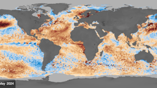
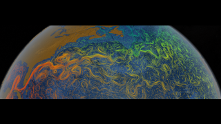
This animation depicts the difference between the actual sea surface temperature and the average climatology data. Blue areas indicate temperatures colder than average while red areas indicate regions that are warmer. Temperature values between -4 degrees and +3 degrees are mapped to gradient color ramps, and regions with less than one degree deviation from average are shown as gray.


Sea Surface Temperature Anomaly from July 5, 2001 to March 10, 2002
Visualization Credits
Cindy Starr (Global Science and Technology, Inc.): Lead Visualizer
Jesse Allen (Raytheon): Animator
Greg Shirah (NASA/GSFC): Animator
David Adamec (NASA/GSFC): Scientist
Jesse Allen (Raytheon): Animator
Greg Shirah (NASA/GSFC): Animator
David Adamec (NASA/GSFC): Scientist
Please give credit for this item to:
NASA/Goddard Space Flight Center Scientific Visualization Studio
NASA/Goddard Space Flight Center Scientific Visualization Studio
Short URL to share this page:
https://svs.gsfc.nasa.gov/2432
Mission:
Terra
Data Used:
Note: While we identify the data sets used in these visualizations, we do not store any further details nor the data sets themselves on our site.
Keywords:
DLESE >> Hydrology
SVS >> SST
SVS >> Sea Surface Temperature Anomaly
NASA Science >> Earth
https://svs.gsfc.nasa.gov/2432
Mission:
Terra
Data Used:
Aqua/MODIS/Sea Surface Temperature
July 5, 2001 - March 10, 2002NOAA-7, 9, 11, 12, 14/AVHRR/AVHRR Pathfinder Global 9km SST Climatology
Terra/MODIS/Sea Surface Temperature
July 5, 2001 - March 10, 2002Keywords:
DLESE >> Hydrology
SVS >> SST
SVS >> Sea Surface Temperature Anomaly
NASA Science >> Earth
