Earth
ID: 11284
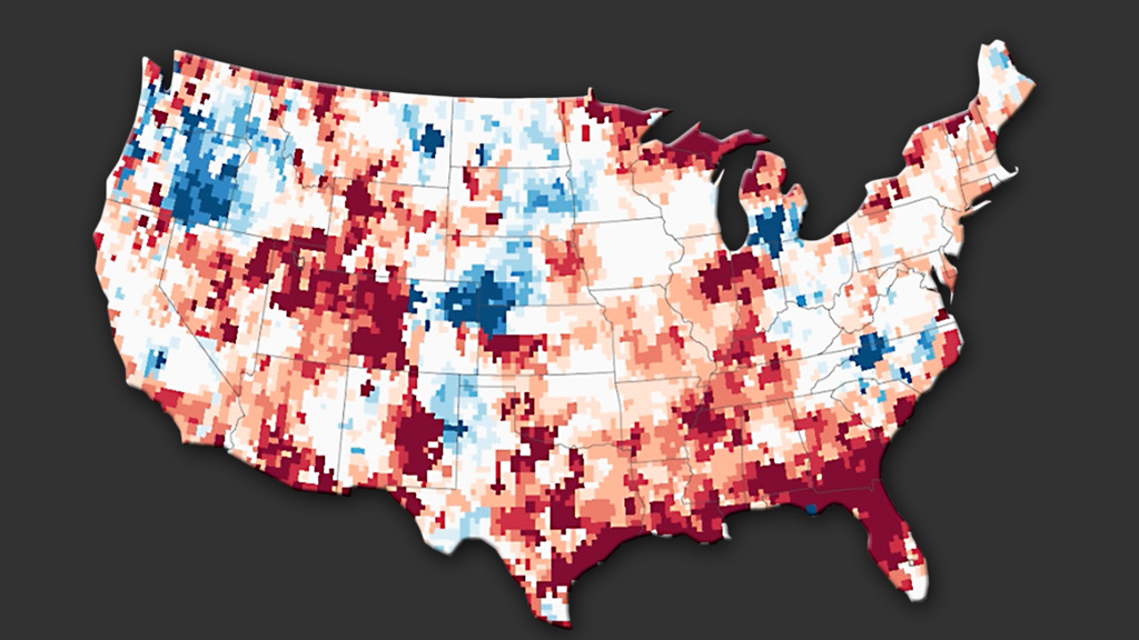
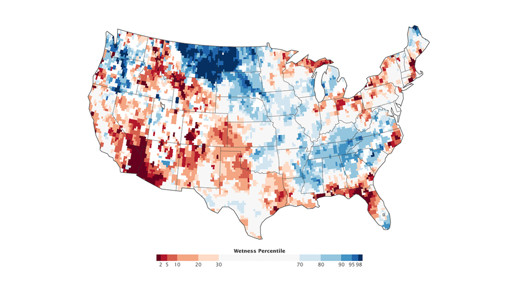
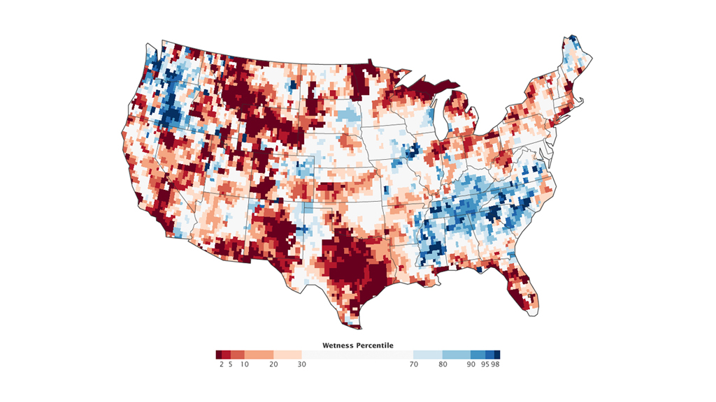
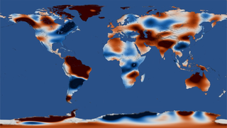
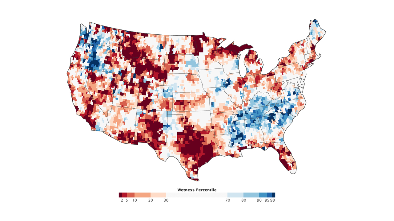
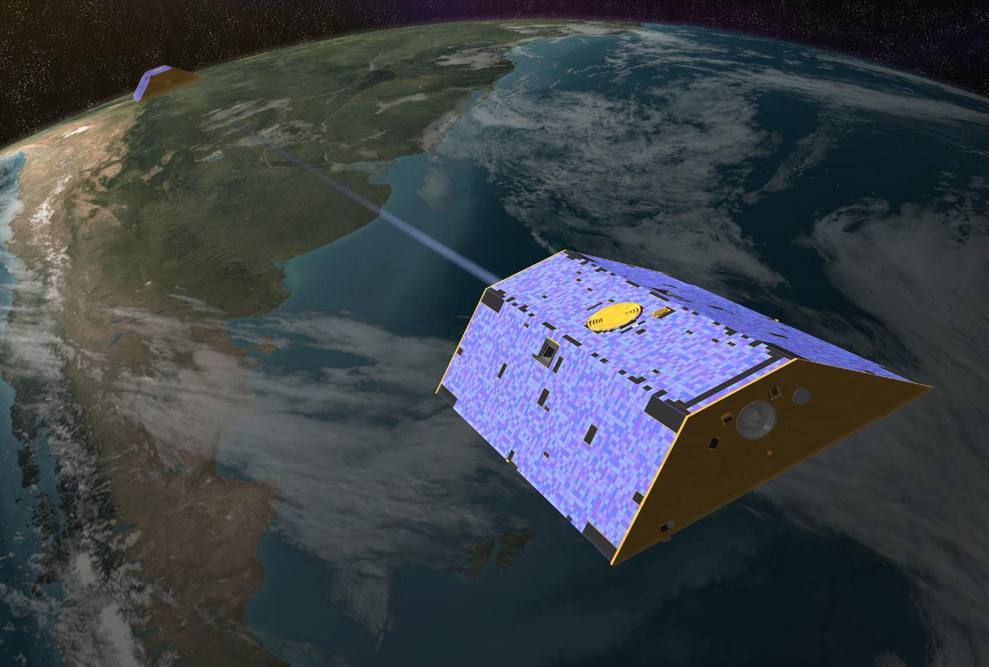
In 2012, the continental United States suffered through one of its worst droughts in decades. With another summer upon us, drought continues to be a problem for many parts of the country. Using data from NASA’s GRACE satellites and other satellite and ground-based measurements, scientists have created maps that show the amount of water in the U.S. stored near the surface and underground from August 2002 through May 2013. The maps provide two views of monthly changes in water storage: the wetness in the “root zone," or the top meter of soil, and the ground water storage in shallow aquifers. The color-coded maps express how much water is stored as a probability of occurrence from 1948 to 2009, where red colors represent places that are dryer than normal, and blue colors represent places that are wetter than normal. Watch the visualization to see how water storage in the U.S. changes over time.

Mapping Drought
For More Information
Story Credits
Visualizer/Animator:
Robert Simmon (Sigma Space Corporation)
Lead Writer:
Adam P. Voiland (Sigma Space Corporation)
Robert Simmon (Sigma Space Corporation)
Lead Writer:
Adam P. Voiland (Sigma Space Corporation)
Please give credit for this item to:
NASA's Earth Observatory
Maps courtesy of NDMC/C. Poulsen and NASA/GSFC/GRACE/M. Rodell
GRACE image courtesy of NASA
NASA's Earth Observatory
Maps courtesy of NDMC/C. Poulsen and NASA/GSFC/GRACE/M. Rodell
GRACE image courtesy of NASA
Short URL to share this page:
https://svs.gsfc.nasa.gov/11284
Keywords:
NASA Science >> Earth
SVS >> App
https://svs.gsfc.nasa.gov/11284
Keywords:
NASA Science >> Earth
SVS >> App


