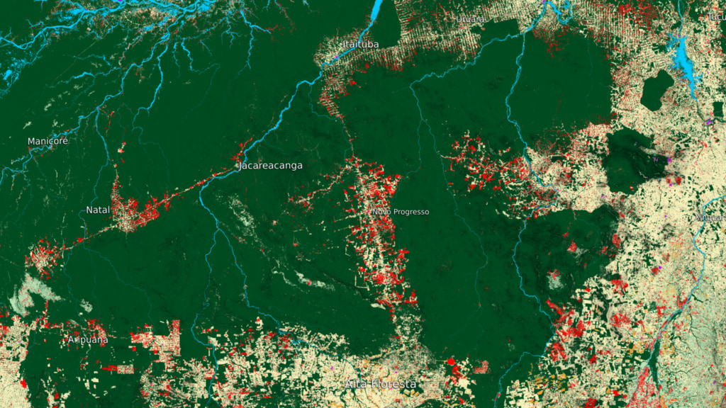
Novo Progresso Deforestation Soccer Field Comparison
Animation begins with a stylized bright green soccer field. Soccer fields then fall into place over a recently deforested field showing the estimated size of the newly cleared field. The camera then pulls back to reveal all the recently deforested areas (shown in bright green) around Novo Progresso from 2017 to 2018.
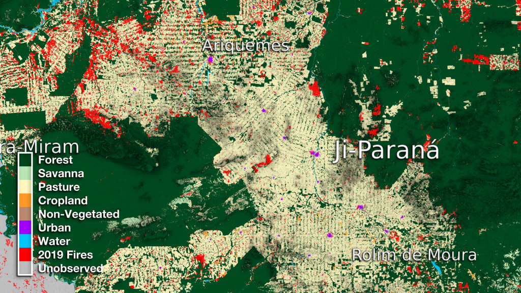
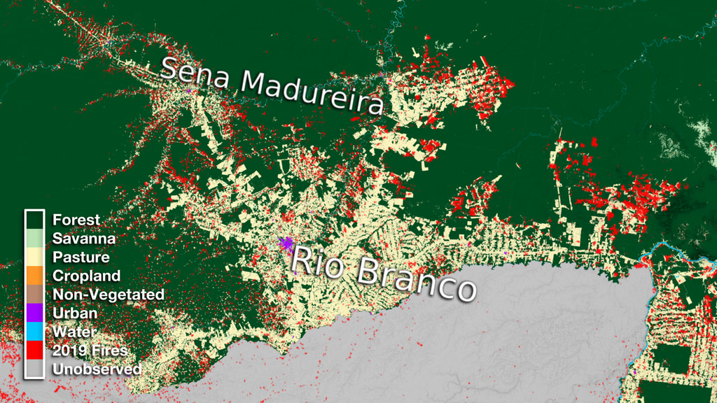
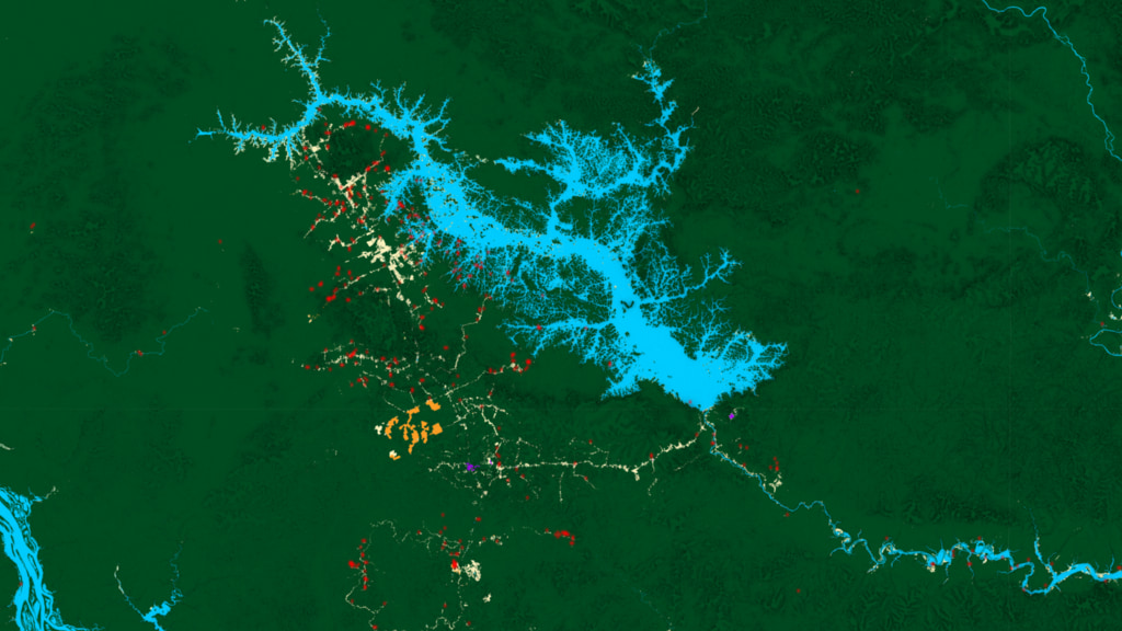
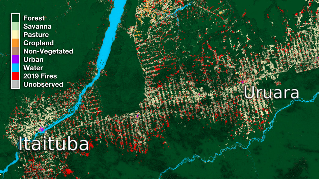
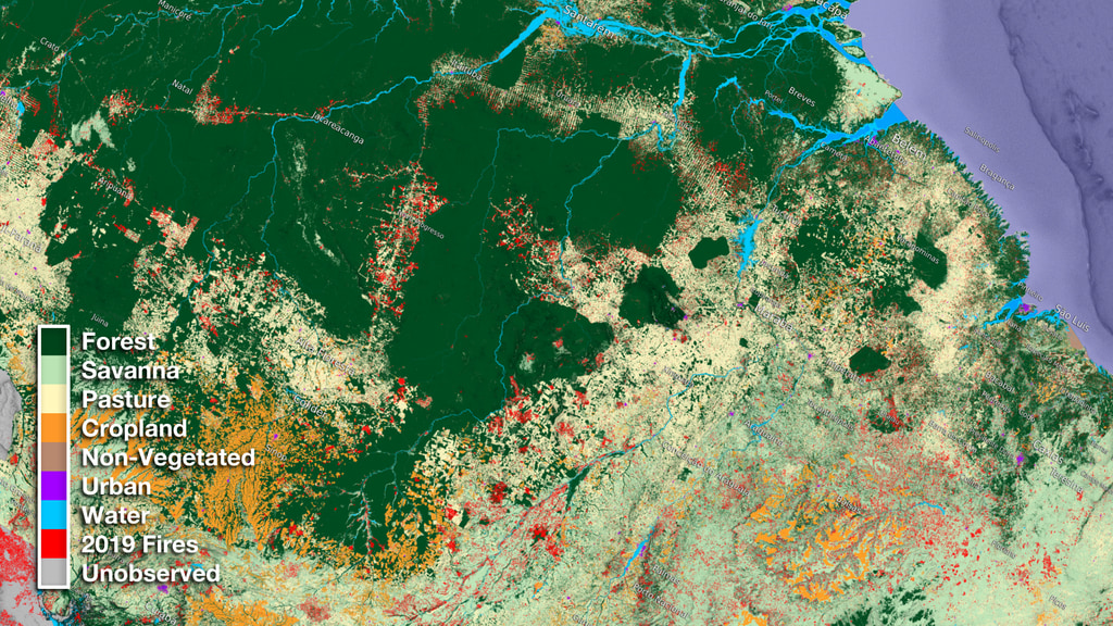
The Amazon has undergone major transformations throughout the past three decades (1985 - 2018). Working closely with their Brazilian counterparts, NASA scientists have mapped the entire country of Brazil to show different kinds of land use throughout the country. This new data is based on the Same animation as above, except in the end it shows all the deforestation that occured between 1985 to 2018 in bright green. Please give credit for this item to: This page was originally published on Monday, April 19, 2021. MapBiomas Project is a multi-institutional initiative to generate annual land cover and use maps using automatic classification processes applied to satellite images. This dataset can be found at: http://mapbiomas.org Note: While we identify the data sets used in these visualizations, we do not store any further details, nor the data sets themselves on our site.
As part of this research, we look closely at the town of Novo Progresso and try to give the viewer a sense of this area's size by comparing the deforested areas to the relative size of a soccer field.
Credits
NASA's Scientific Visualization StudioData visualizers
Producer
Scientist
Data provider
Technical support
Release date
This page was last updated on Wednesday, November 15, 2023 at 12:17 AM EST.
Datasets used in this visualization
Fire Pixels [Suomi NPP: VIIRS]
ID: 1053Biomass Map (MapBiomas)
ID: 1084
Related

Alternate Versions
Used as a Source In
![The Amazon is the largest tropical rainforest in the world, nearly as big as the continental United States. But every year, less of that forest is still standing. Today's deforestation across the Amazon frontier is tractors and bulldozers clearing large swaths to make room for industrial-scale cattle ranching and crops. Landsat satellite data is used to map land cover in Brazil with a historical perspective, going back to 1984.Music: Organic Circuit by Richard Birkin [PRS]; Into the Atmosphere by Sam Joseph Delves [PRS]; Ethereal Journey by Noé Bailleux [SACEM]; Wildfires by Magnum Opus [ASCAP]; Letter For Tomorrow by Anthony d’Amario [SACEM].Complete transcript available.Watch this video on the NASA Goddard YouTube channel.](/vis/a010000/a013600/a013694/Amazon_clearing_poster.jpg)
You may also like...