Climate Vital Signs Dashboard
Overview
NASA monitors the health of our planet to benefit human kind. Our missions track key climate indicators and we share these with the world.

Visualizations
- Section

NASA Climate Spiral 1880-2022
Go to this sectionThe visualization presents monthly global temperature anomalies between the years 1880-2022. Temperature anomalies are deviations from a long term global avergage. In this case the period 1951-1980 is used to define the baseline for the anomaly. These temperatures are based on the GISS Surface Temperature Analysis (GISTEMP v4), an estimate of global surface temperature change. The data file used to create this visualization is publically accessible here. The term 'climate spiral' describes an animated radial plot of global temperatures. Climate scientist Ed Hawkins from the National Centre for Atmospheric Science, University of Reading popularized this style of visualization in 2016. The Goddard Institute of Space Studies (GISS) is a NASA laboratory managed by the Earth Sciences Division of the agency’s Goddard Space Flight Center in Greenbelt, Maryland. The laboratory is affiliated with Columbia University’s Earth Institute and School of Engineering and Applied Science in New York. - Section
Global Temperature Anomalies from 1880 to 2022
Go to this sectionNASA Reports 2022 Tied for 5th Warmest Year on Record, Continuing a Trend Earth's global average surface temperature in 2022 tied with 2015 as the fifth warmest on record, according to an analysis by NASA. Continuing the planet's long-term warming trend, global temperatures in 2022 were 1.6 degrees Fahrenheit (0.89 degrees Celsius) above the average for NASA's baseline period (1951-1980), scientists from NASA's Goddard Institute for Space Studies (GISS) reported. The past nine years have been the warmest years since modern recordkeeping began in 1880. This means Earth in 2022 was about 2 degrees Fahrenheit (or about 1.11 degrees Celsius) warmer than the late 19th century average. “The reason for the warming trend is that human activities continue to pump enormous amounts of greenhouse gases into the atmosphere, and the long-term planetary impacts will also continue,” said Gavin Schmidt, director of GISS, NASA's leading center for climate modeling. Human-driven greenhouse gas emissions have rebounded following a short-lived dip in 2020 due to the COVID-19 pandemic. Recently, international scientists, including those at NASA, determined carbon dioxide emissions were the highest on record in 2022. NASA also identified some super-emitters of methane – another powerful greenhouse gas – using the Earth Surface Mineral Dust Source Investigation instrument that launched to the International Space Station earlier this year. The Arctic region continues to experience the strongest warming trends – close to four times the global average – according to new GISS research presented at the 2022 annual meeting of the American Geophysical Union and a separate study. NASA uses the period from 1951-1980 as a baseline to understand how global temperatures change over time. That baseline includes climate patterns such as La Niña and El Niño, as well as unusually hot or cold years due to other factors, ensuring that it encompasses natural variations in Earth's temperature. Many factors can affect the average temperature in any given year. For example, 2022 was one of the warmest on record despite a third consecutive year of La Niña conditions in the tropical Pacific Ocean. NASA scientists estimate that La Niña’s cooling influence may have lowered global temperatures slightly (about 0.11 degrees Fahrenheit or 0.06 degrees Celsius) from what the average would have been under more typical ocean conditions. A separate, independent analysis by the National Oceanic and Atmospheric Administration (NOAA) concluded that the global surface temperature for 2022 was the sixth highest since 1880. NOAA scientists use much of the same raw temperature data in their analysis and have a different baseline period (1901-2000) and methodology. Although rankings for specific years can differ slightly between the records, they are in broad agreement and both reflect ongoing long-term warming. NASA's full dataset of global surface temperatures through 2022, as well as full details with code of how NASA scientists conducted the analysis, are publicly available from GISS. GISS is a NASA laboratory managed by the Earth Sciences Division of the agency's Goddard Space Flight Center in Greenbelt, Maryland. The laboratory is affiliated with Columbia University's Earth Institute and School of Engineering and Applied Science in New York. For more information about NASA's Earth science programs, visit: https://www.nasa.gov/earth
- ID: 5059 Visualization
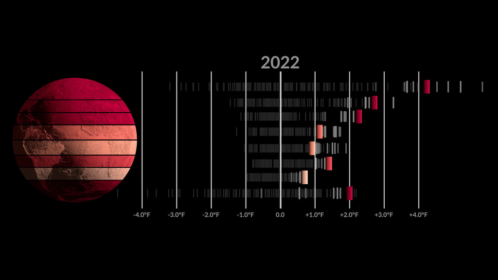
Zonal Climate Anomalies 1880-2022
Go to this pageA visualization of zonal temperature anomalies. The latitude zones are 90N-64N, 64N-44N, 44N-24N, 24N-EQU, EQU-24S, 24S-44S, 44S-64S, 64S-90S. The anomalies are calculated relative to a baseline period of 1951-1980. This version is in Fahrenheit, an alternate version in Celsius is also available. || GISTEMP_Zonal_F.00899_print.jpg (1024x576) [52.2 KB] || GISTEMP_Zonal_F.00899_searchweb.png (320x180) [21.1 KB] || GISTEMP_Zonal_F.00899_thm.png (80x40) [2.9 KB] || GISTEMP_Zonal_F.mp4 (3840x2160) [27.3 MB] || GISTEMP_Zonal_F.webm (3840x2160) [6.2 MB] || F (3840x2160) [64.0 KB] ||
- ID: 5099 Visualization
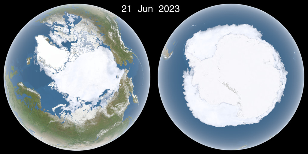
Daily Polar Sea Ice, Two Year History
Go to this pagePolar daily sea ice, two years' history, with dates || polar_sea_ice_sxs_w_date.2023172_print.jpg (1024x512) [109.3 KB] || polar_sea_ice_sxs_w_date.2023172_searchweb.png (320x180) [76.3 KB] || polar_sea_ice_sxs_w_date.2023172_thm.png (80x40) [6.7 KB] || polar_sea_ice_sxs_w_date_2048p30_h265.mp4 (4096x2048) [39.5 MB] || polar_sea_ice_sxs_w_date_2048p30_h265.webm (4096x2048) [6.2 MB] || w_dates (4320x2160) [64.0 KB] ||
- Section
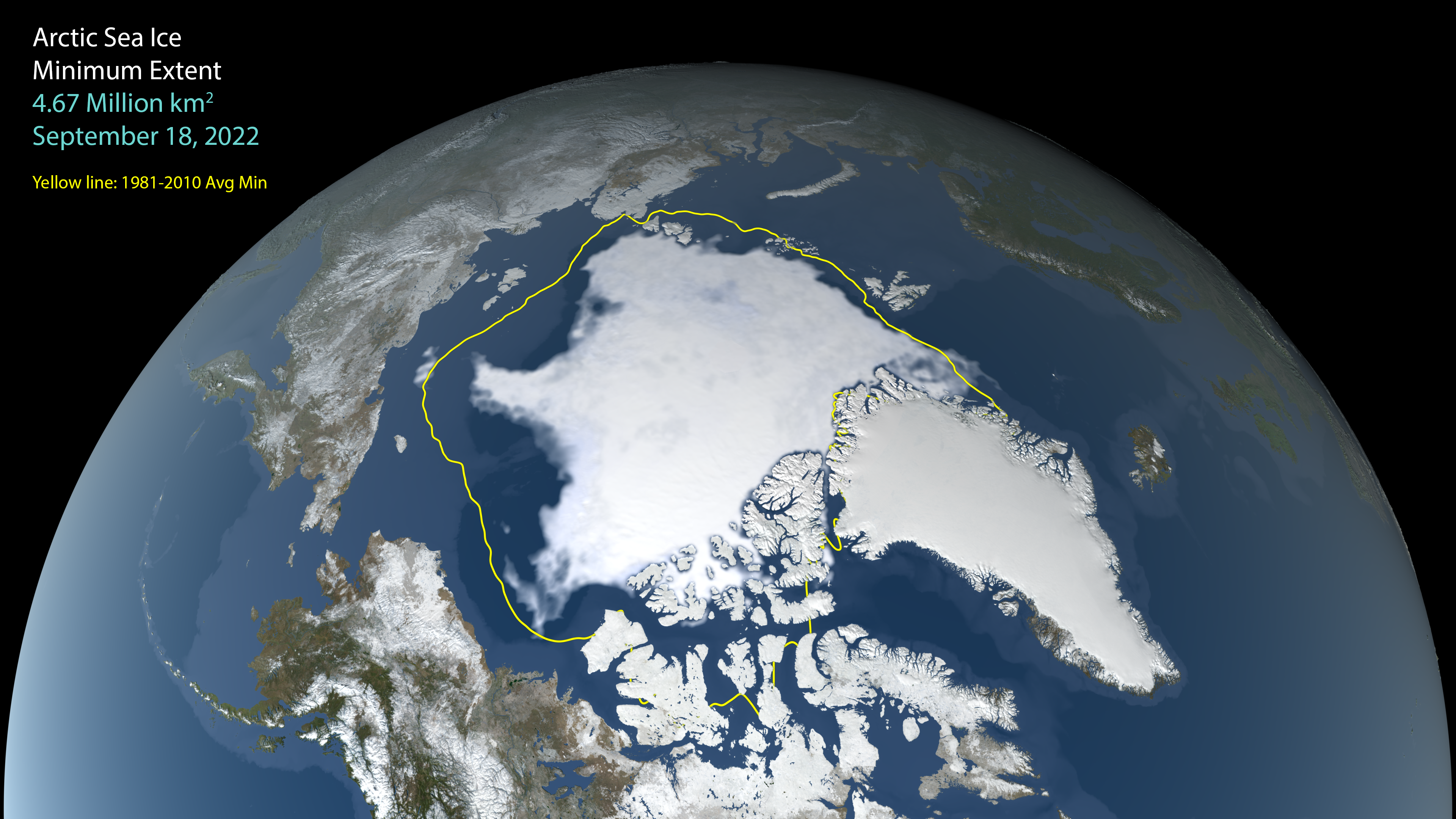
Arctic Sea Ice Minimum 2022
Go to this sectionSatellite-based passive microwave images of the sea ice have provided a reliable tool for continuously monitoring changes in the Arctic ice since 1979. Every summer the Arctic ice cap melts down to what scientists call its "minimum" before colder weather begins to cause ice cover to increase. An analysis of satellite data by NASA and the National Snow and Ice Data Center (NSIDC) at the University of Colorado Boulder shows that the 2021 minimum extent, which was likely reached on Sept. 18, measured 1.80 million square miles (4.67 million square kilometers). The Japan Aerospace Exploration Agency (JAXA) provides many water-related products derived from data acquired by the Advanced Microwave Scanning Radiometer 2 (AMSR2) instrument aboard the Global Change Observation Mission 1st-Water "SHIZUKU" (GCOM-W1) satellite. Two JAXA datasets used in this animation are the 10-km daily sea ice concentration and the 10 km daily 89 GHz Brightness Temperature. In this animation, the daily Arctic sea ice and seasonal land cover change progress through time, from the yearly maximum ice extent on February 25 2022, through its minimum on September 18 2022. Over the water, Arctic sea ice changes from day to day showing a running 3-day minimum sea ice concentration in the region where the concentration is greater than 15%. The blueish white color of the sea ice is derived from a 3-day running minimum of the AMSR2 89 GHz brightness temperature. The yellow boundary shows the minimum extent averaged over the 30-year period from 1981 to 2010. Over the terrain, monthly data from the seasonal Blue Marble Next Generation fades slowly from month to month.
- ID: 5114 Visualization
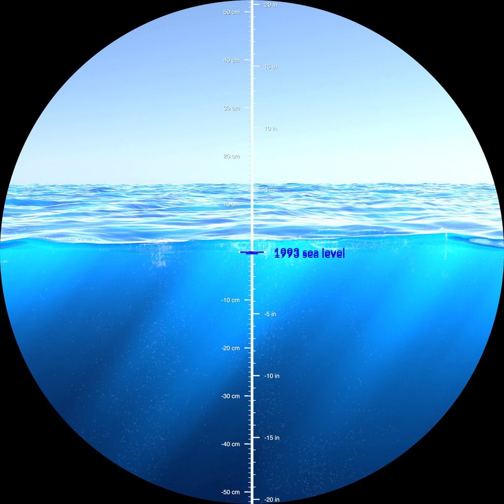
Sea Level Through a Porthole
Go to this pageAs the planet warms and polar ice melts, our global average sea level is rising. Although exact ocean heights vary due to local geography, climate over time, and dynamic fluid interactions with gravity and planetary rotation, scientists observe sea level trends by comparing measurements against a 20 year spatial and temporal mean reference. These visualizations use the visual metaphor of a submerged porthole window to observe how far our oceans rose between 1993 and 2022. ||
- ID: 5111 Visualization
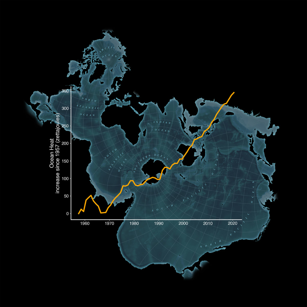
Increase in Ocean Heat since 1957 Map - Spilhaus Projection
Go to this pageA graph of changes in ocean heat content since 1957 overlaying a Spilhaus projection map highlighting the world’s oceans. || oceans_spilhaus_map2160_print.jpg (1024x1024) [151.3 KB] || oceans_spilhaus_map2160.png (2160x2160) [2.2 MB] || oceans_spilhaus_map2160_searchweb.png (320x180) [62.9 KB] || oceans_spilhaus_map2160_thm.png (80x40) [5.4 KB] ||
- ID: 5119 Visualization
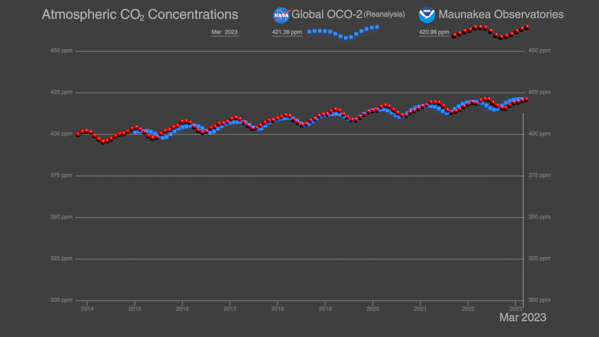
OCO-2 and Keeling Curve: Trends in global atmospheric Carbon Dioxide (CO₂)
Go to this pageOCO-2 and Keeling Curve trends in global atmospheric carbon dioxide. || KeelingCurve_OCO2_1920x1080p30.00370_print.jpg (1024x576) [49.6 KB] || KeelingCurve_OCO2_1920x1080p30.00370.png (1920x1080) [357.7 KB] || KeelingCurve_OCO2_1920x1080p30.00370_searchweb.png (320x180) [16.8 KB] || KeelingCurve_OCO2_1920x1080p30.00370_thm.png (80x40) [2.1 KB] || 1920x1080_16x9_30p (1920x1080) [64.0 KB] || OCO2_KeelingCurve_1920x1080p30.mp4 (1920x1080) [5.3 MB] || KeelingCurve_OCO2_1920x1080p30.00370.exr (1920x1080) [2.3 MB] ||