Sun
ID: 3432
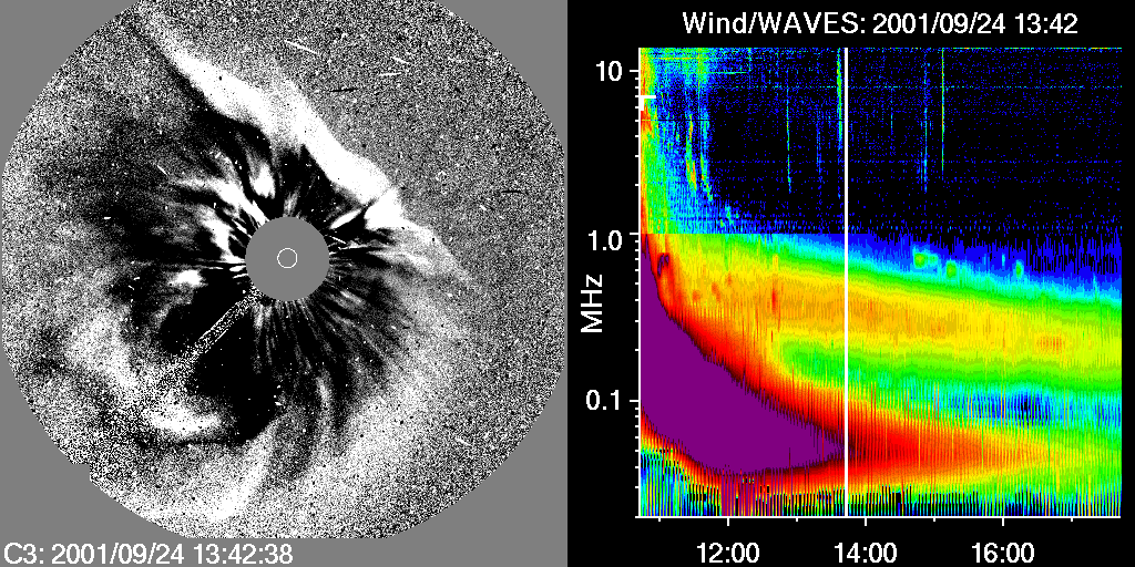
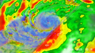
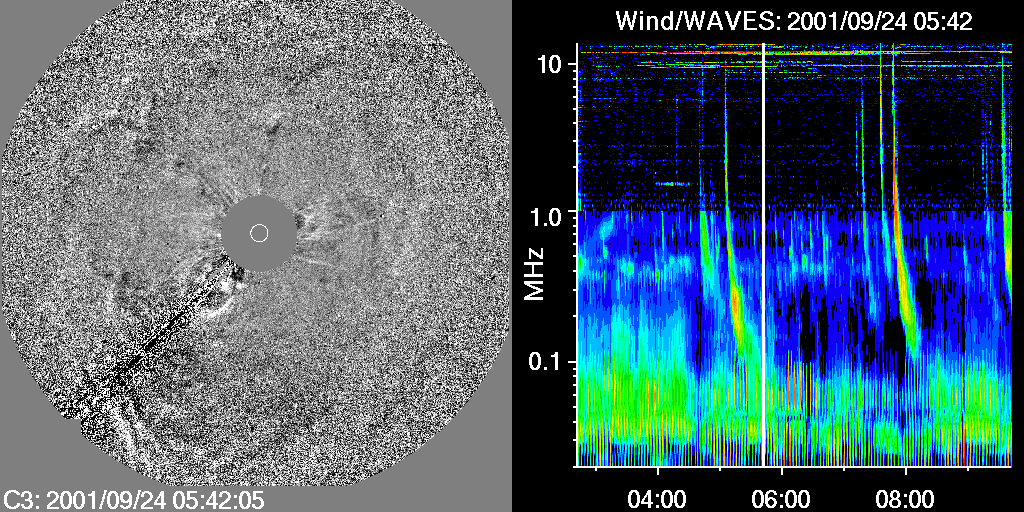
This is a simple comparison of SOHO/LASCO/C3 difference images (left side) combined with radio data from Wind/WAVES (right side).
The LASCO difference images are produced from a time series of images by subtracting the previous image from the current image. Moving material therefore appears white on the leading edge and dark behind it. The WAVES spectrograph shows the variation of radio intensity (black is low, violet is high) in frequency (vertical axis) and time(horizontal axis). A vertical white bar marks the time of the LASCO image.
The radio-loud emission of the CME is the yellow-orange band between 0.2-1.0 MHz.
Coronal Mass Ejections (CME): Radio Loud Variety
The LASCO difference images are produced from a time series of images by subtracting the previous image from the current image. Moving material therefore appears white on the leading edge and dark behind it. The WAVES spectrograph shows the variation of radio intensity (black is low, violet is high) in frequency (vertical axis) and time(horizontal axis). A vertical white bar marks the time of the LASCO image.
The radio-loud emission of the CME is the yellow-orange band between 0.2-1.0 MHz.
Visualization Credits
Tom Bridgman (Global Science and Technology, Inc.): Lead Animator
Natchimuthuk Gopalswamy (NASA/GSFC): Scientist
William Steigerwald (NASA/GSFC): Writer
Natchimuthuk Gopalswamy (NASA/GSFC): Scientist
William Steigerwald (NASA/GSFC): Writer
Please give credit for this item to:
NASA/Goddard Space Flight Center Scientific Visualization Studio
NASA/Goddard Space Flight Center Scientific Visualization Studio
Short URL to share this page:
https://svs.gsfc.nasa.gov/3432
Missions:
SOHO
Wind
Data Used:
Note: While we identify the data sets used in these visualizations, we do not store any further details nor the data sets themselves on our site.
This item is part of this series:
CMEs: Radio Loud and Quiet
Keywords:
SVS >> SOHO
GCMD >> Earth Science >> Sun-earth Interactions >> Solar Activity
GCMD >> Earth Science >> Sun-earth Interactions >> Solar Activity >> Solar Events
GCMD >> Earth Science >> Sun-earth Interactions >> Solar Activity >> Solar Radio Waves
NASA Science >> Sun
GCMD >> Earth Science >> Sun-earth Interactions >> Solar Activity >> Coronal Mass Ejections
GCMD keywords can be found on the Internet with the following citation: Olsen, L.M., G. Major, K. Shein, J. Scialdone, S. Ritz, T. Stevens, M. Morahan, A. Aleman, R. Vogel, S. Leicester, H. Weir, M. Meaux, S. Grebas, C.Solomon, M. Holland, T. Northcutt, R. A. Restrepo, R. Bilodeau, 2013. NASA/Global Change Master Directory (GCMD) Earth Science Keywords. Version 8.0.0.0.0
https://svs.gsfc.nasa.gov/3432
Missions:
SOHO
Wind
Data Used:
Wind/WAVES
2001-09-24SOHO/Large Angle Spectrometric COronagraph (LASCO)/C3 also referred to as: LASCO/C3
NASA and ESA - 2001-09-24This item is part of this series:
CMEs: Radio Loud and Quiet
Keywords:
SVS >> SOHO
GCMD >> Earth Science >> Sun-earth Interactions >> Solar Activity
GCMD >> Earth Science >> Sun-earth Interactions >> Solar Activity >> Solar Events
GCMD >> Earth Science >> Sun-earth Interactions >> Solar Activity >> Solar Radio Waves
NASA Science >> Sun
GCMD >> Earth Science >> Sun-earth Interactions >> Solar Activity >> Coronal Mass Ejections
GCMD keywords can be found on the Internet with the following citation: Olsen, L.M., G. Major, K. Shein, J. Scialdone, S. Ritz, T. Stevens, M. Morahan, A. Aleman, R. Vogel, S. Leicester, H. Weir, M. Meaux, S. Grebas, C.Solomon, M. Holland, T. Northcutt, R. A. Restrepo, R. Bilodeau, 2013. NASA/Global Change Master Directory (GCMD) Earth Science Keywords. Version 8.0.0.0.0