Earth
ID: 3308
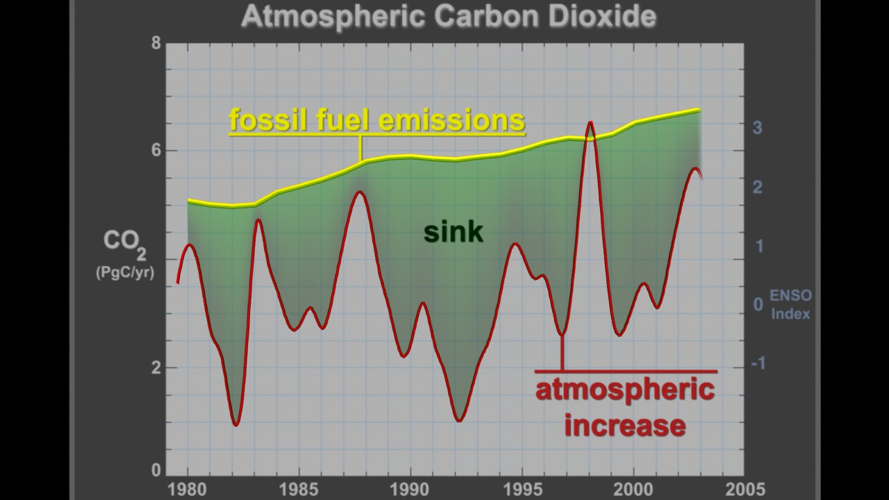
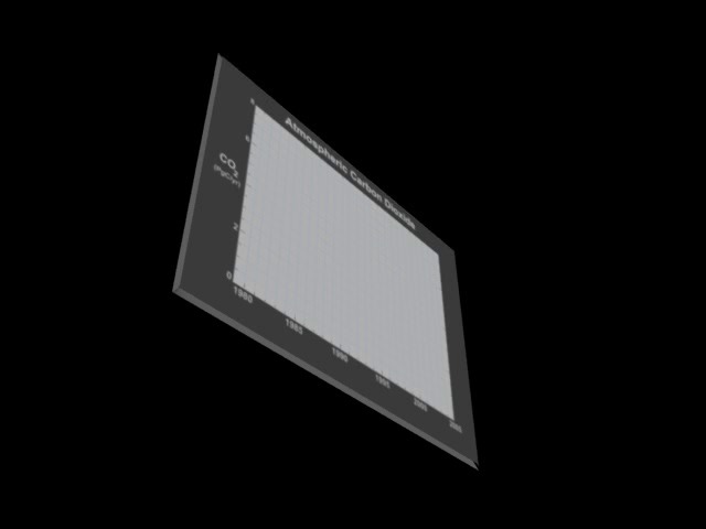
This visualization shows atmospheric carbon dioxide from 1980 to 2005. The first curve (in yellow) is fossil fuel emissions which is the known amount of carbon dioxide put out into the atmosphere. The second curve (in red) is the atmospheric increase which is the measured carbon in the atmosphere. Next, a green region between the two curves highlights the sink which is the amount of carbon dioxide that taken out of the atmosphere by natural processes. Scientists understand when some of the carbon sink occurs, but not all of it. This 'missing carbon' is a scientific mystery. Finally, in the visualization, the El Niño Southern Oscillation (ENSO) Index is added along with blue bars that indicate when each El Niño happens. Notice the strong correlation between the ENSO Index curve and the spikes in the atmospheric increase curve. During an El Niño, there is apparently less of a carbon sink.


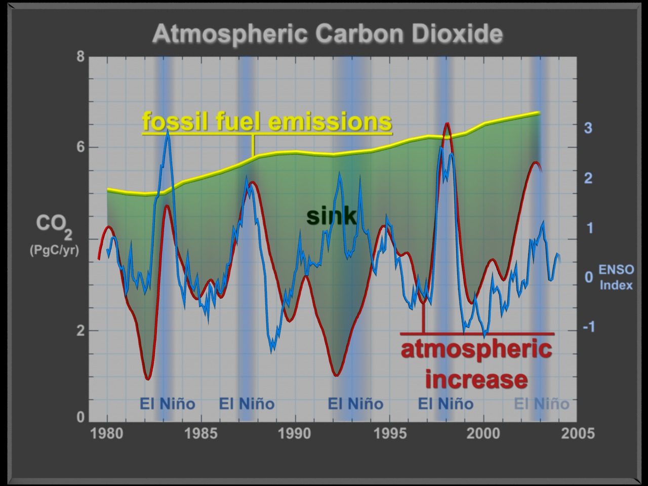
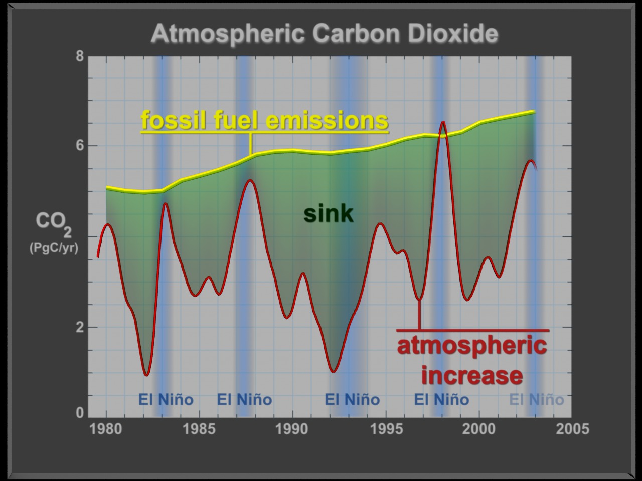
Atmospheric Carbon Dioxide from 1980 to 2005
Visualization Credits
Please give credit for this item to:
NASA/Goddard Space Flight Center Scientific Visualization Studio
NASA/Goddard Space Flight Center Scientific Visualization Studio
Short URL to share this page:
https://svs.gsfc.nasa.gov/3308
Dates of Data Used:
1980 to 2005
This item is part of this series:
Missing Carbon
Goddard TV Tape:
G2007-001HD -- NASA's HD Climate Change Resource Tape
Keywords:
SVS >> HDTV
GCMD >> Earth Science >> Atmosphere >> Atmospheric Chemistry/Carbon and Hydrocarbon Compounds >> Carbon Dioxide
GCMD >> Earth Science >> Climate Indicators >> Teleconnections >> El Nino Southern Oscillation
NASA Science >> Earth
GCMD keywords can be found on the Internet with the following citation: Olsen, L.M., G. Major, K. Shein, J. Scialdone, S. Ritz, T. Stevens, M. Morahan, A. Aleman, R. Vogel, S. Leicester, H. Weir, M. Meaux, S. Grebas, C.Solomon, M. Holland, T. Northcutt, R. A. Restrepo, R. Bilodeau, 2013. NASA/Global Change Master Directory (GCMD) Earth Science Keywords. Version 8.0.0.0.0