A Tour of the Cryosphere
Click here to go to the media download section.
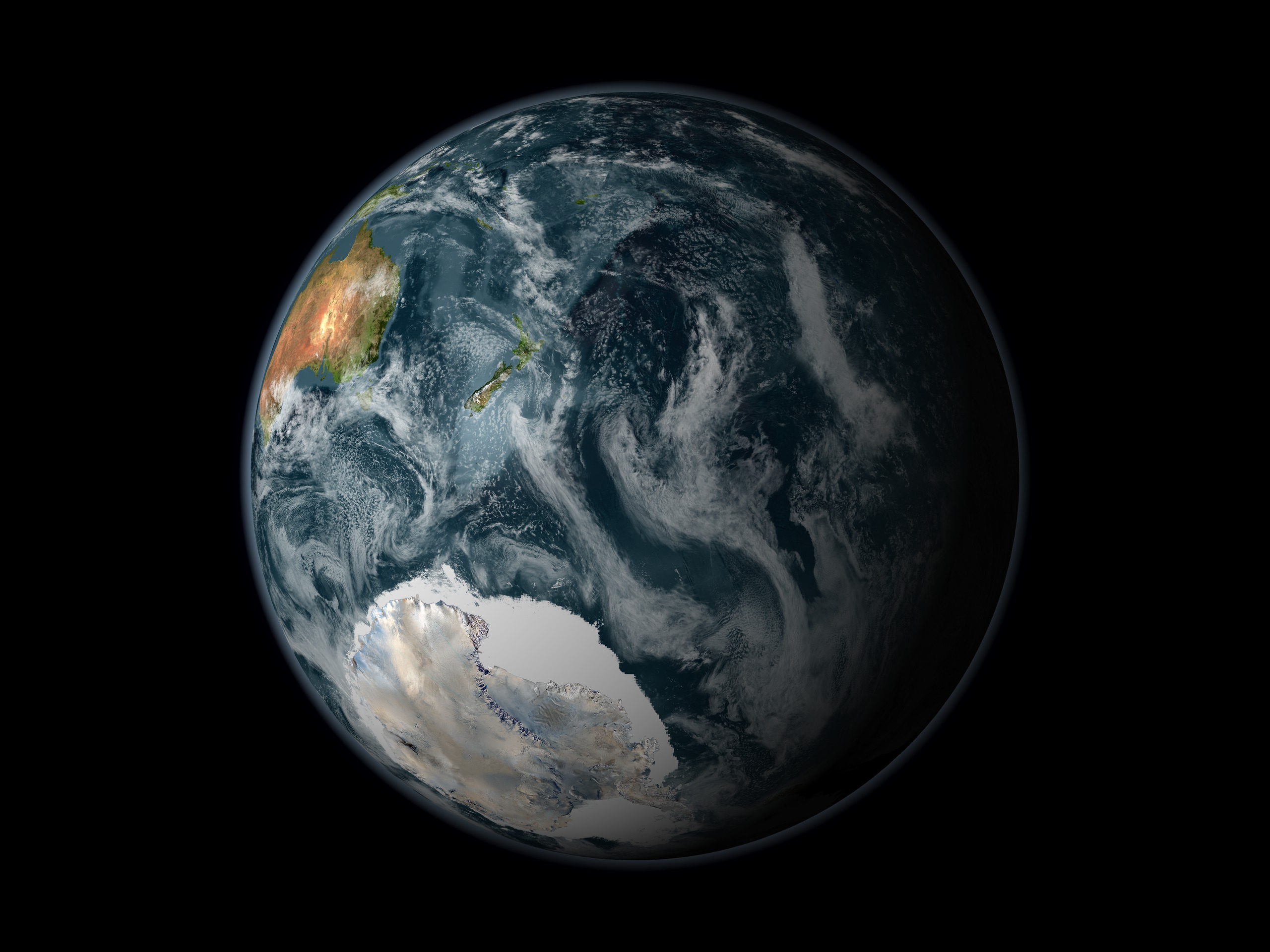
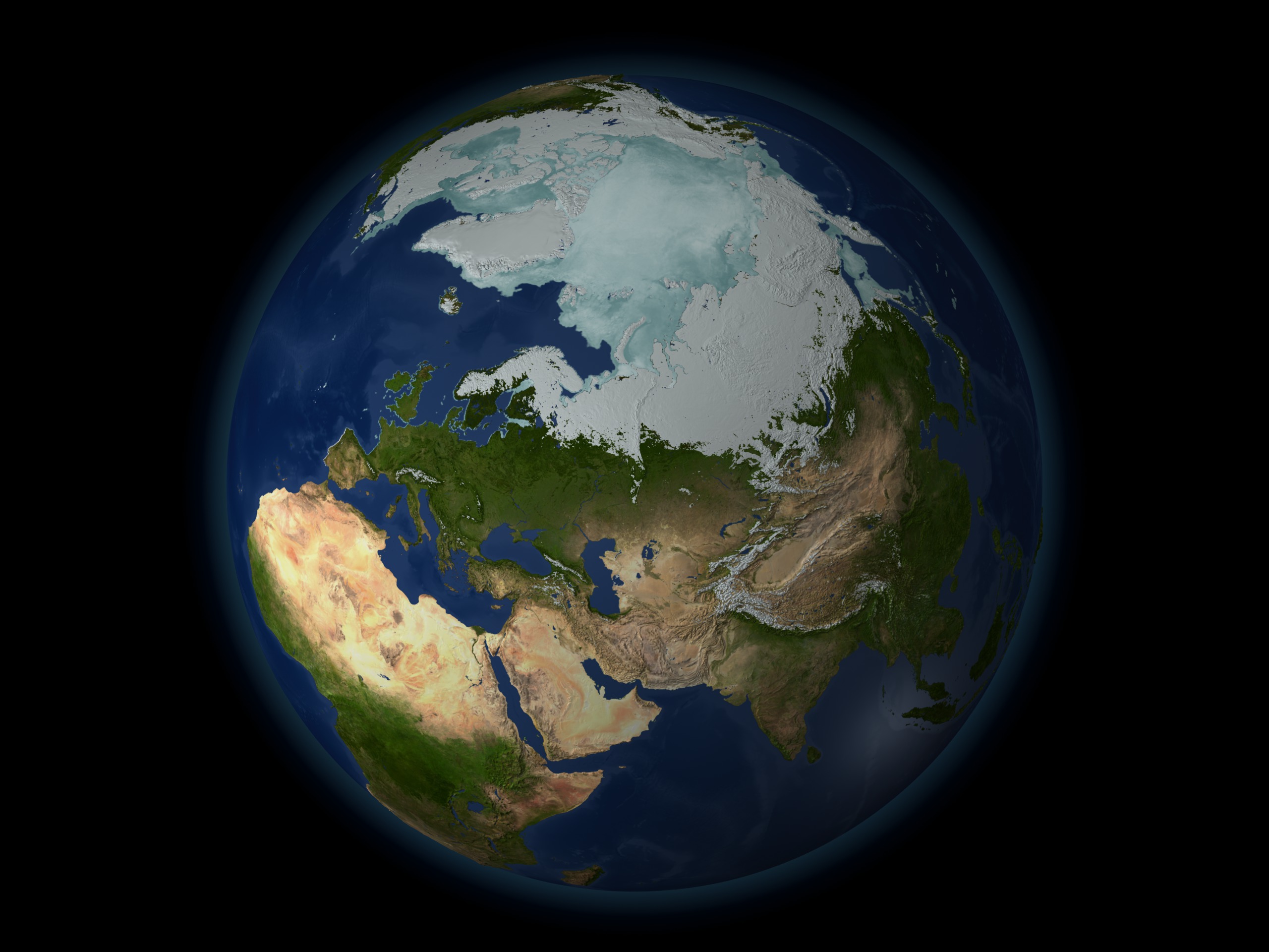
The cryosphere consists of those parts of the Earth's surface where water is found in solid form, including areas of snow, sea ice, glaciers, permafrost, ice sheets, and icebergs. In these regions, surface temperatures remain below freezing for a portion of each year. Since ice and snow exist relatively close to their melting point, they frequently change from solid to liquid and back again due to fluctuations in surface temperature. Although direct measurements of the cryosphere can be difficult to obtain due to the remote locations of many of these areas, using satellite observations scientists monitor changes in the global and regional climate by observing how regions of the Earth's cryosphere shrink and expand.
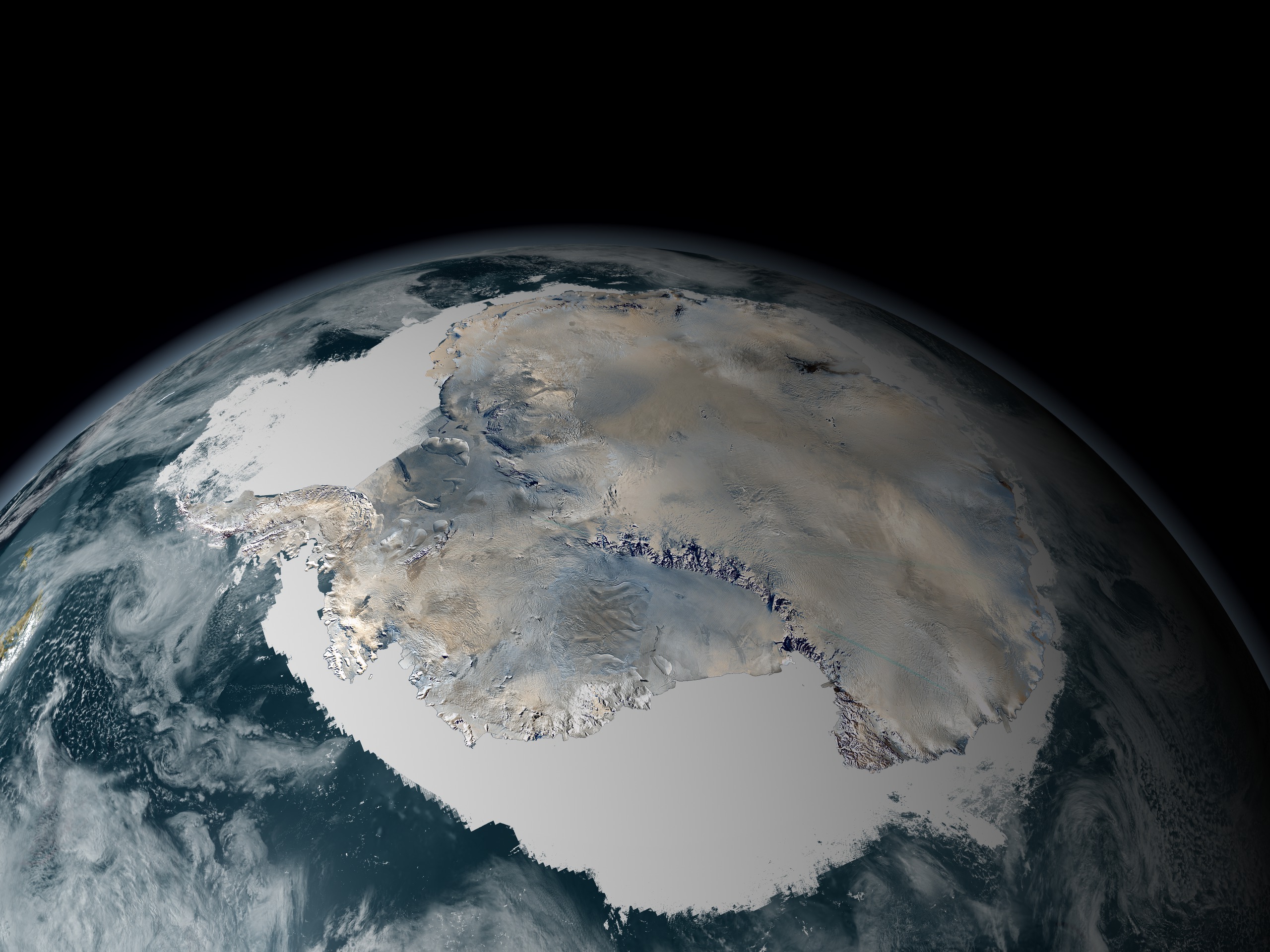
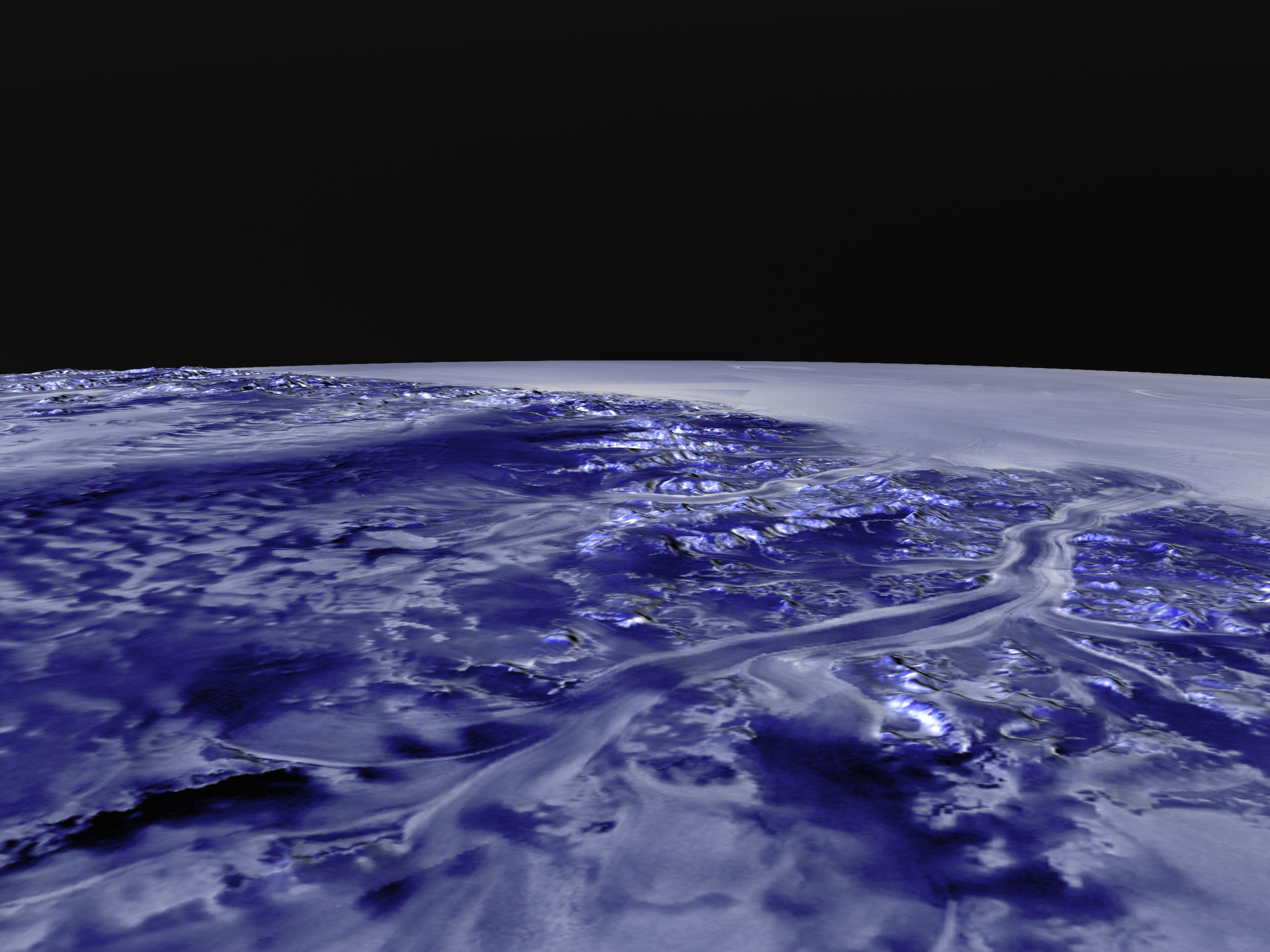
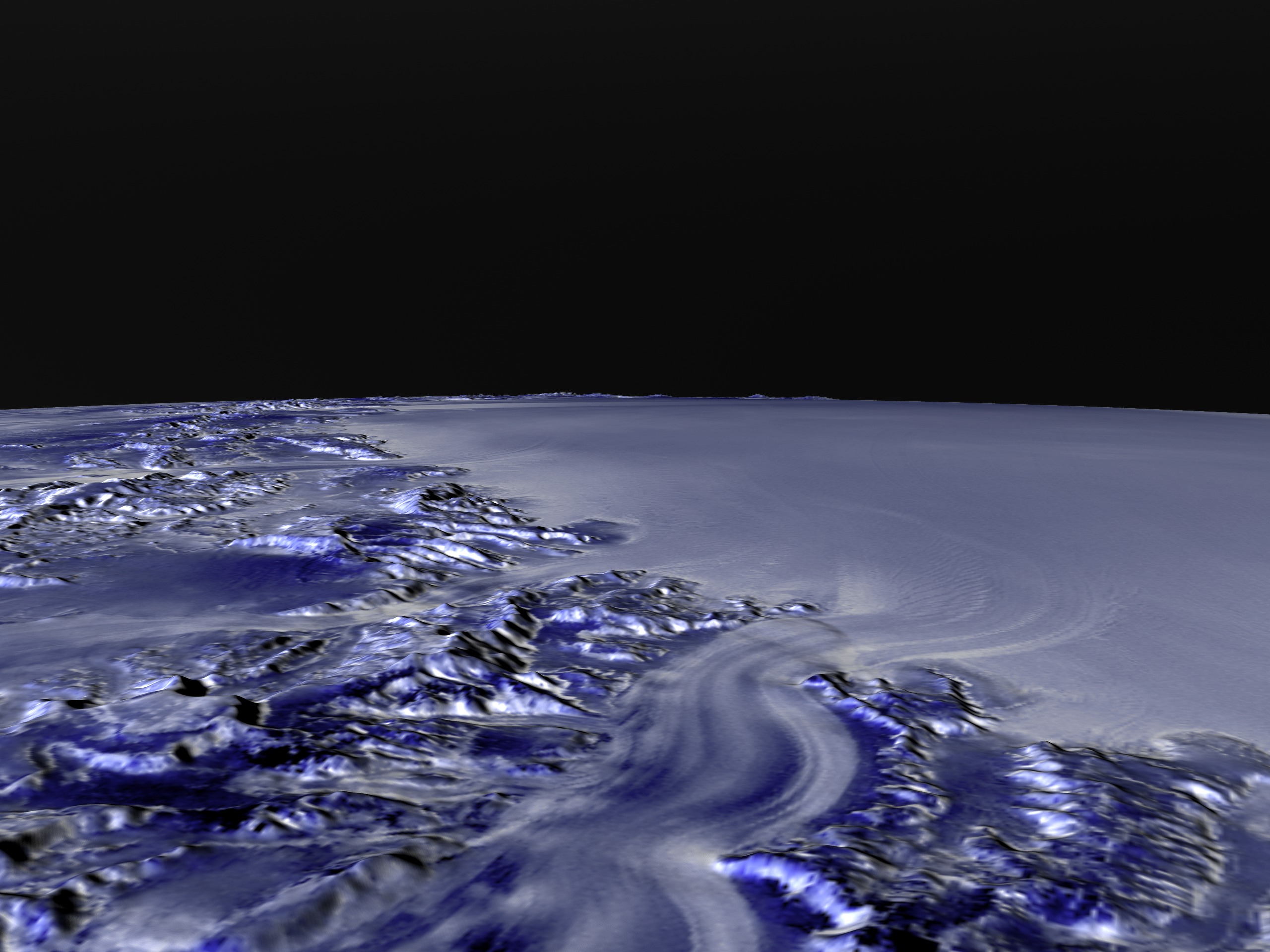
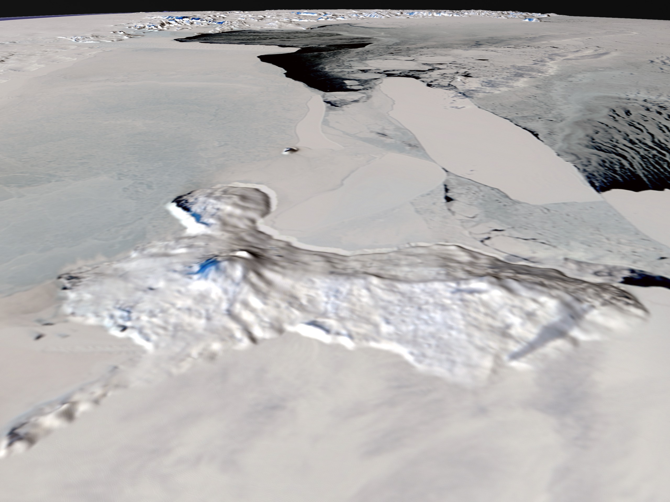
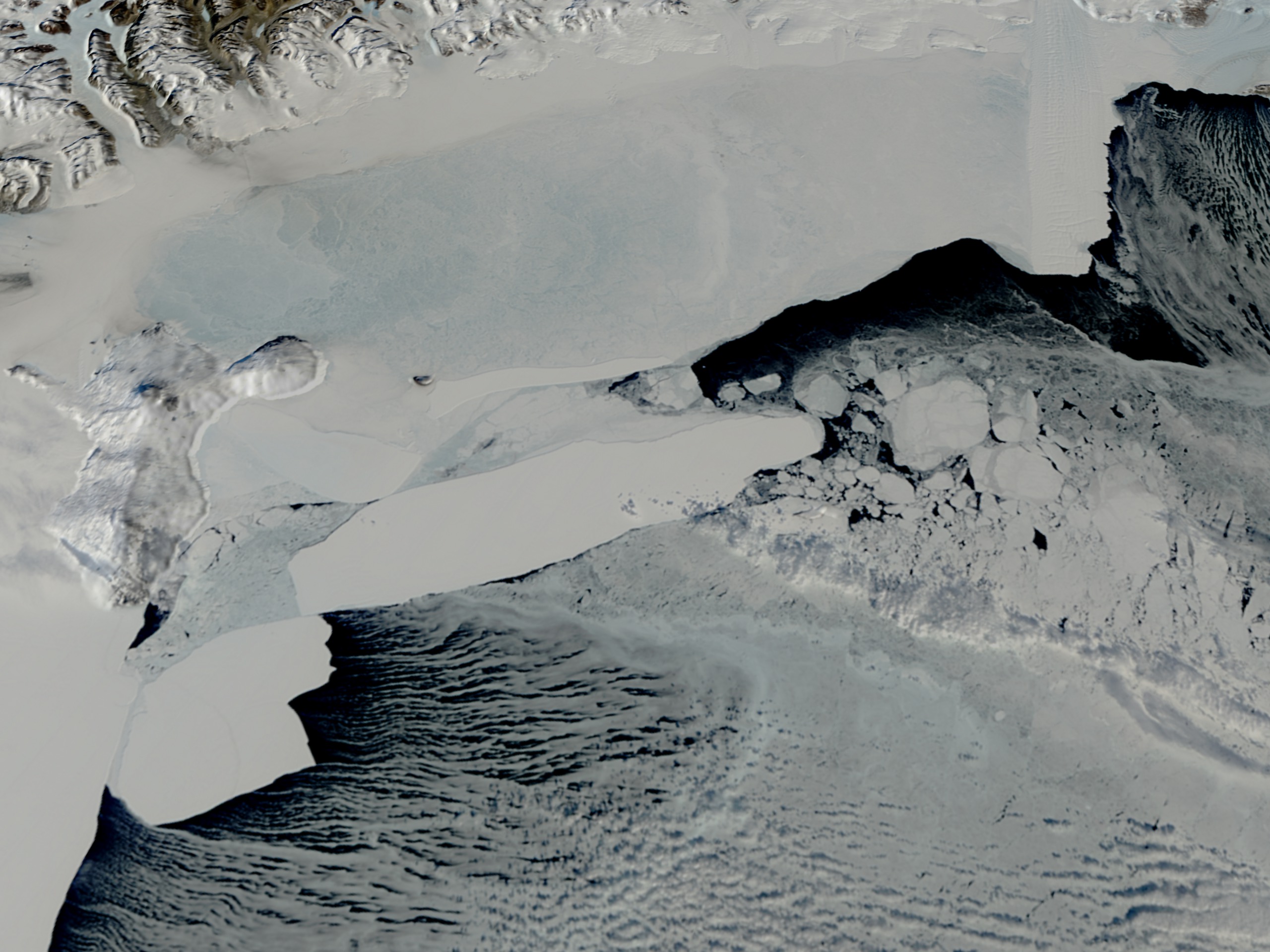
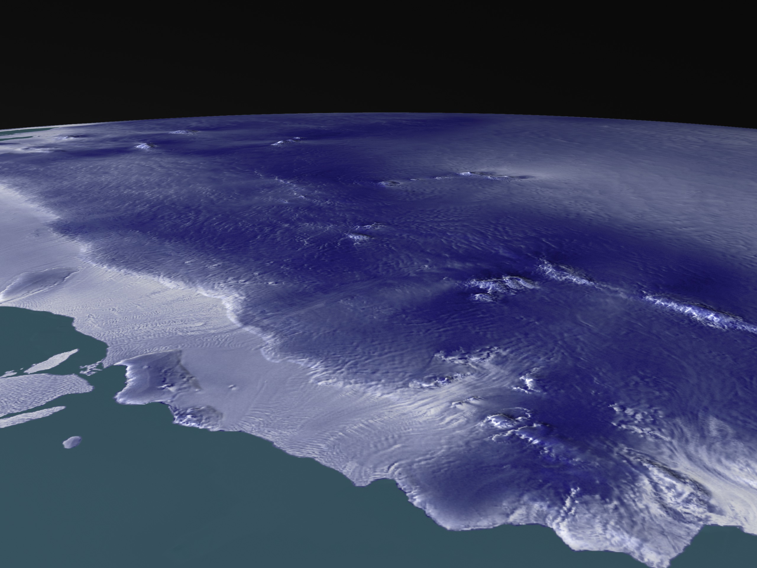
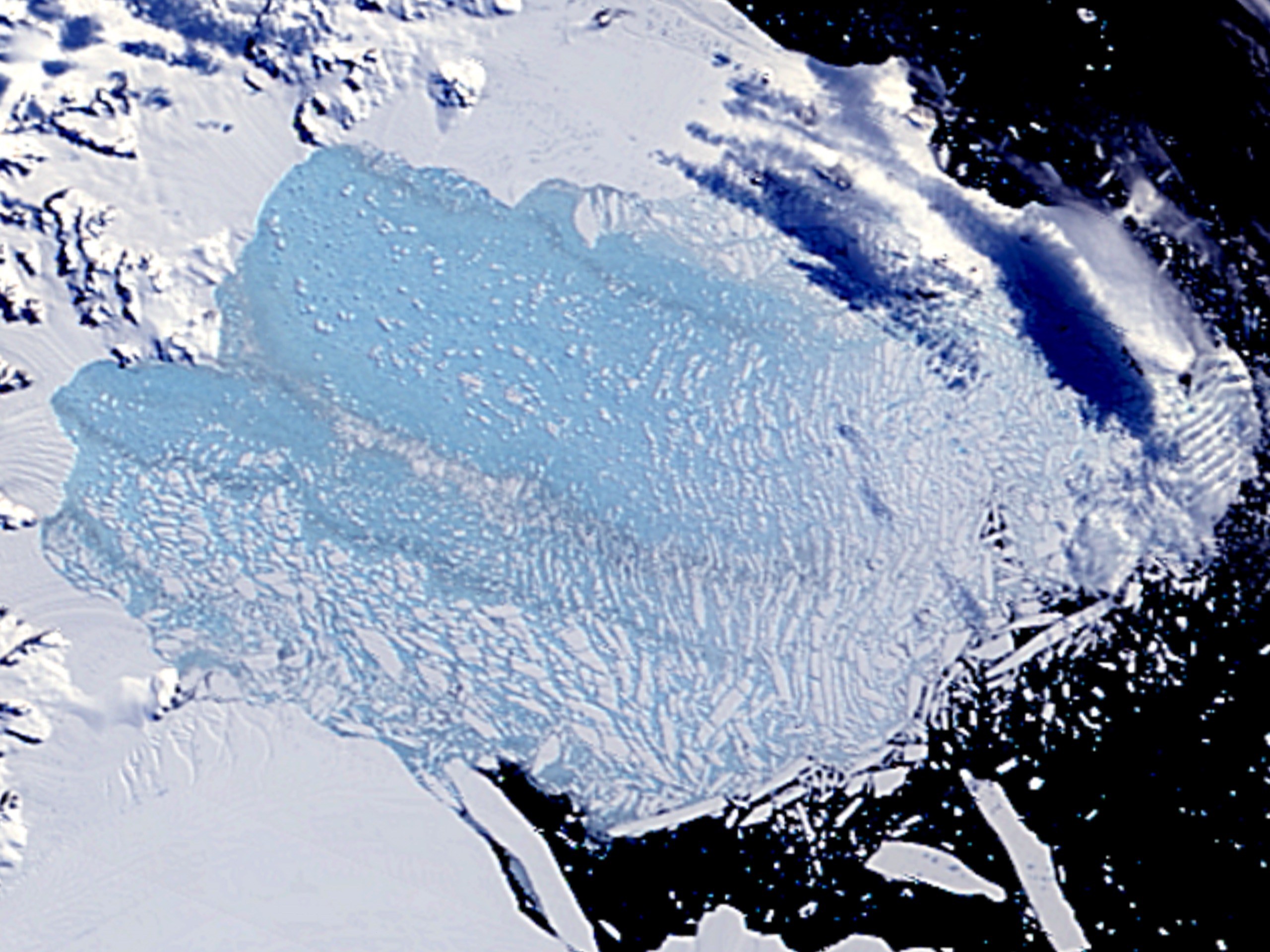
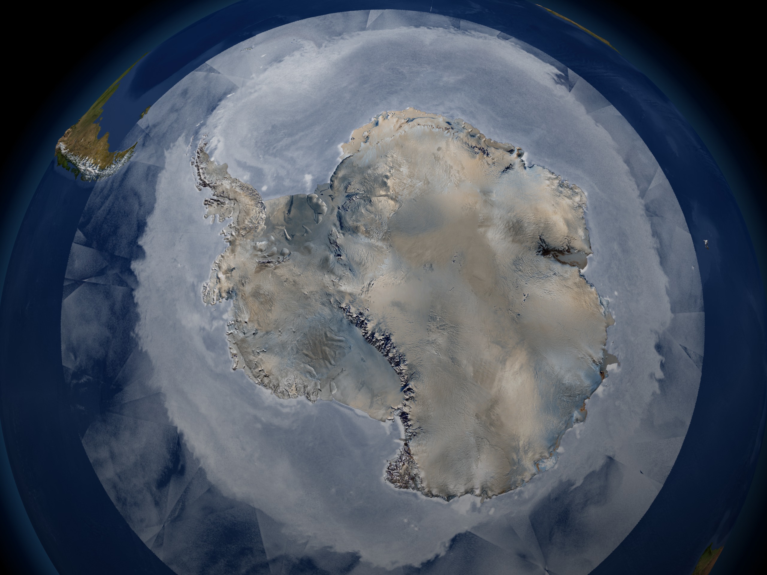
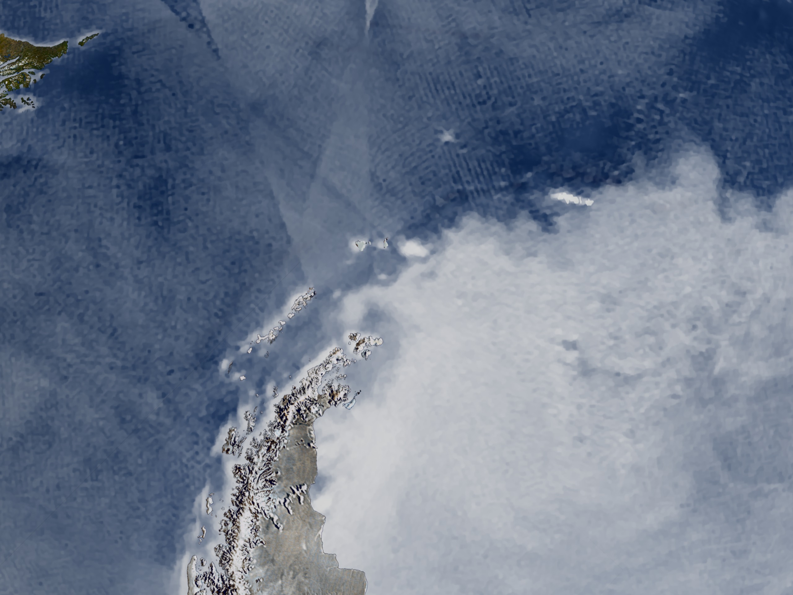
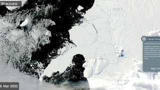
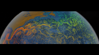
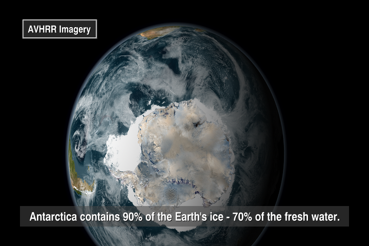
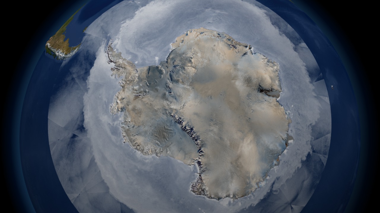
This animation portrays fluctuations in the cryosphere through observations collected from a variety of satellite-based sensors. The animation begins in Antarctica, showing ice thickness ranging from 2.7 to 4.8 kilometers thick along with swaths of polar stratospheric clouds. In a tour of this frozen continent, the animation shows some unique features of the Antarctic landscape found nowhere else on earth. Ice shelves, ice streams, glaciers, and the formation of massive icebergs can be seen. A time series shows the movement of iceberg B15A, an iceberg 295 kilometers in length which broke off of the Ross Ice Shelf in 2000. Moving farther along the coastline, a time series of the Larsen ice shelf shows the collapse of over 3,200 square kilometers ice since January 2002. As we depart from the Antarctic, we see the seasonal change of sea ice and how it nearly doubles the size of the continent during the winter.
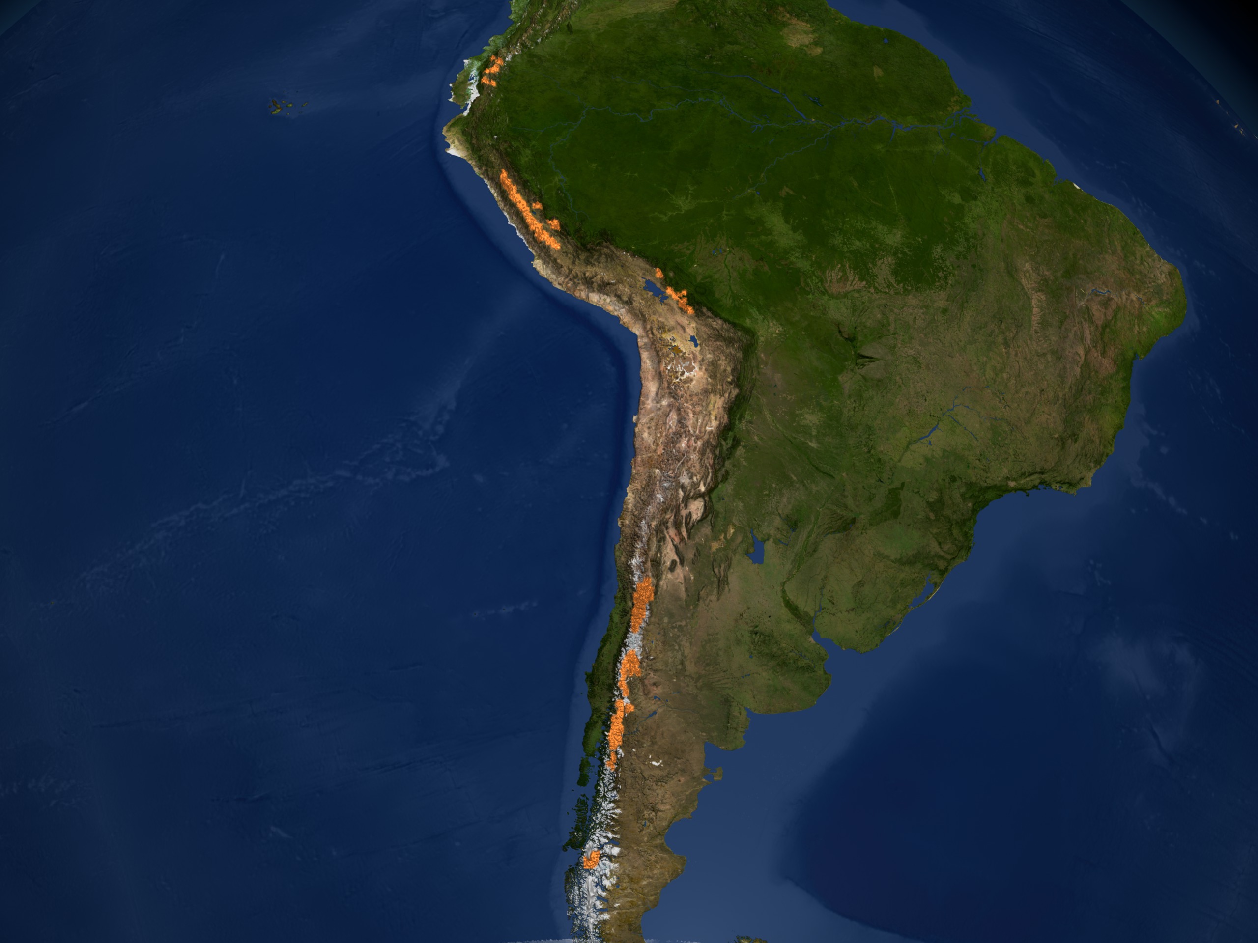
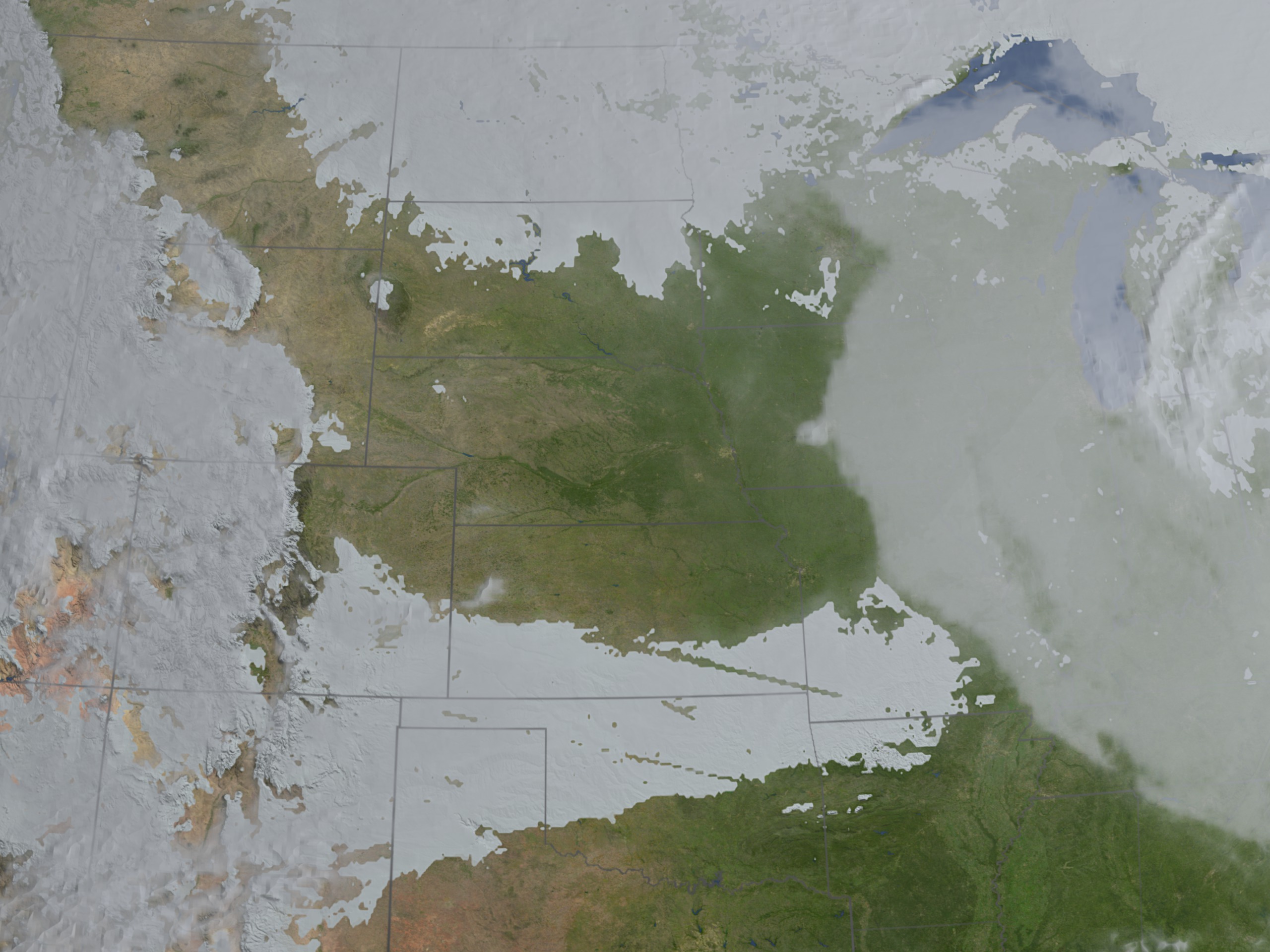
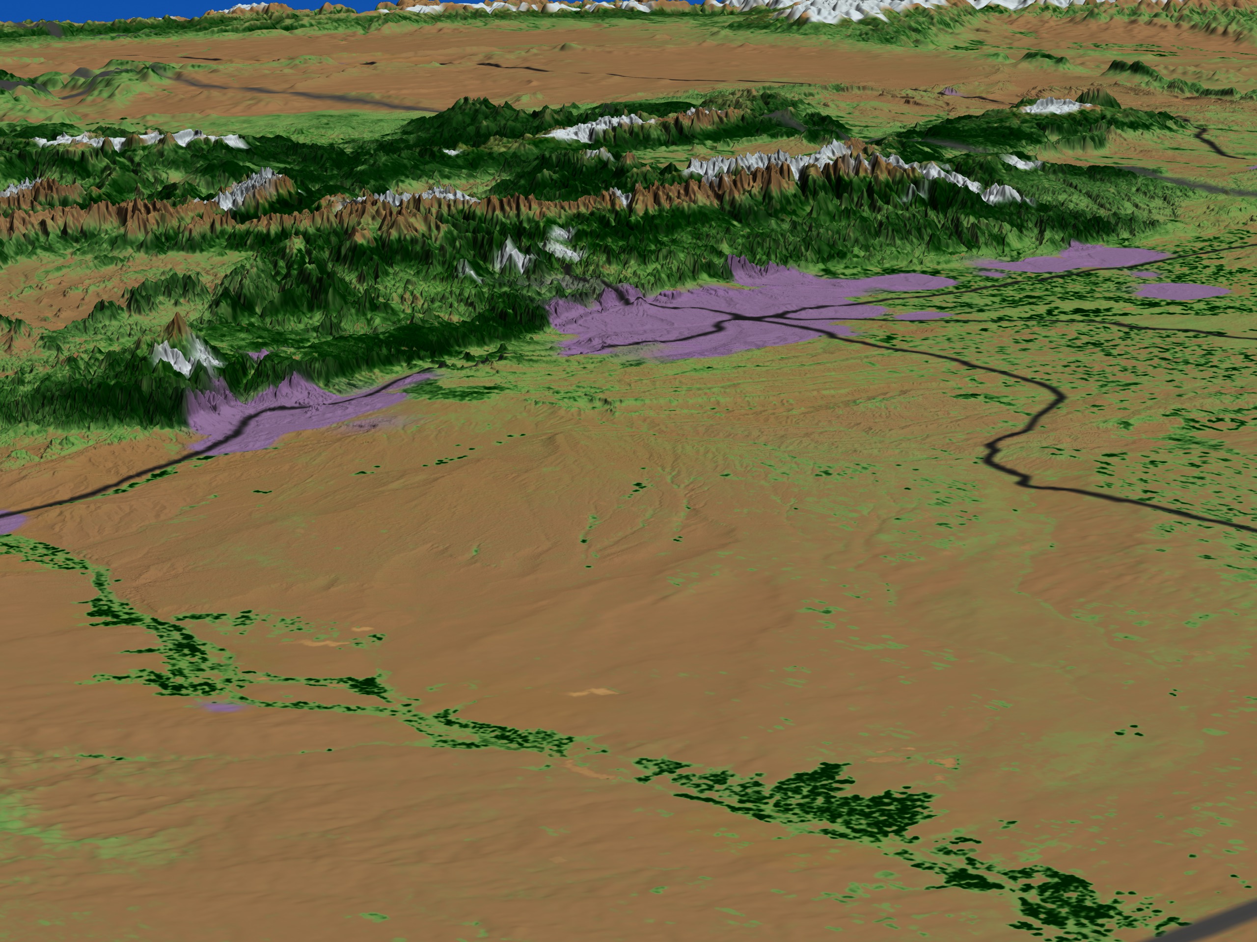
From Antarctica, the animation travels over South America showing areas of permafrost over this mostly tropical continent. We then move further north to observe daily changes in snow cover over the North American continent. The clouds show winter storms moving across the United States and Canada, leaving trails of snow cover behind. In a close-up view of the western US, we compare the difference in land cover between two years: 2003 when the region received a normal amount of snow and 2002 when little snow was accumulated. The difference in the surrounding vegetation due to the lack of spring melt water from the mountain snow pack is evident.
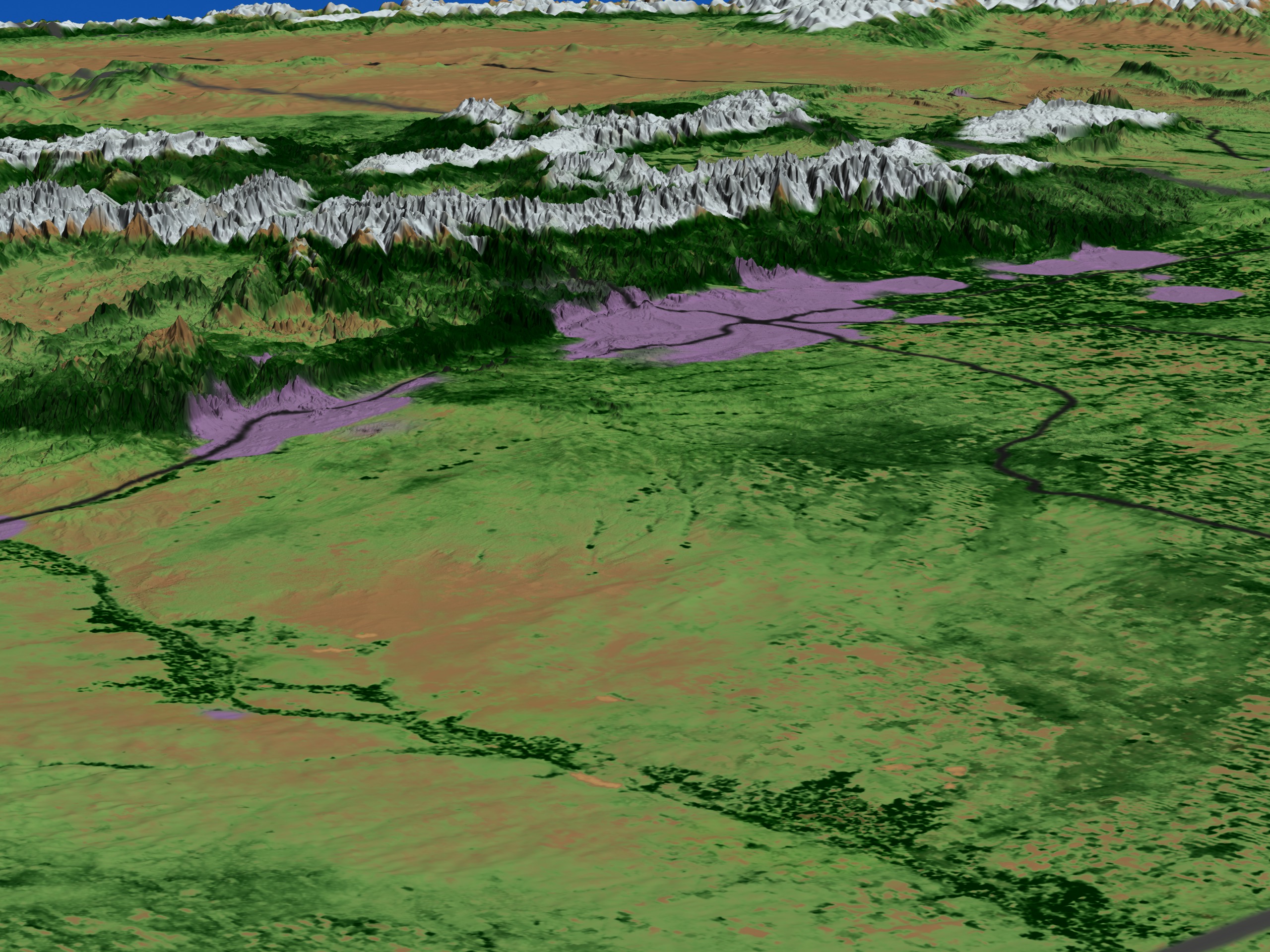
As the animation moves from the western US to the Arctic region, the areas effected by permafrost are visible. In December, we see how the incoming solar radiation primarily heats the Southern Hemisphere. As time marches forward from December to June, the daily snow and sea ice recede as the incoming solar radiation moves northward to warm the Northern Hemisphere.
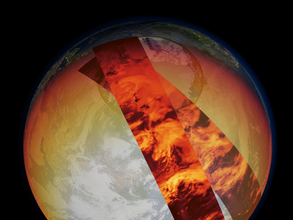
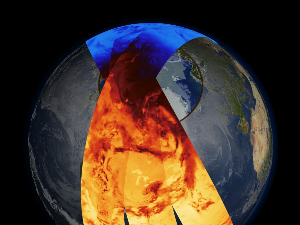
Using satellite swaths that wrap the globe, the animation shows three types of instantaneous measurements of solar radiation observed on June 20, 2003: shortwave (reflected) radiation, longwave (thermal) radiation and net flux (showing areas of heating and cooling). Correlation between reflected radiation and clouds are evident. When the animation fades to show the monthly global average net flux, we see that the polar regions serve to cool the global climate by radiating solar energy back into space throughout the year.
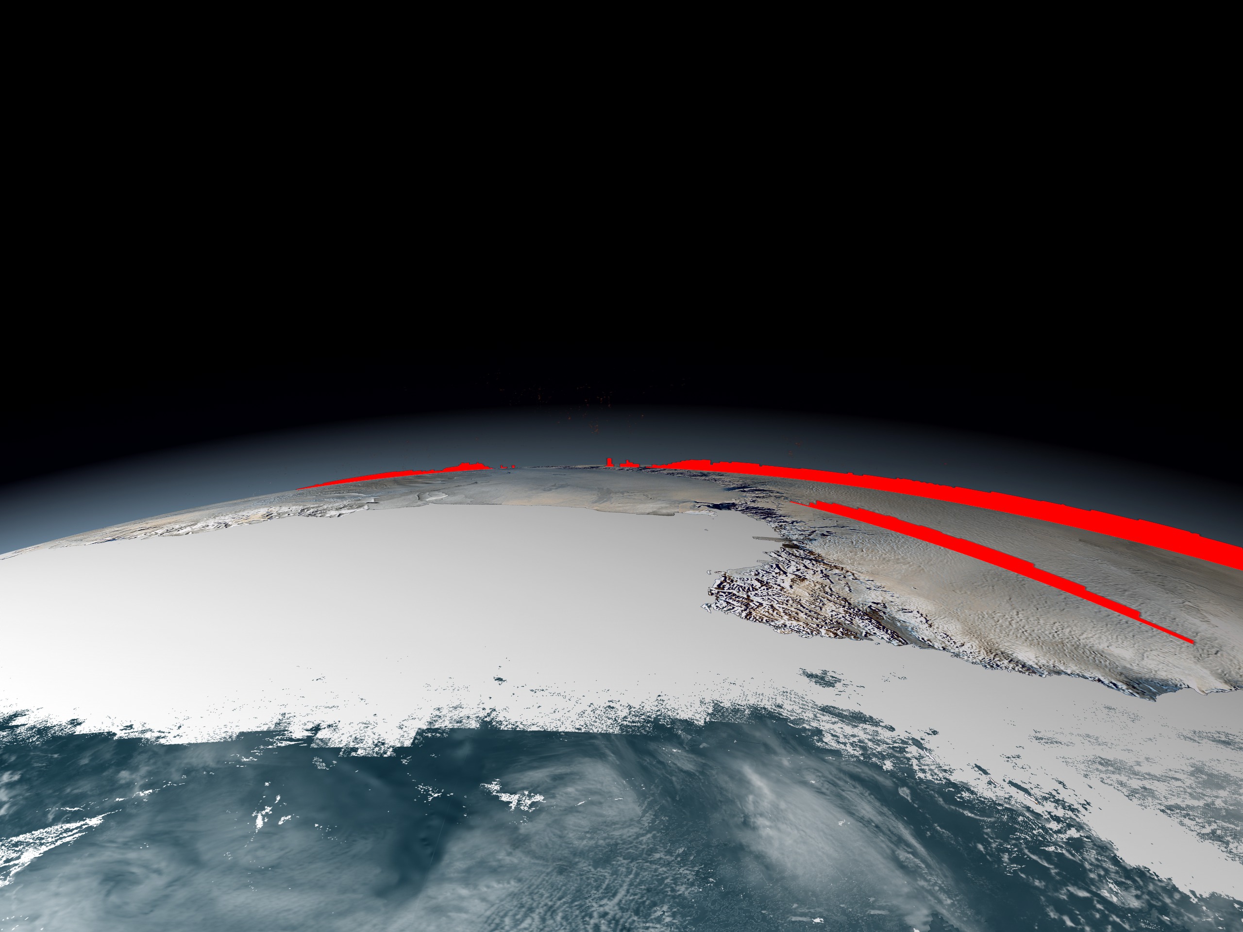
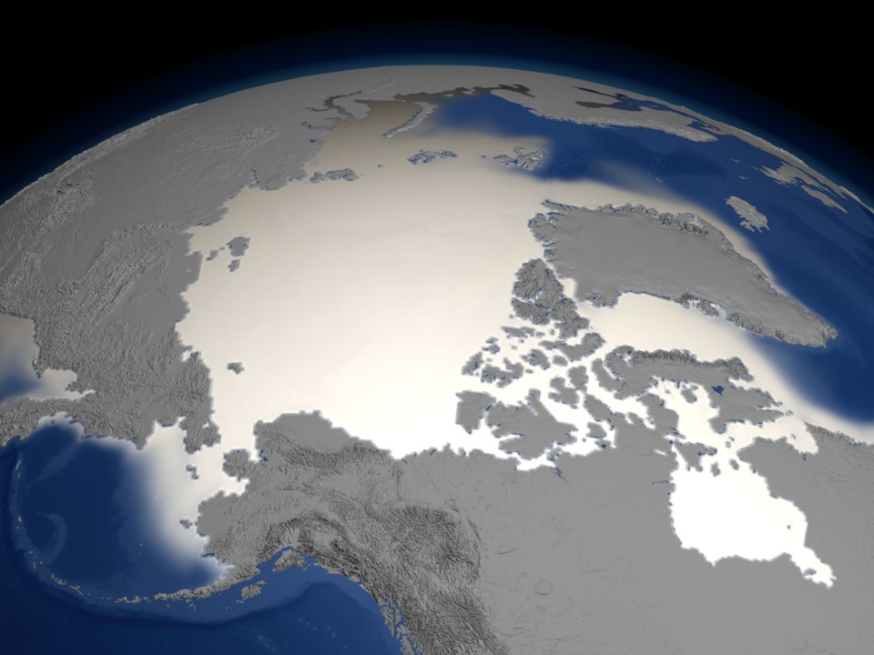
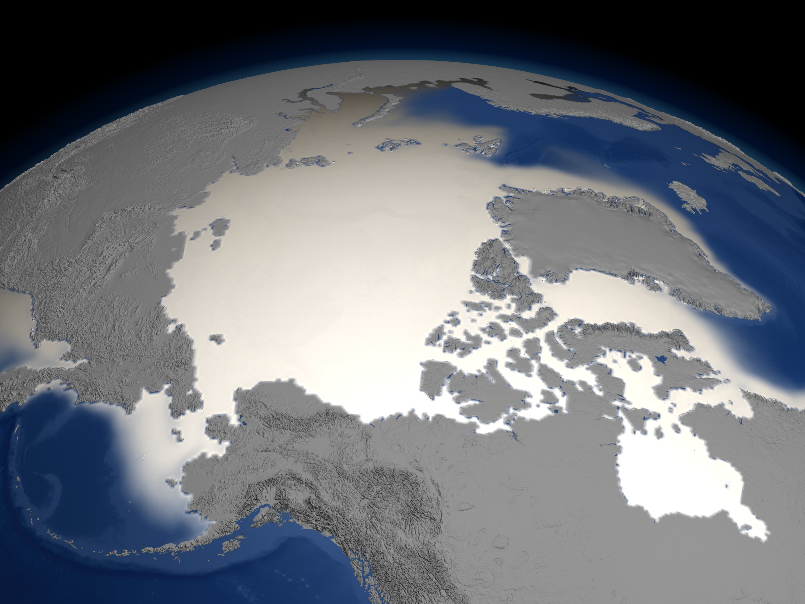
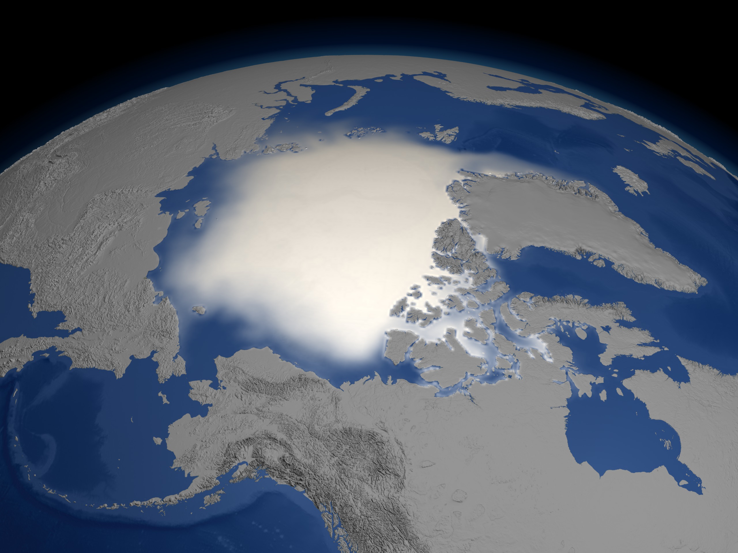
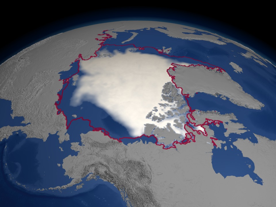
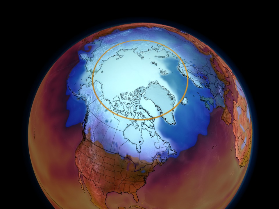
The animation shows a one-year cycle of the monthly average Arctic sea ice concentration followed by the mean September minimum sea ice for each year from 1979 through 2004. A red outline indicates the mean sea ice extent for September over 22 years, from 1979 to 2002. The minimum Arctic sea ice animation clearly shows how over the last 5 years the quantity of polar ice has decreased by 10 - 14% from the 22 year average.
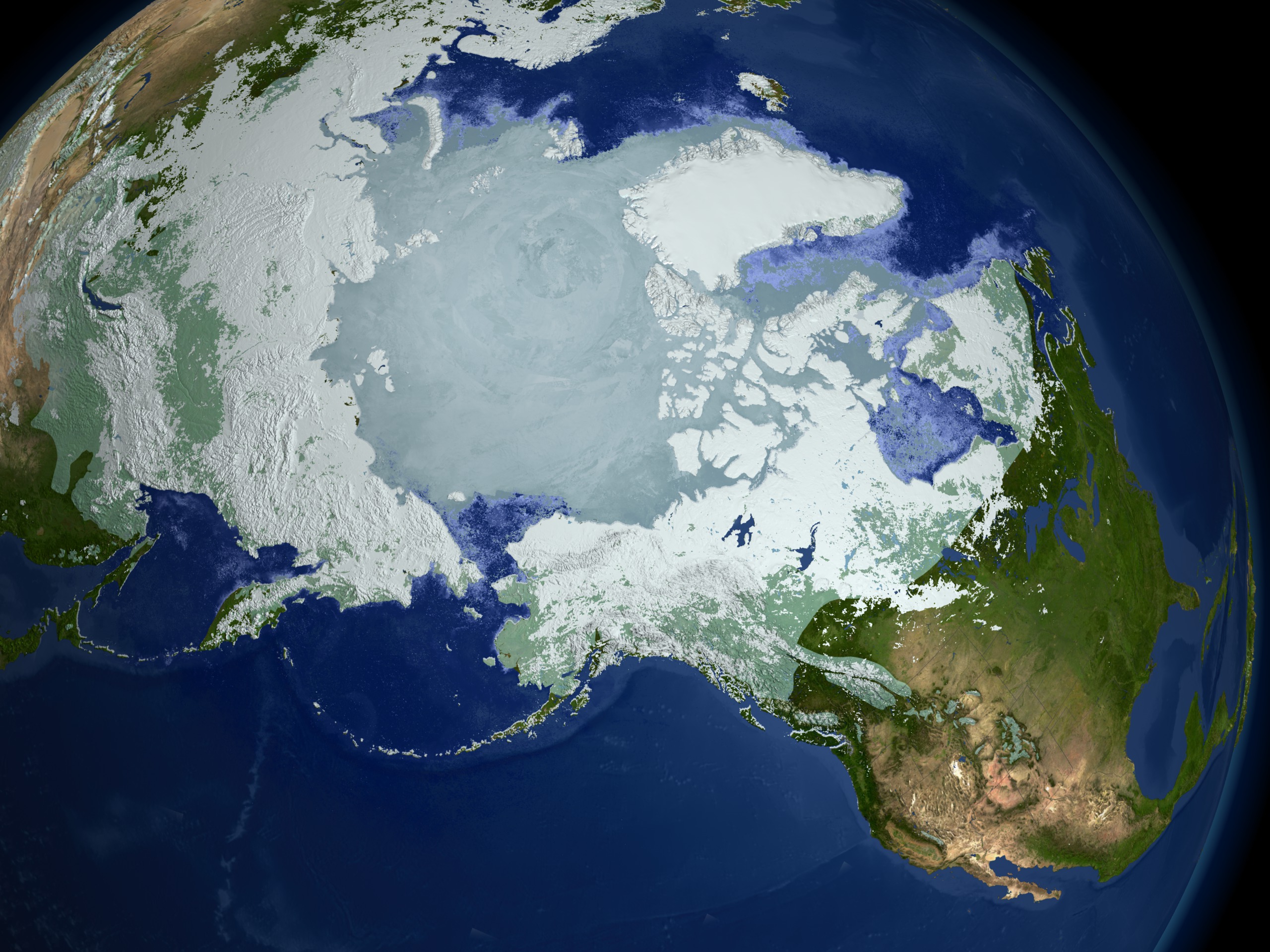
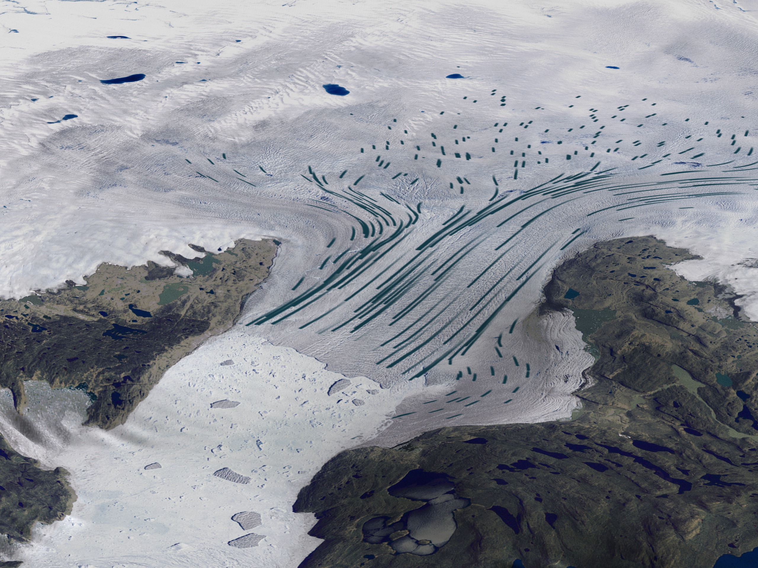
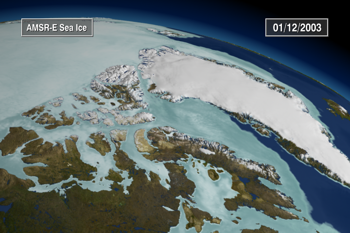
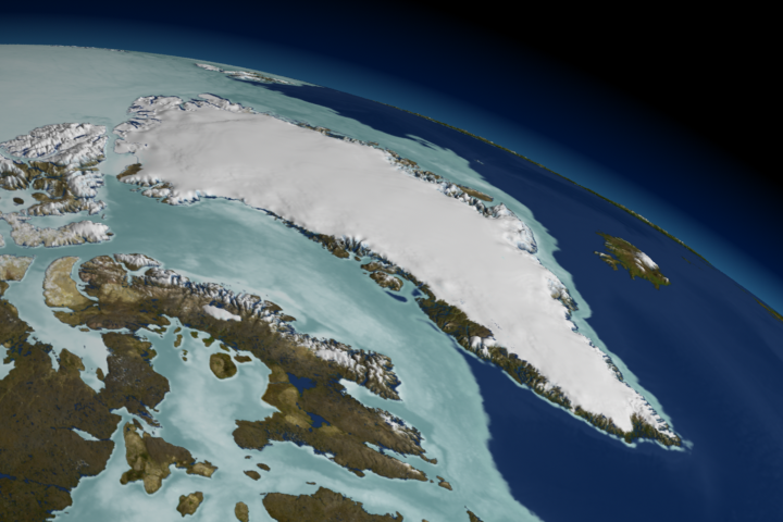
While moving from the Arctic to Greenland, the animation shows the constant motion of the Arctic polar ice using daily measures of sea ice activity. Sea ice flows from the Arctic into Baffin Bay as the seasonal ice expands southward. As we draw close to the Greenland coast, the animation shows the recent changes in the Jakobshavn glacier. Although Jakobshavn receded only slightly from 1042 to 2001, the animation shows significant recession over the past three years, from 2002 through 2004.
This animation shows a wealth of data collected from satellite observations of the cryosphere and the impact that recent cryospheric changes are making on our planet.
For more information on the data sets used in this visualization, visit NASA's EOS DAAC website.


Visualization Credits
Cindy Starr (Global Science and Technology, Inc.): Lead Visualizer
Ryan Boller (NASA/GSFC): Visualizer
Tom Bridgman (Global Science and Technology, Inc.): Visualizer
Randall Jones (GST): Visualizer
Kevin Mahoney (CSC): Visualizer
Horace Mitchell (NASA/GSFC): Visualizer
Marte Newcombe (GST): Visualizer
Lori Perkins (NASA/GSFC): Visualizer
Greg Shirah (NASA/GSFC): Visualizer
Stuart A. Snodgrass (GST): Visualizer
Eric Sokolowsky (Global Science and Technology, Inc.): Visualizer
Michael Starobin (HTSI): Narrator
Walt Meier (NSIDC): Scientist
Waleed Abdalati (NASA/HQ): Scientist
Ronald Weaver (University of Colorado): Scientist
Mary Jo Brodzik (University of Colorado): Scientist
Richard Armstrong (University of Colorado): Scientist
Michael Starobin (HTSI): Writer
Jarrett Cohen (GST): Writer
NASA/Goddard Space Flight Center Scientific Visualization Studio Designed by EOSDIS Outreach Team ESDIS Science Operations Office NASA Goddard Space Flight Center Carol Boquist, NASA Goddard Space Flight Center Jennifer Farnham-Brennan, Global Science and Technology, Inc. Dr. Brian Krupp, Global Science and Technology, Inc. Directed and Edited by Dr. Horace Mitchell, NASA Goddard Space Flight Center DVD Design by Stuart A. Snodgrass, Global Science and Technology, Inc. Written by Jarrett Cohen, Global Science and Technology, Inc. Michael Starobin, Honeywell Technology Solutions, Inc. Narrated by Michael Starobin, Honeywell Technology Solutions, Inc. Audio Engineering by Mike Velle, Honeywell Technology Solutions, Inc. Music by Michael Starobin, Honeywell Technology Solutions, Inc. MODIS Snow and Ice data courtesy of Dr. Dorothy Hall, NASA Goddard Space Flight Center Dr. Vince Salomonson, NASA Goddard Space Flight Center Dr. George Riggs, Science Systems and Applications, Inc. Arctic Sea Ice data courtesy of the National Snow and Ice Data Center Cooperative Institute for Research in the Environmental Sciences University of Colorado ICESat GLAS data courtesy of Dr. Christopher Shuman, NASA Goddard Space Flight Center Steve Palm, Science Systems and Applications, Inc. MODIS Imagery courtesy of the MODIS Land Rapid Response Project NASA Goddard Space Flight Center and the University of Maryland Jacques Descloitres, Science Systems and Applications, Inc. Jeffrey E. Schmaltz, Science Systems and Applications, Inc. Blue Marble MODIS data composite courtesy of the MODIS Science Team NASA Goddard Space Flight Center and the NASA Earth Observatory Reto Stockli, Science Systems and Applications, Inc. RADARSAT data courtesy of the Canadian Space Agency Jakobshavn Ice Velocity data courtesy of Dr. Ian Joughin, University of Washington QuikSCAT Seawinds data courtesy of the BYU Center for Remote Sensing Dr. David Long, Brigham Young University Permafrost data courtesy of the United States Geological Survey and the International Permafrost Association City Lights data courtesy of the Defense Meteorological Satellite Program Topography data courtesy of the United States Geological Survey Cloud data courtesy of the National Oceanic and Atmospheric Administration Population data courtesy of the Socioeconomic Data and Applications Center SeaWiFS data courtesy of the SeaWiFS Project and GeoEye NOTE: All SeaWiFS images and data presented on this web site are for research and educational use only. All commercial use of SeaWiFS data must be coordinated with GeoEye (NOTE: In January 2013, DigitalGlobe and GeoEye combined to become DigitalGlobe). All other data courtesy of NASA NASA EOSDIS and other EOS data distributed by NASA's Distributed Active Archive Centers (DAACs) http://nasadaacs.eos.nasa.gov
https://svs.gsfc.nasa.gov/3181
Missions:
Galileo
Global Precipitation Measurement (GPM)
Ice, Cloud, and land Elevation Satellite (ICESat)
Landsat
QuikSCAT
Shuttle Radar Topography Mission - SRTM
Solar Radiation and Climate Experiment (SORCE)
Terra
Data Used:
SORCE/TIM/Total Solar Irradiance (TSI) data
World Glacier Inventory
Data Compilation - NSIDCDMSP/SSM/I/15% Mean Sea Ice Extent Contour for September also referred to as: Passive Microwave Data
1979-2002DMSP/SSM/I/Monthly Sea Ice Concentration Climatology
1979-2002ICESat/GLAS/L2 Global Cloud Heights for Multi-layer Clouds (GLA09)
Nimbus-7/SSMR/15% Mean Sea Ice Extent Contour for September also referred to as: Passive Microwave Data
Septembers during 1979-2002Nimbus-7/SSMR/Sea Ice Concentrations (Monthly Sea Ice Concentration Climatology from 1979-2002)
RADARSAT-1/SAR/Derived Velocities
Additional credit goes to Canadian Space Agency, RADARSAT International Inc.
SeaStar/SeaWiFS/Land Reflectance also referred to as: ERS SAR-derived Glacial Floes
NASA/Goddard Space Flight Center, The SeaWiFS Project and GeoEye, Scientific Visualization Studio. NOTE: All SeaWiFS images and data presented on this web site are for research and educational use only. All commercial use of SeaWiFS data must be coordinated with GeoEye (NOTE: In January 2013, DigitalGlobe and GeoEye combined to become one DigitalGlobe.).
Circum-Arctic Map of Permafrost and Ground-Ice Conditions
Data Compilation - NSIDCSRTM/SIR-C/DEM
Terra/MODIS/Snow Cover Daily L3 Global 0.05Deg CMG (MOD10C1)
Terra and Aqua/MODIS/Blue Marble Land Cover
The Blue Marble data is courtesy of Reto Stockli (NASA/GSFC).
DMSP/SSM/I/September Mean Sea Ice Concentration
Infrared Global Geostationary Composite
Data Compilation - National Center for Environmental Prediction/Aviation Weather Center (NCEP/AWS)Radarsat Antarctic Mapping Project (RAMP) Digital Elevation Model (DEM) also referred to as: RAMP DEM
Data Compilation - NSIDCDMSP/OLS
GTOPO30 Topography and Bathymetry
Data Compilation - USGSGridded Population of the World (Version 3 Beta)
Data Compilation - SEDACAqua/MODIS/Sea Ice Extent and Ice Surface Temperature Daily L3 Global 4km EASE-Grid Day (MYD29E1D)
Aqua/CERES/Instantaneous Reflected Flux
Aqua/CERES/Instantaneous Outgoing Thermal
Aqua/CERES/Instantaneous Net Flux
Aqua/CERES/Average Net Flux
Aqua/AMSR-E/Daily L3 12.5km Tb, Sea Ice Concentration, and Snow Depth also referred to as: Sea Ice Concentration
10/01/2002 - 06/23/2003Aqua/AMSR-E/Daily L3 6.25 km 89 GHz Brightness Temperature (Tb)
Terra/CERES
QuikSCAT/SeaWinds
Nimbus-7/SMMR
Dates of Data Used:
AMSR-E Level 3 12.5 km Sea Ice Concentration (10/01/2002 - 06/23/2003) AMSR-E Level 3 6.25 km Sea Ice Brightness Temperature (10/01/2002 - 06/23/2003) MODIS Blue Marble Landcover Infrared Global Geostationary Composite (a.k.a. GOES Cloud) (10/01/2002 - 03/31/2003) and (06/19/2003 - 06/22/2003) CERES reflected flux (06/20/2003 - 06/21/2003) CERES outgoing thermal (06/20/2003 - 06/21/2003) CERES net flux (06/20/2003 - 06/21/2003) CERES average net flux (07/2002 - 09/2004) Circum-Arctic Map of Permafrost and Ground-Ice Conditions (1997) DMSP Operational Linescan System (OLS) (Earth-at-Night) ERS SAR-derived Glacial Flows (2001) GPW Population (SEDAC 1990 - 1995) ICESat/GLAS Cloud Height Profile (09/30/2003 - 10/01/2003) Landsat Imagery (07/07/2001, 05/20/2001, 05/23/2002, 05/19/2003) MODIS NDVI (06/06/2002 - 09/14/2002) and (06/06/2003 - 09/14/2003) MODIS imagery of Greenland (06/25/2003) MODIS imagery of B-15A (11/09/2004, 11/15/2004, 11/19/2004, 11/21/2004, 11/26/2004, 12/02/2004, 12/04/2004, 12/07/2004, 12/10/2004, 12/13/2004, 12/20/2004, 12/23/2004, 01/02/2005, 01/11/2005, 01/12/2005, 01/14/2005, 01/17/2005, 01/18/2005, 01/21/2005, 01/26/2005) MODIS imagery of Larsen (01/31/2002, 02/17/2002, 02/23/2002, 03/05/2002, 03/07/2002) MODIS Daily Sea Ice Surface Temperature (07/04/2002 - 07/23/2003) MODIS Daily Snow Cover (01/01/2002 - 06/30/2003) NSIDC World Glacier Inventory (1999) QuikSCAT Seawinds (03/09/2004 - 12/10/2004) Radarsat SAR Imagery (09/26/1997 - 11/04/1997) September Minimum Average Sea Ice Extent-15% mean contour derived from (1979 - 2002) SeaWiFS NDVI (06/01/2002 - 12/31/2003) SORCE Solar Flux NSIDC SSMI-derived Monthly Average Sea Ice Concentration derived from (1979 - 2002) NSIDC SSMI-derived September Minimum Sea Ice Concentration years (1979 - 2004) Topography (SRTM, USGS/GTOPO-30, Antarctic Digital Elevation Model (1999))
This item is part of this series:
Narrated Movies
Goddard TV Tape:
G2007-001HD -- NASA's HD Climate Change Resource Tape
Keywords:
DLESE >> Cryology
SVS >> HDTV
SVS >> Snow and Ice
GCMD >> Earth Science >> Cryosphere >> Frozen Ground >> Permafrost
GCMD >> Earth Science >> Cryosphere >> Glaciers/Ice Sheets >> Glacier Motion/Ice Sheet Motion
GCMD >> Earth Science >> Cryosphere >> Glaciers/Ice Sheets >> Glacier Topography/Ice Sheet Topography
GCMD >> Earth Science >> Cryosphere >> Glaciers/Ice Sheets >> Glaciers
GCMD >> Earth Science >> Cryosphere >> Glaciers/Ice Sheets >> Ice Sheets
GCMD >> Earth Science >> Cryosphere >> Sea Ice >> Ice Growth/Melt
GCMD >> Earth Science >> Cryosphere >> Sea Ice >> Ice Temperature
GCMD >> Earth Science >> Cryosphere >> Sea Ice >> Sea Ice Concentration
GCMD >> Earth Science >> Cryosphere >> Sea Ice >> Sea Ice Motion
GCMD >> Earth Science >> Cryosphere >> Snow/Ice >> Ice Growth/Melt
GCMD >> Earth Science >> Cryosphere >> Snow/Ice >> Ice Motion
GCMD >> Earth Science >> Cryosphere >> Snow/Ice >> Ice Velocity
GCMD >> Earth Science >> Cryosphere >> Snow/Ice >> Permafrost
GCMD >> Earth Science >> Cryosphere >> Snow/Ice >> Snow Cover
GCMD >> Earth Science >> Cryosphere >> Snow/Ice >> Snow/Ice Temperature
GCMD >> Earth Science >> Hydrosphere >> Glaciers/Ice Sheets >> Glacier Motion/Ice Sheet Motion
GCMD >> Earth Science >> Hydrosphere >> Glaciers/Ice Sheets >> Glacier Topography/Ice Sheet Topography
GCMD >> Earth Science >> Hydrosphere >> Glaciers/Ice Sheets >> Glaciers
GCMD >> Earth Science >> Hydrosphere >> Glaciers/Ice Sheets >> Ice Sheets
GCMD >> Earth Science >> Hydrosphere >> Snow/Ice >> Ice Growth/Melt
GCMD >> Earth Science >> Hydrosphere >> Snow/Ice >> Ice Motion
GCMD >> Earth Science >> Hydrosphere >> Snow/Ice >> Ice Velocity
GCMD >> Earth Science >> Hydrosphere >> Snow/Ice >> Permafrost
GCMD >> Earth Science >> Hydrosphere >> Snow/Ice >> Snow Cover
GCMD >> Earth Science >> Hydrosphere >> Snow/Ice >> Snow/Ice Temperature
SVS >> Sea Ice Surface Temperature
SVS >> GOES
DLESE >> Narrated
SVS >> Voice Over Talent
SVS >> CERES
NASA Science >> Earth
GCMD keywords can be found on the Internet with the following citation: Olsen, L.M., G. Major, K. Shein, J. Scialdone, S. Ritz, T. Stevens, M. Morahan, A. Aleman, R. Vogel, S. Leicester, H. Weir, M. Meaux, S. Grebas, C.Solomon, M. Holland, T. Northcutt, R. A. Restrepo, R. Bilodeau, 2013. NASA/Global Change Master Directory (GCMD) Earth Science Keywords. Version 8.0.0.0.0
Places you might have seen this:
'Research Shines Some Light On Mysteries of Antarctica' - Washington Post, Sunday, February 19, 2007.