Sun
ID: 11062
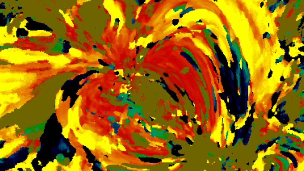
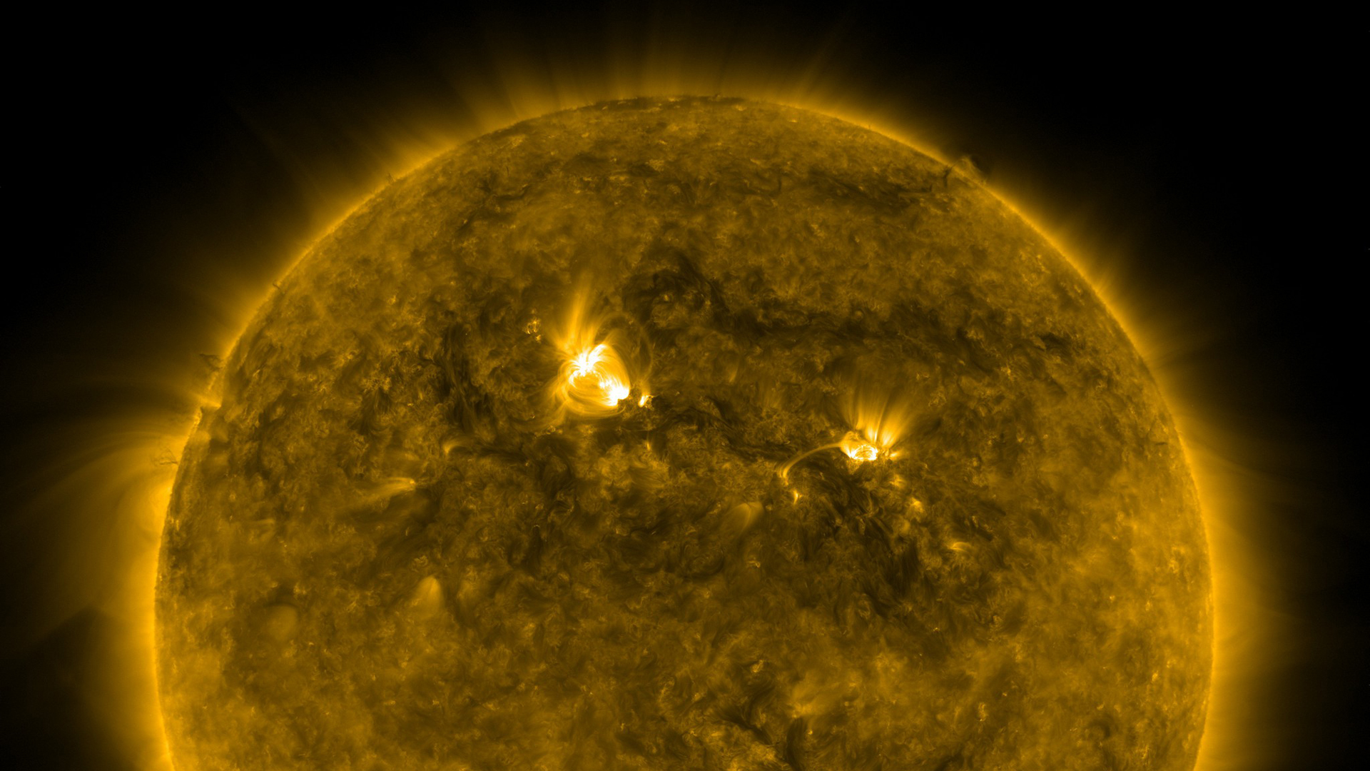
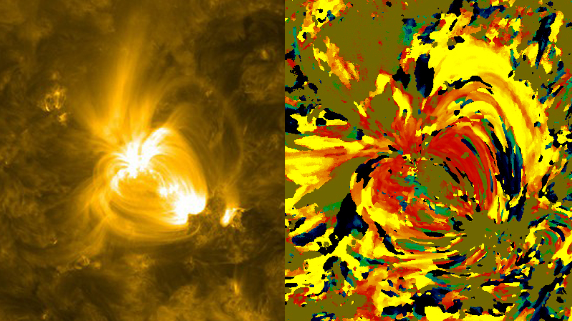
Why is the sun's atmosphere so much hotter than its surface? To help solve this mystery, a NASA scientist recently analyzed satellite images of the sun in a way that yielded colorful strokes reminiscent of a Van Gogh painting. But this is science, not art. Each processed, color-coded image shows how material in the sun's atmosphere changed temperature over a 24-hour period. Red, yellow and orange were chosen to represent areas that cooled, while blue and green highlight areas that warmed. Watch the videos to see a gallery of these scientific works of art and learn how they were made.


Van Gogh Sun
Related Story

For More Information
Story Credits
Visualizer/Animator:
Scott Wiessinger (USRA)
Video Editor:
Scott Wiessinger (USRA)
Narrators:
Scott Wiessinger (USRA)
Nicholeen Viall (NASA/GSFC)
Producer:
Scott Wiessinger (USRA)
Lead Scientist:
Nicholeen Viall (NASA/GSFC)
Lead Writer:
Karen Fox (ADNET Systems, Inc.)
Scott Wiessinger (USRA)
Video Editor:
Scott Wiessinger (USRA)
Narrators:
Scott Wiessinger (USRA)
Nicholeen Viall (NASA/GSFC)
Producer:
Scott Wiessinger (USRA)
Lead Scientist:
Nicholeen Viall (NASA/GSFC)
Lead Writer:
Karen Fox (ADNET Systems, Inc.)
Please give credit for this item to:
NASA's Goddard Space Flight Center
NASA's Goddard Space Flight Center
Short URL to share this page:
https://svs.gsfc.nasa.gov/11062
Keywords:
DLESE >> Narrated
SVS >> App
NASA Science >> Sun
https://svs.gsfc.nasa.gov/11062
Keywords:
DLESE >> Narrated
SVS >> App
NASA Science >> Sun


