Solar Snapshots
Overview
This gallery features some of Goddard's most interesting, artistic and impressive solar imagery and video.
Some of the materials are simple still images showing an aspect of the sun or the NASA satellites that monitor it. Other materials are processed solar images and video that have a particular aesthetic value. And some are breaking news events or solar activity that is unusually beautful or impressive.
Visuals
- ID: 11291 Produced Video
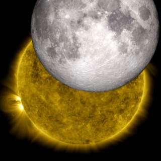
The Moon and the Sun: Two NASA Missions Join Their Images
Go to this pageTwo or three times a year, NASA’s Solar Dynamics Observatory observes the moon traveling across the sun, blocking its view. While this obscures solar observations for a short while, it offers the chance for an interesting view of the shadow of the moon. The moon’s crisp horizon can be seen up against the sun, since the moon does not have an atmosphere. (At other times of the year, when Earth blocks SDO’s view, the Earth’s horizon looks fuzzy due to its atmosphere.) If one looks closely at such a crisp border, the features of the moon’s topography are visible, as is the case in this image from Oct. 7, 2010. This recently inspired two NASA visualizers to overlay a 3-dimensional model of the moon based on data from NASA’s Lunar Reconnaissance Orbiter into the shadow of the SDO image. Such a task is fairly tricky, as the visualizers — Scott Wiessinger who typically works with the SDO imagery and Ernie Wright who works with the LRO imagery — had to precisely match up data from the correct time and viewpoint for the two separate instruments. The end result is an awe-inspiring image of the sun and the moon. To start the process, the visualizers took the viewing position and time from the SDO image. This information was dropped into an LRO model that can produce the exact view of the moon from anywhere, at any time, by incorporating 6 billion individual measurements of the moon’s surface height from LRO’s Lunar Orbiter Laser Altimeter instrument. The model had to take many factors into consideration, including not only SDO’s distance and viewing angle, but also the moon’s rotation and constant motion. Wright used animation software to wrap the elevation and appearance map around a sphere to simulate the moon. The two images were put together and the overlay was exact. The mountains and valleys on the horizon of the LRO picture fit right into the shadows seen by SDO. In its own way, this served as a kind of calibration of data. It means that the SDO data on its position and time is highly accurate and that the LRO models, too, are able to accurately provide images of what’s happening at any given moment in time. And of course, the whole exercise provides for a beautiful picture. ||
- ID: 11168 Produced Video
SDO Sees Fiery Looping Rain on the Sun
Go to this pageEruptive events on the sun can be wildly different. Some come just with a solar flare, some with an additional ejection of solar material called a coronal mass ejection (CME), and some with complex moving structures in association with changes in magnetic field lines that loop up into the sun's atmosphere, the corona. On July 19, 2012, an eruption occurred on the sun that produced all three. A moderately powerful solar flare exploded on the sun's lower right hand limb, sending out light and radiation. Next came a CME, which shot off to the right out into space. And then, the sun treated viewers to one of its dazzling magnetic displays — a phenomenon known as coronal rain. Over the course of the next day, hot plasma in the corona cooled and condensed along strong magnetic fields in the region. Magnetic fields, themselves, are invisible, but the charged plasma is forced to move along the lines, showing up brightly in the extreme ultraviolet wavelength of 304 angstroms, which highlights material at a temperature of about 50,000 Kelvin. This plasma acts as a tracer, helping scientists watch the dance of magnetic fields on the sun, outlining the fields as it slowly falls back to the solar surface. The footage in this video was collected by the Solar Dynamics Observatory's AIA instrument. SDO collected one frame every 12 seconds, and the movie plays at 30 frames per second, so each second in this video corresponds to 6 minutes of real time. The video covers 12:30 a.m. EDT to 10:00 p.m. EDT on July 19, 2012.Watch this video on YouTube. ||
- ID: 11071 Produced Video
SDO Wavelength Graphics
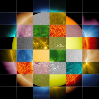
Go to this pageSpecialized instruments, either in ground-based or space-based telescopes, can observe light far beyond the ranges visible to the naked eye. Different wavelengths convey information about different components of the sun's surface and atmosphere, so scientists use them to paint a full picture of our constantly changing and varying star.Yellow light of 5800 angstroms, for example, generally emanates from material of about 10,000 degrees F (5700 degrees C), which represents the surface of the sun. Extreme ultraviolet light of 94 angstroms, on the other hand, comes from atoms that are about 11 million degrees F (6,300,000 degrees C) and is a good wavelength for looking at solar flares, which can reach such high temperatures. By examining pictures of the sun in a variety of wavelengths — as is done through such telescopes as NASA's Solar Dynamics Observatory (SDO), NASA's Solar Terrestrial Relations Observatory (STEREO) and the ESA/NASA Solar and Heliospheric Observatory (SOHO) — scientists can track how particles and heat move through the sun's atmosphere.We see the visible spectrum of light simply because the sun is made up of a hot gas — heat produces light just as it does in an incandescent light bulb. But when it comes to the shorter wavelengths, the sun sends out extreme ultraviolet light and x-rays because it is filled with many kinds of atoms, each of which give off light of a certain wavelength when they reach a certain temperature. Not only does the sun contain many different atoms — helium, hydrogen, iron, for example — but also different kinds of each atom with different electrical charges, known as ions. Each ion can emit light at specific wavelengths when it reaches a particular temperature. Scientists have cataloged which atoms produce which wavelengths since the early 1900s, and the associations are well documented in lists that can take up hundreds of pages.Instruments that produce conventional images of the sun focus exclusively on light around one particular wavelength, sometimes not one that is visible to the naked eye. SDO scientists, for example, chose 10 different wavelengths to observe for its Atmospheric Imaging Assembly (AIA) instrument. Each wavelength is largely based on a single, or perhaps two types of ions — though slightly longer and shorter wavelengths produced by other ions are also invariably part of the picture. Each wavelength was chosen to highlight a particular part of the sun's atmosphere.From the sun's surface on out, the wavelengths SDO observes, measured in angstroms, are: 4500: Showing the sun's surface or photosphere. 1700: Shows surface of the sun, as well as a layer of the sun's atmosphere called the chromosphere, which lies just above the photosphere and is where the temperature begins rising. 1600: Shows a mixture between the upper photosphere and what's called the transition region, a region between the chromosphere and the upper most layer of the sun's atmosphere called the corona. The transition region is where the temperature rapidly rises. 304: This light is emitted from the chromosphere and transition region. 171: This wavelength shows the sun's atmosphere, or corona, when it's quiet. It also shows giant magnetic arcs known as coronal loops. 193: Shows a slightly hotter region of the corona, and also the much hotter material of a solar flare. 211: This wavelength shows hotter, magnetically active regions in the sun's corona. 335: This wavelength also shows hotter, magnetically active regions in the corona. 94: This highlights regions of the corona during a solar flare. 131: The hottest material in a flare. ||
- ID: 11167 Produced Video
SDO Resolution Comparison Resource Page
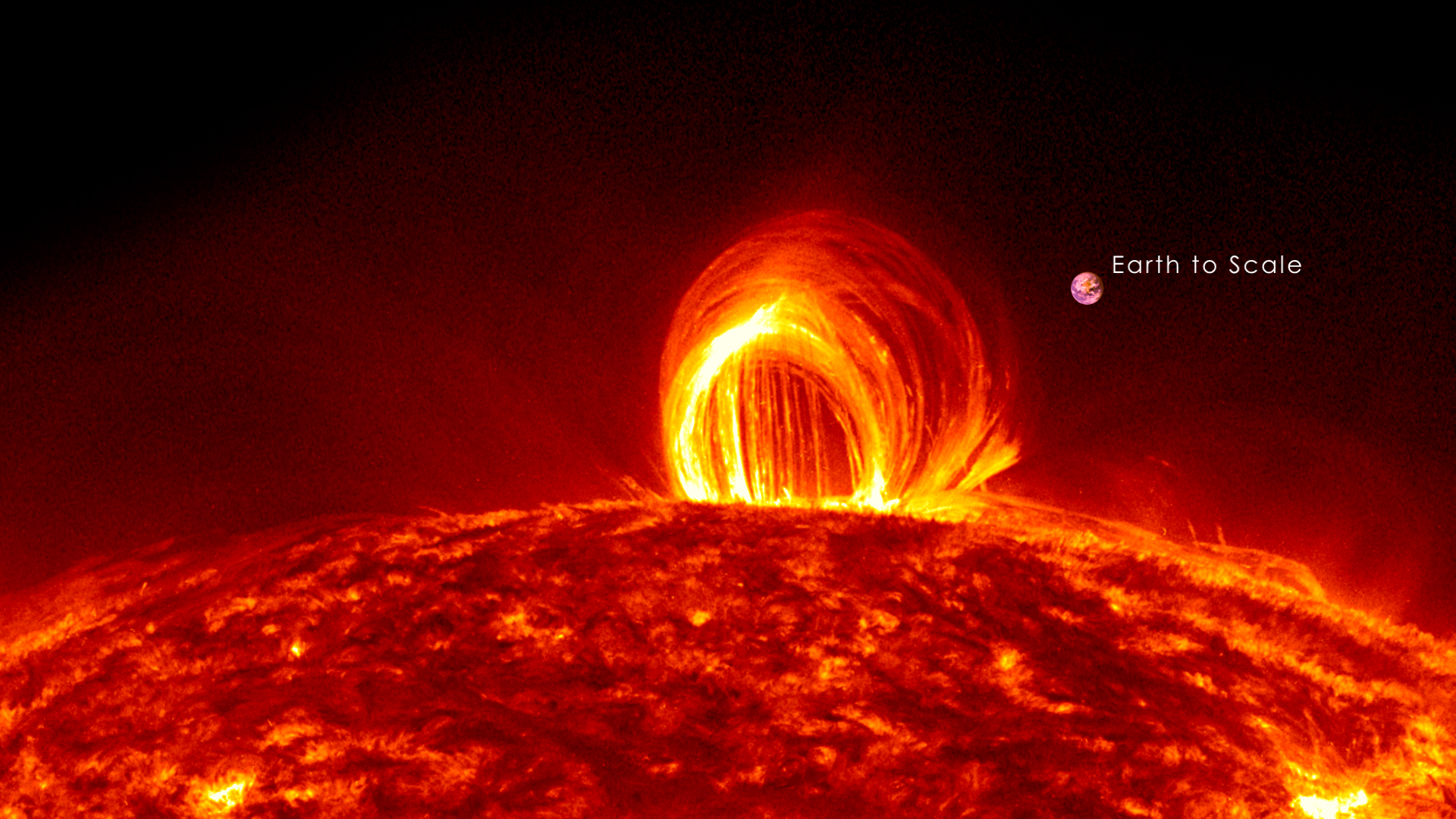
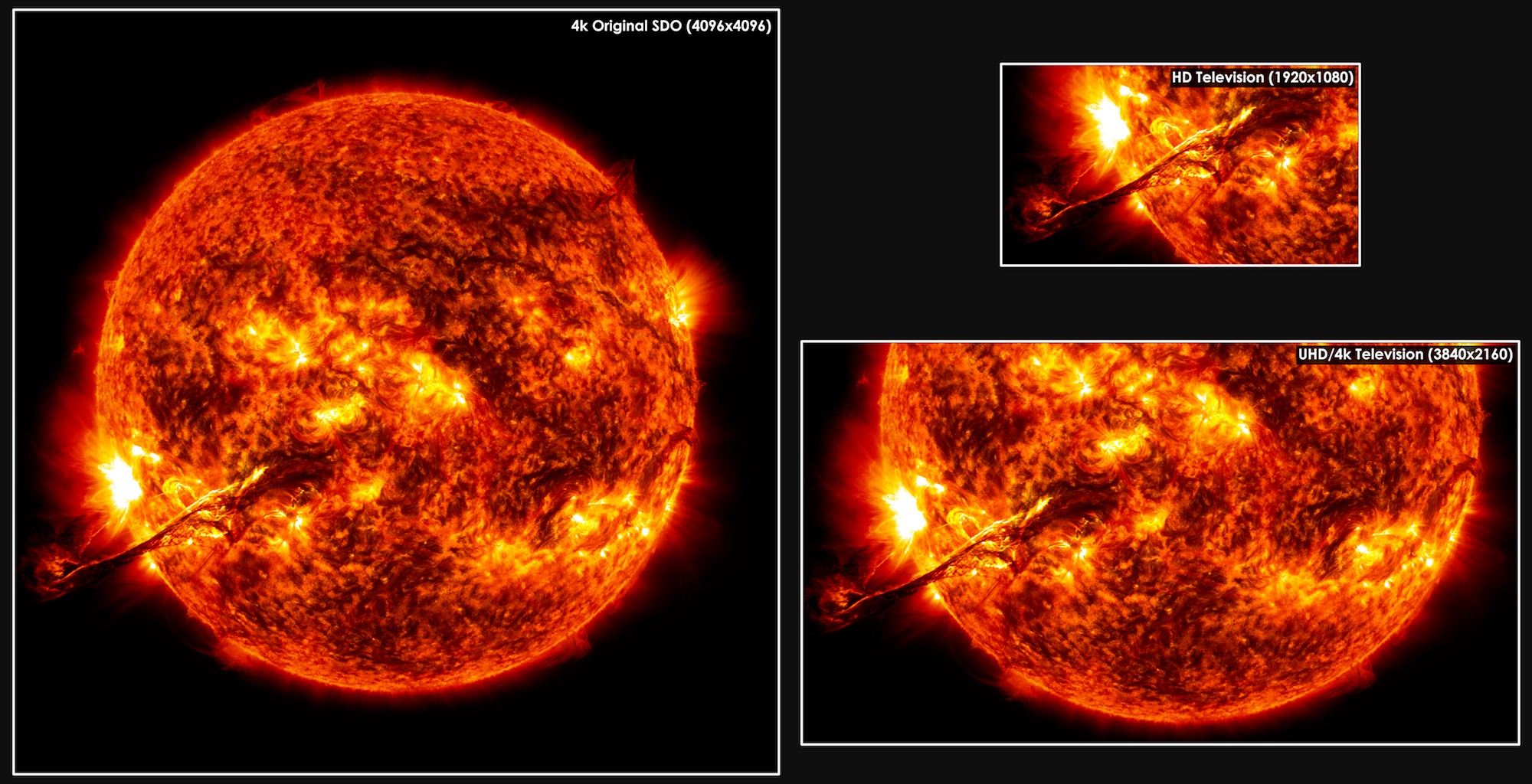
Go to this pageUltra High Definition, or 4k, TV has four times as many pixels as a high definition 1080 TV. NASA's Solar Dynamics Observatory (SDO). Its Atmospheric Imaging Assembly (AIA) and Helioseismic Magnetic Imager (HMI) instruments together capture an image almost once a second that is twice again as large as what the ultra high-def screens can display. Such detailed pictures show features on the sun that are as small as 200 miles across, helping researchers observe such things as what causes giant eruptions on the sun known as coronal mass ejections (CME) that can travel toward Earth and interfere with our satellites. ||
- ID: 11072 Produced Video
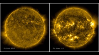
SDO Solar Comparison October 2010 to October 2012
Go to this pageThe sun goes through a natural solar cycle approximately every 11 years. The cycle is marked by the increase and decrease of sunspots — visible as dark blemishes on the sun's surface, or photosphere. The greatest number of sunspots in any given solar cycle is designated as "solar maximum." The lowest number is "solar minimum." The solar cycle provides more than just increased sunspots, however. In the sun's atmosphere, or corona, bright active regions appear, which are rooted in the lower sunspots. Scientists track the active regions since they are often the origin of eruptions on the sun such as solar flares or coronal mass ejections. The most recent solar minimum occurred in 2008, and the sun began to ramp up in January 2010, with an M-class flare (a flare that is 10 times less powerful than the largest flares, labeled X-class). The sun has continued to get more active, with the next solar maximum predicted for 2013. The journey toward solar maximum is evident in current images of the sun, showing a marked difference from those of 2010, with bright active regions dotted around the star. ||
- ID: 11112 Produced Video
Gradient Sun
Go to this pageWatching a particularly beautiful movie of the sun helps show how the lines between science and art can sometimes blur. But there is more to the connection between the two disciplines: science and art techniques are often quite similar, indeed one may inform the other or be improved based on lessons from the other arena. One such case is a technique known as a "gradient filter" — recognizable to many people as an option available on a photo-editing program. Gradients are, in fact, a mathematical description that highlights the places of greatest physical change in space. A gradient filter, in turn, enhances places of contrast, making them all the more obviously different, a useful tool when adjusting photos. Scientists, too, use gradient filters to enhance contrast, using them to accentuate fine structures that might otherwise be lost in the background noise. On the sun, for example, scientists wish to study a phenomenon known as coronal loops, which are giant arcs of solar material constrained to travel along that particular path by the magnetic fields in the sun's atmosphere. Observations of the loops, which can be more or less tangled and complex during different phases of the sun's 11-year activity cycle, can help researchers understand what's happening with the sun's complex magnetic fields, fields that can also power great eruptions on the sun such as solar flares or coronal mass ejections. The images here show an unfiltered image from the sun next to one that has been processed using a gradient filter. Note how the coronal loops are sharp and defined, making them all the more easy to study. On the other hand, gradients also make great art. Watch the movie to see how the sharp loops on the sun next to the more fuzzy areas in the lower solar atmosphere provide a dazzling show. ||
- ID: 11111 Produced Video
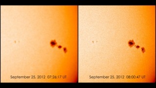
Getting NASA's SDO into Focus
Go to this pageFrom Sep. 6 to Sep. 29, 2012, NASA's Solar Dynamic Observatory (SDO) moved into its semi-annual eclipse season, a time when Earth blocks the telescope's view of the sun for a period of time each day. Scientists choose orbits for solar telescopes to minimize eclipses as much as possible, but they are a fact of life — one that comes with a period of fuzzy imagery directly after the eclipse. The Helioseismic and Magnetic Imager (HMI) on SDO observes the sun through a glass window. The window can change shape in response to temperature changes, and does so dramatically and quickly when it doesn't directly feel the sun's heat. "You've got a piece of glass looking at the sun, and then suddenly it isn't," says Dean Pesnell, the project scientist for SDO at NASA's Goddard Space Flight Center in Greenbelt, Md. "The glass gets colder and flexes. It becomes like a lens. It's as if we put a set of eye glasses in front of the instrument, causing the observations to blur." To counteract this effect, HMI was built with heaters to warm the window during an eclipse. By adjusting the timing and temperature of the heater, the HMI team has learned the best procedures for improving resolution quickly. Without adjusting the HMI front window heaters, it takes about two hours to return to optimal observing. Over the two years since SDO launched in 2010, the team has brought the time it takes to get a clear image down from 60 minutes to around 45 to 50 minutes after an eclipse. "We allocated an hour for these more blurry images," says Pesnell. "And we've learned to do a lot better than that. With 45 eclipses a year, the team gets a lot of practice." SDO will enter its next eclipse season on March 3, 2013. ||
- ID: 11046 Produced Video
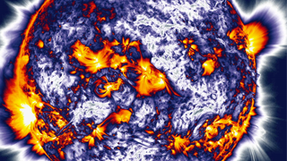
Van Gogh Sun
Go to this pageA crucial, and often underappreciated, facet of science lies in deciding how to turn the raw numbers of data into useful, understandable information — often through graphs and images. Such visualization techniques are needed for everything from making a map of planetary orbits based on nightly measurements of where they are in the sky to colorizing normally invisible light such as X-rays to produce "images" of the sun.More information, of course, requires more complex visualizations and occasionally such images are not just informative, but beautiful too.Such is the case with a new technique created by Nicholeen Viall, a solar scientist at NASA's Goddard Space Flight Center in Greenbelt, Md. She creates images of the sun reminiscent of Van Gogh, with broad strokes of bright color splashed across a yellow background. But it's science, not art. The color of each pixel contains a wealth of information about the 12-hour history of cooling and heating at that particular spot on the sun. That heat history holds clues to the mechanisms that drive the temperature and movements of the sun's atmosphere, or corona.To look at the corona from a fresh perspective, Viall created a new kind of picture, making use of the high resolution provided by NASA's Solar Dynamics Observatory (SDO). SDO's Atmospheric Imaging Assembly (AIA) provides images of the sun in 10 different wavelengths, each approximately corresponding to a single temperature of material. Therefore, when one looks at the wavelength of 171 angstroms, for example, one sees all the material in the sun's atmosphere that is a million degrees Kelvin. By looking at an area of the sun in different wavelengths, one can get a sense of how different swaths of material change temperature. If an area seems bright in a wavelength that shows a hotter temperature an hour before it becomes bright in a wavelength that shows a cooler temperature, one can gather information about how that region has changed over time.Viall's images show a wealth of reds, oranges, and yellow, meaning that over a 12-hour period the material appear to be cooling. Obviously there must have been heating in the process as well, since the corona isn't on a one-way temperature slide down to zero degrees. Any kind of steady heating throughout the corona would have shown up in Viall's images, so she concludes that the heating must be quick and impulsive — so fast that it doesn't show up in her images. This lends credence to those theories that say numerous nanobursts of energy help heat the corona. ||