Space Weather to the Edge of the Solar System - Revisited
Cropped view of the Enlil model from early 2015 to just after the New Horizons flyby of Pluto.
This version is a more polished update to Space Weather to the Edge of the Solar System with more focus on the space weather simulation.
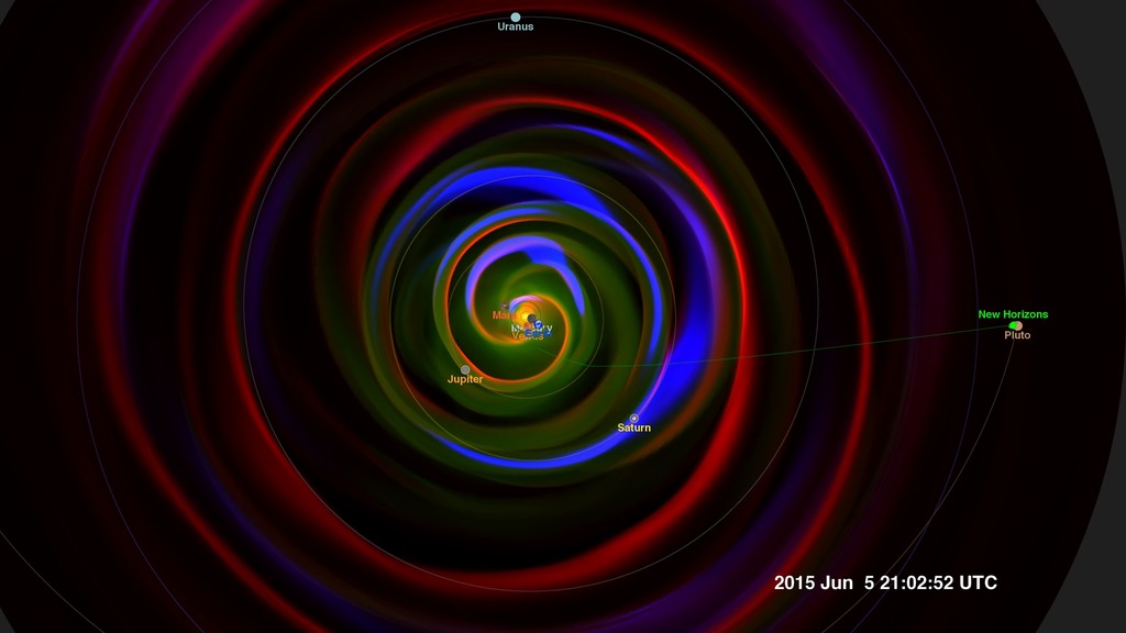
This visualization presents a slice of the data through the ecliptic plane, the plane in which the planets of our solar system orbit. Because Pluto is a bit above this plane, the orbit is projected into the ecliptic plane of the data.
Three different variables are presented from the model - temperature, density, and pressure gradient, simultaneously, using the red, green and blue color channels of the color image. The density of the solar wind (green) flowing outward from the sun decreases as it spreads out. The temperature stays roughly constant as the solar wind material spreads through the solar system. We see the Parker spiral imprinted on the outflow from the spinning sun, much like the outflow from a spinning water sprinkler. We also see the strong density gradients (blue) created by coronal mass ejections and other shocks, propagating outward from the sun in the solar wind.
We can observe regions of interesting interactions when the three primary colors of the basic variables combine to enhance the color, represented in the tricolor diagram below. White represents a hot, dense shock, while cyan (blue-green) represents a dense shock (usually visible close to the sun), magenta (purple) represents a hot, low-density shock, while yellow indicates hot and dense material, again usually close to the sun.

Color bar representing changes in plasma density, in atomic mass units (AMU) per cubic centimeter. This is roughly equal to the number of hydrogen ions per cubic centimeter.
Color bar representing the plasma temperature.
Color bar representing the identification of the coronal mass ejection. Values near 1.0 indicate a shock wave of the CME.
Tri-color diagram illustrating how colors from the three different measurements (density, temperature, pressure gradient) combine to highlight different characteristics of the plasma flow.
Credits
Please give credit for this item to:
NASA's Scientific Visualization Studio
-
Visualizer
- Tom Bridgman (Global Science and Technology, Inc.)
-
Scientist
- M. Leila Mays (Catholic University of America)
-
Producer
- Genna Duberstein (USRA)
-
Technical support
- Laurence Schuler (ADNET Systems, Inc.)
- Ian Jones (ADNET Systems, Inc.)
Release date
This page was originally published on Thursday, October 4, 2018.
This page was last updated on Wednesday, November 15, 2023 at 12:12 AM EST.
Datasets used in this visualization
-
Enlil Heliospheric Model (Enlil Heliospheric Model)
ID: 685MHD solar wind simulation
See all pages that use this dataset -
SPICE Ephemerides (SPICE Ephemerides)
ID: 755Satellite and planetary ephemerides
See all pages that use this dataset
Note: While we identify the data sets used in these visualizations, we do not store any further details, nor the data sets themselves on our site.
Related
- ID: 4392
 Visualization