Monitoring Hurricane Matthew
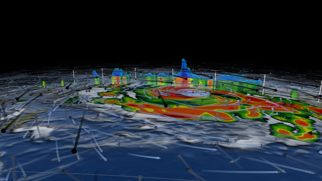
This example visualization shows how all of the below data visualizations could be arranged on NASA's 3x3 hyperwall display.
Hurricane Matthew ravaged the Caribbean and United States from late September to early October 2016. Earth observing satellites provide insights into Matthew's rapid intensification and fast decline. This show was designed for the NASA Hyperwall to be shown at the 2017 American Meteorlogical Society (AMS) Conference. The show highlight's NASA's GPM Core System that works hand-in-hand with numerous other datasets, including model runs.
NOAA Climate Prediction Center (CPC) Infrared Cloud Cover of Hurricane Matthew.
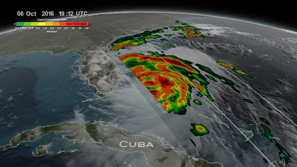
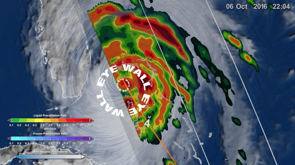
Integrated Multi-satellitE Retrievals for GPM (IMERG) precipitation from Hurricane Matthew.
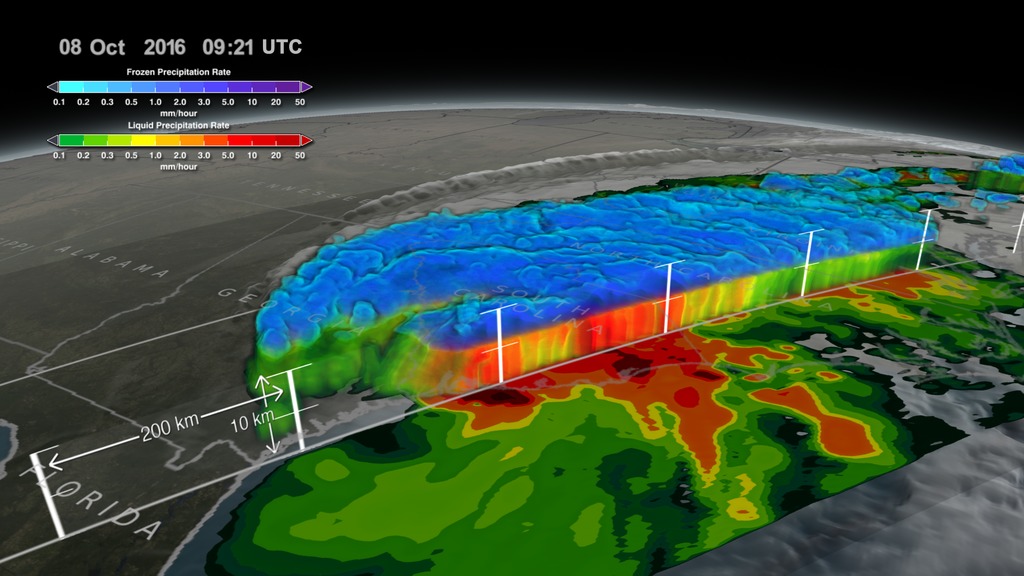
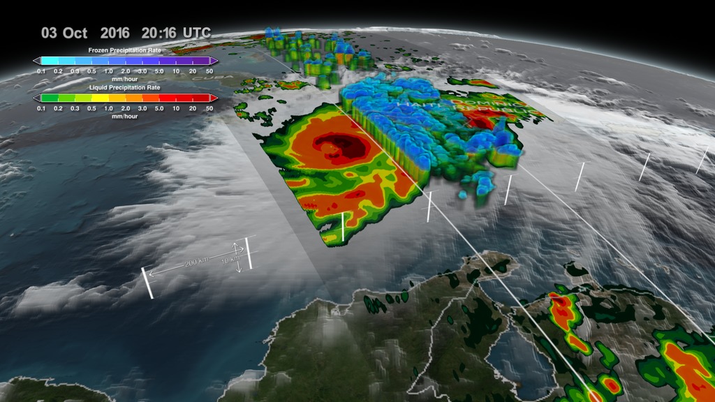
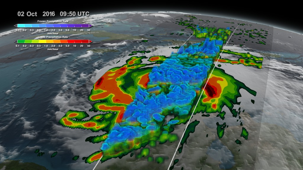
Global Precipitation Mission (GPM) Goddard PROFiling (GPROF) and Dual-Frequency Precipitation Radar (DPR) data of Hurricane Matthew.

Color bar for frozen precipitation rates (ie, snow rates). Shades of cyan represent low amounts of frozen precipitation, whereas shades of purple represent high amounts of precipitation.
Color bar for liquid precipitation rates (ie, rain rates). Shades of green represent low amounts of liquid precipitation, whereas shades of red represent high amounts of precipitation.
JPL Multi-Scale Ultra-high Resolution (MUR) Sea Surface Temperature data during Hurricane Matthew.
Sea Surface Temperature colorbar.
Accumulated IMERG precipitation of Hurricane Matthew.
Accumulated IMERG colorbar. Low amounts of accumulated rain are in shades of blue. The highest amounts of rainfall are in yellow and red.
NASA/Goddard Soil Moisture Anomaly from Hurricane Matthew.
Soil Moisture Anomaly colorbar.
Goddard Earth Observing System Model, Version 5 (GEOS-5) Sea Level Pressure during Hurricane Matthew.
Sea Level Pressure colorbar. The darkest colors represents very low pressure which coincides with the eye of Hurricane Matthew.
GEOS-5 Surface Wind Speeds of Hurricane Matthew.
Surface Wind Speed colorbar.
GEOS-5 winds of Hurricane Matthew.
Wind height colorbar.
- Atmosphere
- Atmospheric Phenomena
- Atmospheric Pressure
- Atmospheric science
- Atmospheric Winds
- Clouds
- Cryology
- Earth Science
- floods
- HDTV
- Human Dimensions
- Hurricanes
- Hydrology
- Hydrosphere
- Hyperwall
- Land Surface
- Natural hazards
- precipitation
- Precipitation Rate
- Presentation
- Pressure Tendency
- snow
- Soil Moisture/Water Content
- Soil science
- Soils
- surface water
- Terrestrial Hydrosphere
- Wind Patterns
- Wind Shear
Credits
Please give credit for this item to:
NASA's Scientific Visualization Studio Data provided by the joint NASA/JAXA GPM mission. Data provided by the joint NASA/JAXA GPM mission.
-
Animator
- Alex Kekesi (Global Science and Technology, Inc.)
-
Data visualizers
- Greg Shirah (NASA/GSFC)
- Horace Mitchell (NASA/GSFC)
- Trent L. Schindler (USRA)
-
Producer
- Ryan Fitzgibbons (USRA)
-
Scientists
- George Huffman (NASA/GSFC)
- Gail Skofronick Jackson (NASA/GSFC)
- Dalia B Kirschbaum (NASA/GSFC)
-
Technical support
- Laurence Schuler (ADNET Systems, Inc.)
- Ian Jones (ADNET Systems, Inc.)
Release date
This page was originally published on Monday, January 23, 2017.
This page was last updated on Tuesday, November 14, 2023 at 12:08 AM EST.
Missions
This visualization is related to the following missions:Series
This visualization can be found in the following series:Datasets used in this visualization
-
[GOES: IR4]
ID: 33 -
GEOS-5 Cubed-Sphere (GEOS-5 Atmospheric Model on the Cubed-Sphere)
ID: 663The model is the GEOS-5 atmospheric model on the cubed-sphere, run at 14-km global resolution for 30-days. GEOS-5 is described here http://gmao.gsfc.nasa.gov/systems/geos5/ and the cubed-sphere work is described here http://sivo.gsfc.nasa.gov/cubedsphere_overview.html.
See all pages that use this dataset -
Rain Rates (Surface Precipitation) [GPM: GMI]
ID: 822Credit: Data provided by the joint NASA/JAXA GPM mission.
See all pages that use this dataset -
Volumetric Precipitation data (Ku) [GPM: DPR]
ID: 830Credit: Data provided by the joint NASA/JAXA GPM mission.
See all pages that use this dataset -
MUR SST (Multi-scale Ultra-high Resolution (MUR) Sea Surface Temperature (SST) Analysis)
ID: 845 -
IMERG
ID: 863This dataset can be found at: http://pmm.nasa.gov/sites/default/files/document_files/IMERG_ATBD_V4.4.pdf
See all pages that use this dataset -
NASA-USDA-FAS Soil Moisture (Surface Soil Moisture corrected with SMOS imagery and assimilated by the Ensemble Kalman Filter)
ID: 954The surface soil moisture product is corrected by integrating satellite-derived Soil Moisture Ocean Salinity (SMOS) mission surface soil moisture retrievals into the modified Palmer two-layer soil moisture model. The SMOS imagery helps to correct the modified Pal
See all pages that use this dataset -
Winds [MERRA-2]
ID: 959
Note: While we identify the data sets used in these visualizations, we do not store any further details, nor the data sets themselves on our site.
Related
- ID: 4575
 Visualization
 - ID: 4548
 Visualization
 - ID: 4512
 Visualization
 - ID: 4511
 Visualization
 - ID: 4508
 Visualization
 - ID: 4507
 Visualization
Alternate Versions
- ID: 12635
 Produced Video
Used as a Source In
- ID: 13216
![Complete transcript available.Music credits: “Northern Breeze” by Denis Levaillant [SACEM], “Stunning Horizon” by Maxime Lebidois [SACEM], Ronan Maillard [SACEM], “Magnetic Force” by JC Lemay [SACEM] from Killer TracksWatch this video on the NASA Goddard YouTube channel.This video can be freely shared and downloaded. While the video in its entirety can be shared without permission, some individual imagery provided by pond5.com is obtained through permission and may not be excised or remixed in other products. Specific details on stock footage may be found here. For more information on NASA’s media guidelines, visit https://www.nasa.gov/multimedia/guidelines/index.html.Notes on footage:• 0:03 - 0:17 provided by Pond5• 1:38 - 1.43 provided by Pond5• 1:49 - 1:52 provided by Pond5• 2:21 - 1:27 provided by Pond5](/vis/a010000/a013200/a013216/13216_NASA_Has_Eyes_On_The_Atlantic_Hurricane_Season_YouTube.00050_print.jpg) Produced Video
Produced Video