NASA Images Show Human Fingerprint on Global Air Quality – Release Materials
This video provides an overview of the study findings. An HD version of this video is available here: Human Fingerprint on Global Air Quality
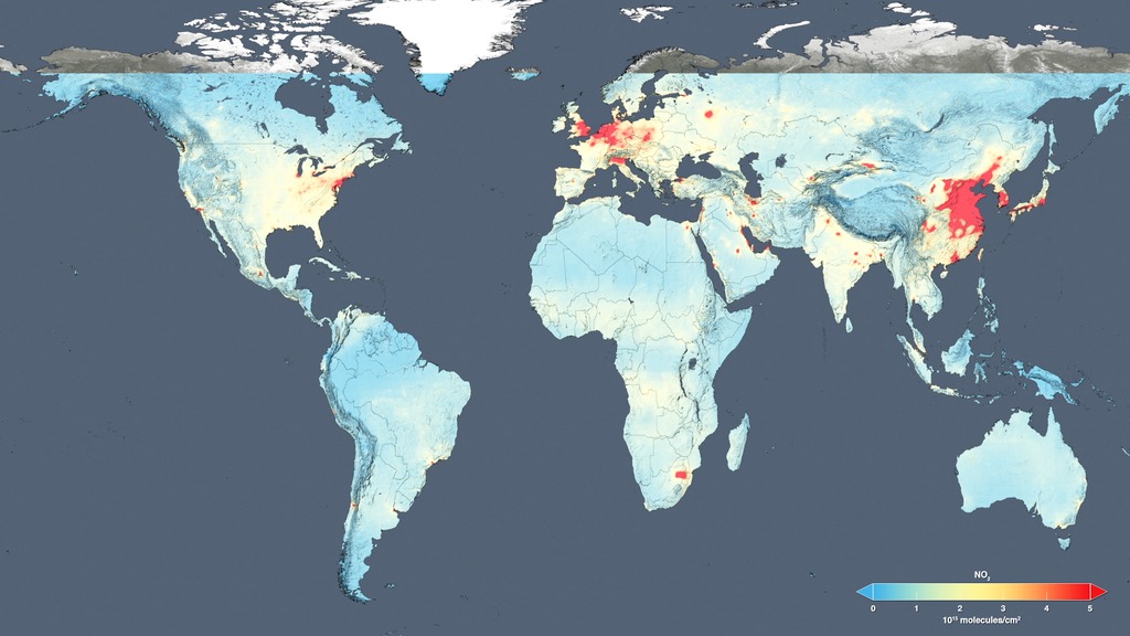
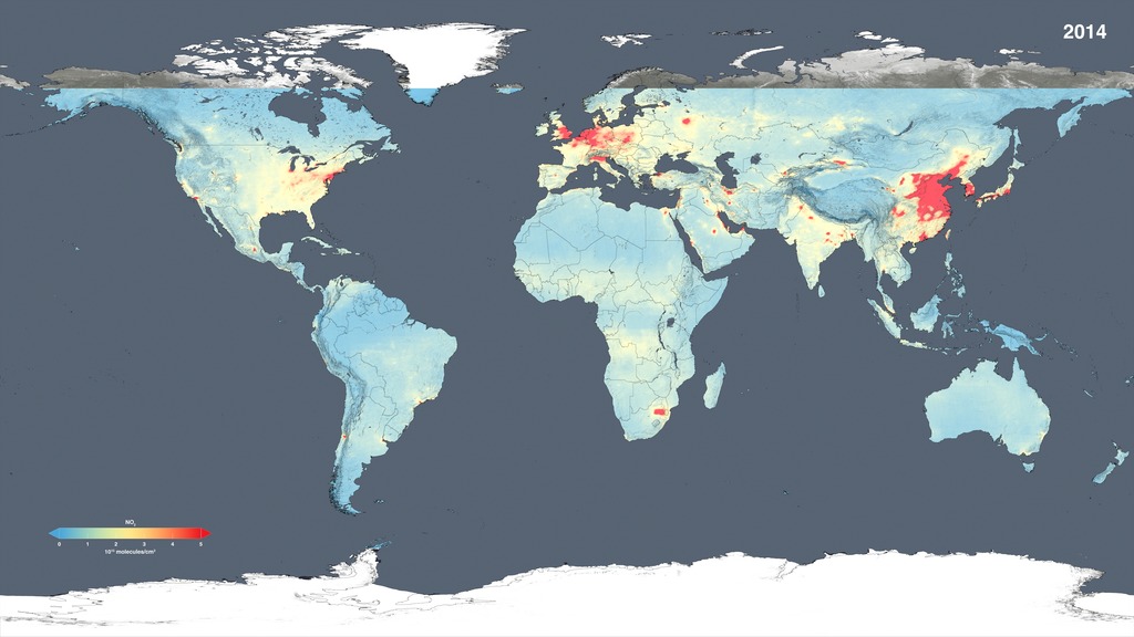
Using new, high-resolution global satellite maps of air quality indicators, NASA scientists tracked air pollution trends over the last decade in various regions and 195 cities around the globe. According to recent NASA research findings, the United States, Europe and Japan have improved air quality thanks to emission control regulations, while China, India and the Middle East, with their fast-growing economies and expanding industry, have seen more air pollution.
Scientists examined observations made from 2005 to 2014 by the Ozone Monitoring Instrument aboard NASA's Aura satellite. One of the atmospheric gases the instrument detects is nitrogen dioxide, a yellow-brown gas that is a common emission from cars, power plants and industrial activity. Nitrogen dioxide can quickly transform into ground-level ozone, a major respiratory pollutant in urban smog. Nitrogen dioxide hotspots, used as an indicator of general air quality, occur over most major cities in developed and developing nations.
The following visualizations include two types of data. The absolute concentrations show the concentration of tropospheric nitrogen dioxide, with blue and green colors denoting lower concentrations and orange and red areas indicating higher concentrations.
The second type of data is the trend data from 2005 to 2014, which shows the observed change in concentration over the ten-year period. Blue indicated an observed decrease in nitrogen dioxide, and orange indicates an observed increase. Please note that the range on the color bars (text is in white) changes from location to location in order to highlight features seen in the different geographic regions.

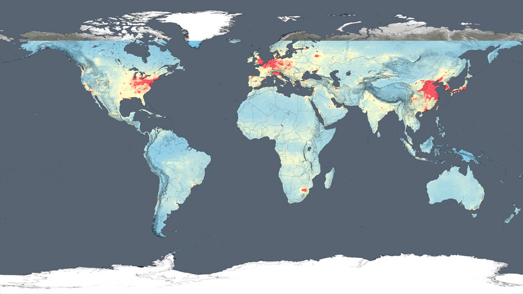
This global map shows the concentration of nitrogen dioxide in the atmosphere as detected by the Ozone Monitoring Instrument aboard the Aura satellite, averaged over 2005.
This global map shows the concentration of nitrogen dioxide in the troposphere as detected by the Ozone Monitoring Instrument aboard the Aura satellite, averaged over 2014.
Color bar for absolute nitrogen dioxide concentrations global images.
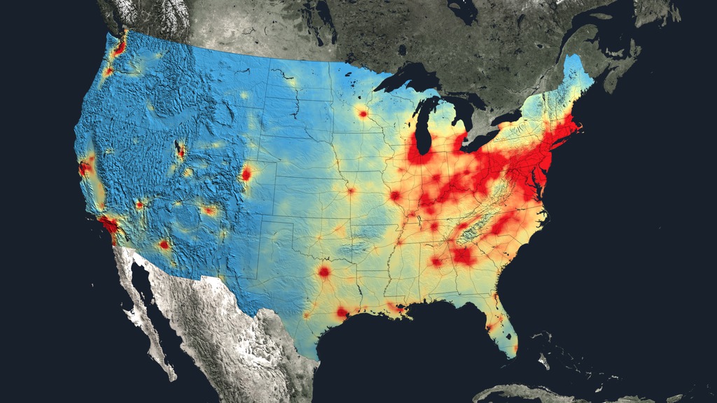
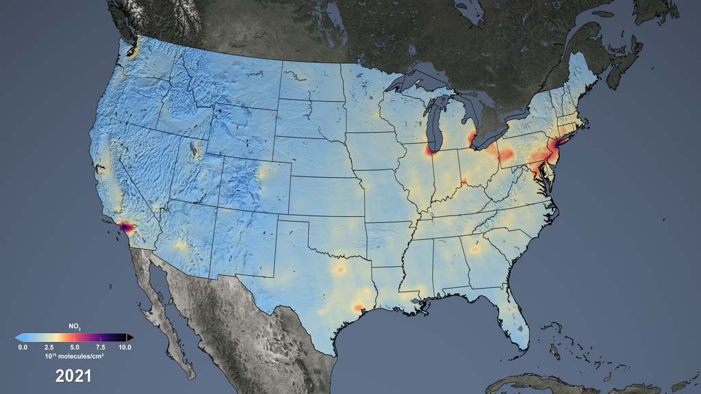
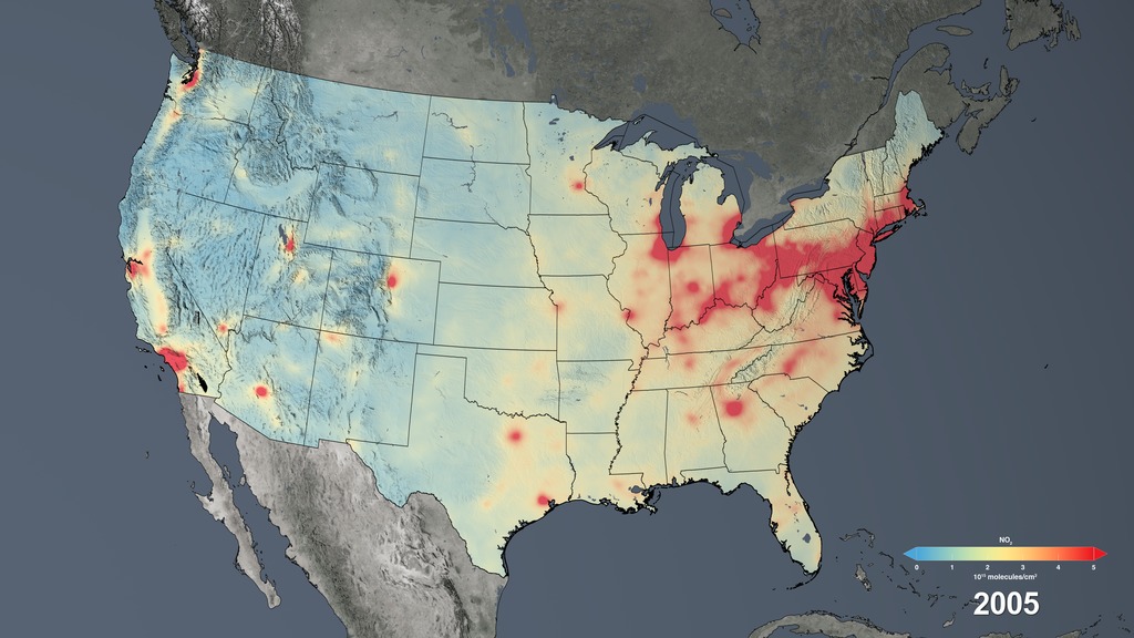
Nitrogen dioxide concentrations across the United States, averaged over 2005.
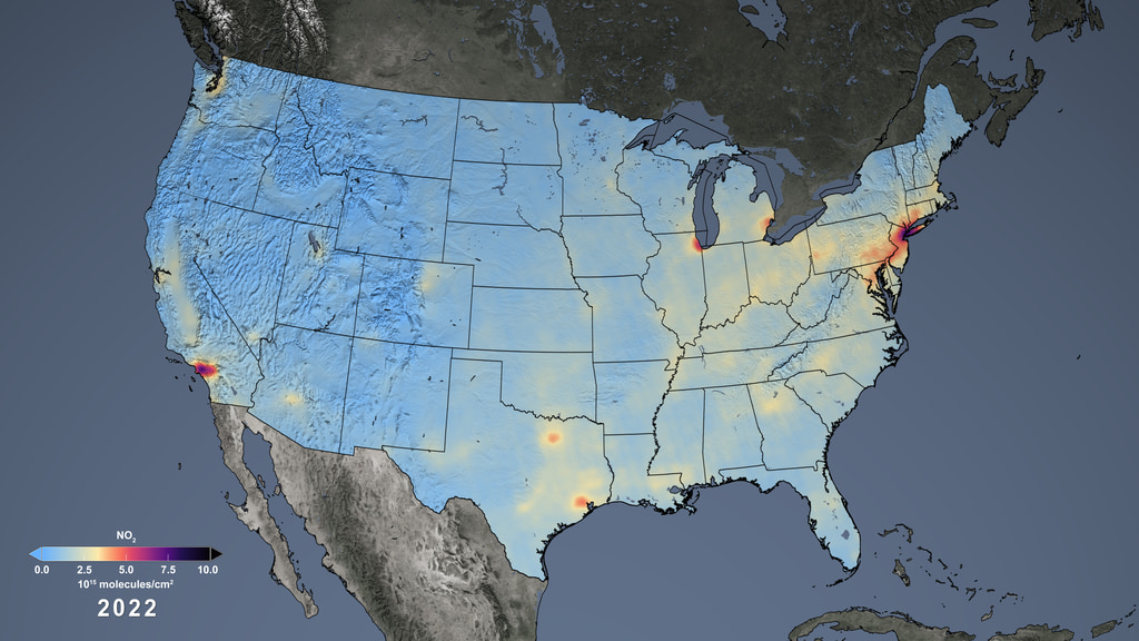
Nitrogen dioxide concentrations across the United States, averaged over 2014.
Color bar for absolute nitrogen dioxide concentrations across the United Sates.
The trend map of the United States shows the large decreases in nitrogen dioxide concentrations from 2005 to 2014. Only decreases are highlighted in this map.
Color bar for the trend in nitrogen dioxide concentrations changes across the United Sates.
The trend map of Europe shows the change in nitrogen dioxide concentrations from 2005 to 2014.
Color bar for the trend in nitrogen dioxide concentrations changes across Europe.
The trend map of East Asia shows the change in nitrogen dioxide concentrations from 2005 to 2014.
Color bar for the trend in nitrogen dioxide concentrations changes across East Asia.
The trend map of the Middle East shows the change in nitrogen dioxide concentrations from 2005 to 2014.
Color bar for the trend in nitrogen dioxide concentrations changes across the Middle East.
The trend map of the Persian Gulf shows the change in nitrogen dioxide concentrations from 2005 to 2014.
Color bar for the trend in nitrogen dioxide concentrations changes across the Persian Gulf.
Nitrogen dioxide concentrations in South Africa, averaged over 2014.
Color bar for absolute nitrogen dioxide concentrations across in South Africa.
The trend map of South Africa shows the change in nitrogen dioxide concentrations from 2005 to 2014.
Color bar for the trend in nitrogen dioxide concentrations changes in South Africa.
The trend map for North Dakota shows the percent change in nitrogen dioxide concentrations from 2005 to 2014.
Color bar for the trend in nitrogen dioxide percent changes in North Dakota.
The trend map for Texas shows the percent change in nitrogen dioxide concentrations from 2005 to 2014.
Color bar for the trend in nitrogen dioxide percent changes in North Dakota.
Globe background layer
Europe background layer
East asia background layer
Middle east background layer
Persian gulf background layer
S Africa background layer
N Dakota background layer
Texas background layer
Credits
Please give credit for this item to:
NASA's Goddard Space Flight Center
-
Animator
- Trent L. Schindler (USRA)
-
Writer
- Ellen T. Gray (ADNET Systems, Inc.)
-
Producer
- Kayvon Sharghi (USRA)
-
Scientists
- Bryan Duncan (NASA/GSFC)
- Lok Lamsal (USRA)
Release date
This page was originally published on Thursday, December 17, 2015.
This page was last updated on Tuesday, November 14, 2023 at 12:07 AM EST.
Datasets used in this visualization
-
[Aura: OMI]
ID: 147
Note: While we identify the data sets used in these visualizations, we do not store any further details, nor the data sets themselves on our site.
Related
- ID: 12076
 Produced Video
 - ID: 4179
 Visualization
Alternate Versions
- ID: 12094
- ID: 12096
 Produced Video
Used as a Source In
- ID: 5070
 Visualization
 - ID: 4994
 Visualization
 - ID: 13753
 Produced Video
 - ID: 4677
 Visualization
 - ID: 4410
 Visualization
 - ID: 11812
 Produced Video