A newer version of this visualization is available.
The Dynamic Solar Magnetic Field
A visualization of the slow changes of the solar magnetic field over the course of four years.
While the sun is well known as the overwhelming source of visible light in our solar system, a substantial part of its influence is driven by some aspects less visible to human perception - the magnetic field.
Most of the solar photosphere has a magnetic field intensity of a few gauss while the active regions which form around sunspots can have magnetic fields of a few thousand gauss. Modern space-based instruments such as HMI (Helioseismic and Magnetic Imager) on the Solar Dynamics Observatory (SDO) enable us to measure the intensity of the magnetic field at the visible surface of the sun.
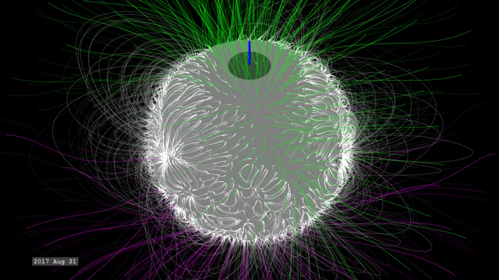
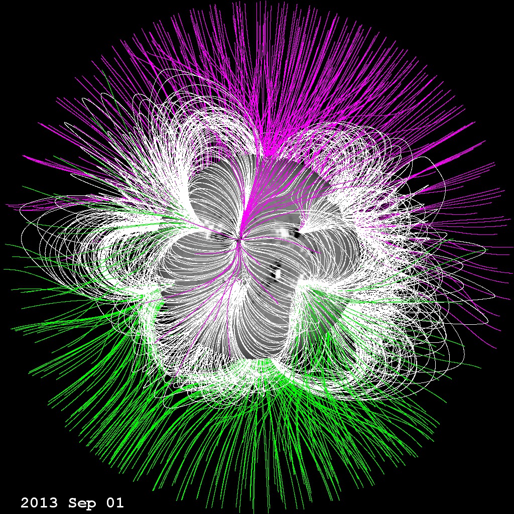
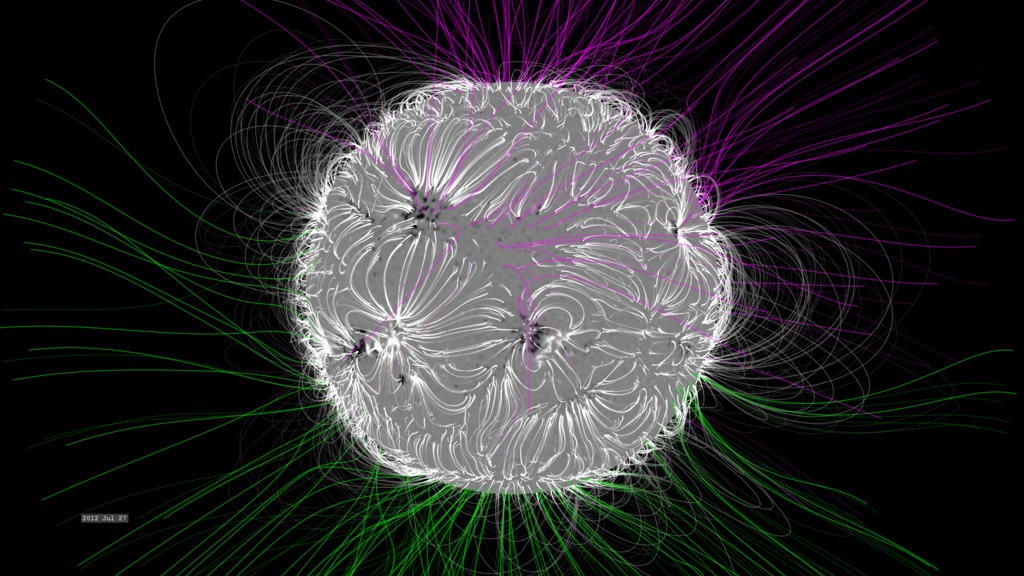
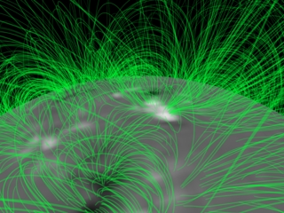
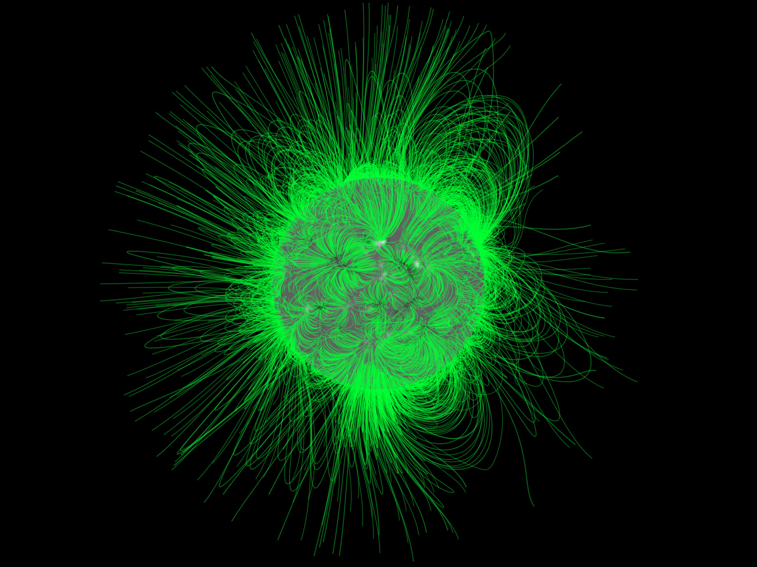
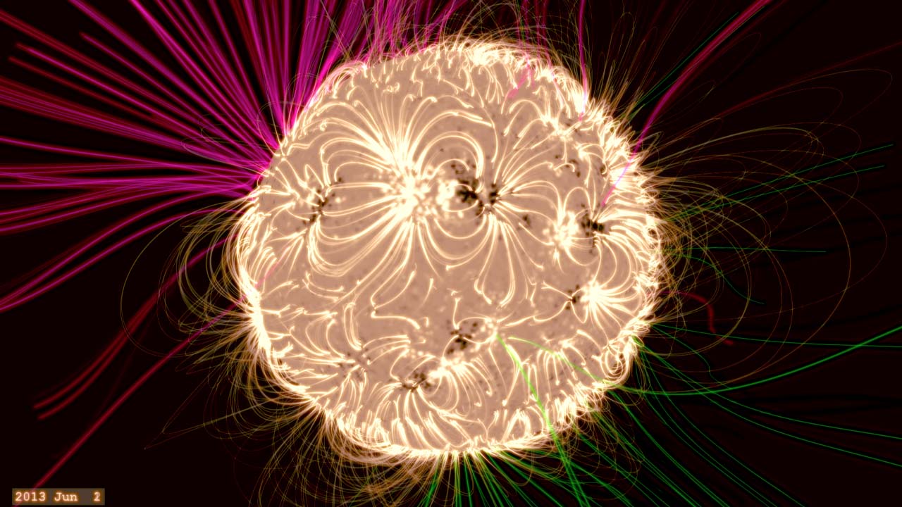
In this visualization, the sphere represents the solar photosphere, with neutral grey indicating a magnetic field of near zero intensity, black representing a magnetic field pointing INTO the sun (south or negative polarity) and white representing a magnetic field pointing OUT of the sun (north or positive polarity). We see that these magnetic regions often appear in nearby pairs of opposite polarities - which in visible light would often correspond to a pair of sunspots.
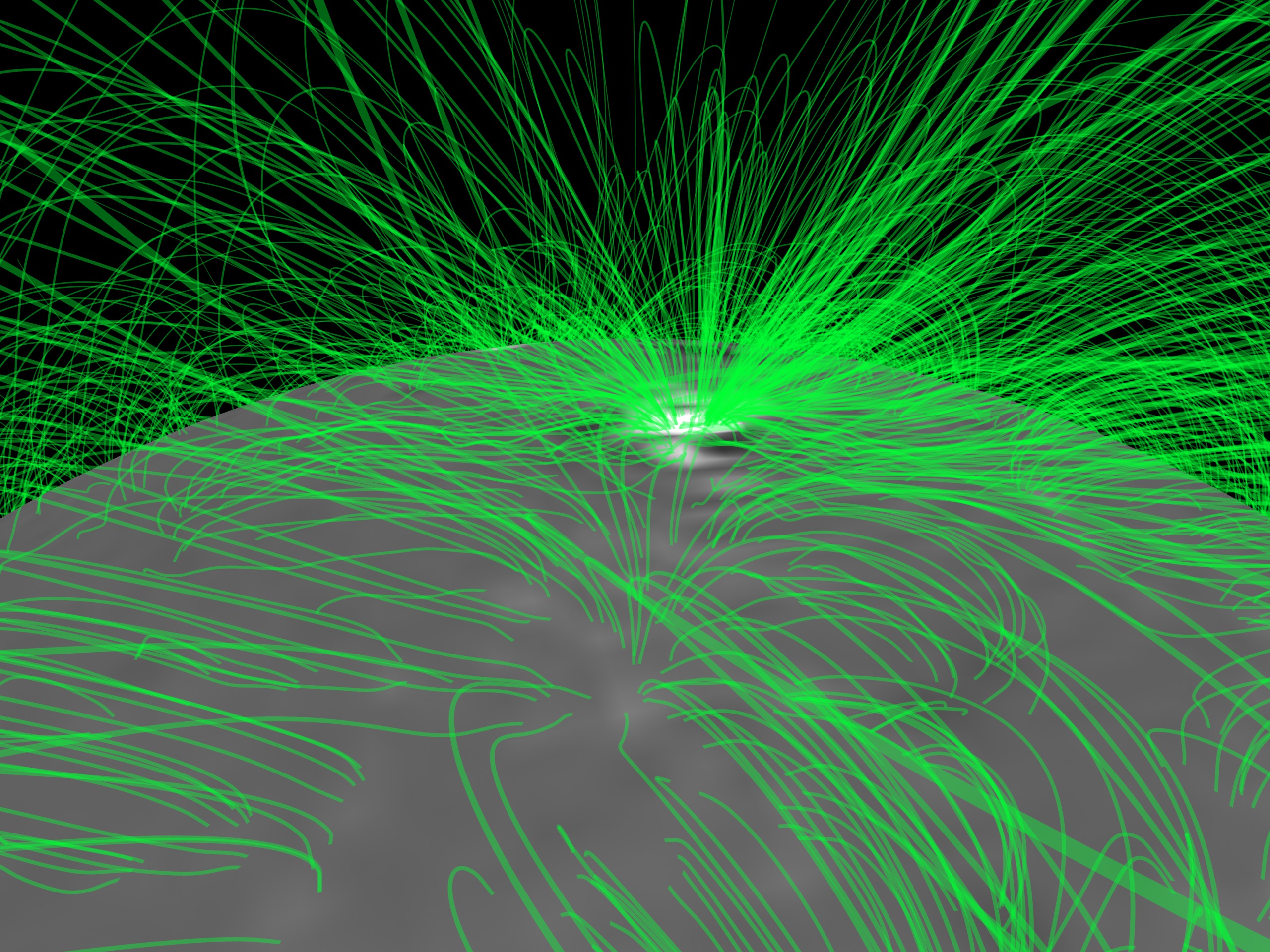
Using this measured magnetic field on the photosphere, combined with mathematical models based on Maxwell's equations and plasma physics, we can construct how the magnetic field would look above the photosphere. Here, the white magnetic field lines are considered 'closed'. They move up, and then return to the solar surface. We often see these closed lines associated with pairs of active regions on the sun. The green and violet lines represent field lines that are considered 'open'. Green represents positive magnetic polarity, and violet represents negative polarity. These field lines do not connect back to the sun but with more distant magnetic fields in space.
Here we build one of the simpler magnetic field models, called Potential Field Source Surface or PFSS, to construct how the magnetic 'lines of force' might look above the sun. The PFSS model represents the simplest and most steady magnetic field possible, though here we sample the field each day to illustrate the slow changes of the magnetic structure over time, in this case between January 1, 2011 through December 30, 2014.
This camera view is fixed in Carrington Heliographic coordinates, so it moves with an 'average' solar rotation value with a period of 25.38 days. The solar equator moves faster than this, and high latitudes move slower. This makes active regions near the equator appear to move to the right (on average) while higher latitude regions move leftward.
Some might note that this model looks rather different than an earlier version The Sun's Magnetic Field. In the earlier version, we were interested in the magnetic field structure significantly above the solar surface and so the model is examined favoring the field lines that reach high above the photosphere. In the model presented here, we are more interested in the magnetic field around the solar active regions, so we examine the model much closer to the photosphere, which favors magnetic field lines clustered around the active regions.
An artifact in this visualization is a 'jump' of change that sweeps through the magnetic loops about once per month based on the timestamp in the lower left corner. This is an artifact of the fact that these types of magnetic field measurements can only be done on one side of the sun at a time. As the sun rotates, the features disappear over the limb and new ones appear on the opposite limb. While on the far-side of the sun from Earth, we have no direct measurements. However, we do have models that can simulate the slow changes in the field while not visible from Earth (described in the science paper Photospheric and heliospheric magnetic fields by Carolus J. Schrijver and Marc L. De Rosa). The 'jump' is created at the seam where the less accurate model gets overwritten by newer data.
A visualization of the slow changes of the solar magnetic field over the course of four years. This version has the color thresholds of the magnetogram adjusted to better illustrate the active regions.
This video is also available on our YouTube channel.

High-resolution still image of the solar magnetic field via PFSS - January 1, 2011.
High-resolution still image of the solar magnetic field via PFSS - October 28, 2011.
High-resolution still image of the solar magnetic field via PFSS - August 23, 2012.
High-resolution still image of the solar magnetic field via PFSS - June 19, 2013.
A visualization of the slow changes of the solar magnetic field over the course of four years. This version has the color thresholds of the magnetogram adjusted to better illustrate the active regions.
High-resolution still image of the solar magnetic field via PFSS - April 15, 2014.
Credits
Please give credit for this item to:
NASA's Scientific Visualization Studio
-
Visualizer
- Tom Bridgman (Global Science and Technology, Inc.)
-
Writers
- Karen Fox (ADNET Systems, Inc.)
- Sarah Frazier (ADNET Systems, Inc.)
-
Scientist
- Marc L. DeRosa (LMSAL)
Release date
This page was originally published on Friday, January 29, 2016.
This page was last updated on Thursday, January 25, 2024 at 12:06 AM EST.
Missions
This visualization is related to the following missions:Papers used in this visualization
Photospheric and heliospheric magnetic fields by Carolus J. Schrijver and Marc L. De Rosa
Datasets used in this visualization
-
PFSS (Magnetic Field Lines) [PFSS]
ID: 409This model generated from SOHO/MDI magnetograms through the SolarSoft package.
This dataset can be found at: http://sohowww.nascom.nasa.gov/solarsoft/
See all pages that use this dataset -
SDO Magnetogram (Magnetogram) [SDO: HMI]
ID: 675
Note: While we identify the data sets used in these visualizations, we do not store any further details, nor the data sets themselves on our site.
Related
- ID: 4788
 Visualization
 - ID: 4124
 Visualization
Newer Versions
- ID: 4623
 Visualization
Older Versions
- ID: 3346
 Visualization
 - ID: 3286
 Visualization
 - ID: 3287
 Visualization
Used as a Source In
- ID: 13716
![VIDEO IN ENGLISH Watch this video on the NASA Goddard YouTube channel.The Sun is stirring from its latest slumber. As sunspots and flares, signs of a new solar cycle, bubble from the Sun’s surface, scientists are anticipating a flurry of solar activity over the next few years. Roughly every 11 years, at the height of this cycle, the Sun’s magnetic poles flip—on Earth, that’d be like the North and South Poles’ swapping places every decade—and the Sun transitions from sluggish to active and stormy. At its quietest, the Sun is at solar minimum; during solar maximum, the Sun blazes with bright flares and solar eruptions. In this video, view the Sun's disk from our space telescopes as it transitions from minimum to maximum in the solar cycle.Music credit: "Observance" by Andrew Michael Britton [PRS], David Stephen Goldsmith [PRS] from Universal Production Music](/vis/a010000/a013700/a013716/13716_SolarCycleFromSpace_YouTube.01410_print.jpg) Produced Video
Produced Video - ID: 12104
 Produced Video