2017 Global Temperature Visuals
Earth’s global surface temperatures in 2017 were the second warmest since modern recordkeeping began in 1880, continuing the planet’s long-term warming trend.
Globally averaged temperatures in 2017 were 1.62 degrees Fahrenheit (0.90 degrees Celsius) warmer than the 1951 to 1980 mean. That is second only to global temperatures in 2016. Last year was the third consecutive year in which temperatures were more than 1.8 degrees Fahrenheit (1 degree Celsius) above late nineteenth-century levels.
2017 was the warmest year that did not have an El Niño event.
NASA’s temperature analyses incorporate surface temperature measurements from 6,300 weather stations, ship- and buoy-based observations of sea surface temperatures, and temperature measurements from Antarctic research stations.
These raw measurements are analyzed using an algorithm that considers the varied spacing of temperature stations around the globe and urban heating effects that could skew the conclusions. These calculations produce the global average temperature deviations from the baseline period of 1951 to 1980.
The full 2017 surface temperature data set and the complete methodology used to make the temperature calculation are available at: http://data.giss.nasa.gov/gistemp/
Animated graph of annual global temperatures, with respect to a baseline from the mid-twentieth century (the average of 1951-1980). In degrees Fahrenheit.
This map shows Earth’s average global temperatures in December 2017, as compared to a baseline average from 1951 to 1980, according to an analysis by NASA’s Goddard Institute for Space Studies. Yellows, oranges and reds show regions warmer than the baseline. The data are in degrees Fahrenheit.
This map shows Earth’s average global temperatures during the entire year of 2017, as compared to a baseline average from 1951 to 1980, according to an analysis by NASA’s Goddard Institute for Space Studies. Yellows, oranges and reds show regions warmer than the baseline. The data are in degrees Fahrenheit.
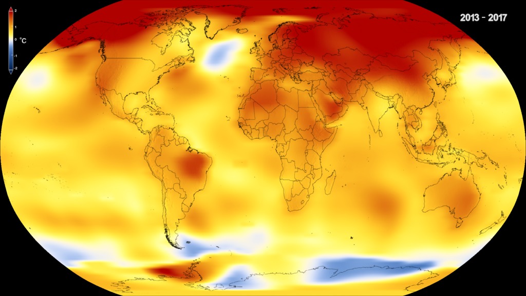
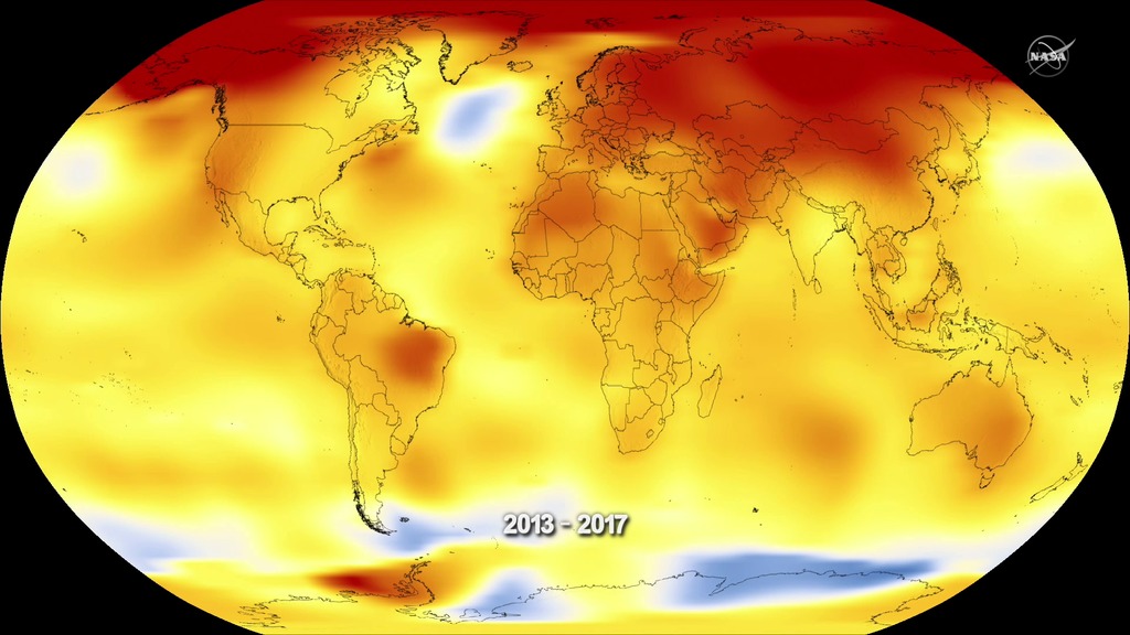
This map shows Earth’s average global temperature from 2013 to 2017, as compared to a baseline average from 1951 to 1980, according to an analysis by NASA’s Goddard Institute for Space Studies. Yellows, oranges and reds show regions warmer than the baseline. The data are in degrees Fahrenheit.
For More Information
See the following sources:
Credits
Please give credit for this item to:
NASA's Goddard Space Flight Center
-
Animators
- Kel Elkins (USRA)
- Lori Perkins (NASA/GSFC)
- Matthew R. Radcliff (USRA)
-
Producers
- Matthew R. Radcliff (USRA)
- Kathryn Mersmann (USRA)
-
Writer
- Kate Ramsayer (Telophase)
Release date
This page was originally published on Friday, January 19, 2018.
This page was last updated on Wednesday, May 3, 2023 at 1:47 PM EDT.
Series
This visualization can be found in the following series:Related
- ID: 4609
 Visualization
 - ID: 12822
![Complete transcript available.Music: Sojourner Rover by Craig Warnock [PRS], Lee Ahmad Baker [PRS], Sean Hennessey [PRS]](/vis/a010000/a012800/a012822/LARGE_MP4_12822_2017Temp_large.00001_print.jpg) Produced Video
Produced Video - ID: 12824
Used as a Source In
- ID: 12847
 Produced Video