Record-Breaking Climate Trends Briefing – July 19, 2016
Two key climate change indicators have broken numerous records through the first half of 2016, according to NASA analyses of ground-based observations and satellite data.
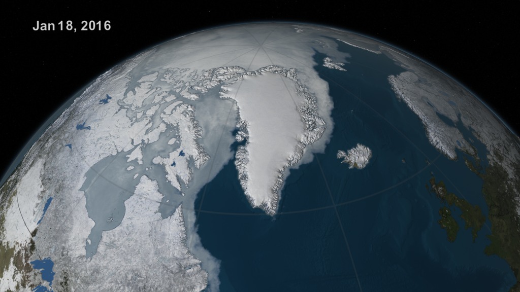
Each of the first six months of 2016 set a record as the warmest respective month globally in the modern temperature record, which dates to 1880. Meanwhile, five of the first six months set records for the smallest monthly Arctic sea ice extent since consistent satellite records began in 1979.
NASA will host a media teleconference at 1:00 PM EDT on Tuesday, July 19, to discuss the latest insights into these two key climate indicators, and what this means for our future climate.
Participating in the briefing:
Gavin Schmidt, director of Goddard Institute for Space Studies (GISS), New York, New York
Walt Meier, sea ice scientist at NASA's Goddard Space Flight Center in Greenbelt, Maryland
Charles Miller, science co-lead for the Arctic Boreal Vulnerability Experiment at NASA's Jet Propulsion Laboratory in Pasadena, California
Nathan Kurtz, project scientist for NASA's Operation IceBridge at NASA’s Goddard Space Flight Center in Greenbelt, Maryland
For more information:
2016 Climate Trends Continue to Break Records
 –– This color-coded map in Robinson projection displays global surface temperature anomalies for the period January 2016 through June 2016. Higher than normal temperatures are shown in red and lower then normal termperatures are shown in blue.Credit: NASA/GISS")
Figure 1 (Schmidt) –– This color-coded map in Robinson projection displays global surface temperature anomalies for the period January 2016 through June 2016. Higher than normal temperatures are shown in red and lower then normal termperatures are shown in blue.
Credit: NASA/GISS
Figure 2 (Schmidt) –– A graph of the global mean surface temperature for the six-month period of January through June of each year from 1880-2016. The numbers are the differences from the pre-industrial era, calculated as the average mean surface temperature of 1880-1899.
Credit: NASA/GISS
Figure 3 (Meier) -- Chart showing the difference between the 1981-2010 average extent of Arctic sea ice and each year's maximum extent. Years with a larger extent of sea ice are colored red and years with a smaller extent of sea ice are colored blue.
Credit: NASA/Meier
Figure 4 (Meier) -- Map showing the number of days, earlier or later than the long-term average, when sea ice began to melt in the Arctic.
Credit: NASA/Meier
Figure 5 (Meier) -- Map showing how much the barometric pressure in the Arctic differed from the long-term average.
Credit: NASA/Meier
Figure 6 (Meier) -- Animation of sea ice in Beaufort Sea, off the coast of Barrow, Alaska, on five dates from April to July, 2016. Images from MODIS, 250m resolution.
Credit: NASA/Matt Radcliff (USRA)/NASA's EOSDIS Worldview
Figure 7 (Kurtz) -- A large melt pond is seen out the window of NASA's HU-25C Guardian Falcon aircraft during an Operation IceBridge flight over the Beaufort Sea on July 14, 2016, to measure the characteristics of melt ponds on the surface of Arctic sea ice.
Credit: NASA/Richard J. Yasky
Figure 8 (Kurtz) -- Chunks of sea ice, melt ponds and open water are all seen in this image captured at an altitude of 1,500 feet by the NASA's Digital Mapping System instrument during an Operation IceBridge flight over the Chukchi Sea on Saturday, July 16, 2016.
Credit: NASA
 -- Smoke rises into the air from a large fire in the boreal forest north of Fort Providence, Canada, on June 26, 2014.Credit: Flickr user KyleWiTh")
Figure 9 (Miller) -- Smoke rises into the air from a large fire in the boreal forest north of Fort Providence, Canada, on June 26, 2014.
Credit: Flickr user KyleWiTh
Figure 10 (Miller) –– Animated GIF of false-color satellite images of Alaska's forests on June 14, 2015, before the fire season intensified, and on September 1, 2015, after the major fires had been controlled. The images are from the Moderate Resolution Imaging Spectroradiometer (MODIS) on NASA's Terra and Aqua satellites, respectively. More information can be found at NASA's Earth Observatory
View the June 14, 2015, MODIS image
View the September 1, 2015, MODIS image
Credit: Jeff Schmaltz, LANCE/EOSDIS Rapid Response
 -- Photographs taken in the same place in 1987 and 2013 on Herschel Island, Yukon Territory, Canada, show the expanded growth of shrubs as the Arctic has warmed in recent decades.Credit: Myers-Smith et al, Ambio")
Figure 11 (Miller) -- Photographs taken in the same place in 1987 and 2013 on Herschel Island, Yukon Territory, Canada, show the expanded growth of shrubs as the Arctic has warmed in recent decades.
Credit: Myers-Smith et al, Ambio
Figure 12 (Miller) -- At continental scales, satellite data since the 1980s have indicated increased vegetation productivity (greening) across northern high latitudes, and a productivity decline (browning) for certain areas of undisturbed boreal forest of Canada and Alaska. This image shows the change in the vegetation trend over Canada and Alaska between 1984 and 2012. Green colors indicate an increase while brown colors indicate a decrease.
Credit: NASA/GSFC/Scientific Visualization Studio/Cindy Starr
Credits
Please give credit for this item to:
NASA's Goddard Space Flight Center
-
Producers
- Matthew R. Radcliff (USRA)
- Kathryn Mersmann (Intern)
-
Technical support
- Aaron E. Lepsch (ADNET Systems, Inc.)
-
Writer
- Patrick Lynch (Wyle Information Systems)
-
Scientists
- Gavin A. Schmidt (NASA/GSFC GISS)
- Walt Meier (NASA/GSFC)
- Nathan T. Kurtz (NASA/GSFC)
- Charles E. Miller (NASA/JPL CalTech)
Release date
This page was originally published on Tuesday, July 19, 2016.
This page was last updated on Monday, January 6, 2025 at 1:31 AM EST.
Series
This page can be found in the following series:Related
- ID: 4481
 Visualization
 - ID: 12306
![Two key climate change indicators have broken numerous records through the first half of 2016, according to NASA analyses of ground-based observations and satellite data. Each of the first six months of 2016 set a record as the warmest respective month globally in the modern temperature record, which dates to 1880. Meanwhile, five of the first six months set records for the smallest monthly Arctic sea ice extent since consistent satellite records began in 1979. NASA researchers are in the field this summer, collecting data to better understand our changing climate.Music: Hidden Files by Sam Dodson [PRS]](/vis/a010000/a012300/a012306/12306_climate_2016_large.00071_print.jpg)
- ID: 12310
 Produced Video