Seeing Trends In Air Pollution

New NASA satellite maps show the human impact on global air quality.
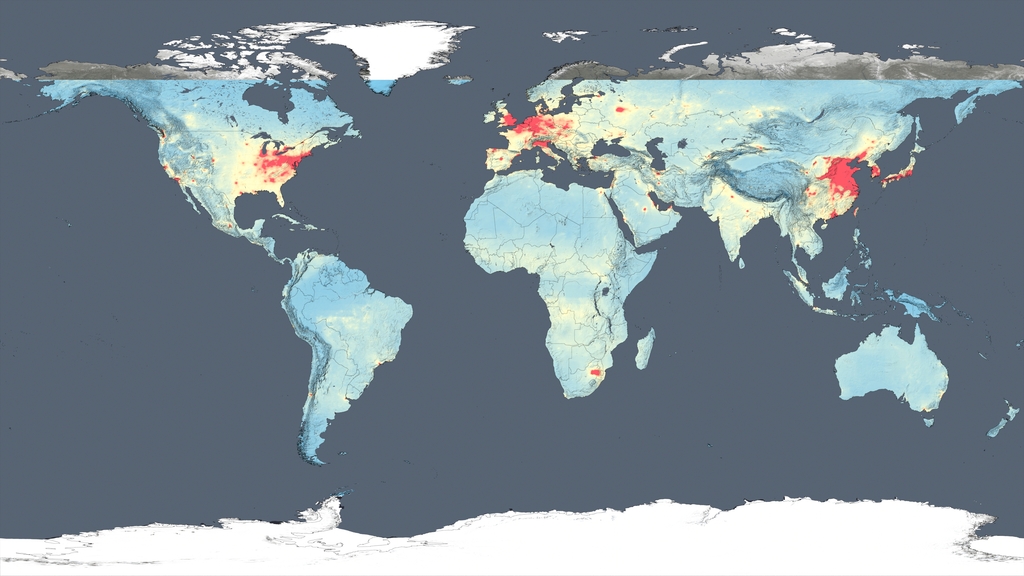
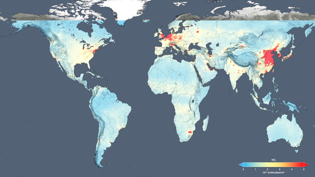
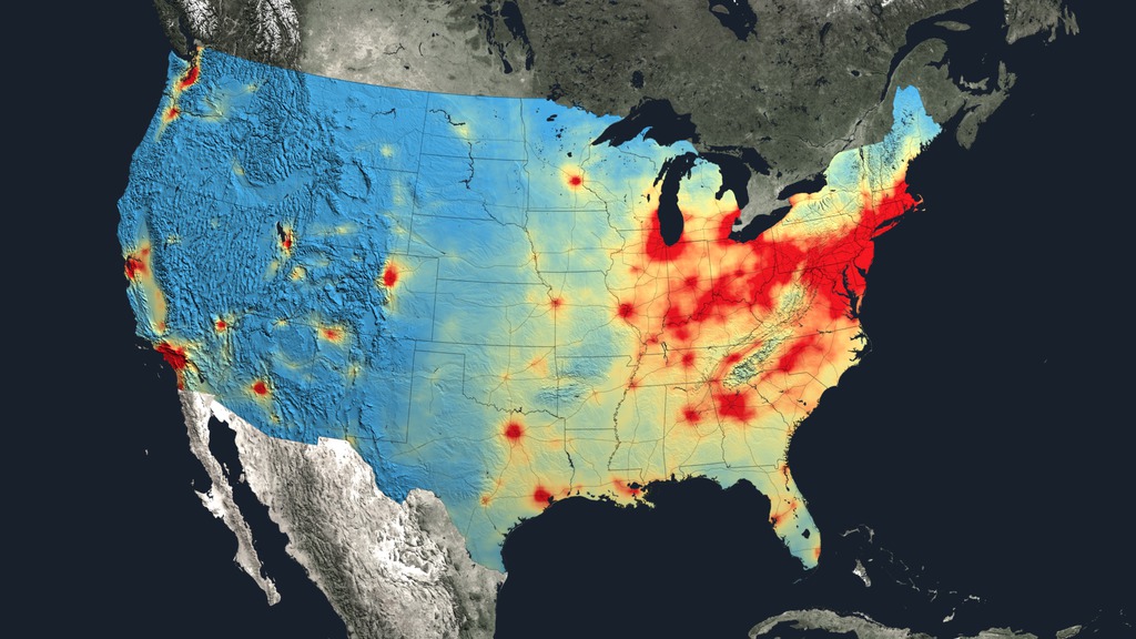
Is the quality of our air getting any better? To help answer that question, scientists examined ten years of observations from the Ozone Monitoring Instrument aboard NASA's Aura satellite. One of the atmospheric gases it detects is nitrogen dioxide (NO2), a yellow-brown gas that is a common emission from cars, power plants and industrial activity. Nitrogen dioxide levels in the atmosphere are used as a general indicator of air quality as the gas can quickly transform into ground-level ozone, a major respiratory pollutant in urban smog. By creating high-resolution maps that show how much nitrogen dioxide concentrations went up or down for each year between 2005 and 2014, scientists were able to track evolving trends in air pollution across the world over the last decade. Watch the video to learn more.
Explore how air pollution has changed over the last 10 years in different regions of the world in this video.
This map shows changes in NO2 levels over Europe from 2005-2014. The decreases (blue) are due to emission control regulations.
This map shows changes in NO2 levels over China from 2005-2014. The increases (red) are due to a rise in coal use for power generation.
This map shows changes in NO2 levels over the Middle East from 2005-2014. The decreases (blue) in Syria are tied to the country's civil war.
For More Information
See NASA.gov
Credits
Please give credit for this item to:
NASA's Goddard Space Flight Center
-
Animator
- Trent L. Schindler (USRA)
-
Writer
- Ellen T. Gray (ADNET Systems, Inc.)
-
Producers
- Kayvon Sharghi (USRA)
- Sophia Roberts (USRA)
-
Video editor
- Sophia Roberts (USRA)
-
Scientist
- Bryan Duncan (NASA/GSFC)
-
Interviewee
- Bryan Duncan (NASA/GSFC)
-
Videographers
- Rob Andreoli (Advocates in Manpower Management, Inc.)
- John Caldwell (Advocates in Manpower Management, Inc.)
Release date
This page was originally published on Tuesday, December 15, 2015.
This page was last updated on Wednesday, May 3, 2023 at 1:49 PM EDT.
Related
- ID: 4412
- ID: 12094

- ID: 12096
 Produced Video
 - ID: 4179
 Visualization