NASA Images Highlight U.S. Air Quality Improvement – Release Materials
Anyone living in the U.S. for the past decade may have noticed a change in the air. The change is apparent in NASA satellite images that demonstrate the country's reduction of air pollution, or more specifically, nitrogen dioxide.
Nitrogen dioxide can impact the respiratory system, and it also contributes to the formation of other pollutants including ground-level ozone and particulates. The gas is produced primarily during the combustion of gasoline in vehicle engines and coal in power plants. Air pollution has decreased even though population and the number of cars on the roads have increased. The shift is the result of regulations, technology improvements and economic changes, scientists say.
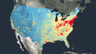
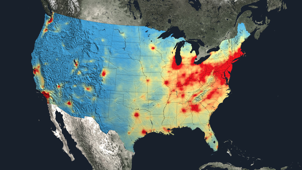
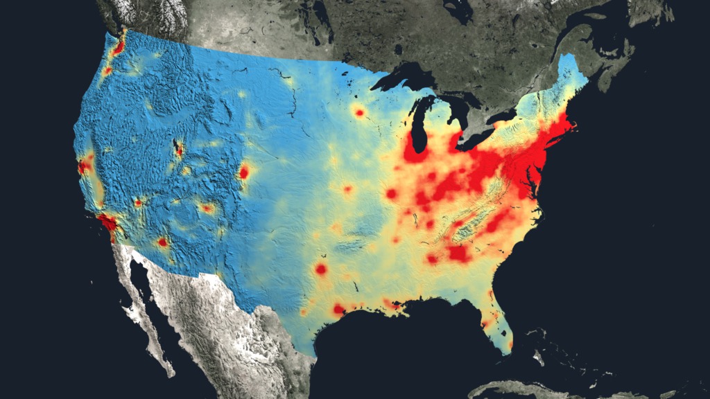
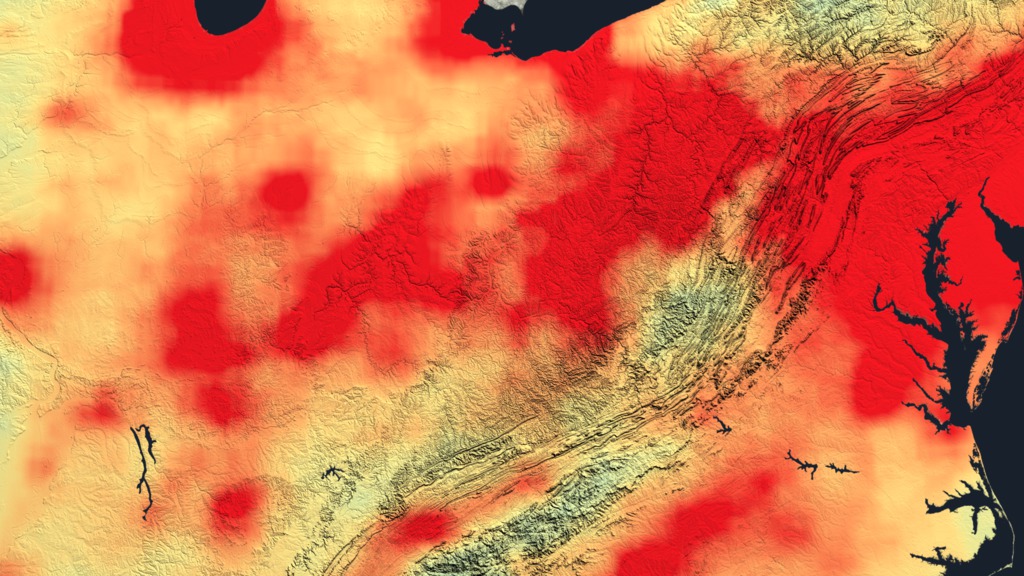
This following visualizations show tropospheric column concentrations of nitrogen dioxide as detected by the Ozone Monitoring Instrument on NASA's Aura satellite. Blue and green denote lower concentrations and orange and red areas denote higher concentrations, ranging from 1e+15 to 5e+15 molecules per square centimeter, respectively.
United States
This visualization shows tropospheric column concentrations of nitrogen dioxide across the U.S. as detected by the Ozone Monitoring Instrument on NASA's Aura satellite, averaged yearly from 2005-2011.

Atlanta
Satellite data show that Atlanta has seen a 42 percent decrease in nitrogen dioxide between the 2005-2007 (left) and 2009-2011 (right) periods.
Chicago
Satellite data show that Chicago has seen a 43 percent decrease in nitrogen dioxide between the 2005-2007 (left) and 2009-2011 (right) periods.
Denver
Satellite data show that Denver has seen a 22 percent decrease in nitrogen dioxide between the 2005-2007 (left) and 2009-2011 (right) periods.
Houston
Satellite data show that Houston has seen a 24 percent decrease in nitrogen dioxide between the 2005-2007 (left) and 2009-2011 (right) periods.
Los Angeles-San Diego
Satellite data show that the Los Angeles area has seen a 40 percent decrease in nitrogen dioxide between the 2005-2007 (left) and 2009-2011 (right) periods.
New York City
Satellite data show that New York City has seen a 32 percent decrease in nitrogen dioxide between the 2005-2007 (left) and 2009-2011 (right) periods.
Philadelphia
Satellite data show that Philadelphia has seen a 26 percent decrease in nitrogen dioxide between the 2005-2007 (left) and 2009-2011 (right) periods.
San Francisco Bay Area
These images show how nitrogen dioxide in the San Francisco Bay area changed between the 2005-2007 (left) and 2009-2011 (right) periods.
Tampa
These images show nitrogen dioxide in Tampa, averaged over 2005 (left) and 2011 (right).
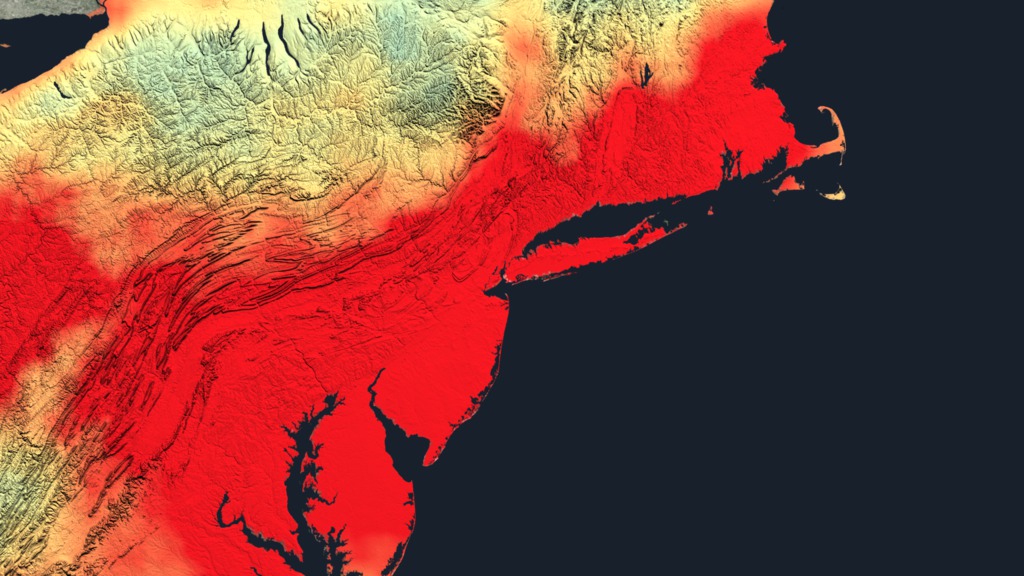
Northeast U.S. – 2005 Still for Slider
Close up of nitrogen dioxide in the Northeast U.S. averaged over 2005.
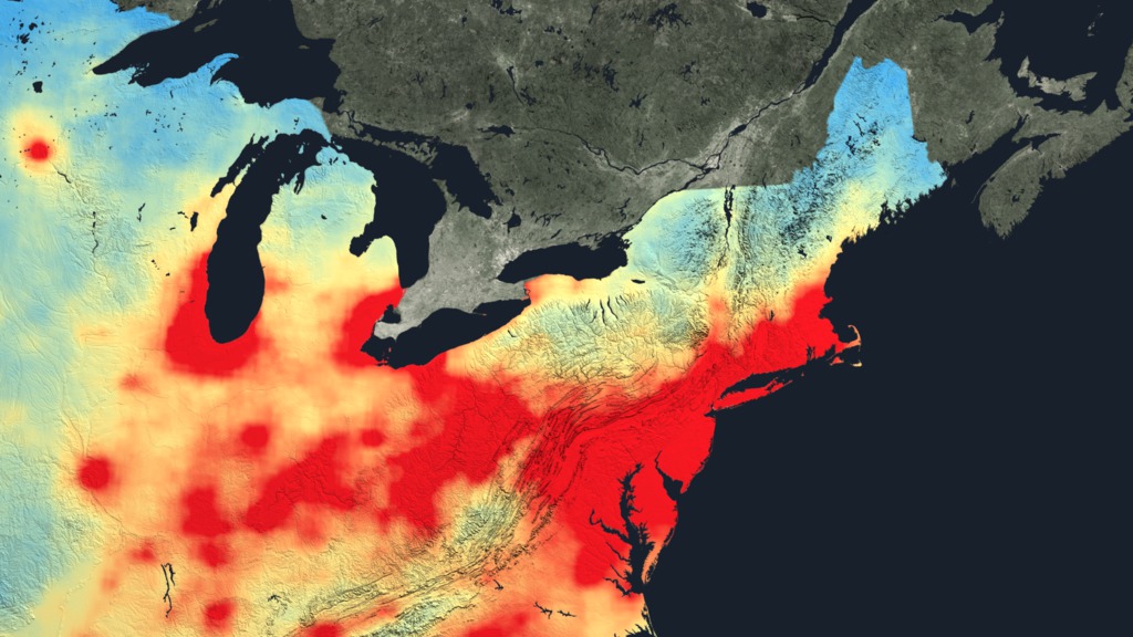
Northeast U.S. – 2011 Still for Slider
Close up of nitrogen dioxide in the Northeast U.S. averaged over 2011.
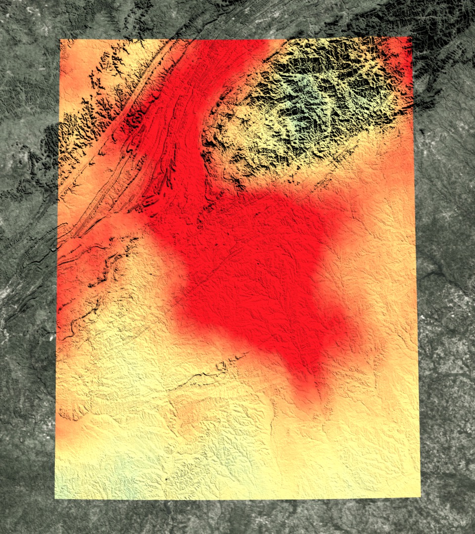
Ohio River Valley – 2005 Still for Slider
Close up of nitrogen dioxide in the Ohio River Valley averaged over 2005.
Ohio River Valley – 2011 Still for Slider
Close up of nitrogen dioxide in the Ohio River Valley averaged over 2011.
This visualization corresponds to a hyperwall show of the material above.
For More Information
Credits
Please give credit for this item to:
NASA Goddard's Scientific Visualization Studio
-
Animator
- Trent L. Schindler (USRA)
-
Producer
- Kayvon Sharghi (USRA)
-
Scientists
- Bryan Duncan (NASA/GSFC)
- Lok Lamsal (USRA)
- Yasuko Yoshida (SSAI)
-
Project support
- Aaron E. Lepsch (ADNET Systems, Inc.)
-
Writer
- Kathryn Hansen (Wyle Information Systems)
Release date
This page was originally published on Thursday, June 26, 2014.
This page was last updated on Tuesday, November 14, 2023 at 12:18 AM EST.
Related
- ID: 11582
 Produced Video
 - ID: 11547
 Produced Video
 - ID: 11572
 Produced Video
 - ID: 11573
 Produced Video
 - ID: 11574
 Produced Video
 - ID: 11575
 Produced Video
 - ID: 11576
 Produced Video